3.3 Warm and cold contrast
3.3 Warm and cold contrast


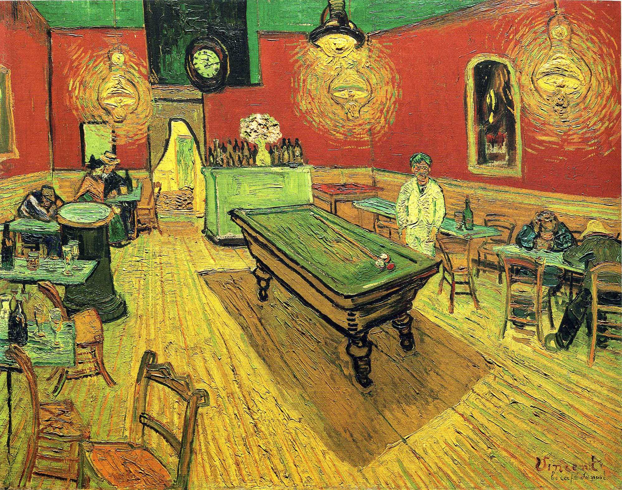
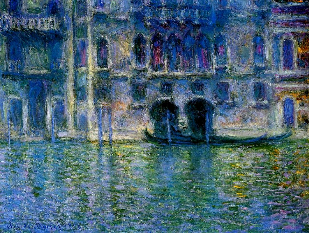
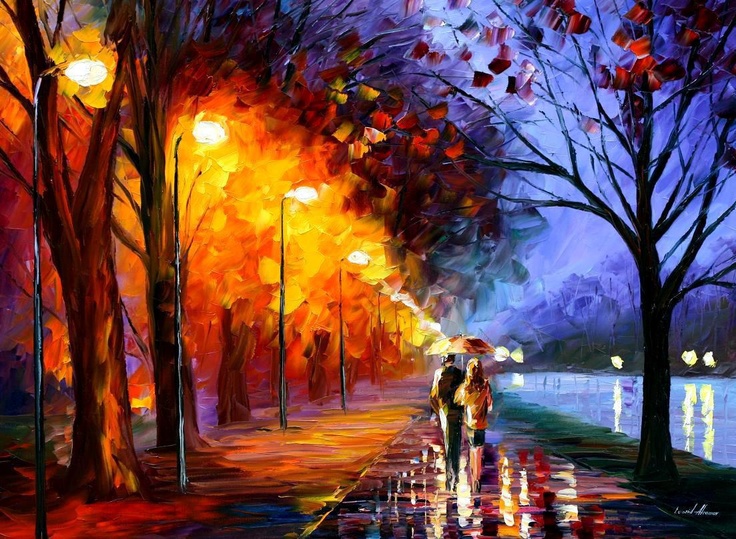
The distinction between warm and cold colors is not based in the nature, but in the culture and perception. It seems that colors can induce feeling of either warmth or cold. Cold colors can calm down, whereas warm can stimulate activity. Such perception is subjective.
Warm colors are red, orange and yellow. So the warm colors are rather to be perceived with attributes as activity, joyfulness, excitement.
Cold colors are green, blue and violet. Cold colors are perceived with such attributes as passivity, sadness, peace.
Colors can also have a spatial effect for perception: Warm colors seem to advance, whereas cold colors recede in the space.
Individual perception of warmth or coldness is influenced by the intensity of light. During a bright day, colors appear to be warmer than in the darker areas.
Comedy would prefer warm and bright colors, whereas tragedy would incline to cold and dark ones.

All the letters are the same, but the their color induces various visual perception of their position.

cold colors recede
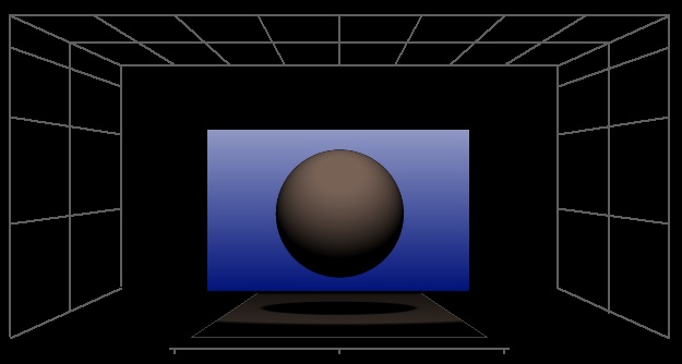
cold colors recede
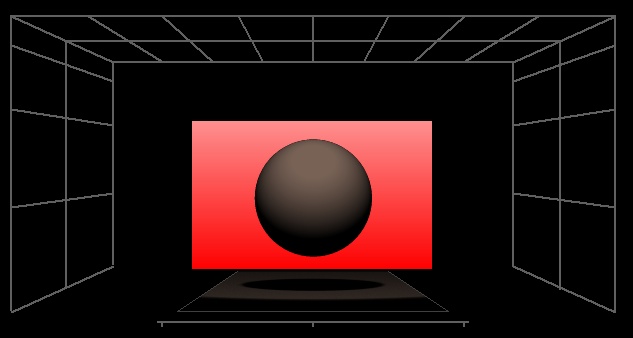
Warm colors tend to advance
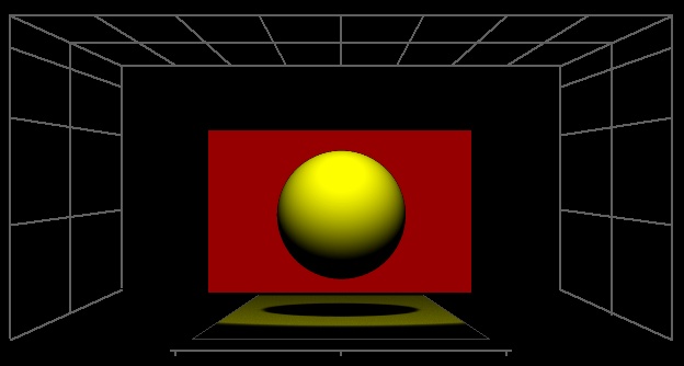
Warm colors tend to advance