
6. Color schemes
6. Color schemes
This system uses RYB color model.
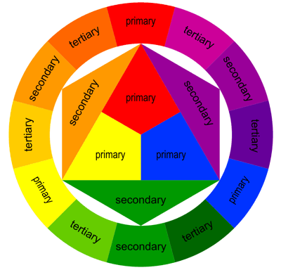
Color harmonies or color schemes is a theoretical framework, decribing the choice of colors to achieve an aesthetic effect. It is based on chromatic colors that is any color, in which one a particular wavelength or hue predominates. In contrast, achromatic colors are white, black, neutral shades of grey.
When achromatic color is mixed with achromatic one, it intensifies the intensity of chromatic shades.
Harmony is based on the prevalence of a given shade of color and on relations between the two mixed colors.
Attributes of individual colors are conceived in relation to another colors, i.e. in contrast.
- Simultaneous contrast emerges in the eye of a spectator, when colors are not complementary, possibly in brightness, saturation,
- Saturation of colors plays a large role in a successive contrast – if a saturated color is observed for a larger period of time, in the view after the end of seeing the color, its negative image is seen – the opposite of perceived
- The middle grey has an activation effect towards its adjacent colors. Neutral colors have the capability of to merge a bit into a complementary color to the one, with which it is complemented. If grey is next to orange, it has a colder effect than when it would be next to blue
- The surface area ratio of colors influence the efficiency of a contrast
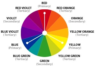
Primary colors in the model are different than in the RGB or CMY model.

Secondary colors of the scheme: green, orange and purple.
6.1 Monochromatic
The monochromatic or monotone color scheme uses variations of brightness and saturation and shades of a single color, such as red dark red, and pink. It is clean, elegant, balanced, but of course it offers little contrast.
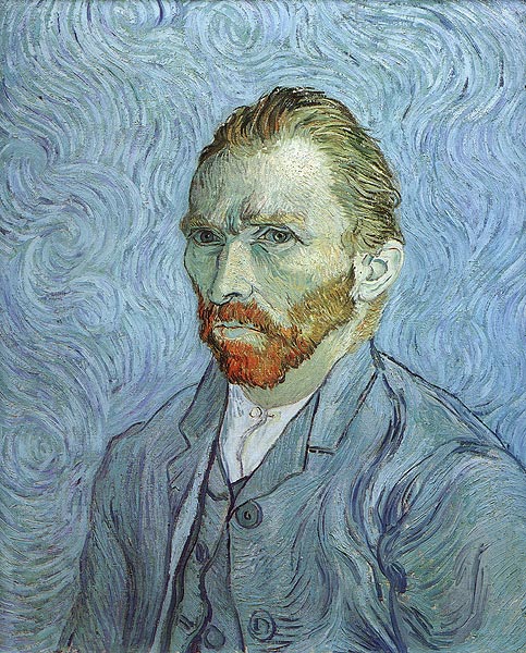
Vincent Willem van Gogh: a self portrait: prevalence of monochromatic scheme in blue, supplemented with complementary red.

6.2.Complementary
Color harmony is at best achieved with mixture of complementary colors. Complementary colors are pairs of colors which, when combined, cancel each other out. This means that when combined, they produce black, or if colored light (rather than pigment) is used, they produce white.
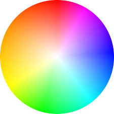 Complementary color Scheme is composed of a main color and the color that is opposite to it at the color wheel. Such a combination attracts maximal contrast and attention.
Complementary pairs are red–green, blue–orange, and yellow–violet. Or in other words , those color that are directly across from each other on the color wheel:
The complementary color scheme uses colors that are opposite each omen such as blue and orange. Contrasts cool against warm colors,
In theory, complementary colors form white light, if they are combined in a additive manner on a neutral surface.
Complementary of any primary color is the secondary color formed by mixing the two remaining primaries.
Complementary colors, when used next to each other, reinforce each other; each makes the other appear to be more vibrant.
The complementary of any primary color is the secondary color formed by mixing the two remaining primaries.
Subtractive mixing of colors is when a single light source shines through differently-colored filters. As the filters alows only a part of the wavelenght to penetrate, with several filters absorbing unwanted color up to the final one.
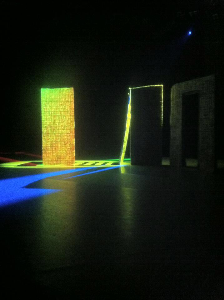
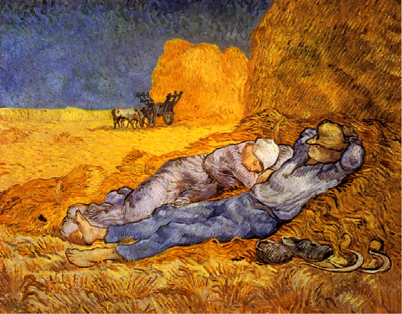
(example: Orange and Blue)

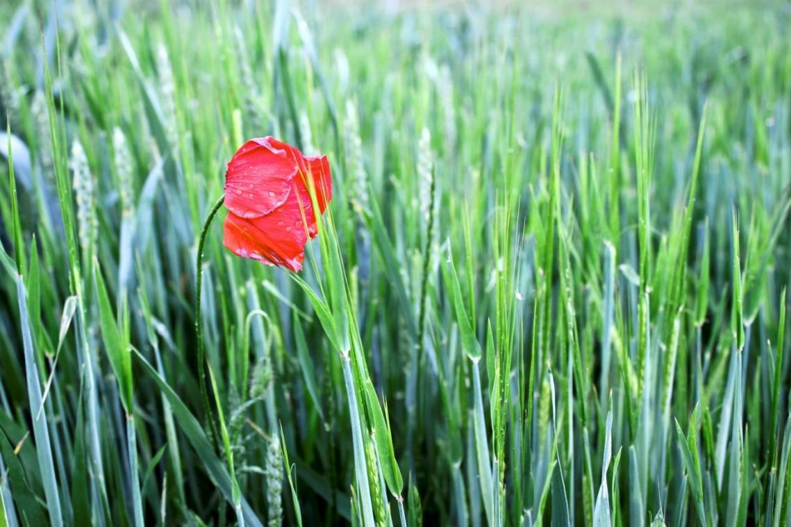
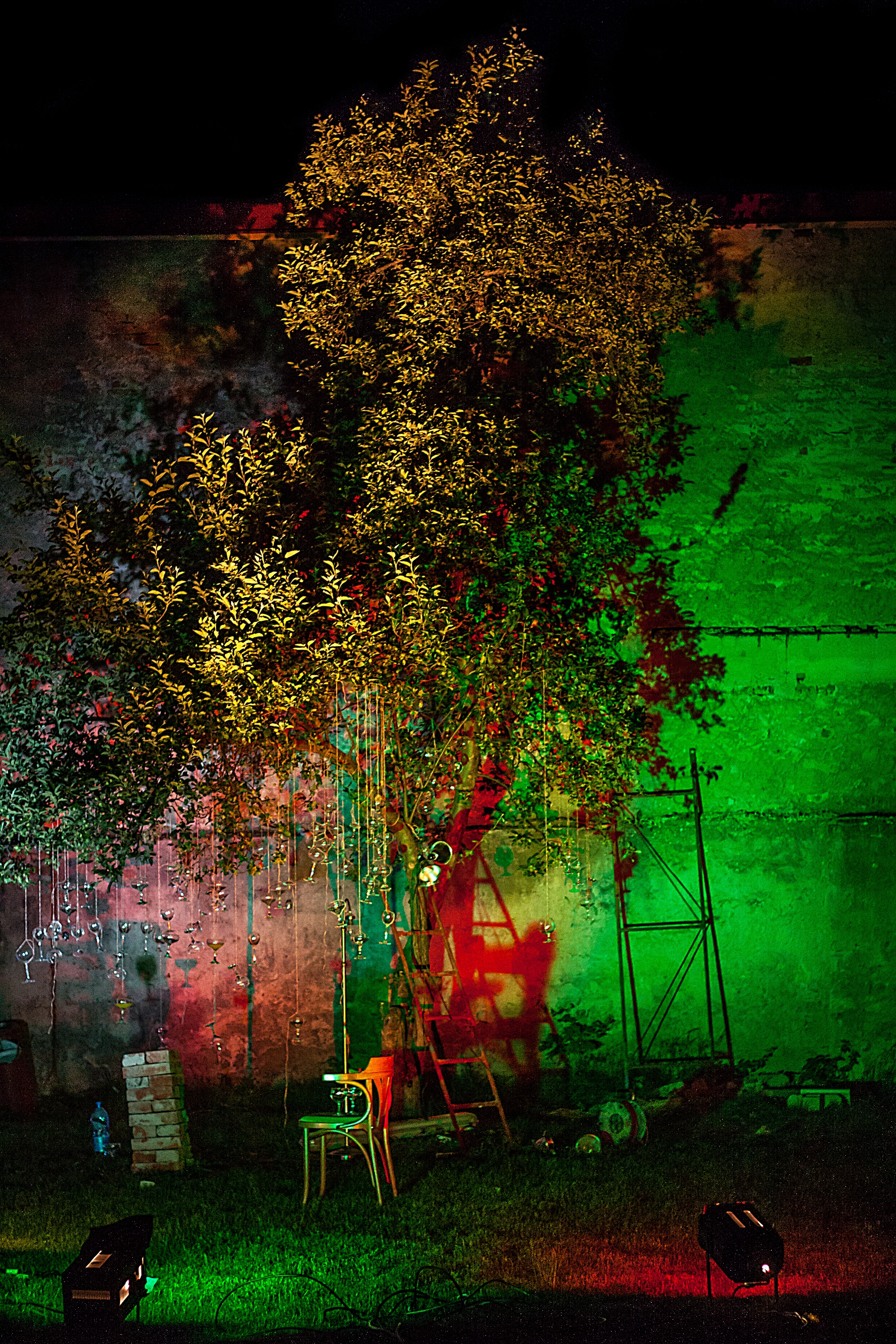
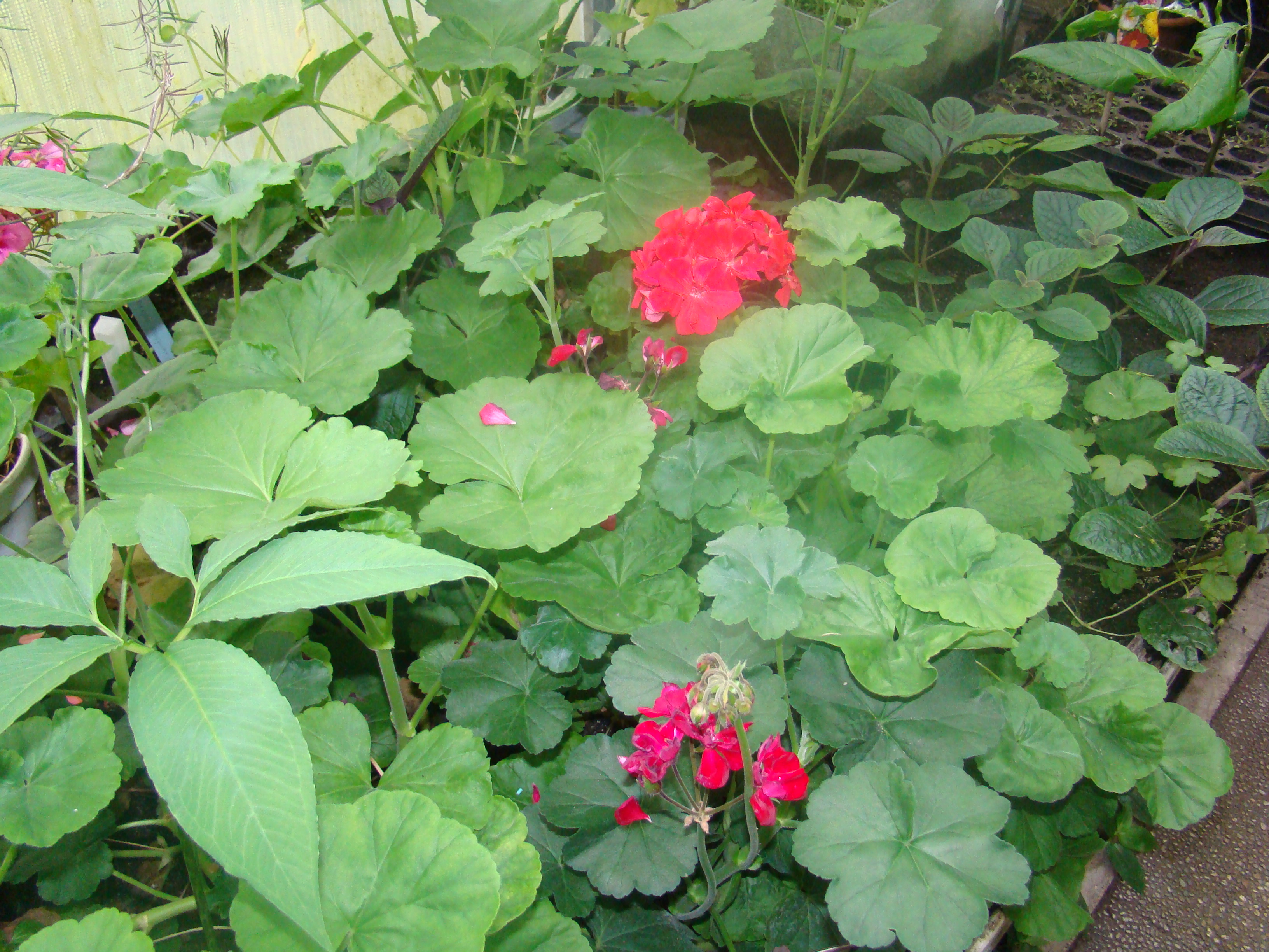
Red and green

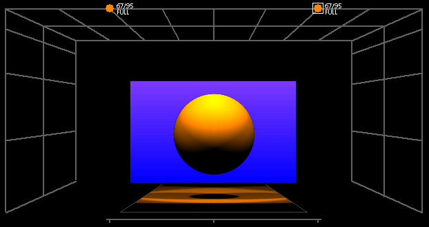
Ratio of colors in complementary harmony.




6.3 Analogous
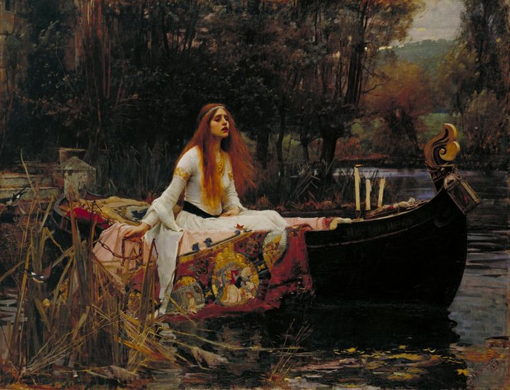
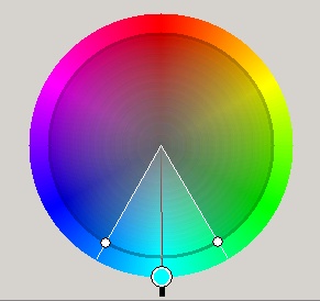
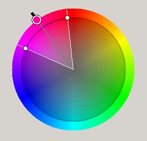
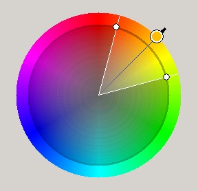
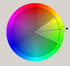
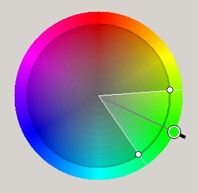
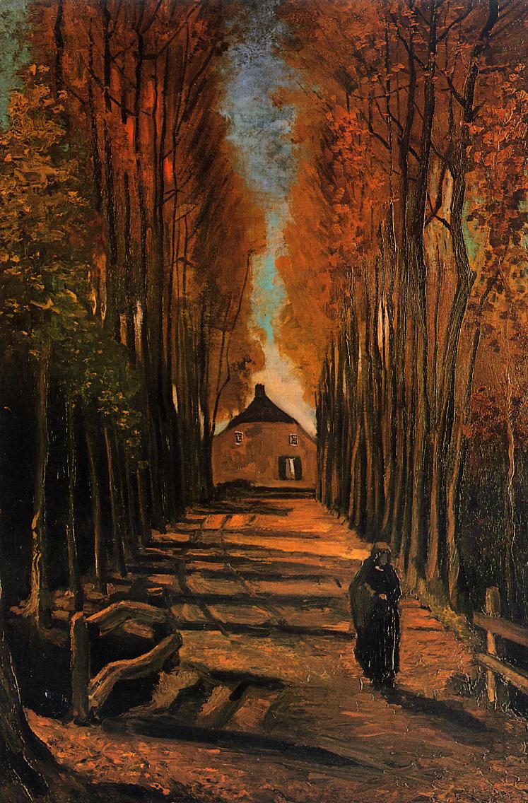
Scheme of adjacent color shades is composed of color that are located next to each other on the color wheel. This type of harmony appears in the nature as well.
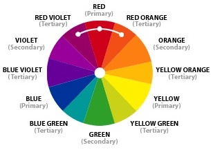
Analogous Color Scheme

Snake Charmer by Henri Rousseau: yellow, yellow-green, green, and blue-green as prevalent colors in the painting.
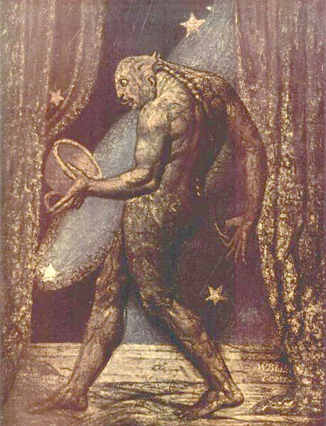
William Blake The Ghost of a Flea






6.4 Triadic Color
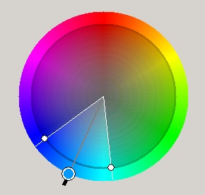
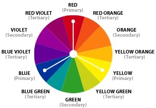
Triad harmony – Colors that are located in thirds of the color circle compose triple triad of colors. These colors are located in the vertexes of isosceles triangle in the color circle.
Such a combination has an active and lively effect.
The triadic color scheme uses three colors that are equally spaced around the wheel, such as red. blue, and yellow.
(example: Yellow-Green. Red-Orange and Blue-Violet)

6.5 Split-Complementary
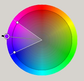
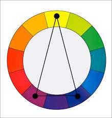
The split-complementary color scheme is a variation of the complementary color scheme. In addition to the base color, it uses the two colors adjacent to its complement.

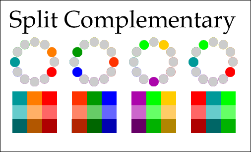
Split complementary
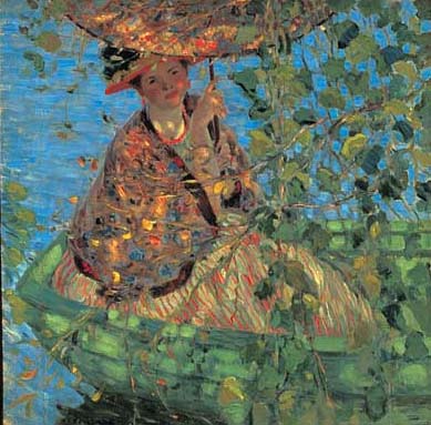
Through the Vines by Frederick Carl Frieseke.
6.6 Tetradic Color
Rectangle (tetradic) harmony

Tetradic Color Scheme uses two pairs of complementary colors that are balances between each other.
The rectangle or tetradic color scheme uses four colors arranged into two complementary pairs.
(example: Orange, Red, Blue and Green)
Double complementary blue/orange – violet/ yellow green.
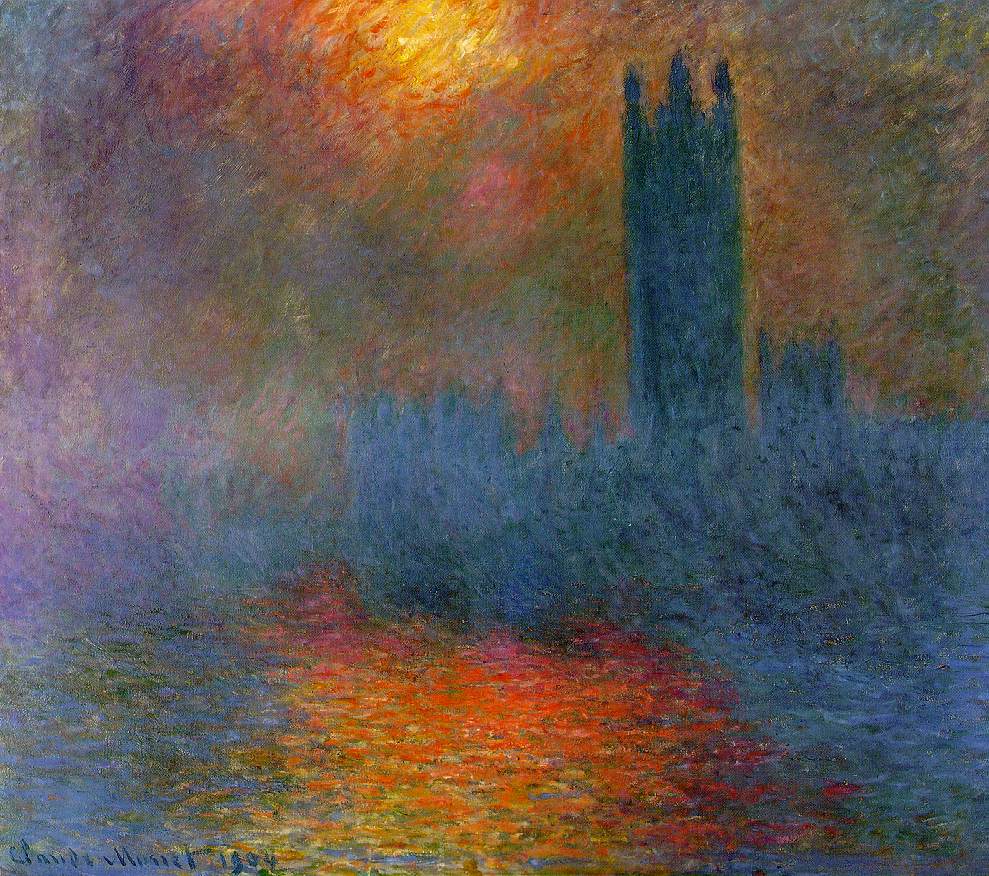
Sun Breaking Through Fog by Claude Monet
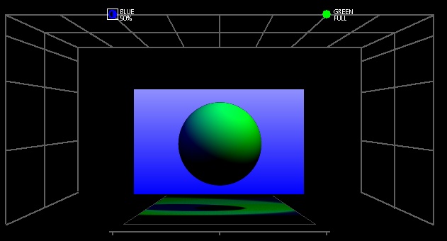
Tetradic harmony

Tetradic harmony
6.7 Square harmony
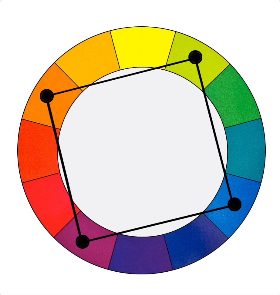
The square color scheme is similar to the rectangle, but with all four colors spaced evenly around the color circle.
(example: Yellow, Red-Orange, Violet and Blue-Green)
7. Conclusions
In the complicated universe of human society, light and colors play their respective parts. They mainly remain hidden from the attention, being more a component of the structure that determines the everyday life than something specific, to which the attention is paid in that span of awareness dealing with matter of common importance.
The color of uniforms in battle is nowadays rather functional: the soldier is not to be an easy target for the enemy: grey, brown colors are employed. When conditions change so does the clothing as seen in the case of a Finnish machine gun crew during the Winter War.
This functional aspect of colors might or might not be the source of cultural meaning of colors and light. Visual literacy is a sort of developed sensitivity to interpretation of visual images. As an analogy, the reader who has read many books and thought them through, is very likely to be endowed by improved reading skills. He can read better, faster, more deeply than anyone who has done none of this. Something of a similar sort happens with images as well. Though not indispensable, some knowledge of relations that connect various phenomena could be beneficial. Visual literacy is thus higher awareness of something that might have passed unnoticed otherwise.
Light and colors are a mean of expression for a lighting designer. These two natural phenomena are often humanized – they serve as a sign in communication that constantly occurs in the surrounding world. Colors hardly posses such mystic characteristic that would be connected unequivocally with features, or human qualities, but now and then a semiosis occurs and the color acquires a meaning behind its physical nature. Design and color of clothes may serve a function within society as a representation of the wearer’s rank in the pyramid of social stratification.
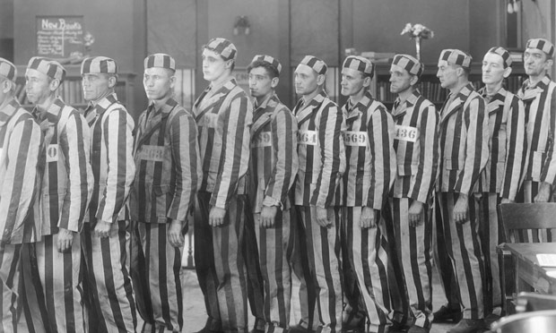
Prisoners in uniform from the 1920 film From Now On.

A suit: a uniform for those who want to display at least some degree of wealth.

A Finnish machine gun crew during the Winter War. The uniforms are adjusted to the envinronment.
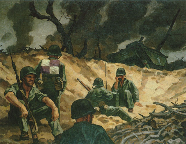
Depiction of a battle: uniforms are functionally designed to correspond to the battle envinronment.
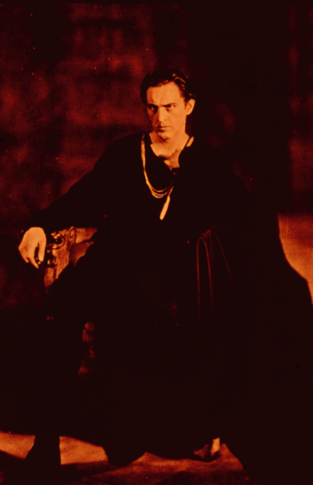
If Hamlet was to say: ” I only crave for love”, would you believe him? John Barrymore as Hamlet