Contents
LIGHTING DESIGN IS A CULTURAL CONVENTION
Welcome, you are starting with the first lesson of the E-Learning program. In this lesson, we introduce light in a broader sense than only in stage lighting. We think that it is important to know more about the historic, social and cultural history of light. How mankind switched from natural light to artificial light and how we actually perceive light and how we see colors. As humans, our color vision influences everything from our art and poetry to the colors we paint our homes and the clothing we choose to buy. Yet, we rarely question the mechanics of our color perception, or what we may not be able to see. Working in theatre is working with light, is working with space, is working with colored scenery. We think it is important to understand that a lot of spontaneous decisions are made by using a lot of color theory or cultural conventions without even realizing it.
Light and colors are perceived in the ecultural context.
Colors are not only experienced and understood visually, but also psychologically and emotionally.
Colors can convey a cultural meaning.
Introduction
Topics:
Natural vs. artificial light. Development of lighting. Evolution of theater (space, technology, lighting). What is their relation to lighting design?
Attribution of the meaning to the light, metaphor. (Theater)
Perception of light in the cultural, social, (philosophical) context, convention. (Generally)
Perception of light by the sight, optical illusions. (Generally)
Psychology of colors.
The purpose is to learn how to think about the context of lighting / lighting conditions, aesthetic and function of lighting, origin and reason for lighting, what is the goal of the lighting design for the stage lighting.
Time requirement for a lesson:
4-6 hours
Specification of knowledge acquired from the lesson:
What is the perception of light in the cultural, social or philosophical context, convention?
The aim of this lesson is to see the cultural conditioning of how the things are illuminated, of how we see them.
Author and tutor for the lesson:
The lesson was prepared by Isabel Nielen and Jan Purkert.
Photos courtesy of Institute of Lighting Design and Jan Purkert. Photos of theaters courtesy of the European Theatre Architecture. Other sources are quoted at individual pictures as convenient.
The tutor for the lesson is Isabel Nielen and Jan Purkert who are available for answering questions between 7th and 21st July of 2015, you can contact them via the contact form at the end of the lesson.
Introduction Test
Key terms
General
Color symbolism in art and anthropology refers to the use of color as a symbol in various cultures.
Color psychology is the study of color as a determinant of human behavior.
Visual perception is the ability to interpret the surrounding environment by processing information that is contained in visible light.
Visual literacy is the ability to interpret, negotiate, and make meaning from information presented in the form of an image, extending the meaning of literacy, which commonly signifies interpretation of a written or printed text.
Enlightenment is a metaphorical image of acquiring knowledge. It was a name for philosophic movement as well.
Visual rhetoric is a theoretical framework describing how visual images communicate, as opposed to aural, verbal, or other messages.
Composition is the placement or arrangement of visual elements or ingredients in a work of art, as distinct from the subject of a work.
Anthropology of art is a sub-field in social anthropology dedicated to the study of art in different cultural contexts.
Perception
Perception is the organization, identification, and interpretation of sensory information in order to represent and understand the environment.
Photoreceptor cell is a specialized type of neuron found in the retina that is capable of phototransduction.
Adaptation is the ability of the eye to adjust to various levels of darkness and light.
Chromatic adaptation is one aspect of vision that may fool someone into observing a color-based optical illusion, such as the same color illusion.
Warm and cold colors warm colors are made with orange, red, yellow and combinations of them. Cold colors are made with blue, green and light purple.
Trichromacy is the condition of possessing three independent channels for conveying color information, derived from the three different cone types.
Human eye is an organ that reacts to light and has several purposes.
Accommodation is the process by which the vertebrate eye changes optical power to maintain a clear image or focus on an object as its distance varies.
Purkinje effect is the tendency for the peak luminance sensitivity of the human eye to shift toward the blue end of the color spectrum at low illumination levels.
Afterimage is a non-specific term that refers to an image continuing to appear in one’s vision after the exposure to the original image has ceased.
The color opponent process is a color theory that states that the human visual system interprets information about color by processing signals from cones and rods in an antagonistic manner.
Contrast effect is the enhancement or diminishment, relative to normal, of perception, cognition or related performance as a result of successive (immediately previous) or simultaneous exposure to a stimulus of lesser or greater value in the same dimension.
Simultaneous contrast refers to the manner in which the colors of two different objects affect each other.
Successive contrast occurs when the perception of currently viewed stimuli is modulated by previously viewed stimuli.
Kruithof curve describes a region of illuminance levels and color temperatures that are often viewed as comfortable or pleasing to an observer.
Chromatic induction
Symbolism
Symbol is an object that represents, stands for, or suggests an idea, visual image, belief, action, or material entity.
Semiosis is any form of activity, conduct, or process that involves signs, including the production of meaning.
Sign is an object, quality, event, or entity whose presence or occurrence indicates the probable presence or occurrence of something else.
Framing comprises a set of concepts and theoretical perspectives on how individuals, groups, and societies organize, perceive, and communicate about reality.
Connotation is a commonly understood cultural or emotional association that some word or phrase carries, in addition to the word’s or phrase’s explicit or literal meaning, which is its denotation.
Black and white dualism traditionally symbolize the dichotomy ofgood and evil, metaphorically related to light and darkness and day and night.
Solar deity is a sky deity who represents the Sun, or an aspect of it, usually by its perceived power and strength.
Color schemes
RYB color model is an historical set of colors used in subtractive color mixing, and is one commonly used set of primary colors. It is primarily used in art and design education, particularly painting.
Color scheme is the choice of colors used in design for a range of media.
Monochromatic color schemes are derived from a single base hue and extended using its shades, tones and tints.
Analogous colors are groups of three colors that are next to each other on the color wheel, with one being the dominant color, which tends to be a primary or secondary color, and one on either side of the color.
Triadic color scheme uses three colors equally spaced around the color wheel.
Rectangle color scheme uses four colors arranged into two complementary pairs and offers plenty of possibilities for variation.
Square color scheme is similar to the rectangle, but with all four colors spaced evenly around the color circle.
Lesson 1
1. Visual literacy
Light is an experience, an experience creates an emotion.
Light is a natural phenomenon and it nourishes all life on our planet. We have never experienced a day, in which the sun didn’t rise. We cannot live without it, it is vital to our survival. Everybody knows the power of our natural light, consciously and unconsciously. Looking at a sunset or the image of the low sun shining through trees can produce a sense of inner peace and happiness, which is much deeper than what only the mind perceives. There is a good reason that nature is often the greatest inspiration source of lighting designers, lighting artists and painters. Light makes us perceive. Sensing light is also an experience and this experience creates an emotion.
It is this quality of feeling or sensing light that is particularly difficult to define, but which I believe to be the core of lighting quality and light design.
The physical process, by which humans perceive light, is complemented by activity of their brain that bestows a meaning to the impulses that have been received through the eyes. One has to learn how the data should be interpreted. Not only in the long run as what is to be recognized should be within the realm of culture in relation to our knowledge, but also in the short term as the qualities of light are perceived in dependency on the surrounding environment.
Sight has an enormous capability of adaptation. Actually, there is too much of information coming in, the brain is not capable to process it all and so the information is filtered. What is filtered and what is interpreted is the work of brain that decides to its own designs and conditions. The brain had to learn it. Thus how we see something is determined to a large extent by what has been seen before.
The physical process of seeing is influenced by our cultural background. Watching and using light is communication too.
We know that some people have better fantasy, they can create images in their heads better than the others. They even can create visual pieces of art that are applauded by others. Or perhaps we only judge it according to its success. An artist communicates these ideas to audience through tools of his art field. As the actor and spectator communicate even when only in one direction (the applause being a conclusion of this communication in the other direction), there are some basic similarities that lies at the base of any communication as such.
“One cannot not communicate.” Because every behaviour is a kind of communication, people who are aware of each other are constantly communicating. Any perceivable behaviour, including the absence of action, has the potential to be interpreted by other people as having some meaning. There are several channels of communication where one endorses the other. In everyday communication, the content of the words is complemented with gestures, relation, facial expression, posture, which happens as well within the frame of a lighting scene, where visibility of other means of communication is a key factor for endorsing the content of words. This content also expresses relation to the one who listens and is watching. In everyday life, the words not only transmit information about the world, they also form bonds of relation, they create and maintain them.
The way the scene is lit might endorse or kill the action that takes place within the scene. It may help considerably to a spectator to understand and process the words of an actor.
If performing is a form of communication, framing of a scene with light is a strong expressive mean.
A lighting designer is thus engaged in visual communication. For better understanding of the process, the knowledge of cultural circumstances might be beneficial, although there were certainly many good artists who didn’t care about it at all.
Visual literacy
In the complicated universe of human society, light and colors play their respective parts. They mainly remain hidden from the attention, being more a component of the structure that determines the everyday life than something specific, to which the attention is paid in that span of awareness dealing with matters of common importance. This had been understood by many cultures and that is the reason why God uttered “γενηθήτω φῶς” (“let there be light”) while creating the world as it is one of its founding components, at least according to the biblical tradition. The visual literacy deals as well as with knowledge of determinants of visual perception as well as with communication and interpretation of visual messages. It is one possible angle of how to look at the world around us, of how to interpret it. To be aware of the visual literacy, to be knowledgeable of it refers to the competence of consciously interpreting visual information that is used in the communication process. As an analogy to reading, a more educated reader can discover a larger area of meaning in shorter time. Any writer who wants to create a literary piece work is usually also a good reader. Not all good readers are good writers, but almost all good writers are good readers. As a result of the analogy, we may fairly expect that an educated spectator has a better taste for nuances in lighting design. That he has a refined taste in the aesthetic of the performance, that he can detect, often create interpretation, meaning. As he has seen many performances, he can compare them, because he has developed improved memory for visual composition. An educated spectator is very likely to be visually literate.


2. History of light
Cultural and social historic use of light and theatre
2.1 Natural light
From natural light to artificial light
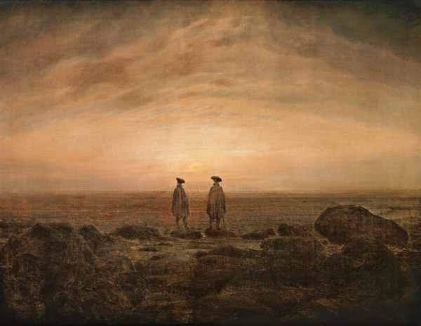
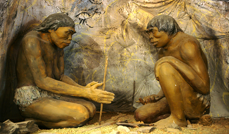
For the major part of human history, light played an important part in the transition of mankind from animal kingdom toward civilization and culture. There is an evidence of 1,9 million years of use of fire by predecessors of man. Practically, the invention of how to make fire was a leap forward in technology that can bear a comparison with landing on the moon.
However, throughout the large part of history, only natural sources of light like the sun, fire, light from stars, were available to man apart of bioluminescence, lightning etc. For our ancestors, the world as they understood it was a small patch of land, bounded perhaps by hills and by the blue line of the sea. Overhead, there was the sky and sun, a god, giving light and warmth. The moon was a lesser deity, shining with lesser light, and at night, there where the stars. Outside of their little universe, there laid unimagined mystery. Their time was structured according to the rhythm of day and night and years circles, of both the sun was the defining essential component. This structural position is also the base for metaphors that shape the worldview up to the present days.

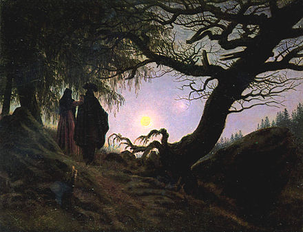
Buddha as an enlighted being
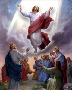
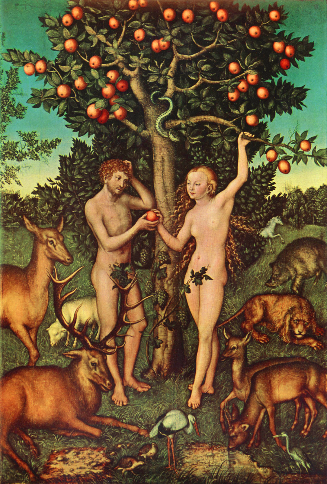
In many creationist myths, the light was considered to be the first thing that was made by God. Especially the cultures that settled down with agriculture-based economy largely worshipped the sun in the first phase of this development (Neolithic revolution). There is significantly deep meaning in the symbolism and symbolical relation between light and dark as light always served as a metaphor for wisdom and dark for ignorance and danger. It is simply based in the everyday life, it is not an arbitrary binary opposition- we would have troubles to imagine it in the opposite way. Light is thus a metaphor for understanding, for clear perception, inspiration. The light itself serves as a metaphor of wisdom from the beginnings of civilization up to the present days. A lack of light is a metaphor for fear, danger, fraud, deceit.
In the Greek mythology, the beginnings of civilization are connected to Prometheus who brought the fire (i.e. technology of producing heat and light) to the hands of humans, which made humans more independent from gods, and he was punished for it.
Already the first Greek philosophers who thought about nature created theories about the light, as for instance Euclid who formulated the law of reflection of light. One of the defining metaphors of Western Philosophy is located in the VII. book of Plato’s Republic, the Allegory of the Cave, where Socrates introduces his imagery of the human situation. First he depicts the situation of a prisoner who is chained to a wall, on which roam soldiers and he is only able to see the shadows that are cast by them onto the wall. “Such prisoners would deem reality to be nothing else than the shadows of the artificial objects.” (Republic 515c) What would happen if such a prisoner is released? Could he describe the world he sees to his former fellow prisoners? If what we see are shadows, what kind of a new world will the freed prisoner see?
As any allegory, there may be many possible readings, and let’s leave to each reader, what he discovers when he reads it. But its impact on the further development was deeply profound. In a way, it is rather an elaboration of the fundamental binary opposition: such basic distinction shapes the form of our perception in such a way that another form seems to be absurd at the first sight.
Religious preachers or Enlightenment philosophers stylize themselves into a role of those who bring the light. However, light might be brought by “light-bringing” (Lucifer) morning star. Similarly as with Prometheus, with the Lucifer who brings the light, we loose something important from the primordial innocence. There is also a mystical tradition throughout the entire history, in which sinking into the darkness leads to wisdom. Somehow, the light methaphor is inherently refused. There are other points of view where the enlighten reason is brought by demonic pride (superbia).
Pero el alma no se puede purificar plenamente de estas imperfecciones y de otras mientras Dios no la meta en la purgación pasiva de la noche Oscura.
Juan dela Cruz, La noche oscura del alma, Capítulo 3 .3
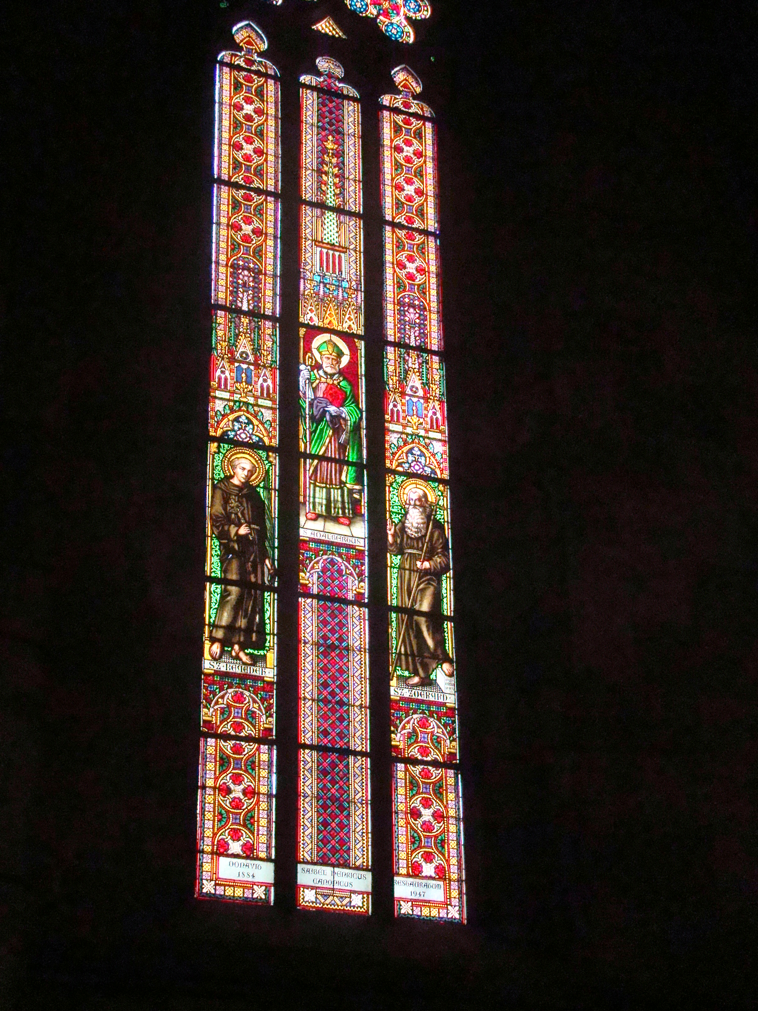
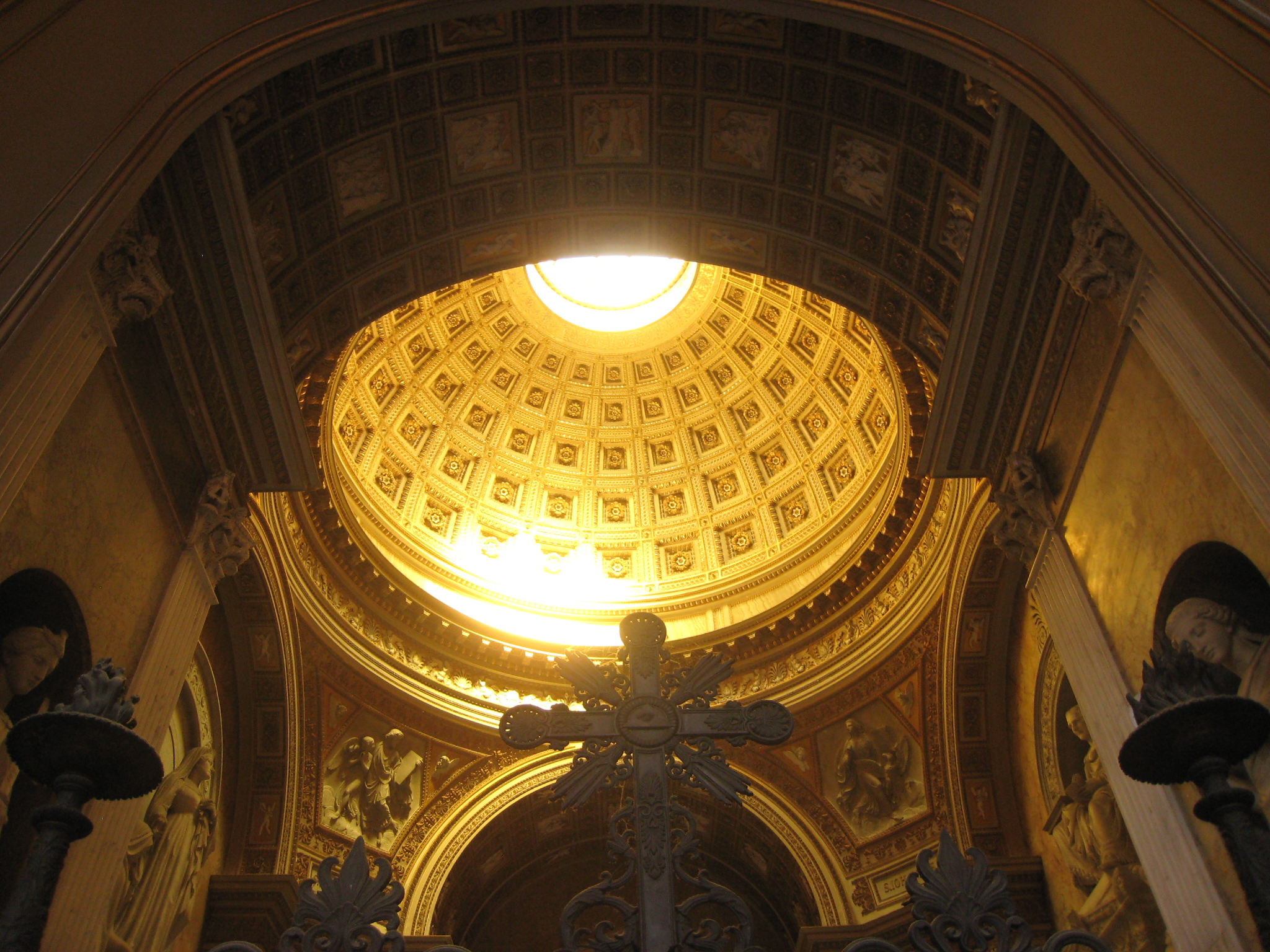
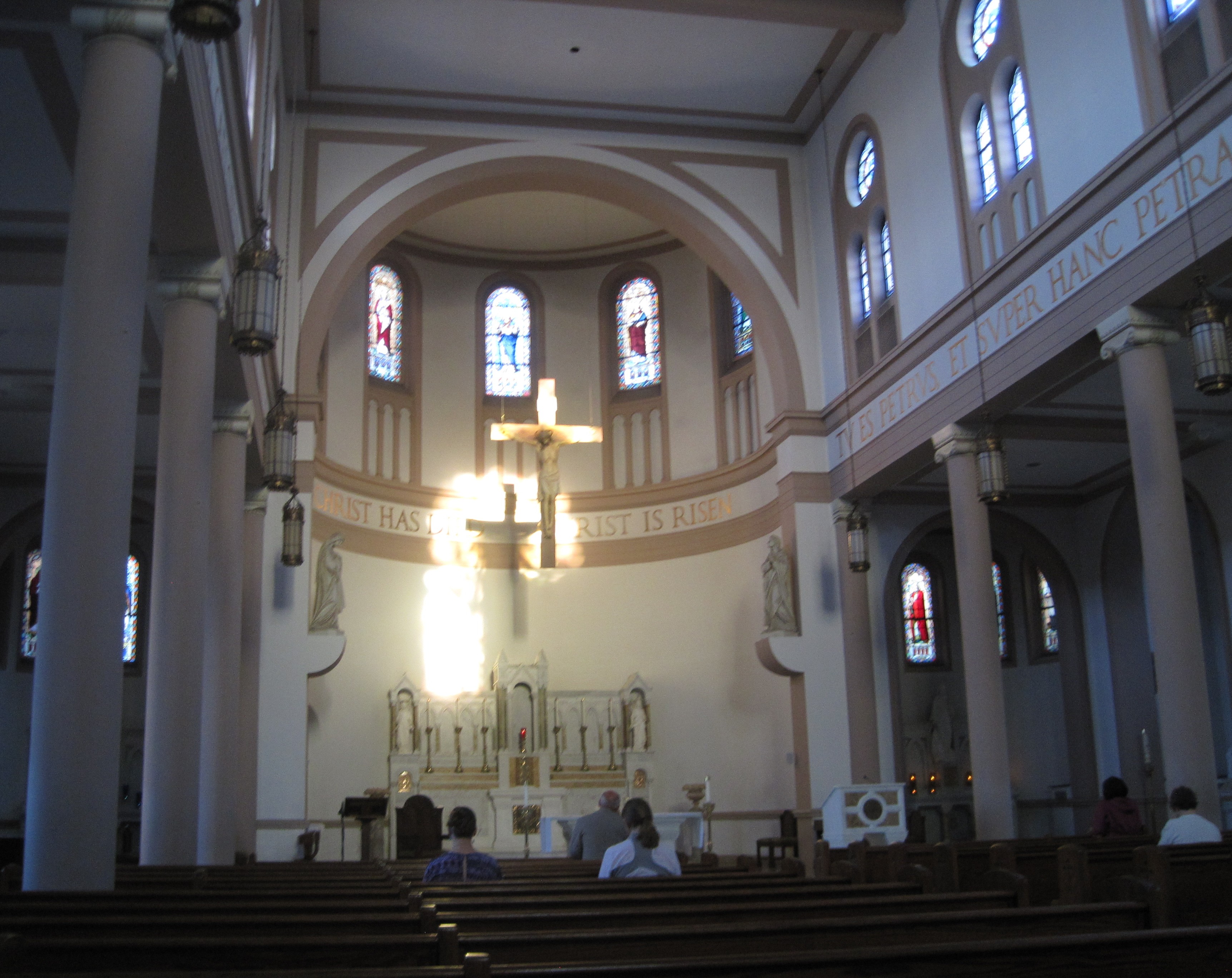
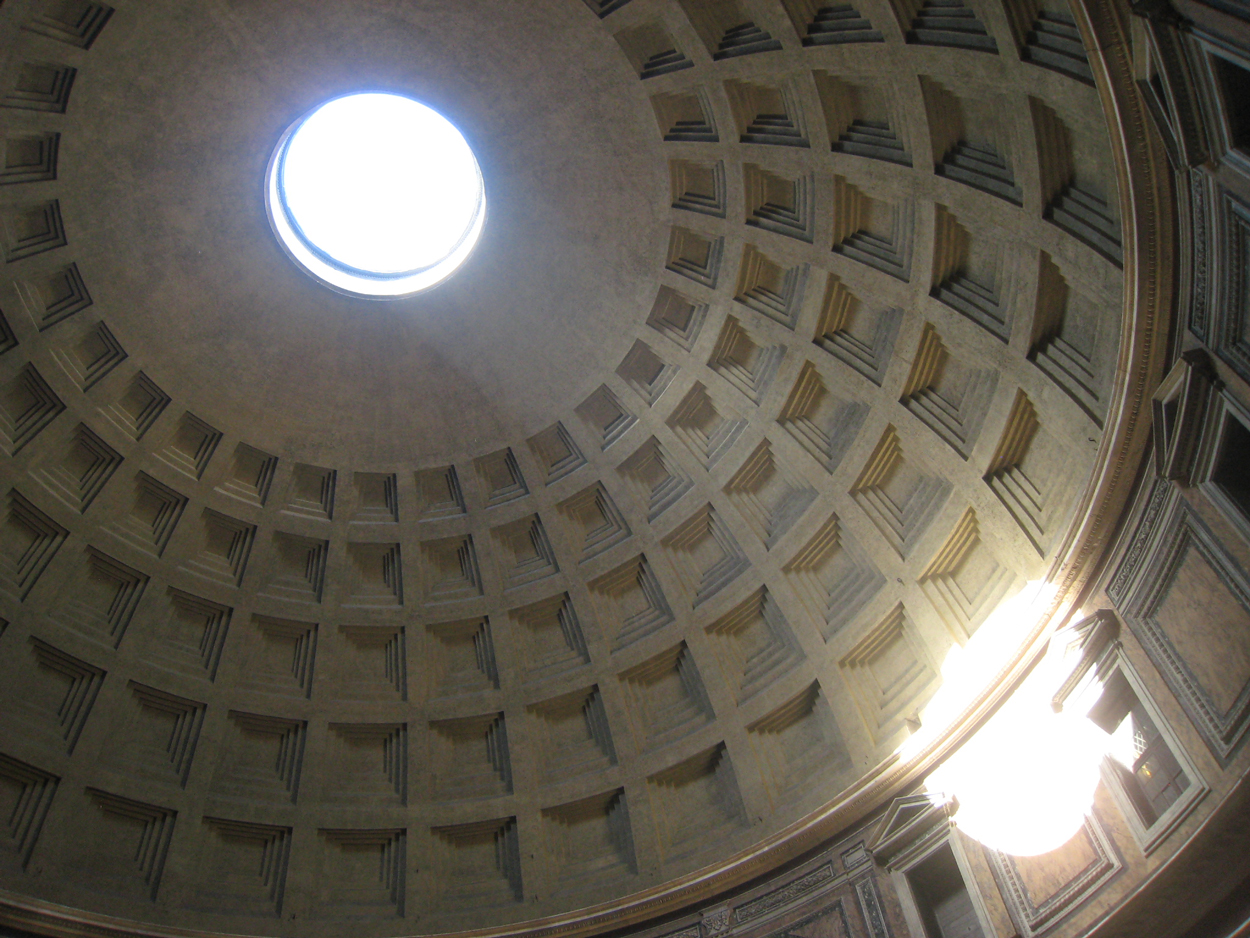
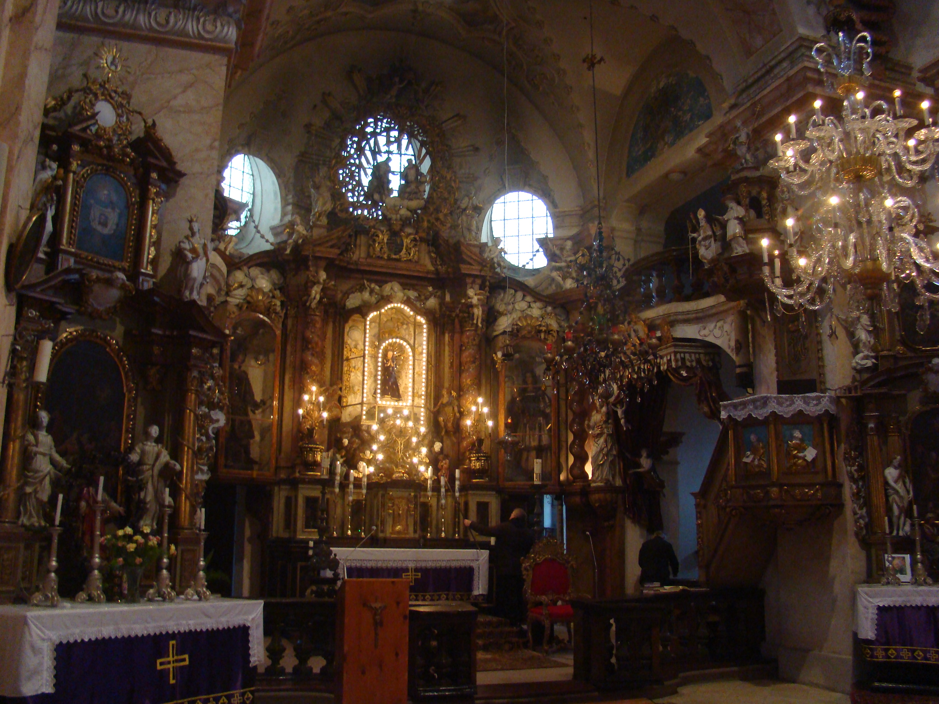
Natural light served not only to purposes of philosophical speculation. One of many possible examples of its use is how it was employed in a general layout of churches, which was a sort of an inverse lighting design so to speak. Figuratively speaking, they couldn’t move the sun as the source of light, so they adapted the building layout: churches of which choir and altar were oriented towards east and so when the believers entered the church every Sunday, low morning light shone onto the altar through the windows in the walls above it. Stained glass provided further embellishment also with the help of colored light. Later, Renaissance architects employed the light in the domes of churches.
Medieval art shaped light to its design.
Another key metaphor that was laying in the foundation of the modern era thinking was the idea of clarity, which was pioneered by René Descartes. In a thought experiment with possible limits of doubt, one of the conclusions, he draws, is “Omne est verum, quod clare et distincte percipio.” ( Truth is that which is clear and distinct.)
In the 18th century, Enlightenment philosophers laid foundations of modern day thinking that fueled rather rapid development in various fields. Of course, the central metaphor based on the distinction between light and dark was a construction, on which other points of worldview were further elaborated. Similarly, the historical metaphor depicts the ages, in which there were no education as Dark Ages with large influence of church onto the society, as a the opposite of the better, enlightened future. The era of technological innovation brought a new feature to the life of the society that changed it profoundly: artificial light.


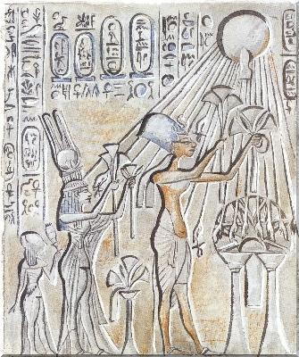
Ra god of the universe, the sun. Ancient Egypt
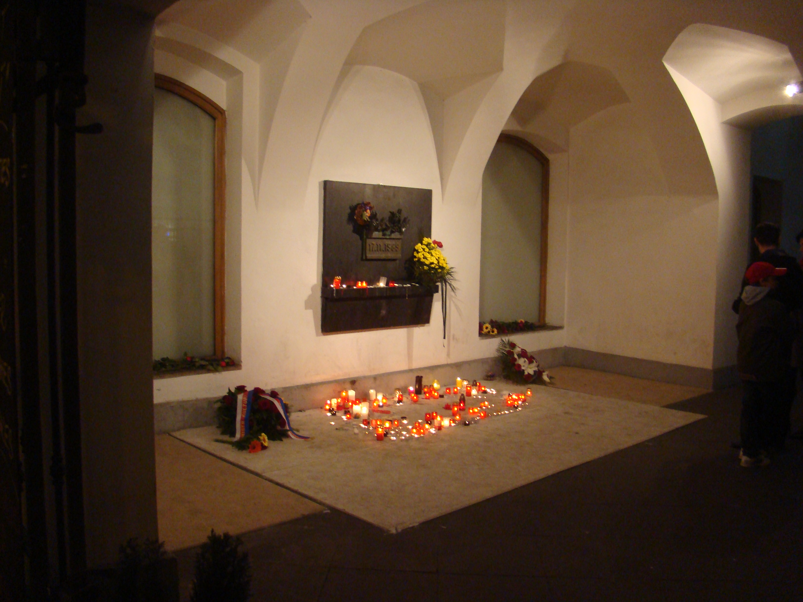
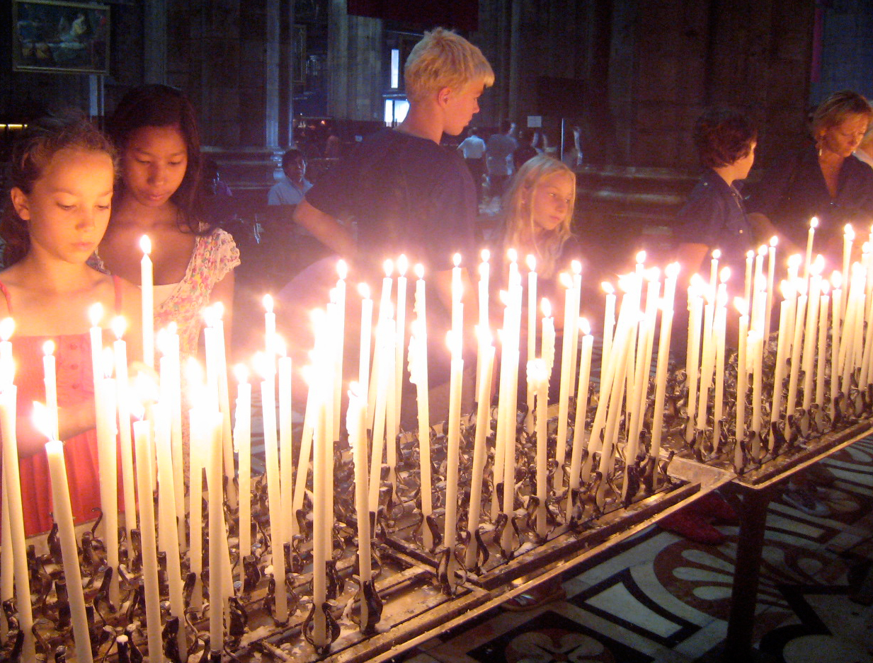
Candles are a sign for reverence. Prague, Národní třída – a memorial of the Velvet Revolution of 1989.

Light at the end of the tunnel while dying is considered by some as a proof of afterlife.
Use of light for spiritual purposes.
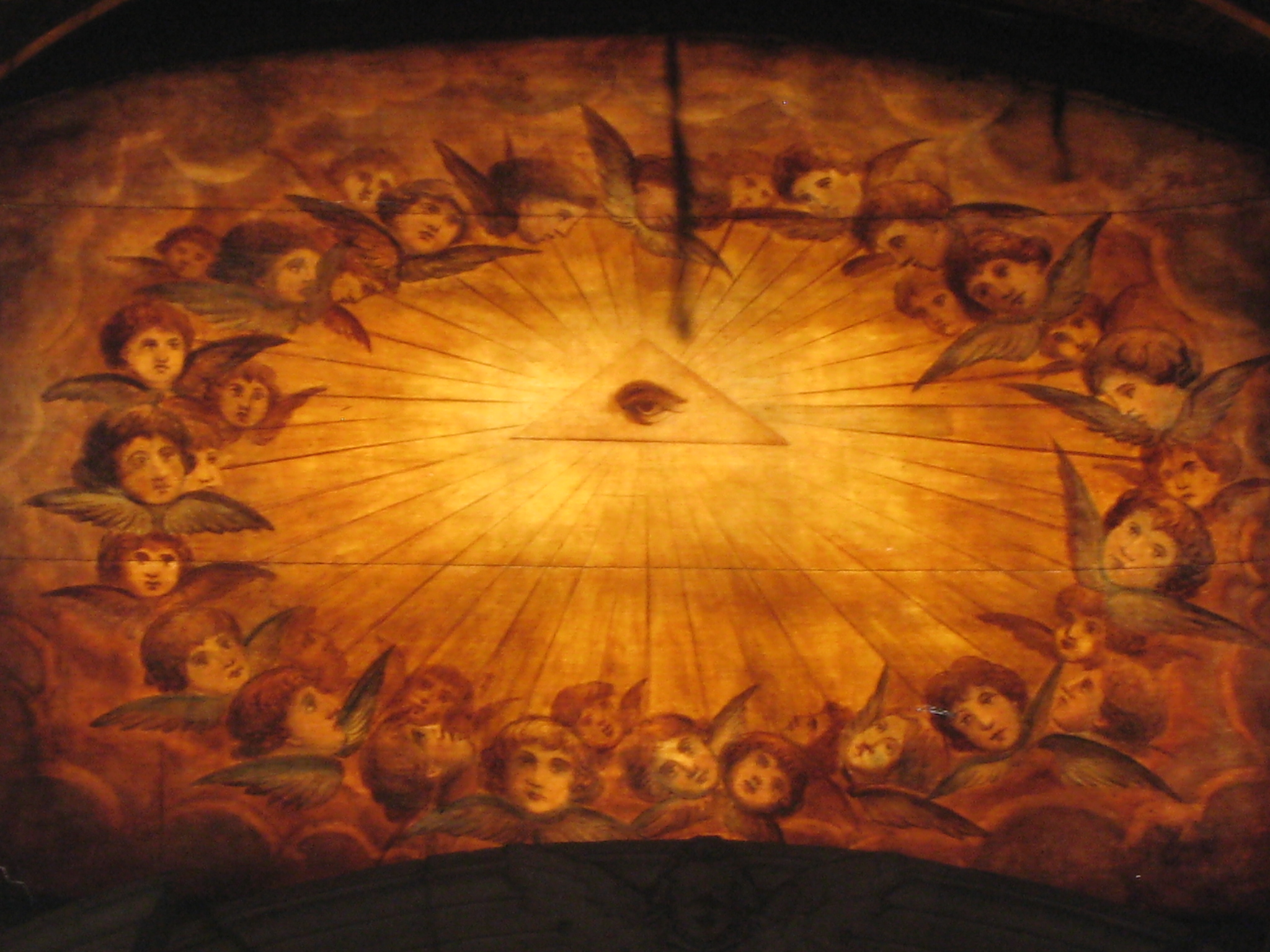
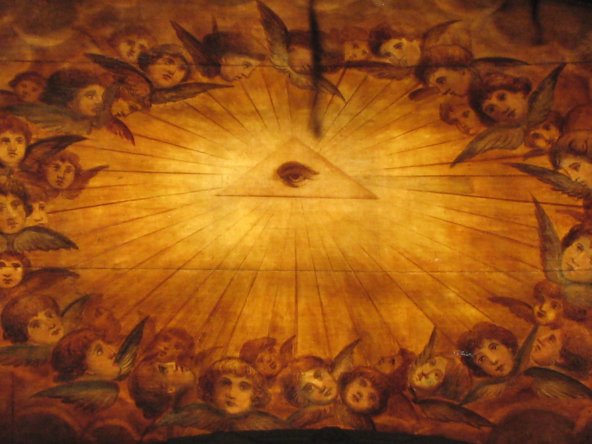
Eye of Providence.

festival of lights Thailand
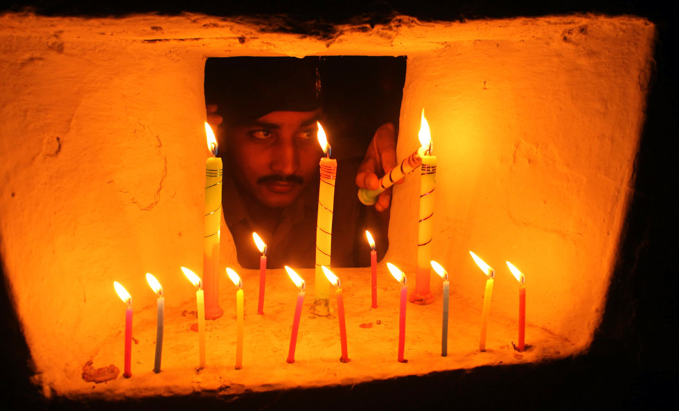
An Indian soldier lights a candle inside a bunker as part of Diwali celebrations at the India-Bangladesh border.
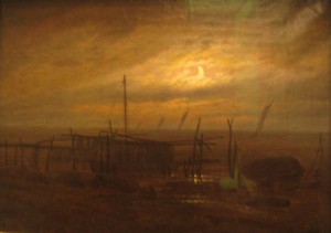
2.2 Artificial light
One of the features of today’s society is life in artificial light. As men invented making light, they became its master. Before that they used to live in daylight and moonlight. Our life rhythm was connected with the cycle of day and night. These natural light sources were not static, on the contrary they changed during the day by intensity, direction and color. But when it became dark, all activities stopped. We could not control the light.
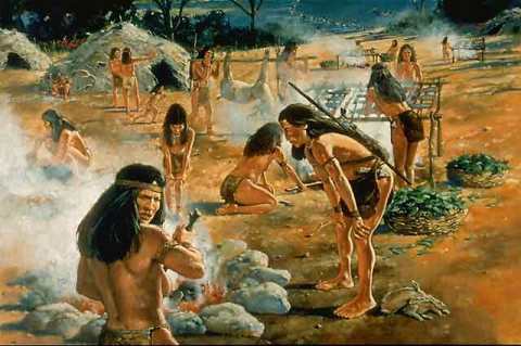
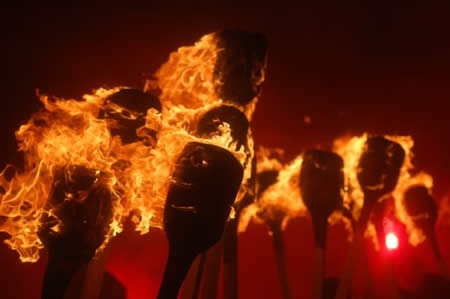
Fire

The first step made to control a light source was discovered by archeologists in a cave in South Africa of a campfire that was presumably used to cook food. This discovery is 200,000 years older than any other firm evidence of human-controlled fire. Because this cave also contains the remains of Homo erectus, it is believed that these hominids were perhaps the first to use fire. The campfire probably constituted early man’s first use of ‘artificial’ lighting. Firm evidence of controlled use of fire is dated back to one hundred thousand years ago. For the first time man gained some small degree of freedom from the blindness of night, and some small degree of safety from the fear of unseen wild beasts.
Torch
 The torch was the first portable lamp. One of the earliest developments was the discovery that a bundle of sticks tied together made a blazing torch, producing brighter and longer lasting light. Man had finally learned to control fire and the human race was on the road to civilization.
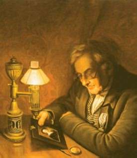
Oil lamp

The oil lamp, consisting of an open (then later enclosed) saucer or pan filled with animal or vegetable fat and some form of porous wick, remained virtually unchanged for several millennia. It made life at night more easier. Now a days the oil lamp is still used in many cultures and for many occasions. It refers to cosines, feeling save, the flame gives warm flickering light and we prefer to have a romantic evening with candle light!
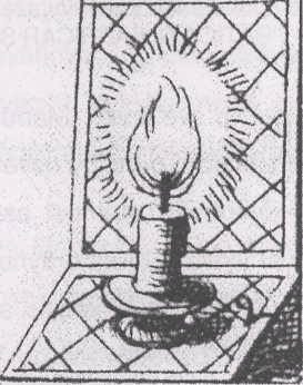
Candle
 The invention of the candle dates back to about 400 A.D. Relatively few candles were used in the home until about the 14th Century, however they were an important symbol of the Christian religion. The best candles were made of beeswax and were used chiefly in church rituals because the bee was regarded as a symbol of purity. But because beeswax was expensive, crude tallow candles had to be used by the common people. This tallow candle was smelly and smoky.
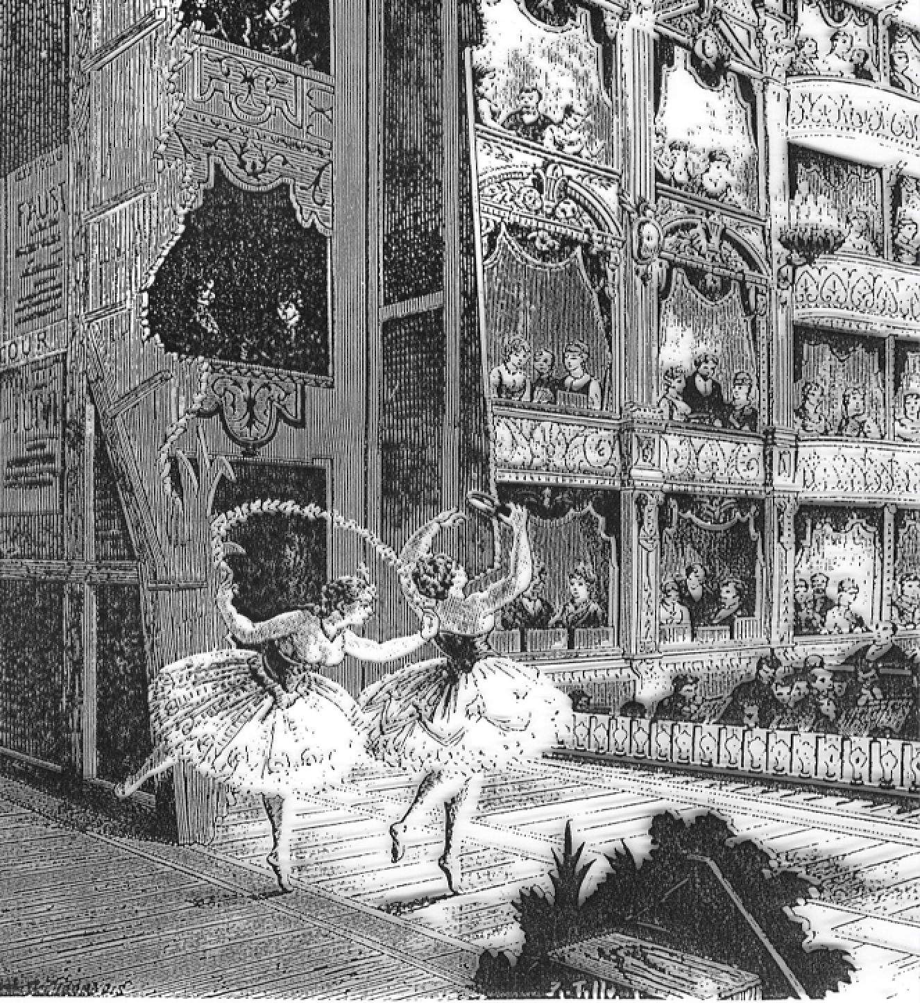
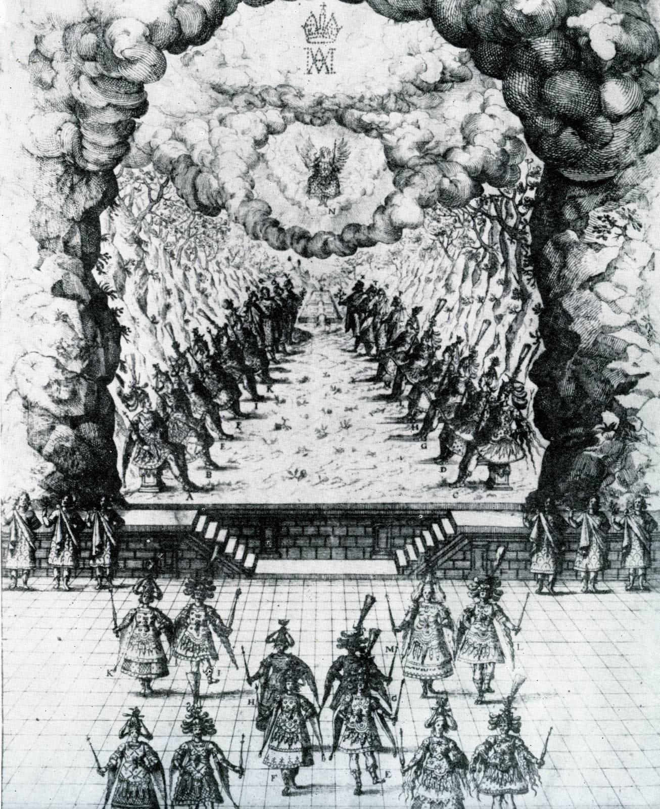
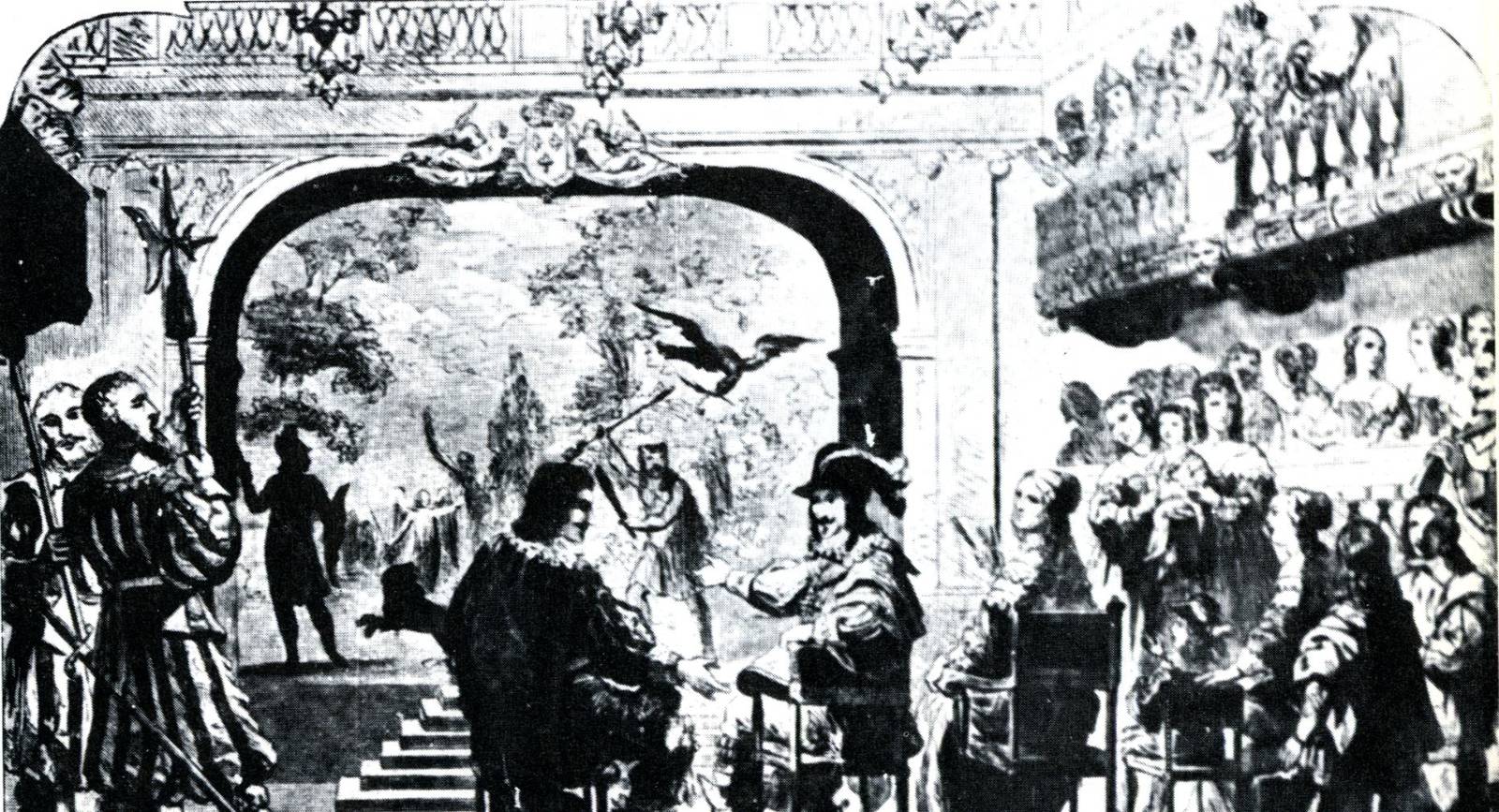
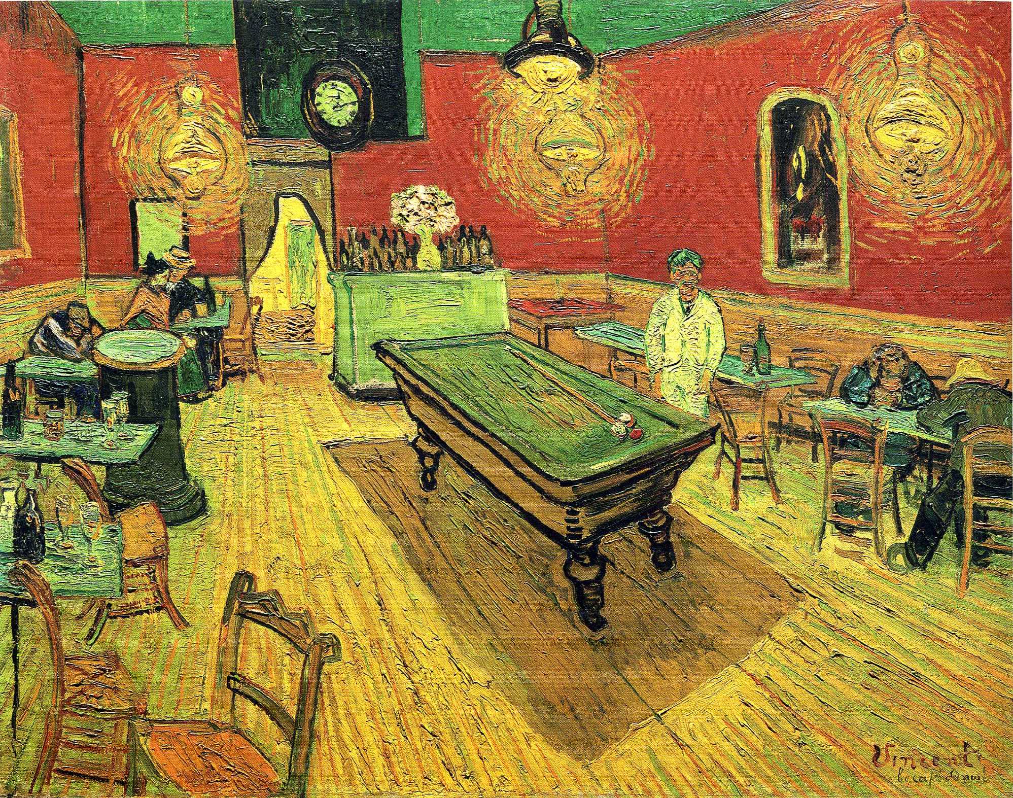
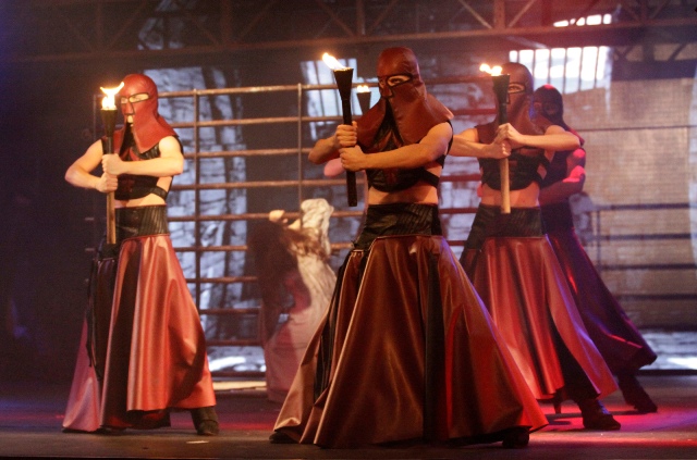
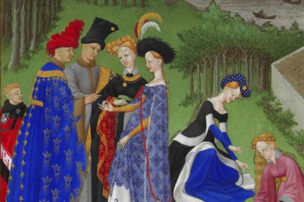
Around 1670, the use of footlight by candles can be seen in the French painting ‘Les delices du genre humain’, 1670. The painting of the Comedie Francais in Paris shows a row of small protruding flames along the downstage edge of the stage. Four chandeliers with candles are also shown, hanging above the stage. Even then “light designers” tried to make special effects with the candles. They placed bottles with colored water in front of the candles to create water effects or colored light.
The technical era in Western culture began with the steam engine by James Watt (ca 1760) and with the electric generator by Werner Siemens (ca 1866). One of the first products of the electrical engineering industry was the light bulb (Edison 1879). Since the invention of the light bulb we live a large part of the day at lamp light. The lamp is “constant ‘ if we let it change, it’s adjustable, controllable by us. This controllability of light is used for all kinds of applications, especially in theatre.
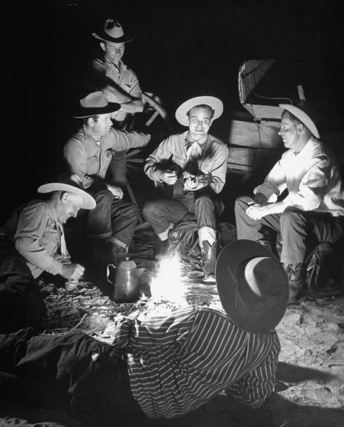

Use of footlight by candle or oil lamp
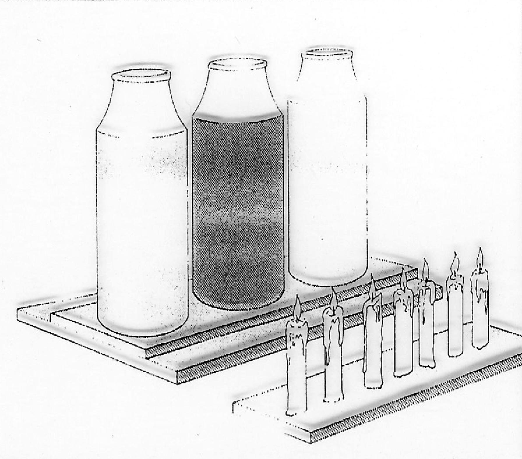
Special light effects using bottles with colored liquid
Chandeliers and candles
Special light effects

Tall-necked saucer lamp. Earthenware, thrown, modeled and glazed, with splashes, Egypt, c. 1100, 908.21.24. Royal Ontario Museum
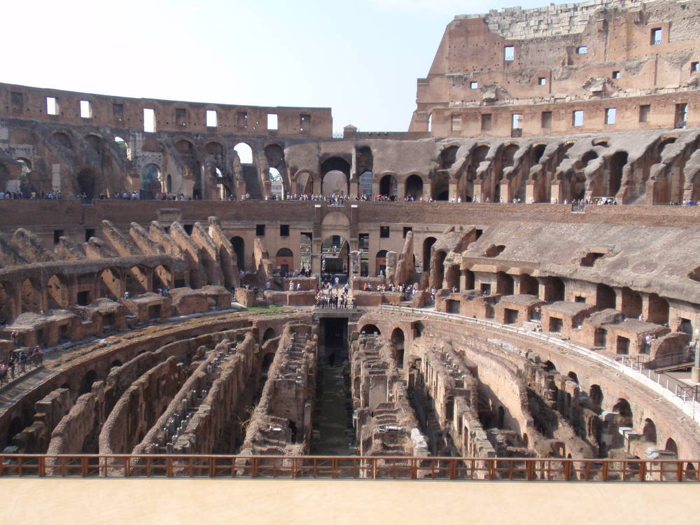
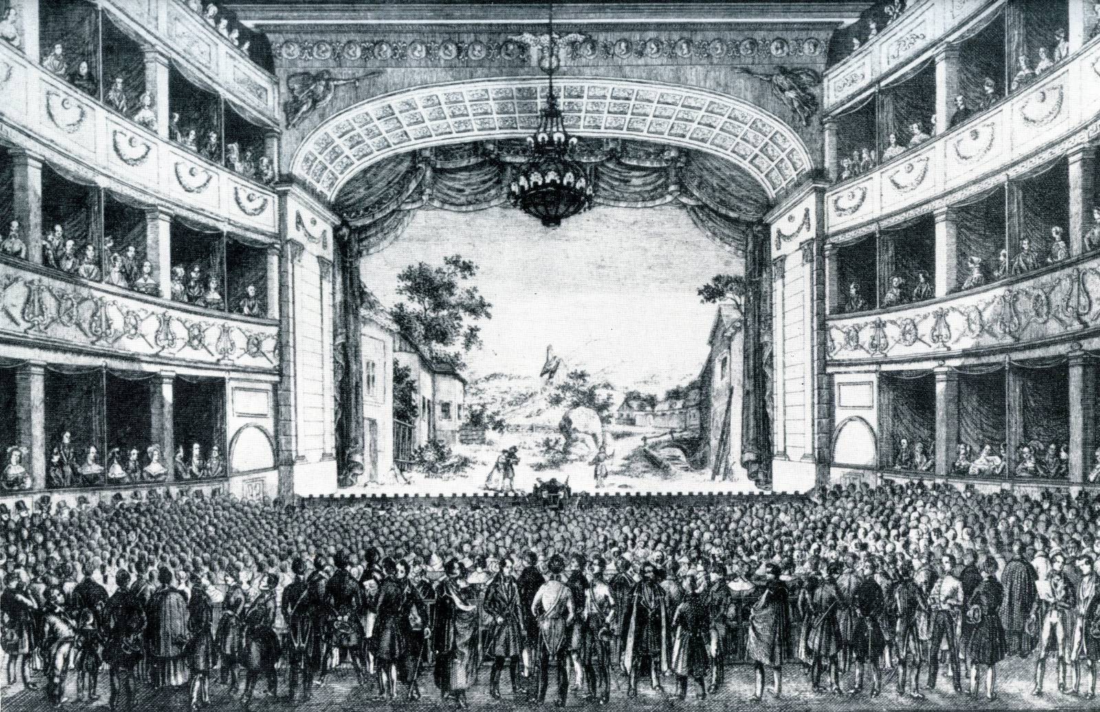
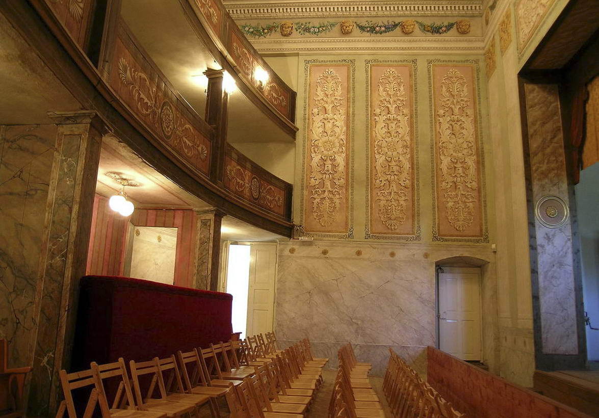
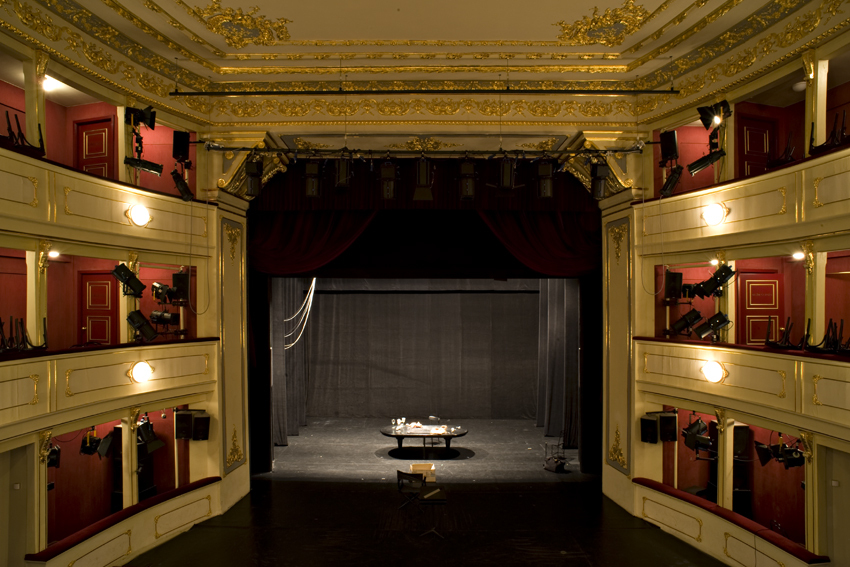
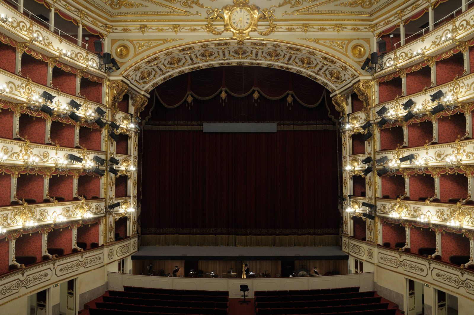
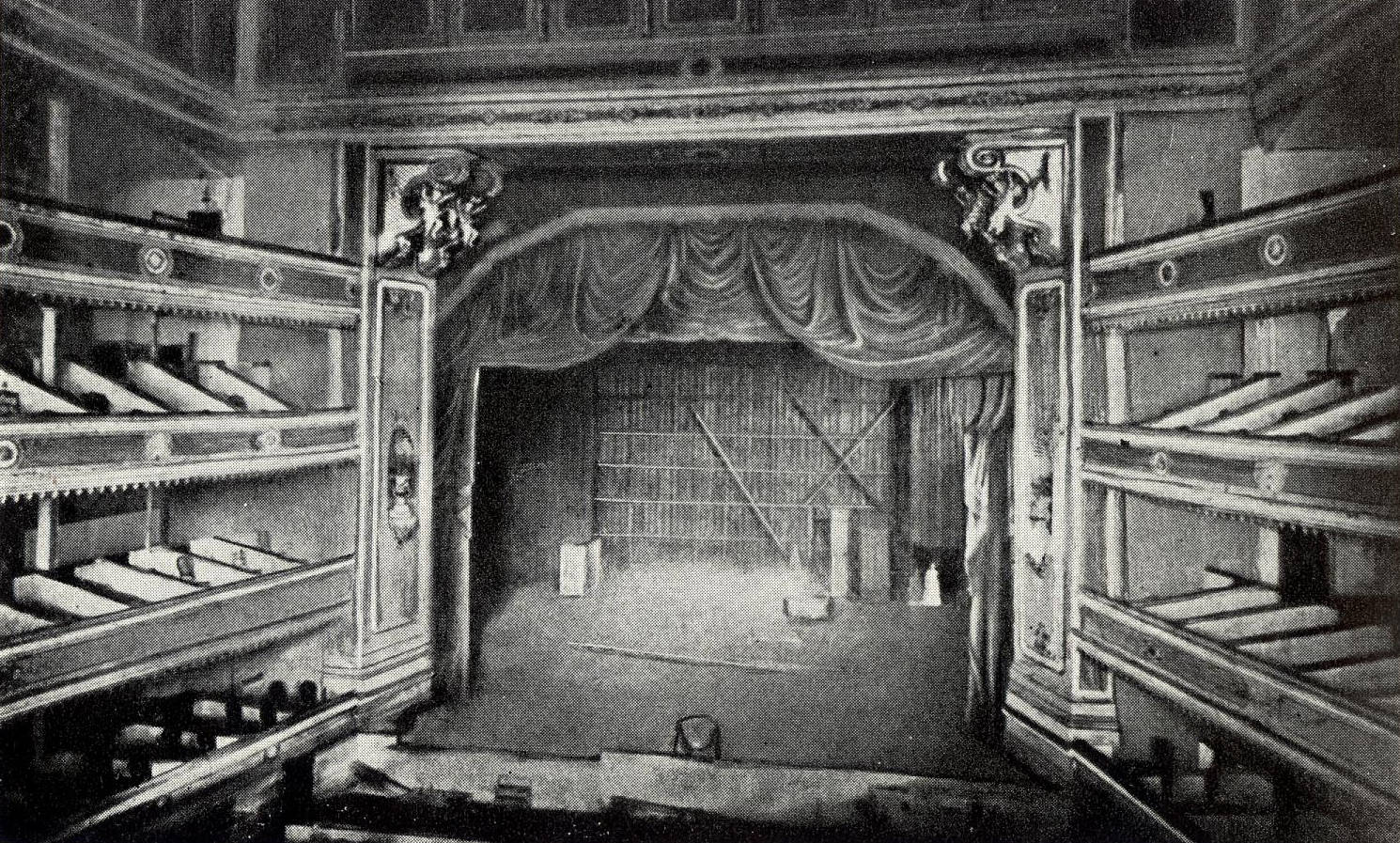
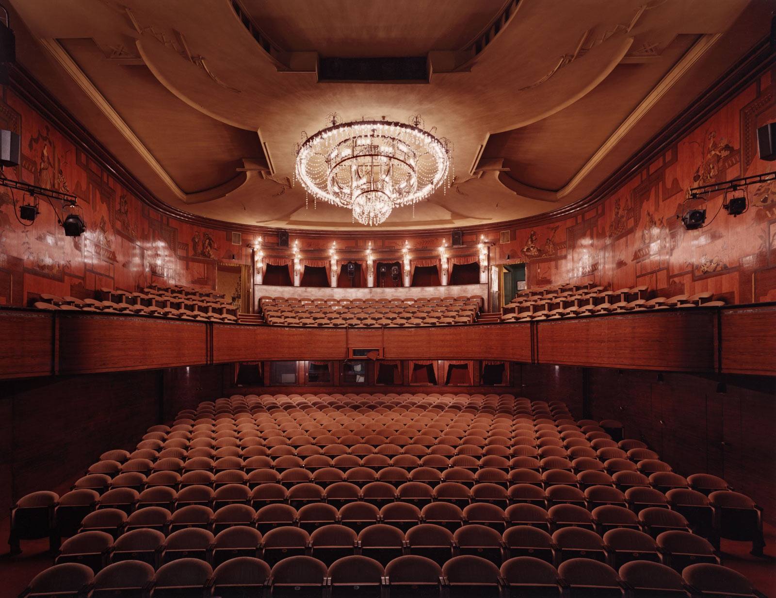
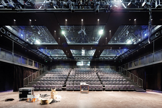
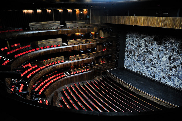
2.3 Theatre lighting
Development of theatre lighting
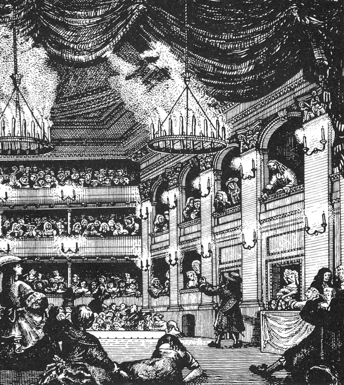
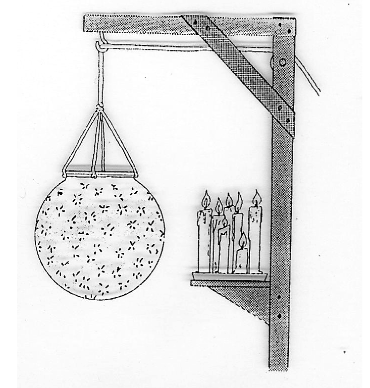
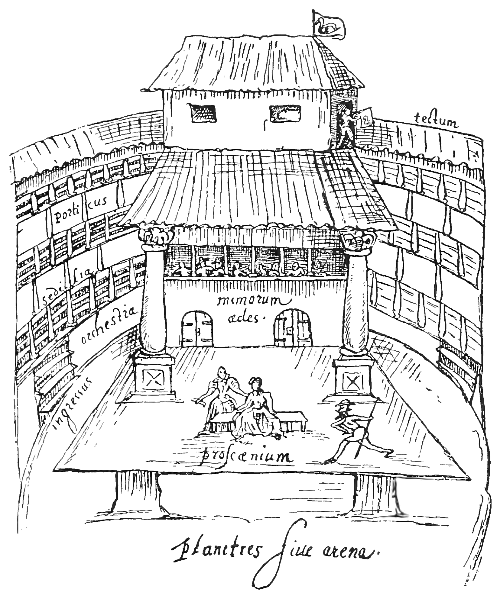
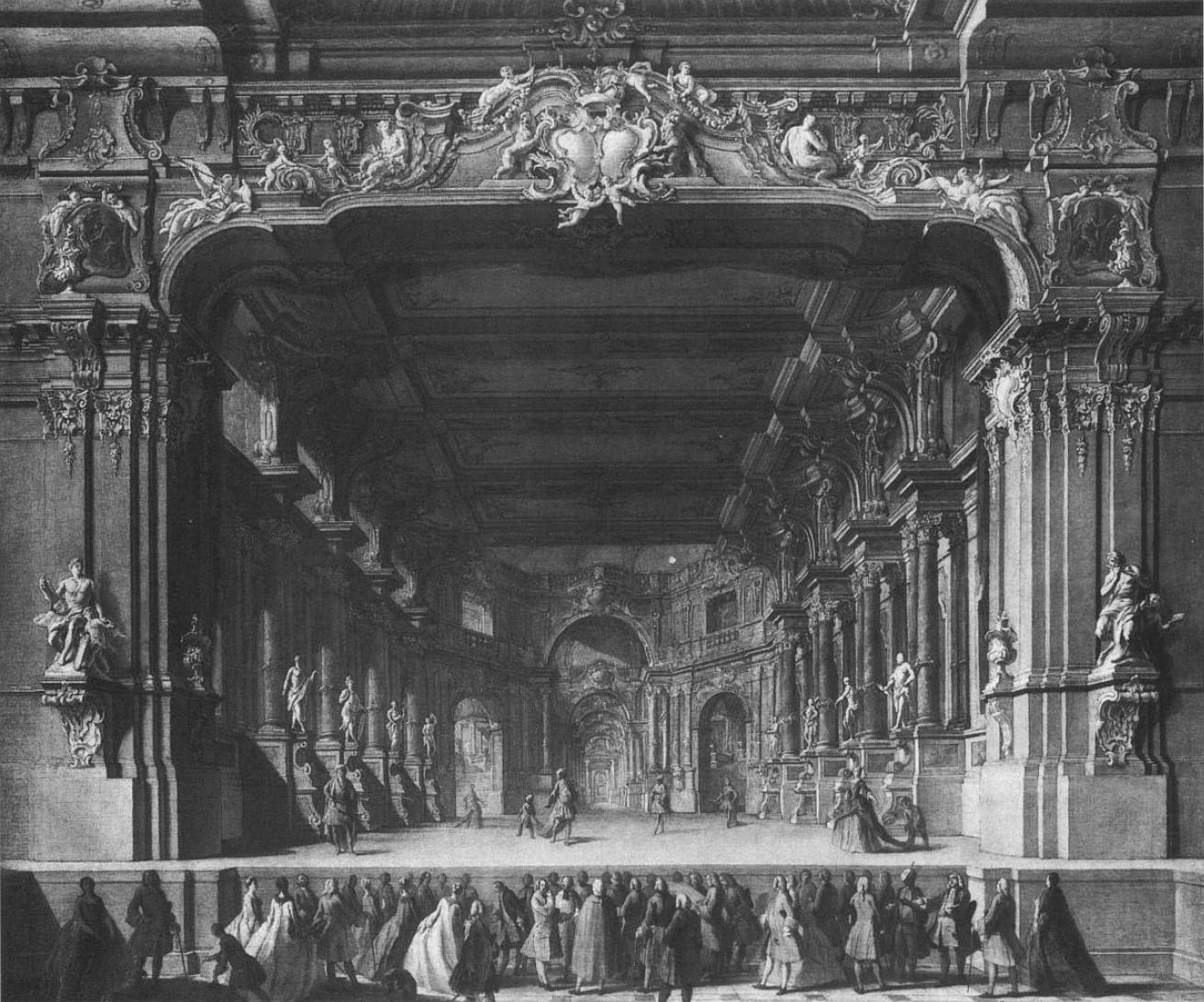
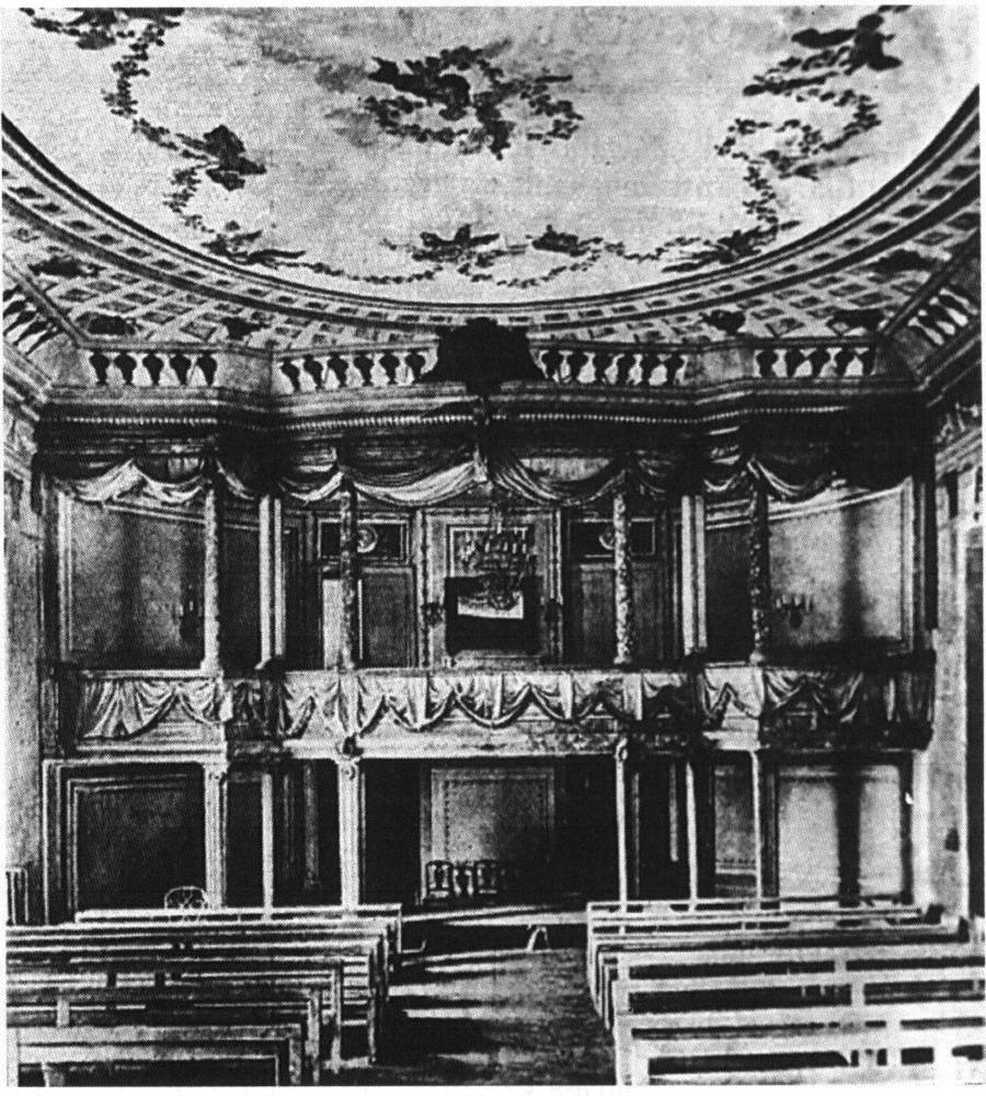
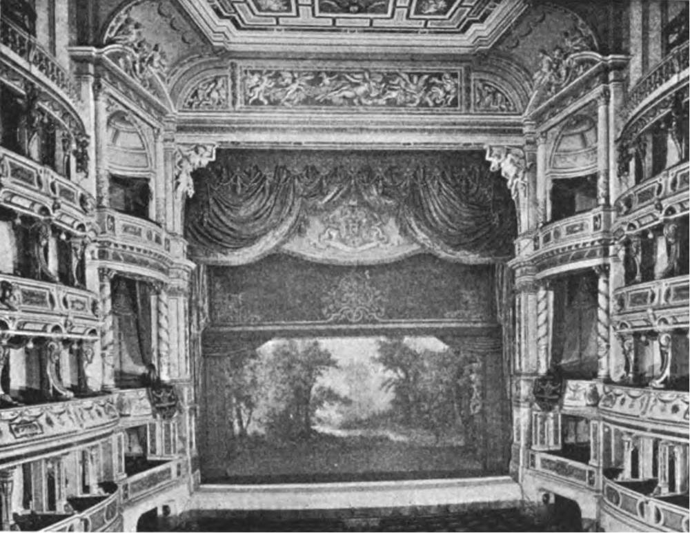
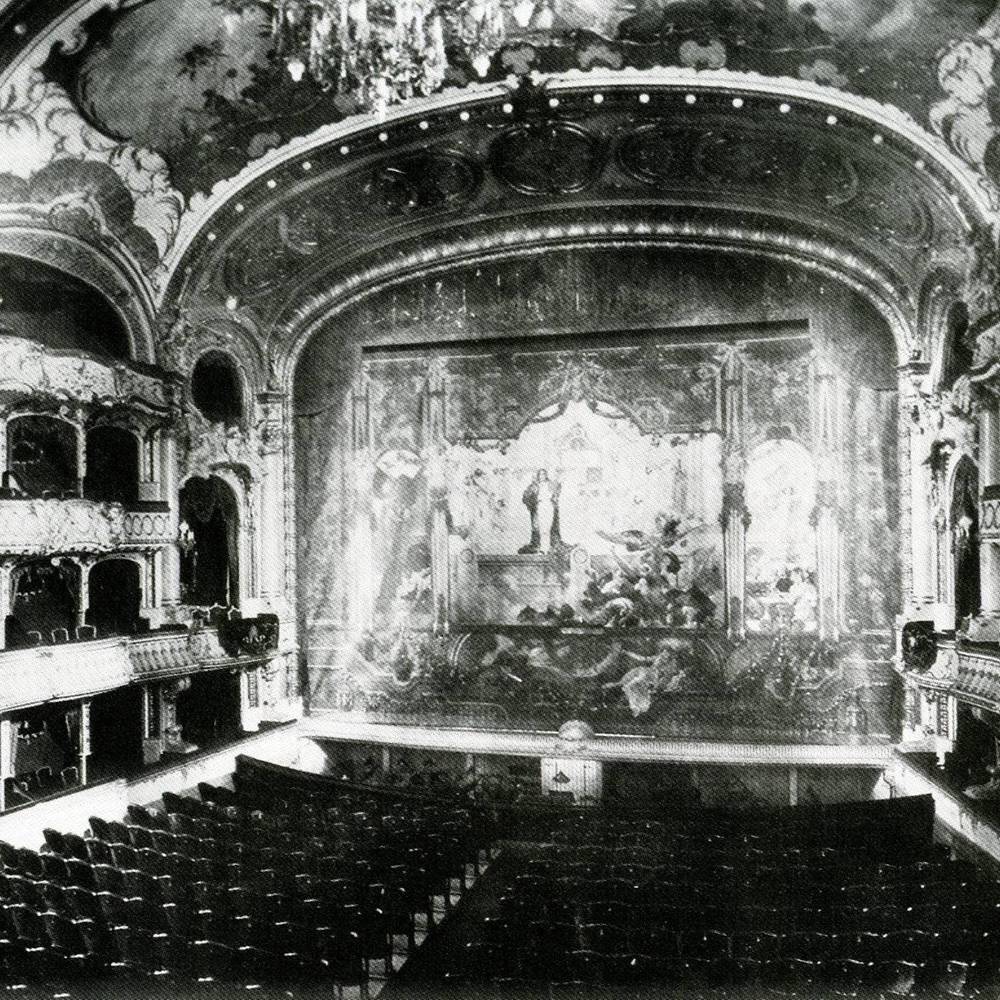
The prehistory of the modern day lighting dates back to the Renaissance with the emergence of a permanent theater building. Oil lamps or candles served there and once in a while there were attempts to improve the quality by fixing a reflector to them or changing the color by mounting colored glass in front of the source.
A large source for our understanding of the theater in 17th century is the book Pratica di fabricar scene e macchine ne‘ teatri by Nicola Sabbatini, which was published in 1638, or Architectura navalis by Joseph Furttenbach the Elder from 1629. There are many examples of fabrication of scenic effects next to several insights about lighting. The oil lamps were improved by mounting a glass chimney, but still there had to be many of them and the actors had to wear white clothing and be with white masked faces. The number could reach astonishing amount as so happened by opening of Royal Court Opera in Berlin, where 1300 candles with reflectors were used by its opening.
Argand Lamp

Prehistory of dimmers: two candles A and B, two cylinders with opened bottom and top, a wire mechanism enabling their lowering and pulling. Nicola Sabbatini, 1638.
In 1783/4, Ami Argand, a Swiss chemist, developed the principal of using an oil lamp with a hollow circular wick surrounded by a glass chimney. The wick and chimney improved the combustion of the oil and resulted in a brighter light with less smoke. This was the first real advancement in lamp technology in thousands of years. The Argand lamp required much more fuel than did conventional oil lamps, limiting their use to the rich, and to public places.
At the beginning of the 19th century stages were illuminated by Argand oil burners. They were provided as footlights, stage side lights and by overhead chandeliers. For stage use, the glass chimney was often made from colored glass. During the 19th century, gas light was being developed and flourished. Other sources such as the arc lamp and the lime light were also developed and put to use on stage.
Gas Lamp
It was the introduction of gas lighting to the theatre that began the first real advance in theatre lighting. Gas was manageable and controllable. Centralized remote control systems were developed, usually in wings, backstage. Footlights and wing lights could be dimmed or brightened. It had higher luminance and the light was more brighter with stable intensity. It enabled to evenly illuminate large areas. It had its dangers as well. They could easily start a fire, they were smelly and smoky. From time to time, the gas poured into area without burning and subsequently when ignited, a blast could destroy not only the stage, but the entire building as well. If we have only a brief look at the history of various theaters, we notice that many of them were consumed by fires. Its emission caused breathing problems both to actors as to audience.
The first general use of gas street lighting took place in London in 1814. By 1823 nearly 40,000 lamps had been installed in 215 miles of London streets. In 1820, Paris adopted gas street lighting.
Limelight was in widespread use in theaters throughout the 19th century until it was replaced by Arc lamp. Its firs use is credited to Covent Garden Theatre in 1837.
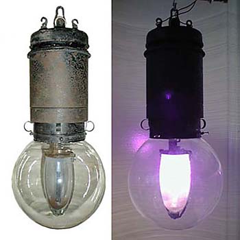
Arc lamp
Arc lamp was the first practical electric light. Because electricity lacked all the dangers of the gas lighting, the transition was rather quick and by the beginning of the 20th century, the theaters were already overwhelmingly quipped by electricity. Because electricity lacked all the dangers of the gas lighting, the transition was rather quick and by the beginning of the 20th century, the theaters were already overwhelmingly quipped by electricity. With it, the rapid development of theater lighting came into existence.
Wax candle with a reflector to enhance its intensity.
Argand Lamp

Gas Lamp

Limelight
Arc lamp
Out of the Dark: The history of illumination
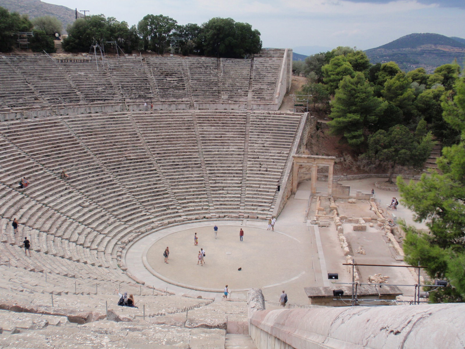
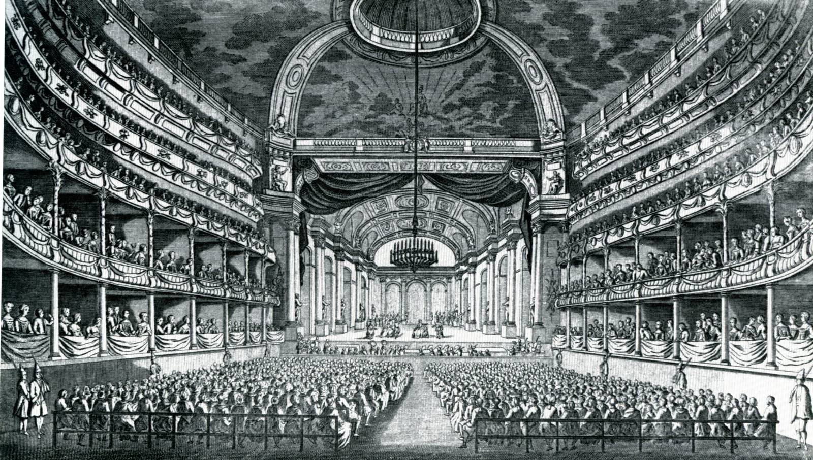
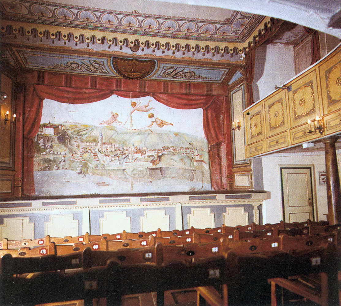
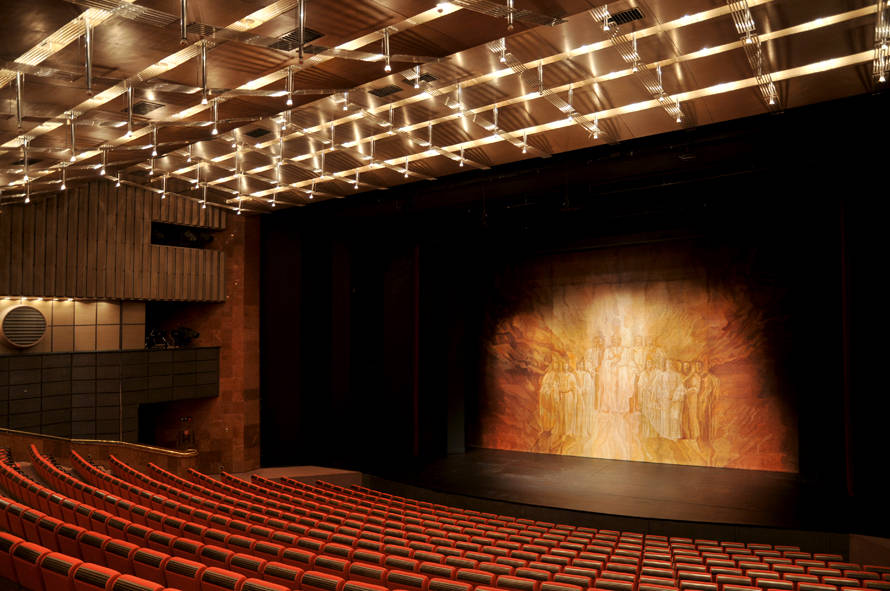
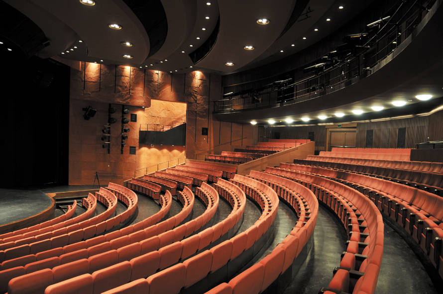
2.4 Theatre space
Development of theatre space
Telling stories and fairytales is loved by children all over the world. Perhaps it is a form of a game with words, perhaps it shapes the ideological boundaries of small children, forming the basic knowledge between good and bad. Fairytales are told in the most primitive societies and the drive and passion for telling them might very well be a key factor for further development, of which theatre buildings have been preserved as a silent expression for this human activity. The most rudimentary theatre form is actually a game played by children, adults, kittens or other animals. It may develop into a religious ritual, sacral game, or theatre. Theatre itself as we understand it can be played practically by anyone (Ken and Barbie might be a part of large imaginary world of a child that is to be forgotten soon). But to become a social institution, towards which a considerable amount of resources is directed, some economical progress of society is of course necessary, as there have to be resources available, and some ideological development, as there has to decision that these resources would be directed here and not somewhere else.
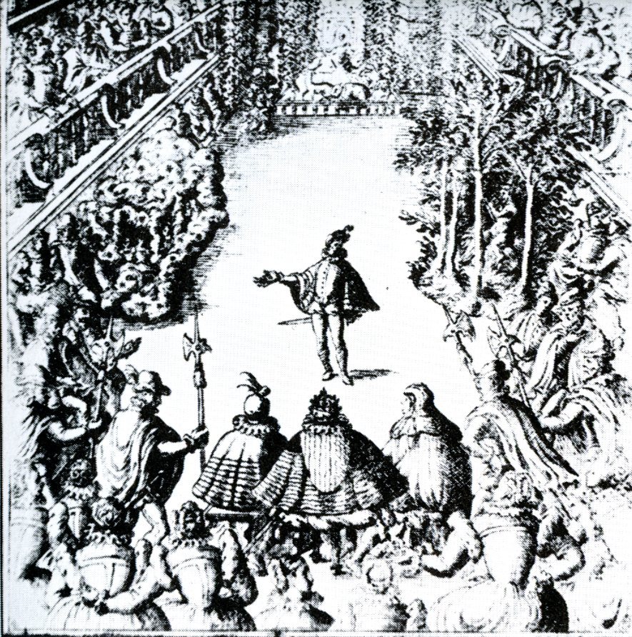
In the development of the theatre space in Europe, it is possible to discern that as much as the resources concerns, the ancient Greece and Rome concentrated some amount of their resources for construction of mainly open-air theatres as a common part of civic facilities and civilization. Though indeed costly, the first of them were just carved out in the hills, the latter ones were still unroofed with scaenae frons in the location of the present day stage. The shape of the auditorium quite reflected the democratic structure within equals of the old society and so it was retained, even when the nature of society changed with emergence of Imperial Rome. The dissolution of its western part meant economic decline over the centuries and thus favorable conditions for existence of theatre institutions as such disappeared, but the Middle Ages society for obvious ideological reasons preferred staging the liturgical drama in the churches. These were the centers of community that performed much larger social role than it is assigned to it today. Among other manifestations of community life, a form of a theatre space was being developed, the so called mansion stages, which were built to various occasions to frame a scene. There were several of them along the way of a procession and the actors moved between them. During religious festivities, liturgical drama was staged on the so called pageants (movable carts) that were in motion with the processions, stopping at certain points.
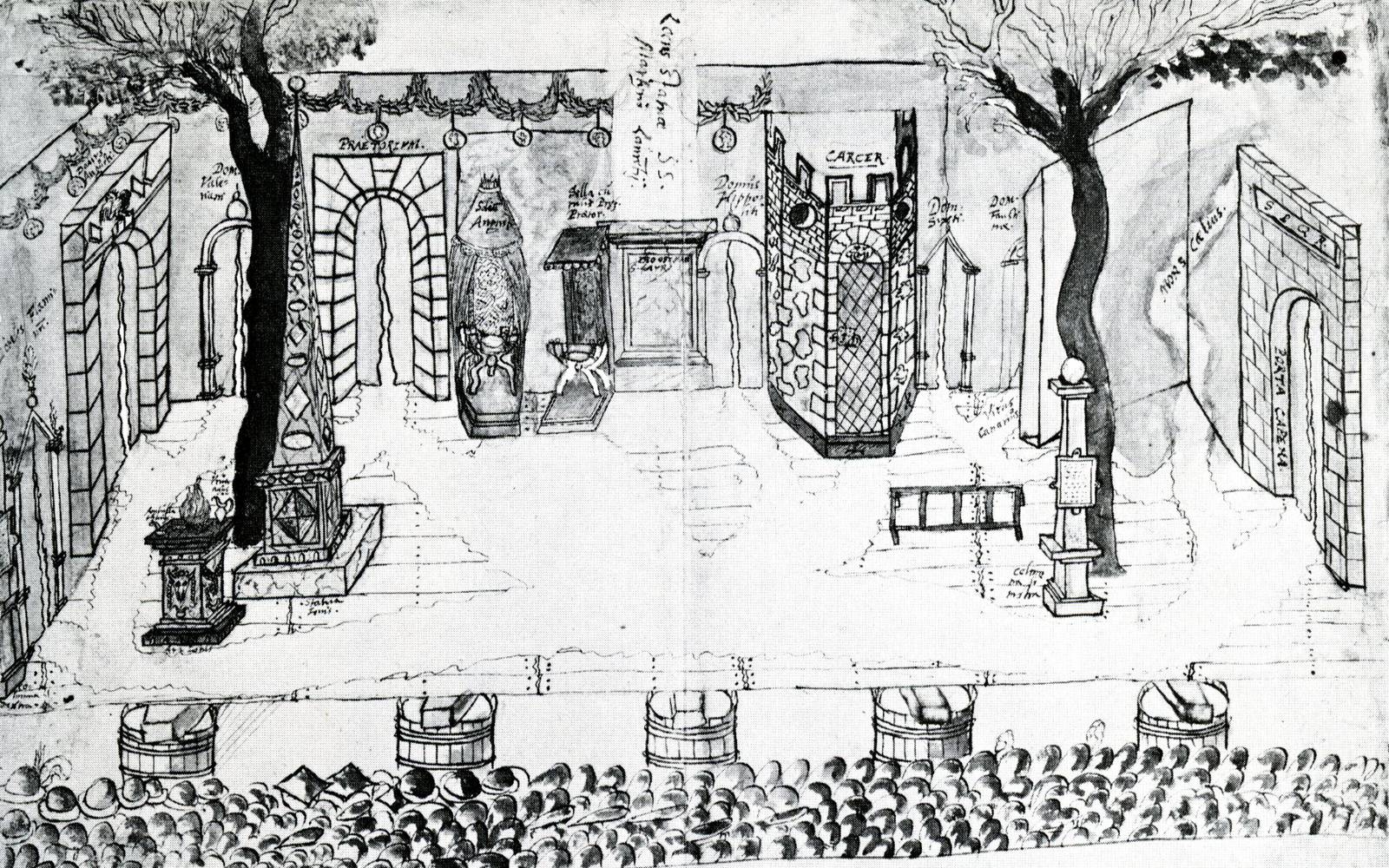
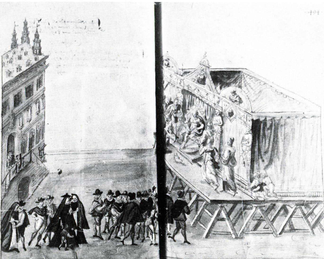
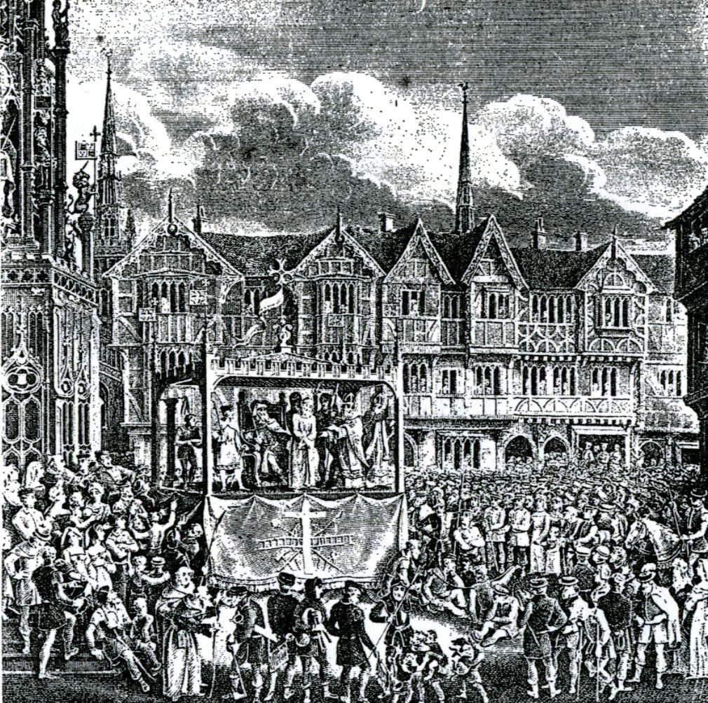
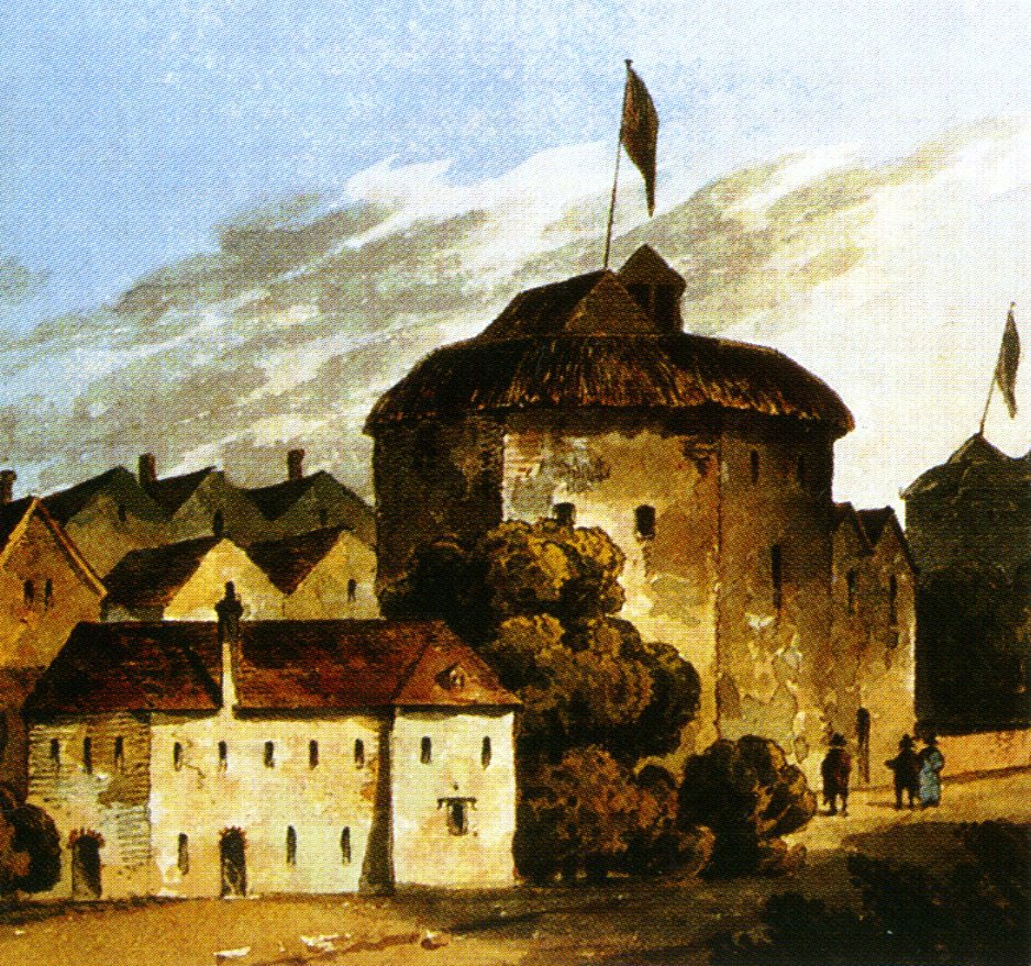
English Pageant wagon. ca. 1375-1550 AD
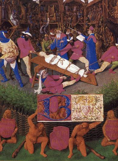
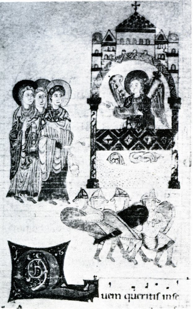
“Sometime in the tenth century, a part of the Mass for Easter Sunday was embellished by a question and answer sequence telling the story of the Three Maries at the Sepulchre [PI. 26]: ‘Whom do you seek in the Sepulchre, O followers of Christ?’ asks one speaker representing the angel. ‘Jesus of Nazareth, who was crucified’, is the reply. ‘He is risen, as he foretold; go and tell how he is risen from the tomb.’ As the years passed, other episodes from the Gospels were dramatized in the same simple way. The performers were priests and choristers, the language Latin, the setting the chancel of the parish church. But the dialogue was working itself free from the actual words of the Biblical text, a few stage properties were introduced and there was action of a sort. Subjects included the Nativity, the Journey to Emmaus, the Ascension and Pentecost. The staging was elaborated so that the whole church, including the nave, was used, with each bay of the arcade representing a particular place (Pilate’s Palace, Gethsemane, etc.). Rich costumes were provided and the characters carried their traditional attributes. In spite of ecclesiastical controls, comedy kept breaking in and certain characters (for instance the man who sold spices to Mary Magdalene) became recognized comic types.”
In: TIDWORTH, Simon. Theatres; an illustrated history. London: Pall Mall Press, 1973, 224 p. ISBN 02-690-2833-1. Available from: http://amzn.com/0269028331, p. 35.
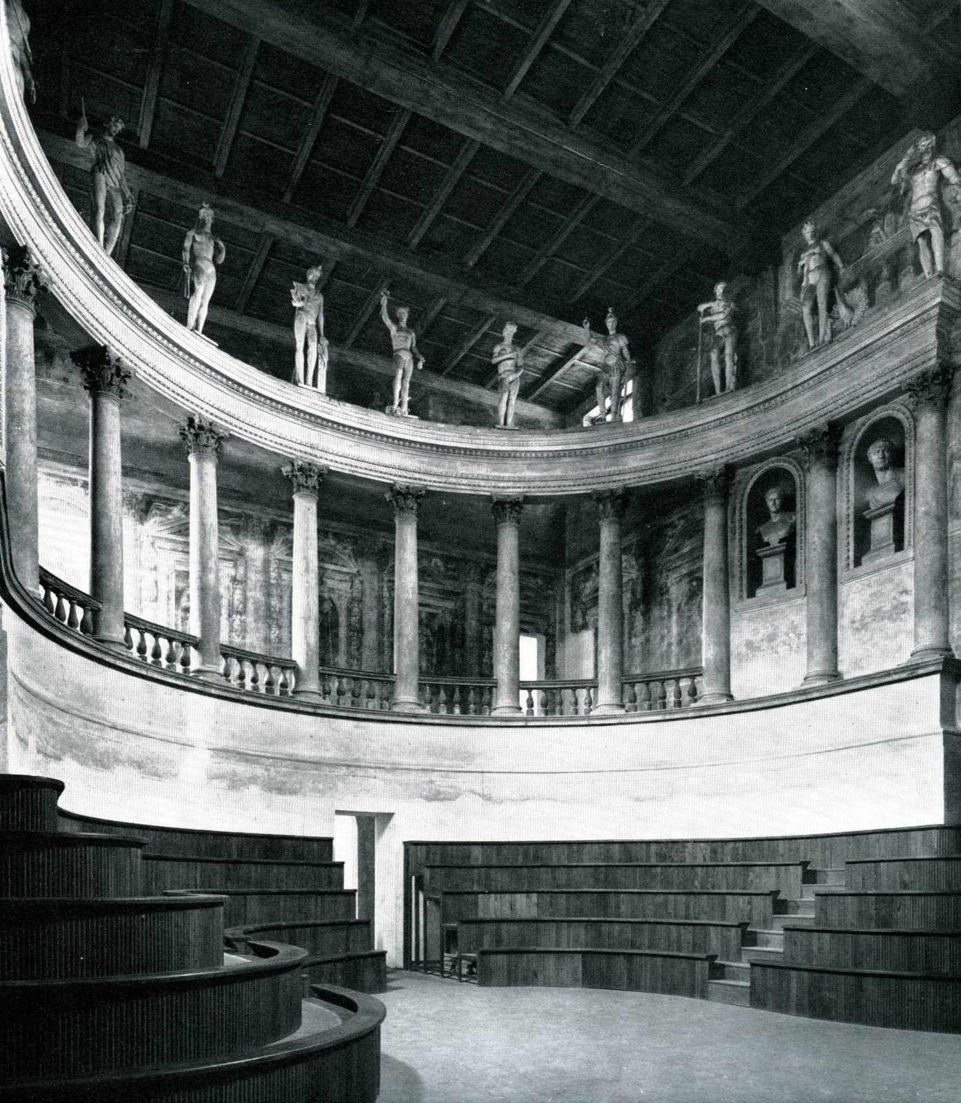
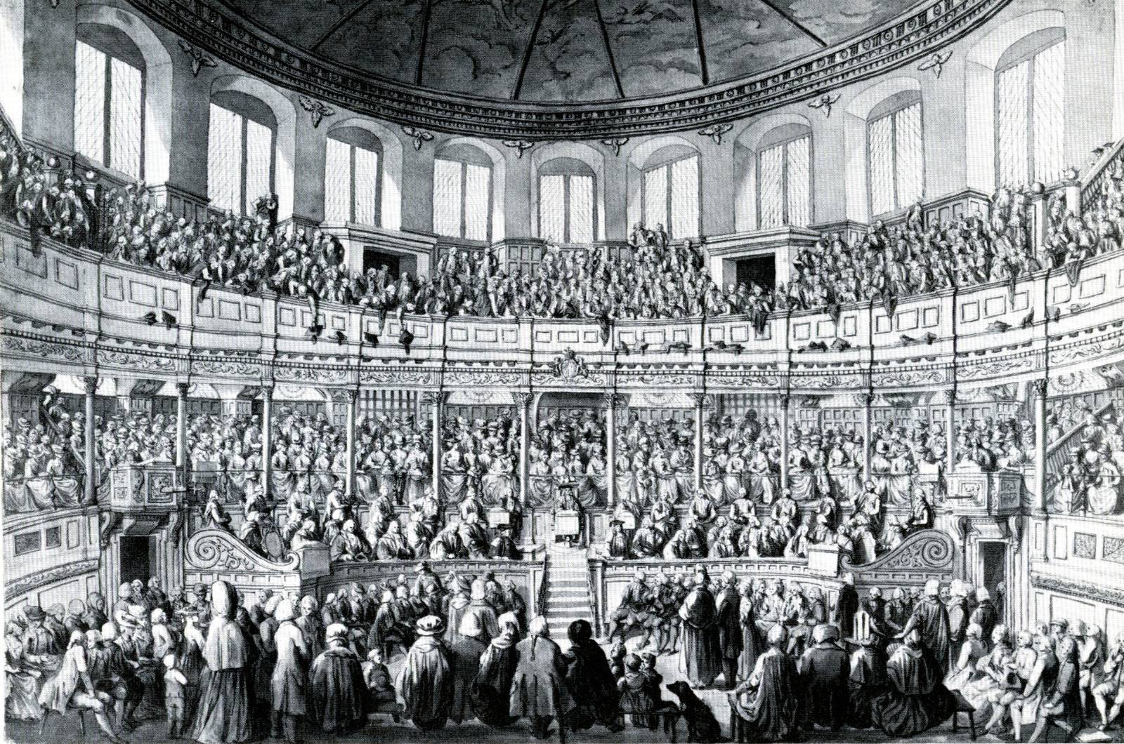
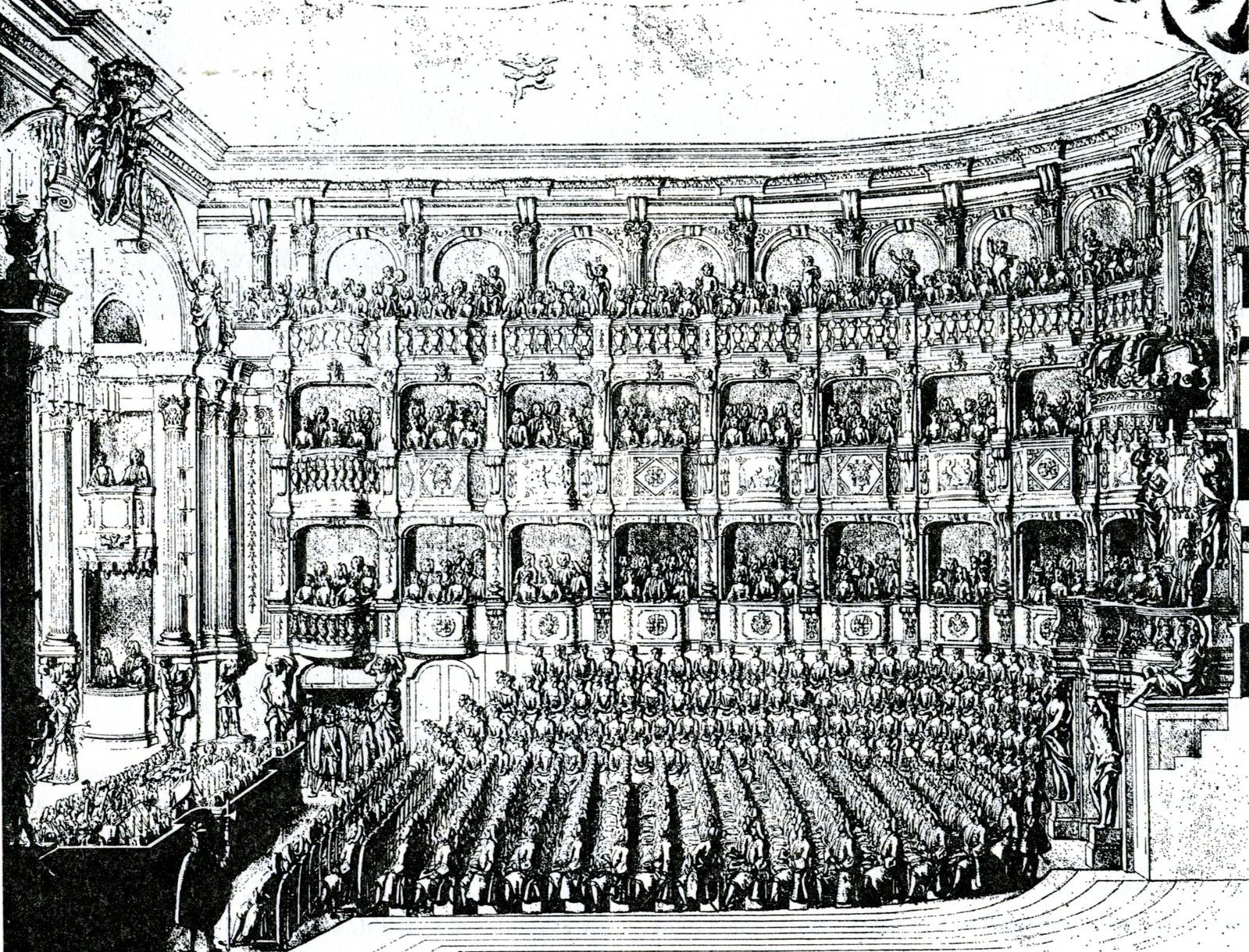
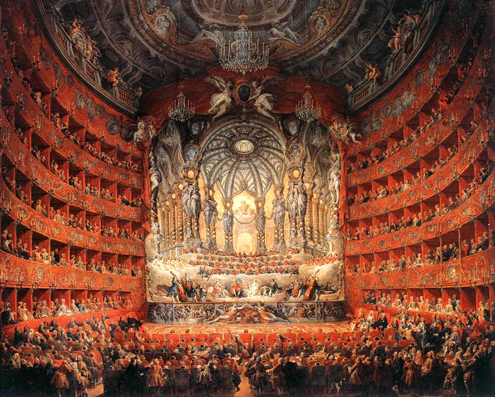
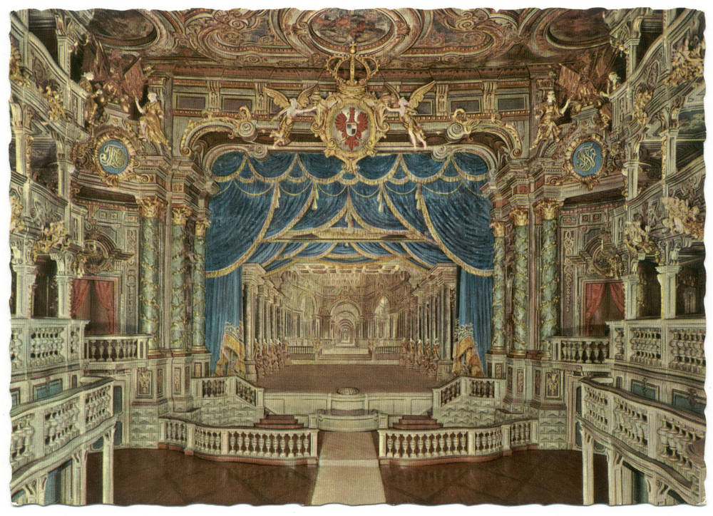
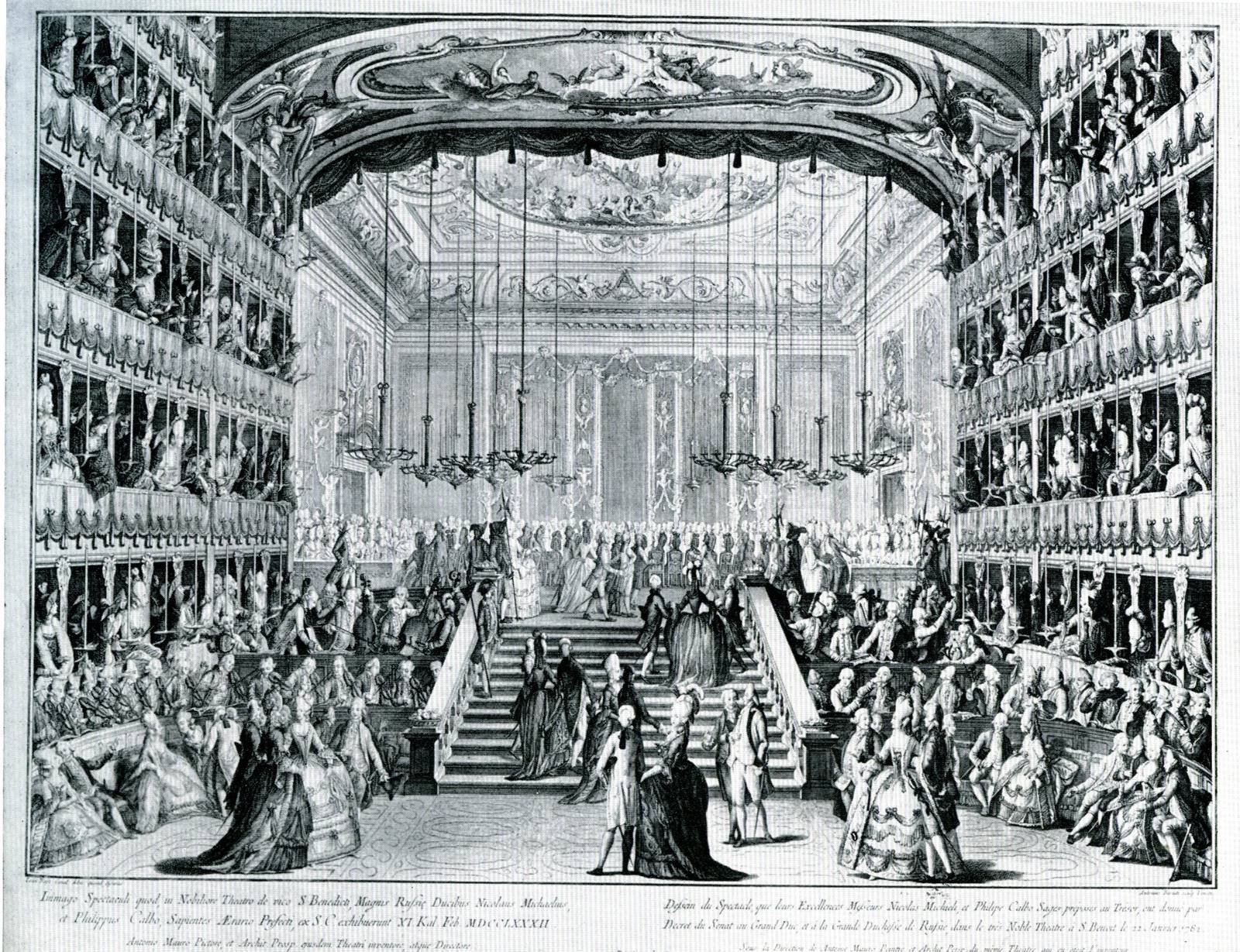
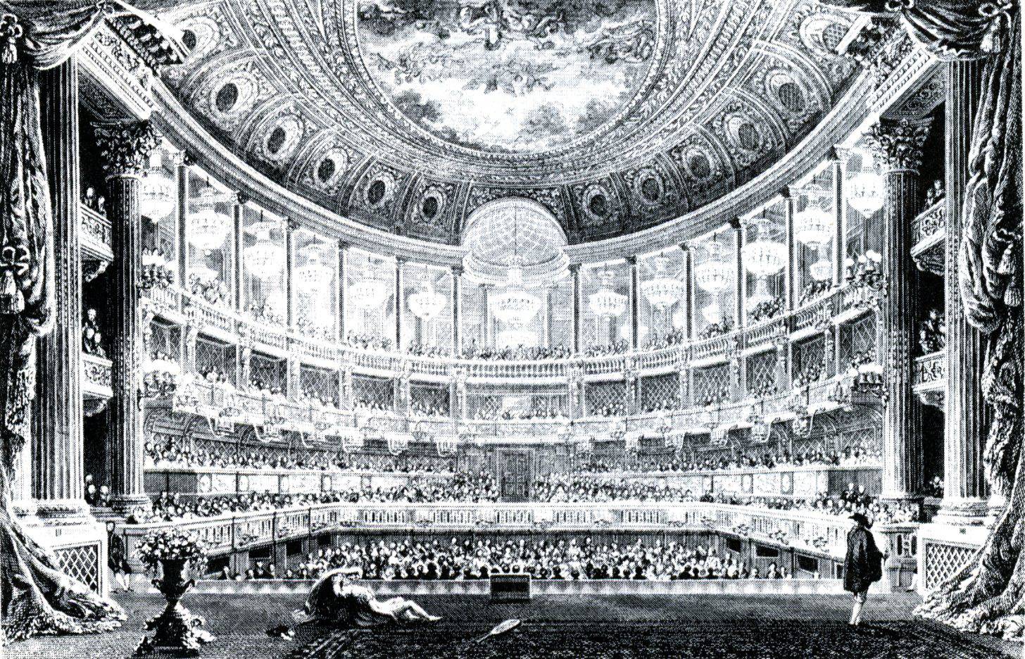
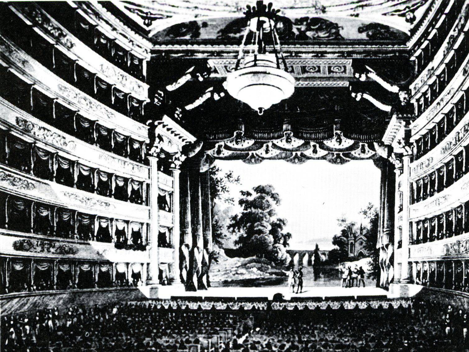
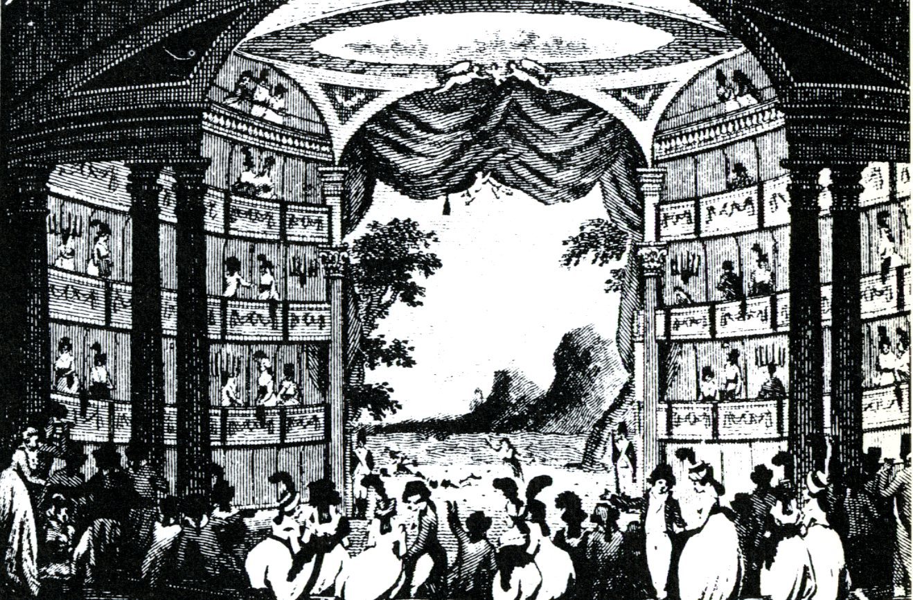
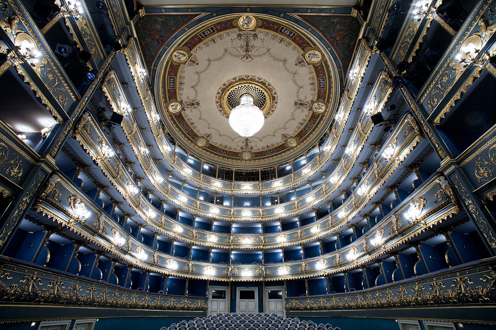
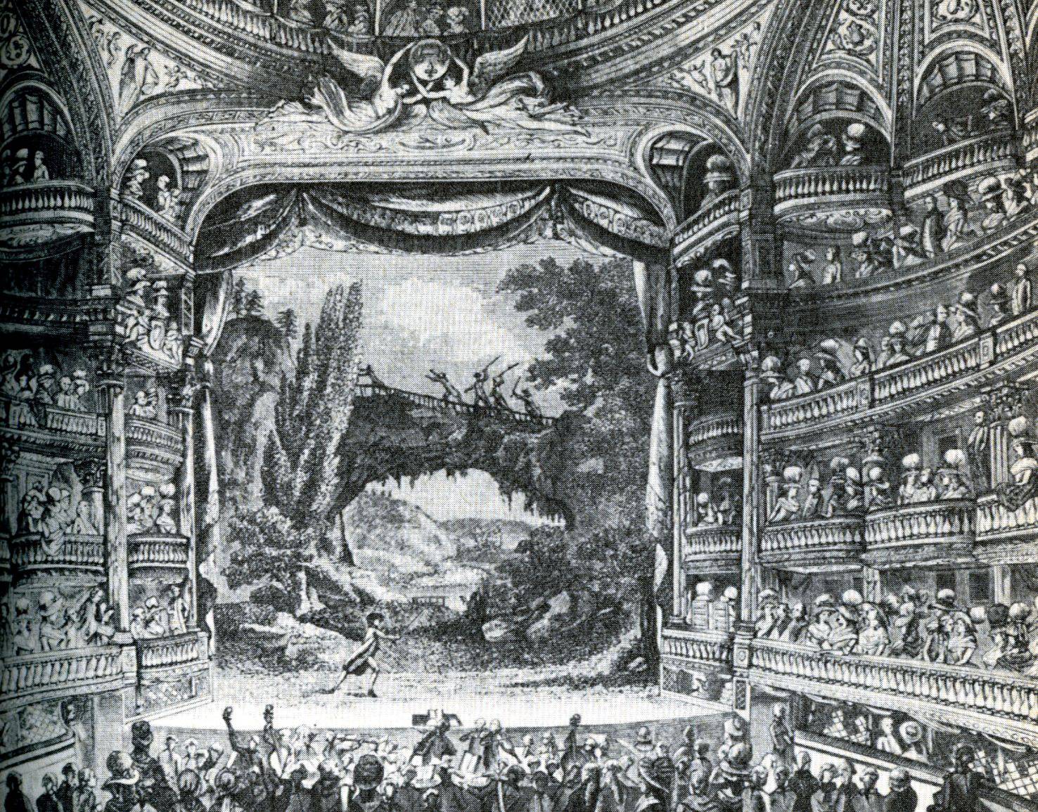
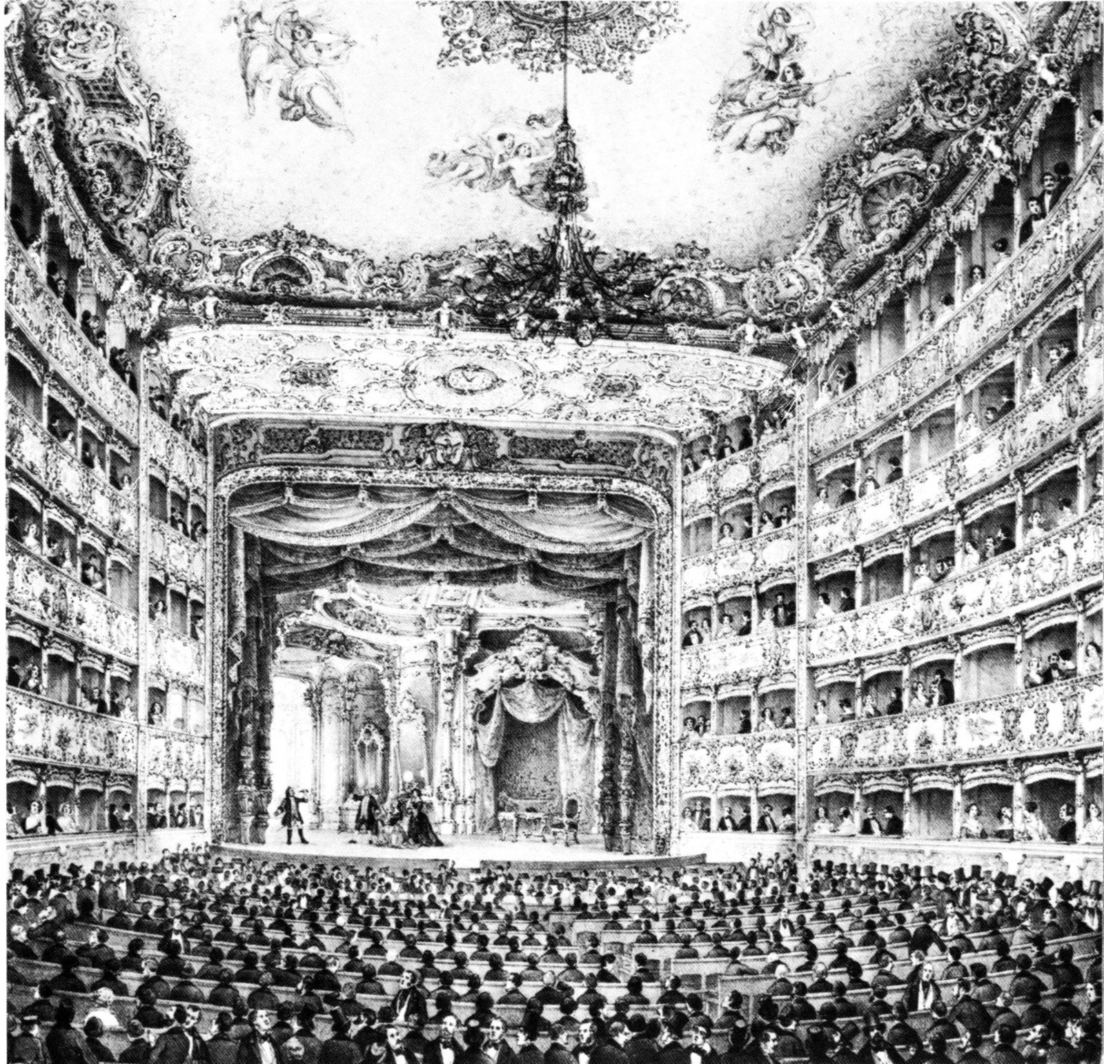
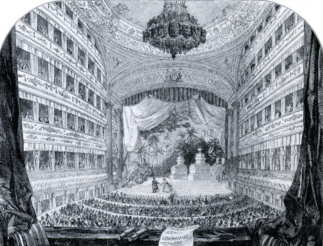
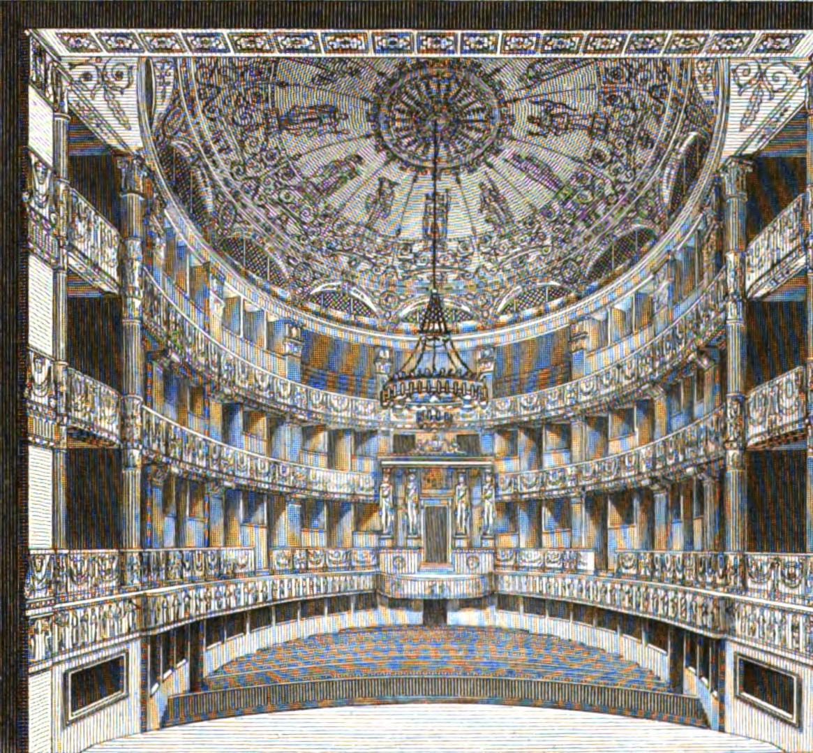
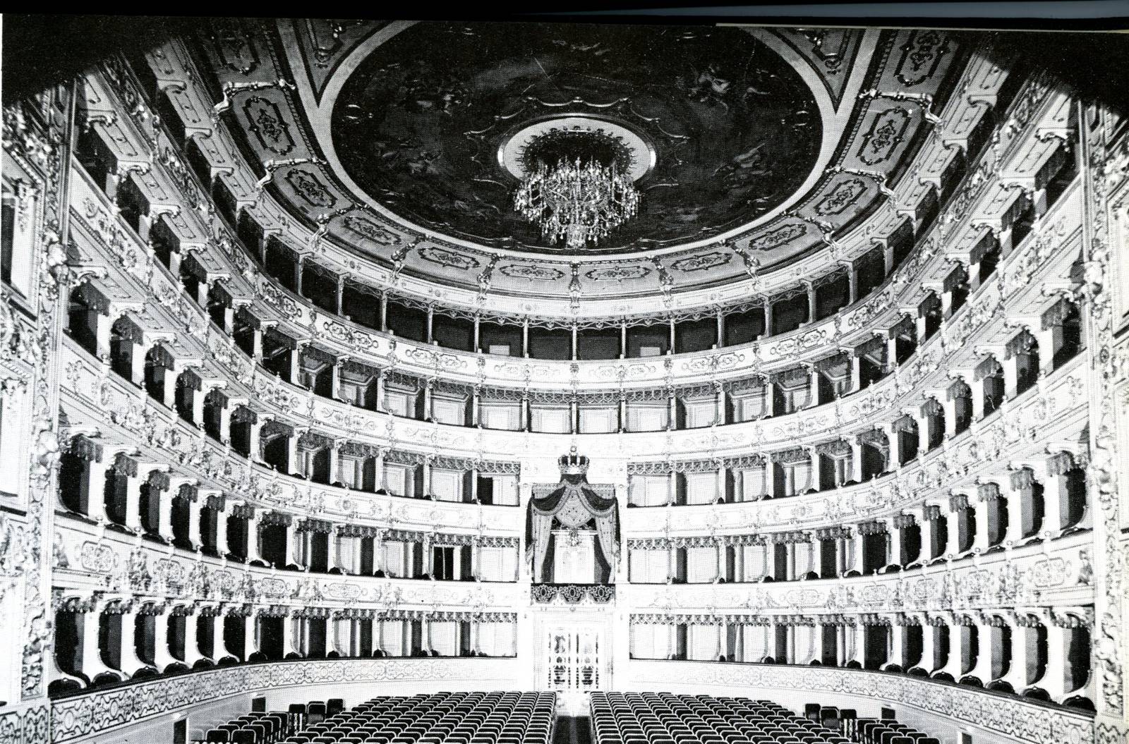
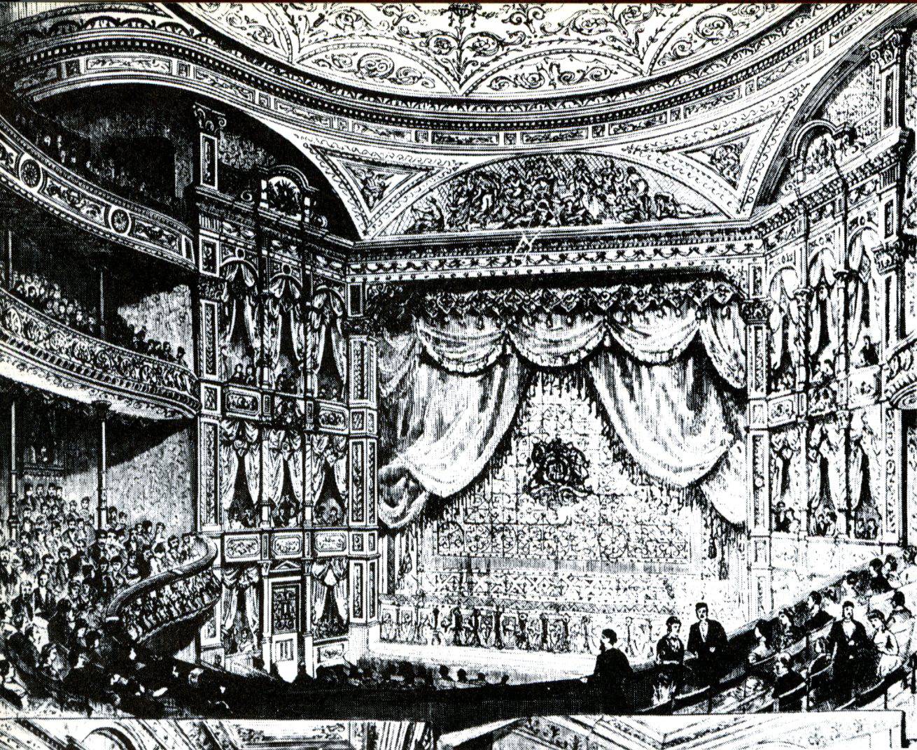
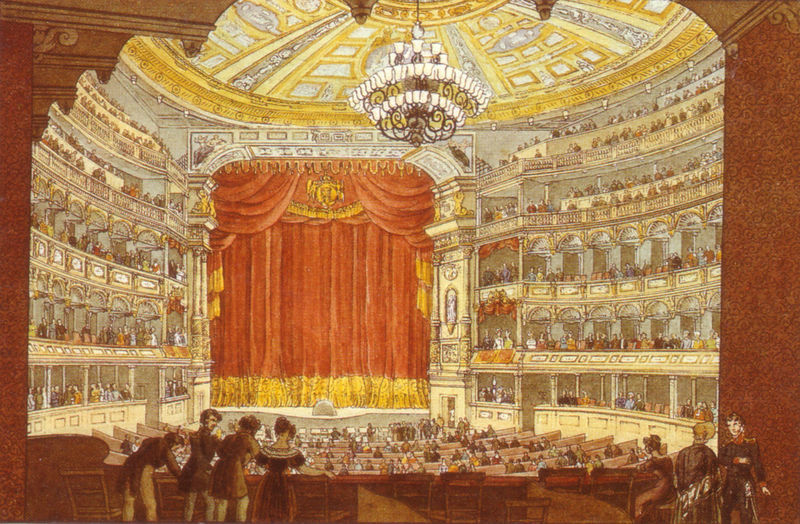
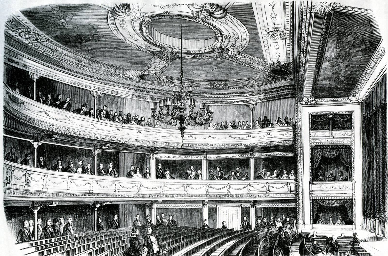
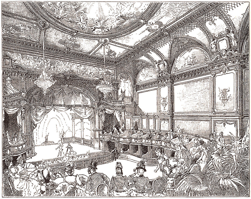
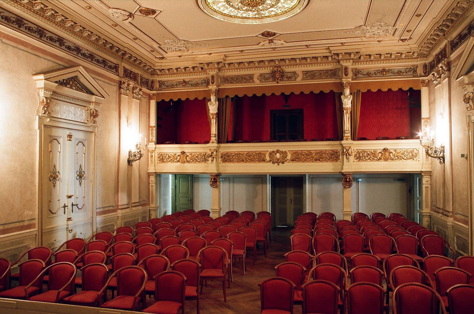
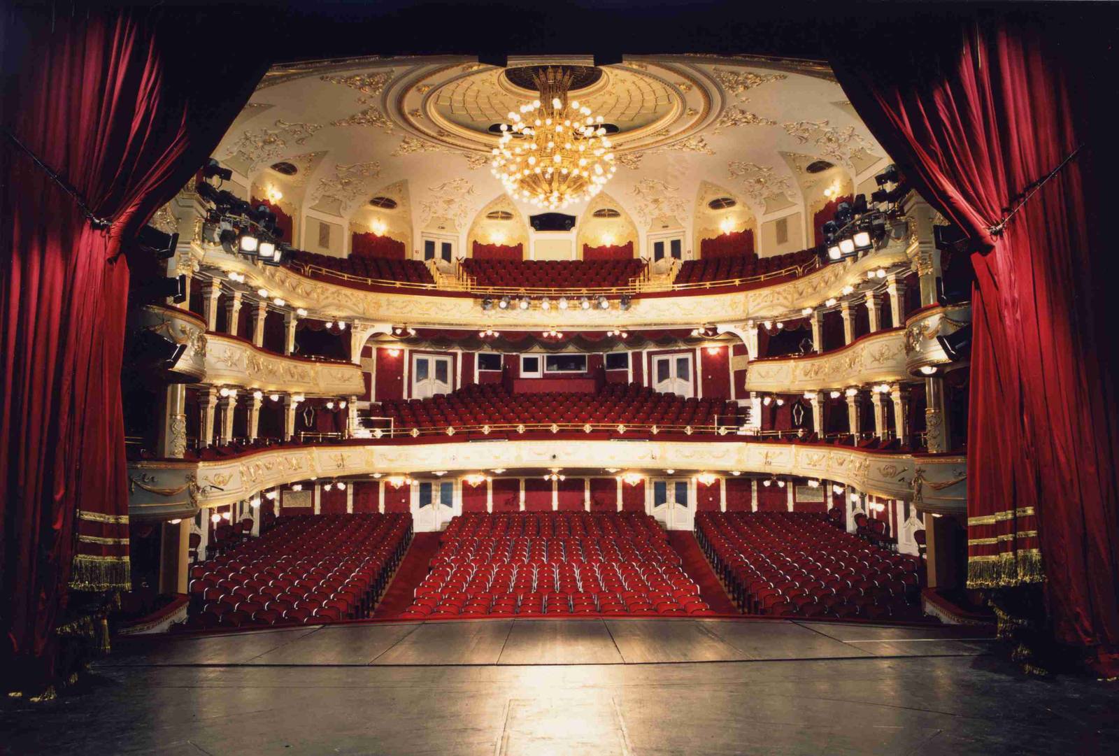
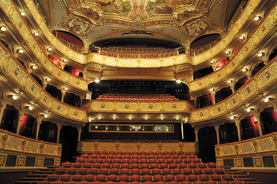
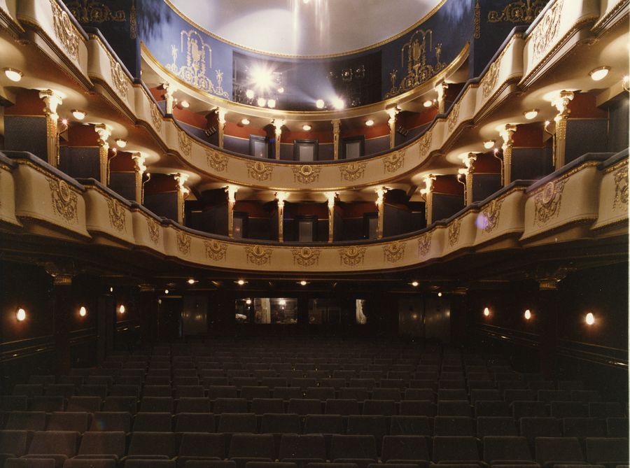
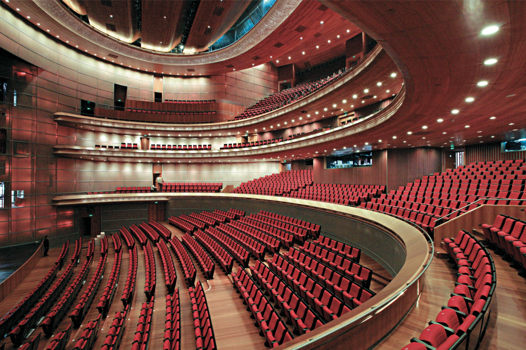
The first buildings that were devoted solely to theatre usage were built in the late Renaissance in Italy, where artist intended to revive Roman art and culture, of which theaters were a striking component. However, the society changed profoundly and now the special place for the ruler highlighted his majesty in the middle of the auditorium. The royal box, a focal point of the theatre, was surrounded by boxes of less prominent members of society. During the 17th century, the galleries were partitioned into boxes for nobility. That allowed more symbolic decoration. Of course, if the visibility was seen as the main requirement, the auditorium would have been constructed differently, more or less in Ancient style. But the theatre auditorium somehow mirrored the strata in the society and its symbolical order. It allowed social interaction, to be on the display of richness, to start new liaisons, to be in the center of attention. Having a box in the opera, where the better society was encountered, was widely considered as a condition sine qua non of being a member of privileged classes.
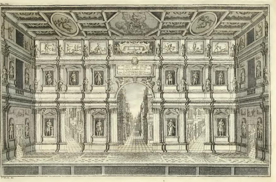
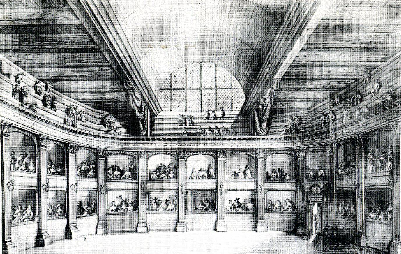
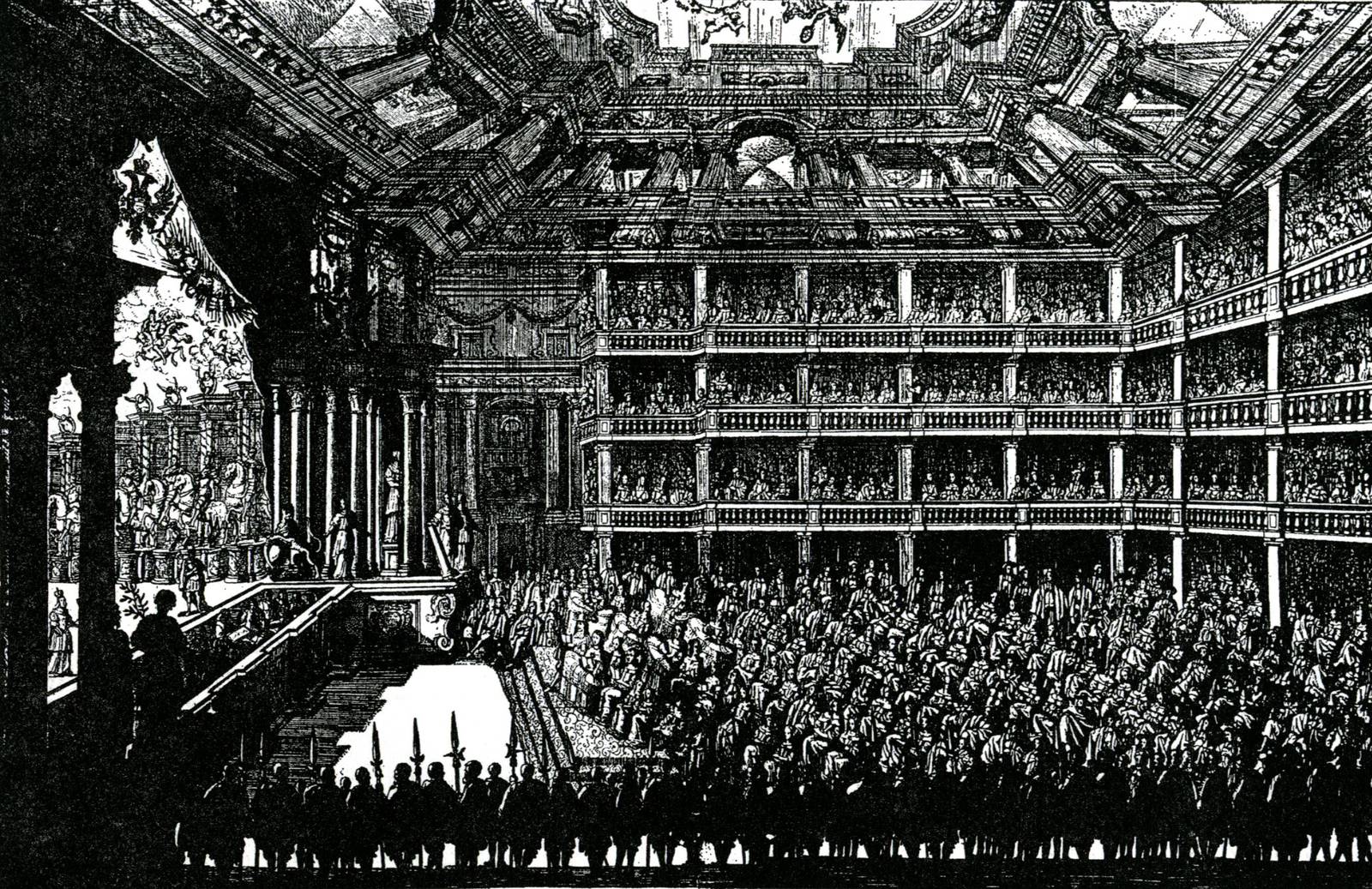

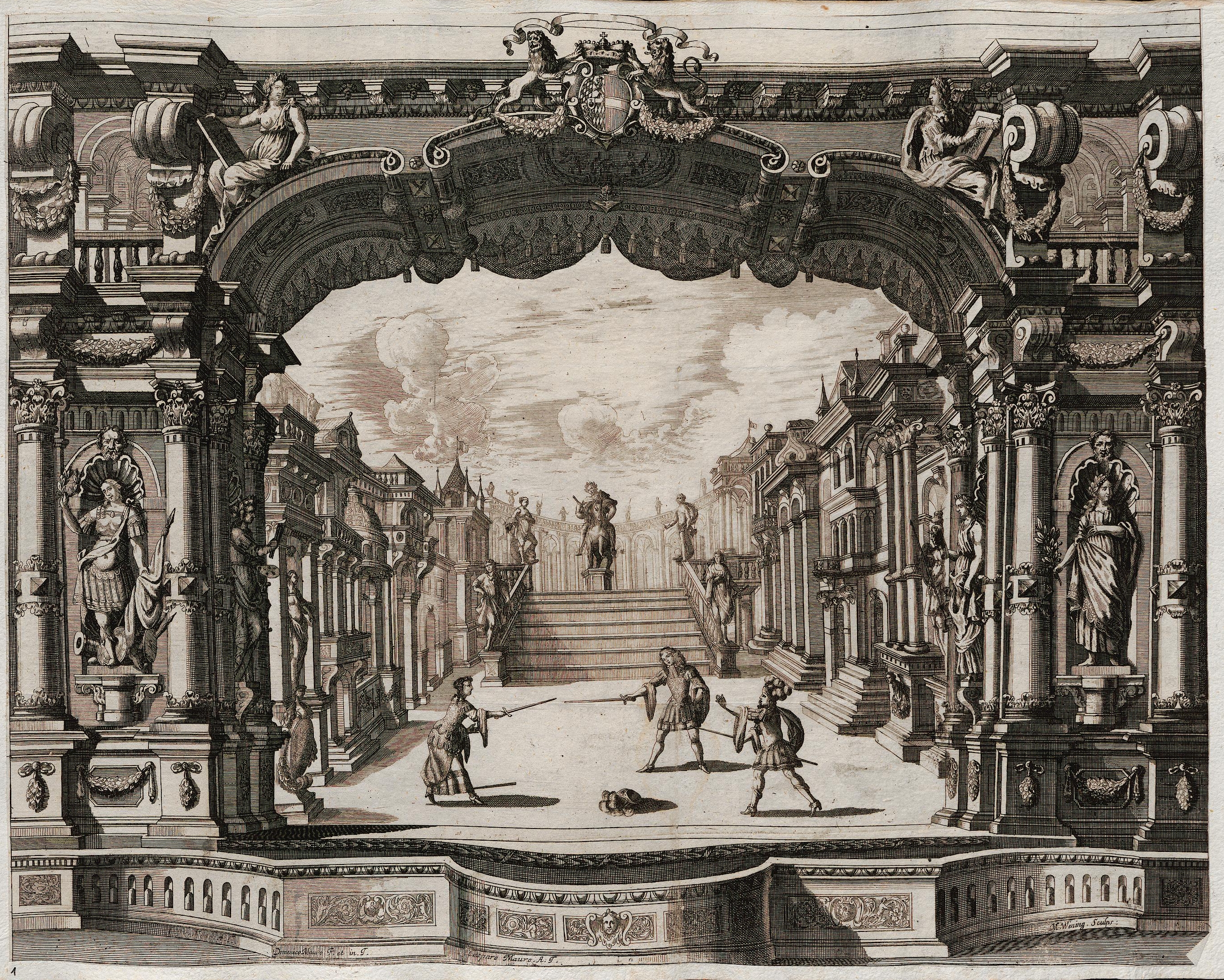
From the Italian cities, the new type of building with a new genre – opera was spreading to the Europe. Nobility in various countries started building their own private theaters in their castles. Theatre was always played for all the ranks of the society, however, the era of the proscenium stage theater is the one, in which this art was seen as very prestigious and so relatively large portion of resources was directed by owners into the appearance of the theatre as well as to technology. And so with increased complexity in the auditorium, the stage of the Baroque era was being improved as well. Quite refined systems of scenery changes was already in use.
The philosophers of Enlightenment as well as Jesuits put stress on theatre, in both cases because it would lead to higher culture and better moral. The theatre building had an important place in the life of society.
The forestage boxes, reserved for royalty, were immediately removed when a king disappeared from the political system as so happened in with the Théâtre National de la rue de la Loi (1793) after the execution of Luis XV, whereas they were still built for instance in England by Frank Matcham a hundred years later.
“The new monied classes of the nineteenth century appropriated the opera as their central example of high art, and the monumental opera house became the architectural symbol of nineteenth-century high bourgeois culture.”
CARLSON, Marvin. Places of performance: the semiotics of theatre architecture. 2. publ. Ithaca, N.Y: Cornell University Press, 1989. ISBN 978-080-1480-942. p. 81
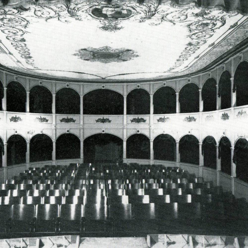
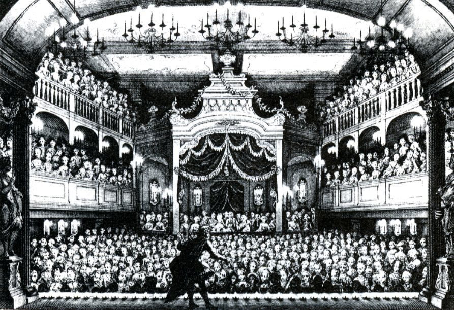
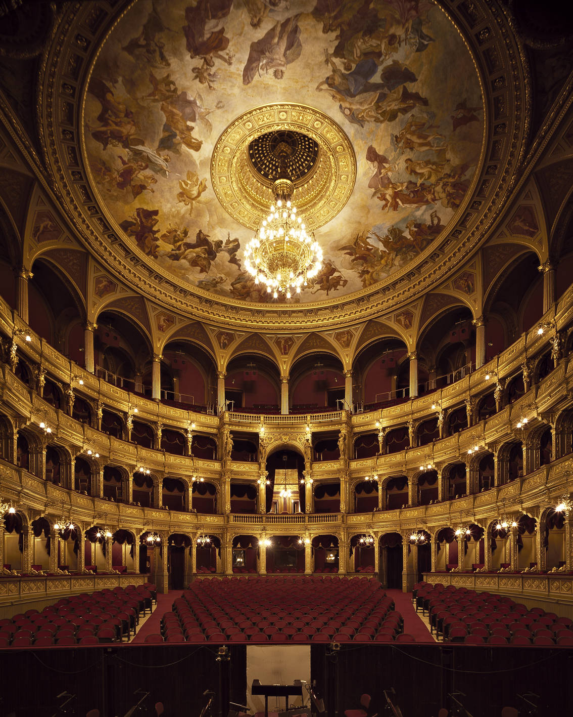
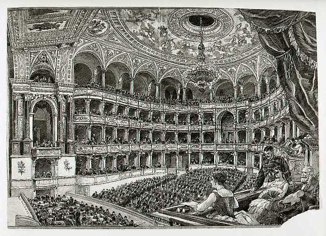
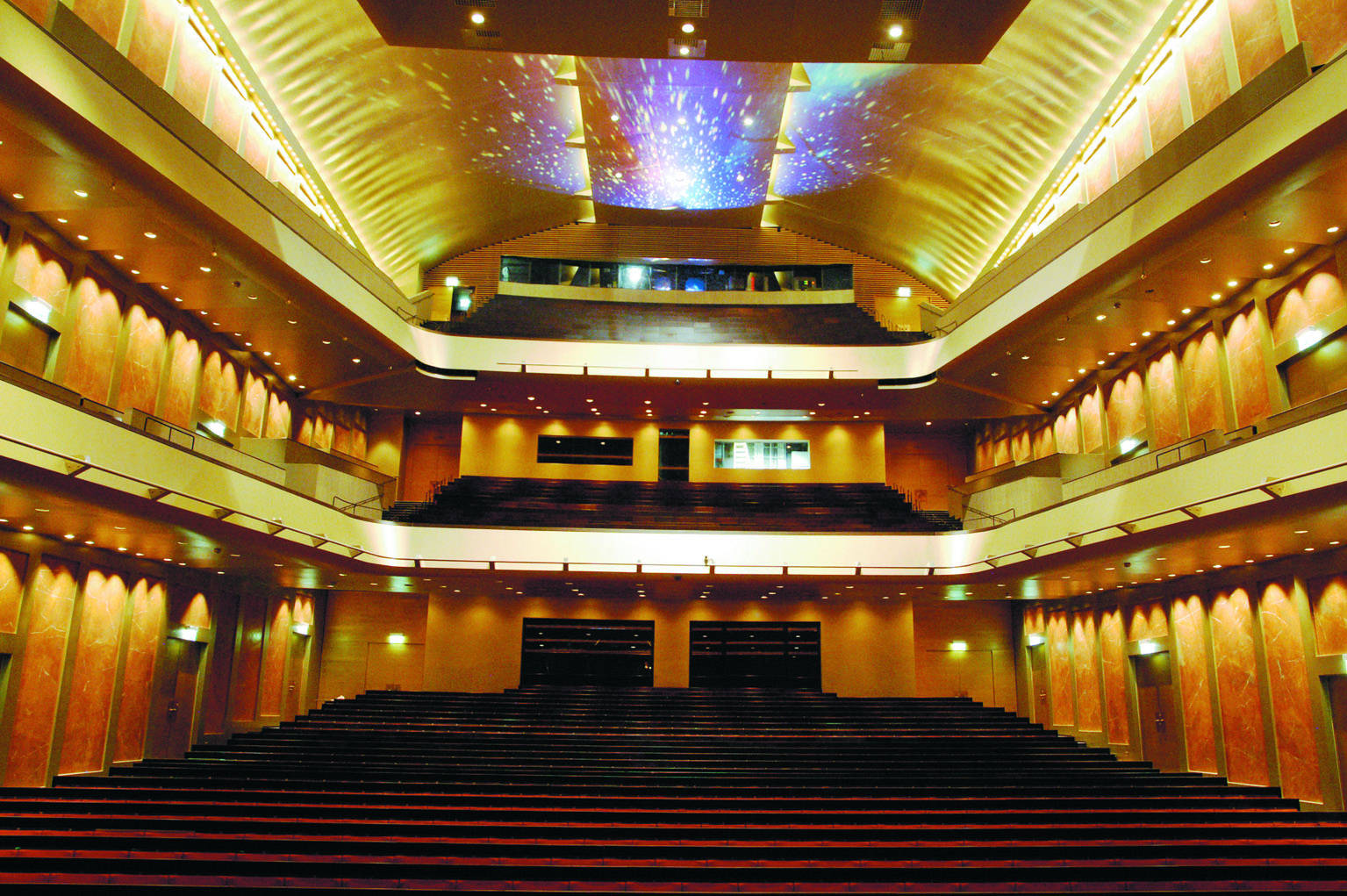
During the course of time, theatre buildings became a distinctive mark of civilization progress even in rather petty towns together with the railway. Theatre as an institution and monument of citizens self consciousness were spreading towards east in Europe together with industrialization, growth of the cities. In the Austria Hungary, such a demand was partially covered by the work of a famous architectural atelier Fellmer and Helmer, who created over 50 theaters all over the central Europe. These lavish theatre buildings mirrored the self-confidence of townsmen, seated in the boxes, where they consumed their high culture. The upper balconies above the boxed tiers offered participation on the event to lower classes. Similarly, distinctive theater architects emerged as Frank Matcham or Charles John Phipps in England, Martin Dülfer or Carl Moritz in Germany. In many cases, there were separate entrances for different sorts of audience.
To consider the importance of the theater as a community center of local society, one might just read novels of the 19th century as for instance Honoré de Balzac to realize, how much of the life of the society used to take place there. The theaters were built in a lavish style and often served as a landmark in the city. The boxes
« facilitent à chacun d’aflîfter au spectacle , suivant son rang ou ses moyens , & de s’y rassembler avec ses compagnies ou ses sociétés ordinaires. «
PATTE, Pierre. Essai sur l’architecture théâtrale: ou De l’ordonnance la plus avantageuse à une salle de spectacles. Paris, 1782. p. 165
One of the important milestones in the development of nationalism was spreading of literary form of the vernacular through theatre, in some cases leading to establishment of a “national theatre” that might have became a key narrative of national discourse as happened in Bohemia. The theater thus carried important meaning for all the classes of society that had only little relation to actual art.
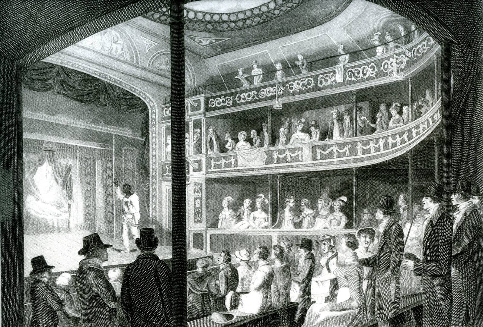
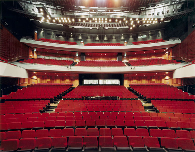
Partially in England, where theatres always relied on commercial attraction much more than on support of the local aristocracy as was common in continental Europe, were boxes slowly disappearing and replaced by open balconies. In industrialized Europe, the association of opera with wealthy society caused tension in the democratic and socialist counter movement. The theorist sought to open the art to larger public. In a symbolic sense, it meant to refuse the old settings where some spectators are more noble, which is reflected in the rank they are seated in. To make all the visitors equal, to be democratic, also the space had to be adjusted to it. The first theatre of the so called first theatre reform was built in Bayreuth in 1876 at the incentive of Richard Wagner. Such stance became overwhelming after the disruption of old style society after the First World War. The audience is no longer separated in semiotic aspect of the rank in the society, only by the price by which the spectator is seated closer or farther from the stage and segregation in other areas virtually disappears.
Even in the present days, the type of theatre structure (and genre of course) define to some considerable extent the audience that came to the performance.


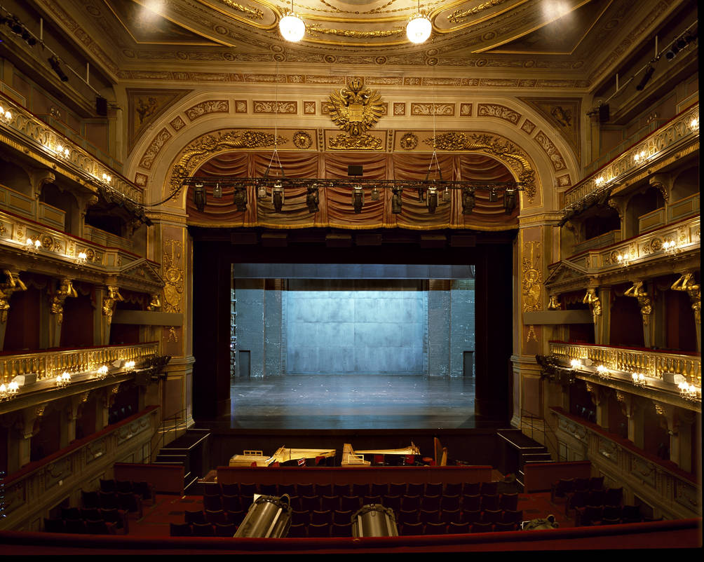

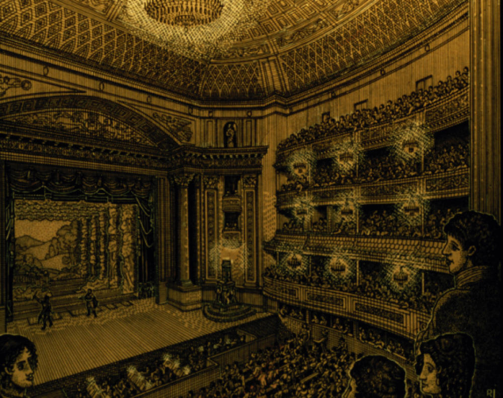


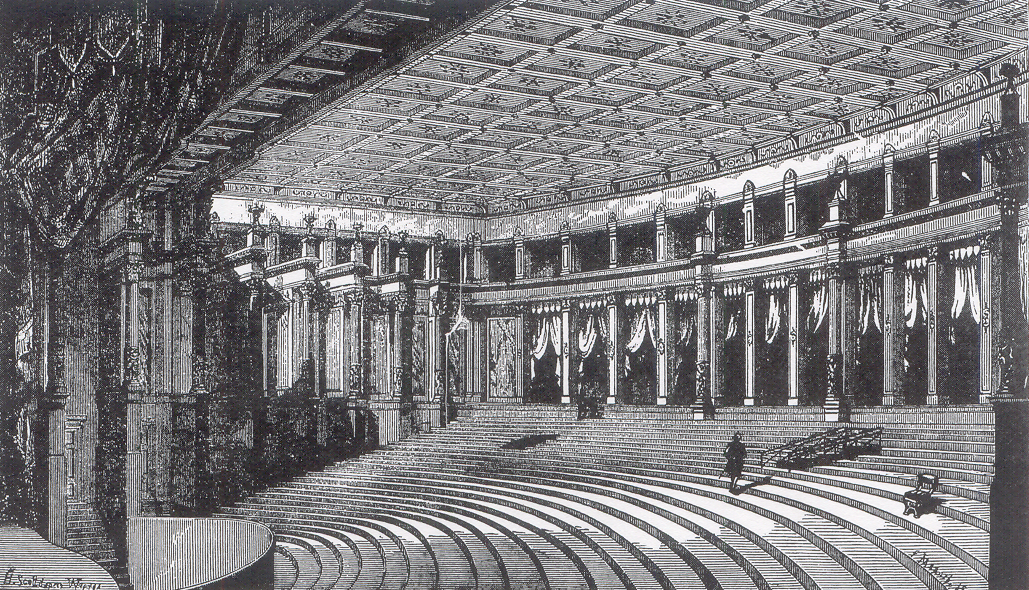


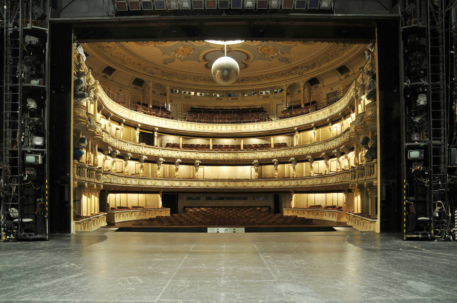
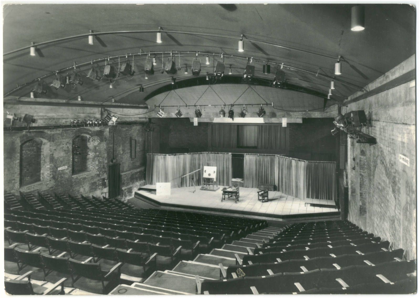
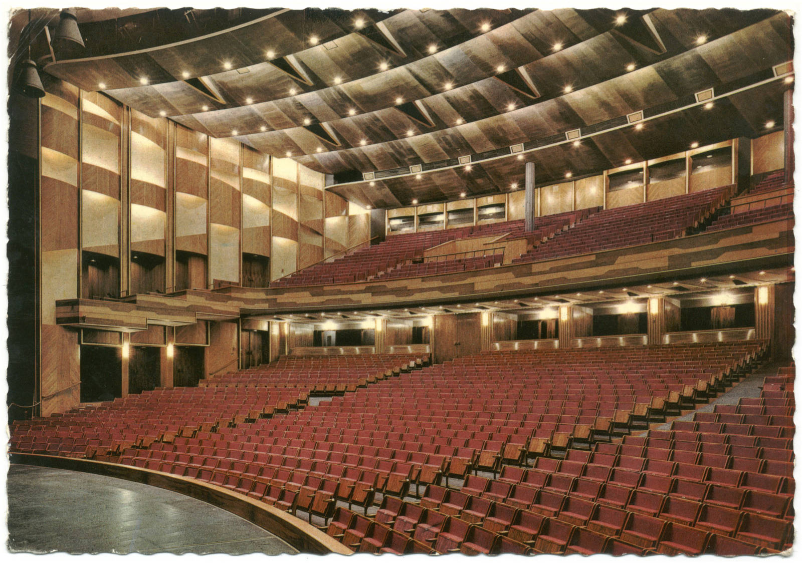
The so called proscenium stage theatre type remained the main type of theatre space layout up to the middle of twentieth century. One of its key characteristics is the proscenium arch, a frame that opens a look through to another dimension, to the world in a scene on the stage. While this type with the so called reformed auditorium is still being built, the search for artistic expression influenced the theater space further. The economic development that brought unprecedented levels of wealth changed not only the construction possibilities of new materials, but in the first place brought new approach of individuals to society. Avant-garde theatre, experiments substituted the fixed form of former theater genres.
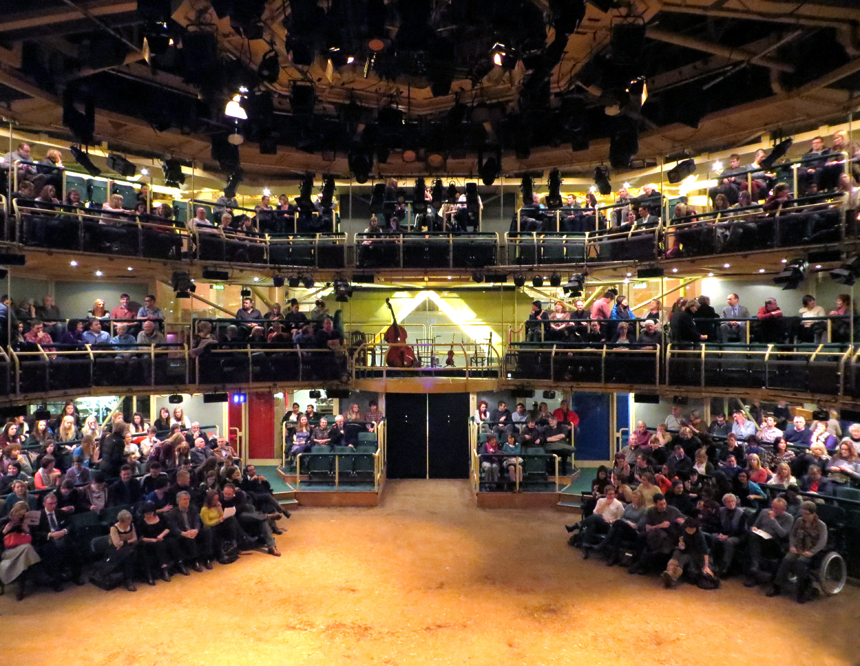
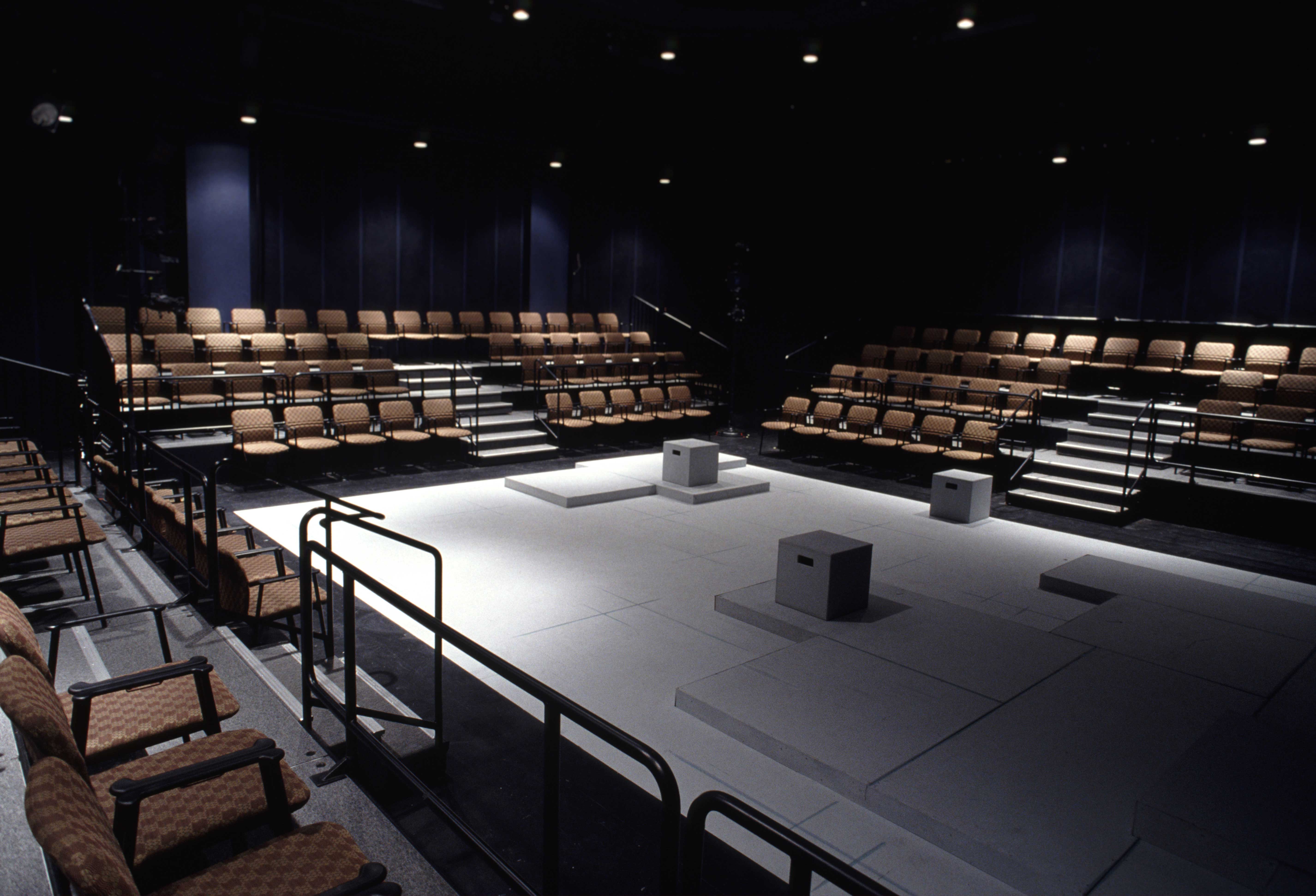
Similarly, the so called traditional society, of which world was so splendidly mirrored in the theater buildings, gradually died out, conquered by a new world. A trust stage theater started being built, similarly theater in the round after the Second World War.
The cultural revolution was highly perceivable in the 1960s and together with it, a search for shaking the chains of the theater space, to which this art was attached to. The large theaters remain operational for staging drama, ballet and opera, but a large number of smaller theaters came into existence that offer more closer contact between audience and actors. But there still remained distinction in space that separated audience form actors. That was even more distorted with the stress to site-specific theater and new experimental theater forms that strive to overcome the distinction between stage and auditorium. So, the variety of spaces is widened and in a way each space also accommodate its genre.


3. Perception
3.1 How do we see?
Light influences the perception of space considerably.


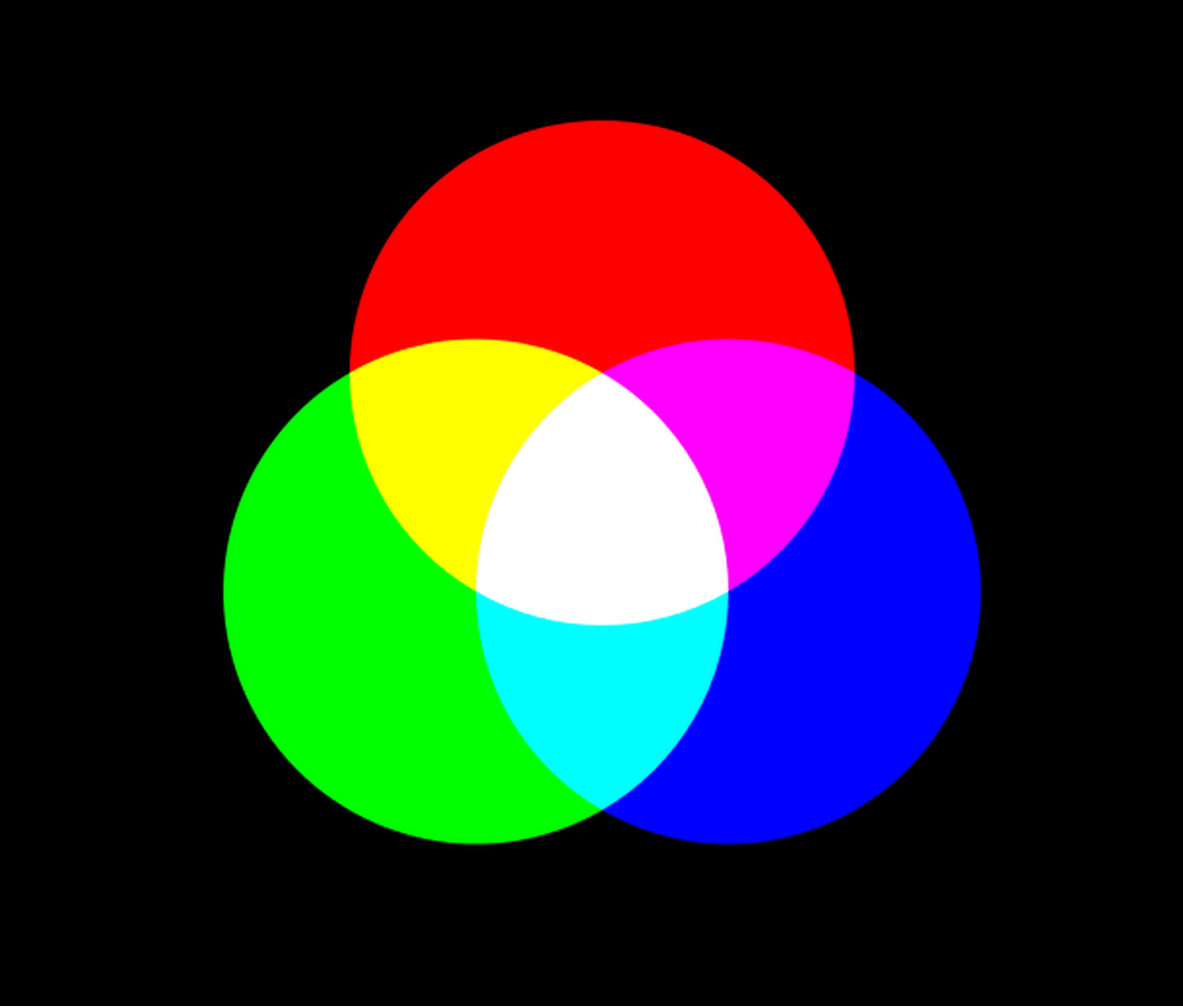
Light as we know it is just a small part of a greater phenomenon known as the Electromagnetic spectrum. For the human eye, the visible spectrum is between 400 nanometers (nm), which we perceive as the violet color, to 700 nm, which we perceive as red. Each color in the visible spectrum conforms to a wavelength of the spectrum.
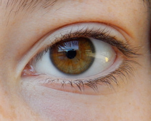
So how do our eyes perceive red, yellow, green or any other color? Is it just by seeing a wavelength? In the back of our eyes, in the retina, we have photosensitive cells. These cells are named rods or cones. The rods are responsible for sensing light intensity and the cones for distinguishing a color.
There are three sets of different cones in the retina and they perceive the wavelengths red, blue and green. If we see the color yellow then the eye receives the equal stimulation of the red and green receptors. Therefore we see yellow.
The human eye is adapted to seeing things under the light of varying degrees of brightness. Sunlight, moonlight or even starlight, the human eye can change the size of the pupil to adjust to the brightness that is available at that moment. However, not just the pupil alone governs the functioning of the eye. Certain other visual systems control the way the eye works. And two systems in particular are responsible for this so called ‘color fade’ in the evenings and nights.
These two systems (aka two photoreceptors in retinas) are called the cones (color receptors) and rods (light receptors). The cones work best under bright light, can see color vividly and can focus on fine details effectively. The rods on the other hand are sensitive to light and can only see light and dark. They cannot see any colors or differentiate between them. The rods would need to borrow light from the other parts of the eye to adjust vision and so, cannot focus on fine details like the cones.
Now, try to understand what exactly happens when the lights dim and the colors start fading. The cones respond better to yellowish light and so find it difficult to function under the receding light, passing on the responsibility of vision to the rods.
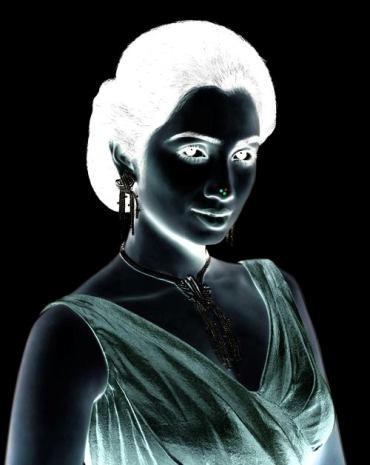
Colors are not an attribute of things as such, but they are recognized in our brains, though a color is based on a feature of a given thing. The things in the world don’t have its own color, but one of their attributes is to absorb some wavelengths while reflect others. Black object absorbs the entire spectrum, while white one reflect all of it. There is no color, when there is no spectator. All the things are actually black and white and the color of things is a result of reflection of light in combination with the composition of the surface. Therefore objects can have different colors when lit by a specific type of light.
Some retinal cones are sensible to longer waves of light radiation, so red stimulus is perceived, while others are sensible to other lengths. The final shade colors are determined from the pool of perceived stimuli on cones and overall distribution of them. The human eye is trichromatic that means that this system is based on recognition of three types of stimuli according to the length of the waves. In accordance with overall distribution, the resulting image is roughly of the same proportions as the distribution of stimuli at the cones.
Receptors in the human eye are sensitive to the light of wavelength between 380 to 780 nm. If only one type of receptors is irritated, the perception of a basic color is achieved. Irritation of more receptors cause the perception to see shades of colors or white in dependency on overall distribution of impulses in the eye. If there is none irritation whatsoever, black is perceived.
The sensitivity of the eye towards all the colors isn’t equal, the retina can adjust itself to higher or lower levels of luminosity. The sensitivity is maximal for the color of wavelength of 555 nm that is yellow green and corresponds to the center of visible color spectrum and to the fact that the sun emits most of the energy at this wavelength of 550 nm. When the eye is adapted to dark as happens in the night, the sensitivity is shifted and colors differ only by their brightness and most bright seem to be wavelength of 500 nm, which corresponds to blue green color.
Rods in the eye detect the perception of intensity of light, i.e. brightness and luminosity and so providing further indication and dimension to the sight.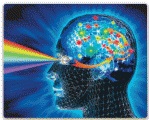
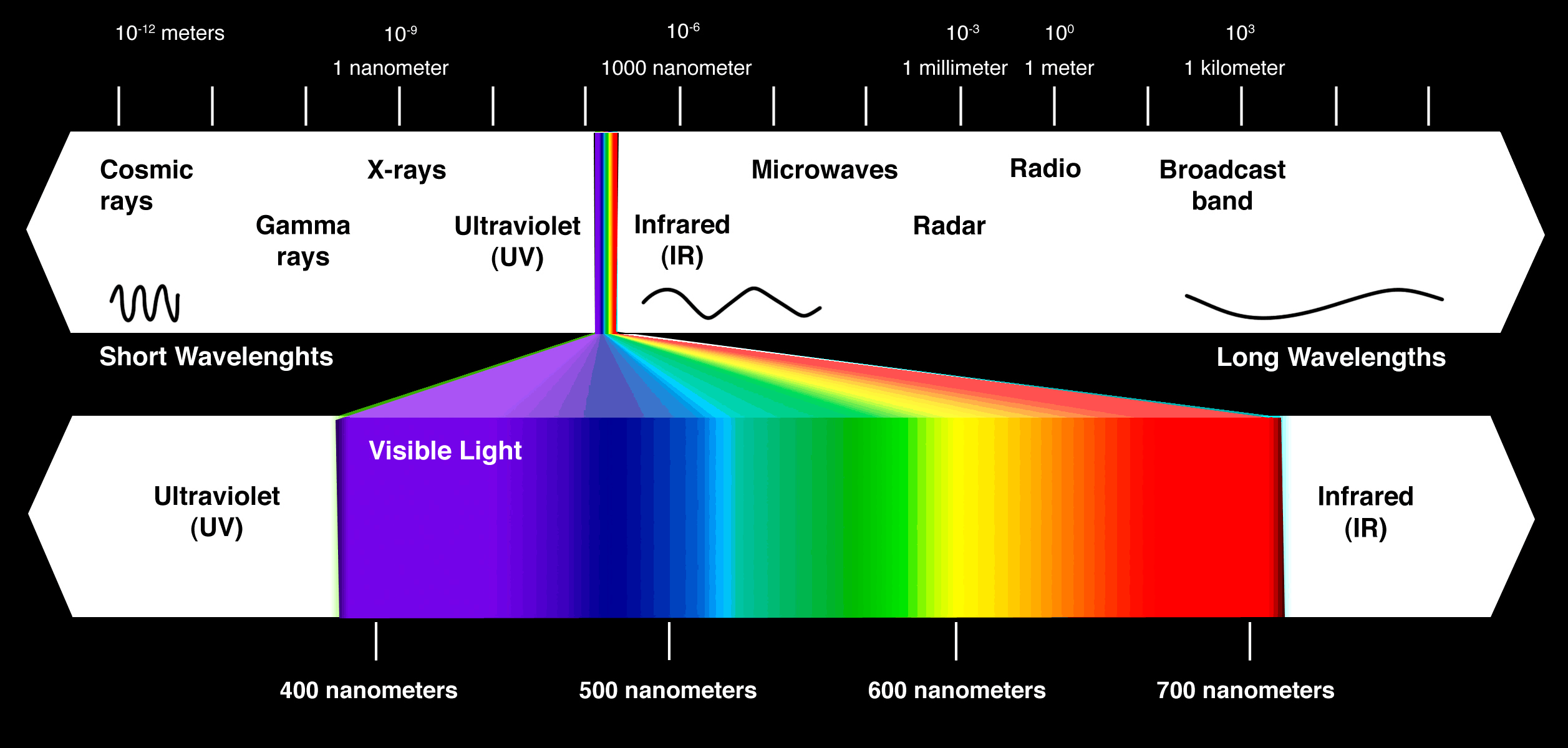
Electromagnetic spectrum.

3.2 Contrast
The sight has the capability of adjusting itself to the given environment and as
the process cannot be completely up to time in the real world, it creates some
effect that can be used in the art of lighting.
Adaptation


Accommodation of eye occurs not only when focusing towards a closer or farther object, but during observation of colors as well. The more two colors are farther from each other at the spectrum, the more exhausting it is for eyes and brain to watch it.
Furthermore, sight adapts to intensity of the light as well. In common experience, we are aware of this process when the intensity of light changes dramatically, for instance when we enter dark cellar on a sunny day and we have to wait for a moment until the sight adjusts itself to the new condition. Adaptation to dark is much slower than to light. The duration of adaptation depends on how large is the difference in intensity. Sensitivity of an eye to individual colors is variable and is dependent on the intensity of light. The change in intensity of light causes the change in intensity of colors.
Objectively, the degree of illumination has a great influence on the intensity of color quality. In order to prove this most vividly, take some colors before daybreak, when it begins slowly to get lighter. Initially one sees only black and grey. Particularly the brightest colors, red and green, appear darkest. Yellow cannot be distinguished from a rosy red. Blue became noticeable to me first. Nuances of red, which otherwise burn brightest in daylight, namely carmine, cinnabar and orange, show themselves as darkest for quite a while, in contrast to their average brightness. Green appears more bluish to me, and its yellow tint develops with increasing daylight only.
The appearance of any one color is influenced by the presence of other colors.

Green inside lighter green

The same green within darker green.
Contrast
contrast (subjective sense)
Subjective assessment of the difference in appearance of two parts of a field of view seen simultaneously or successively. (Hence: luminosity contrast, lightness contrast, color contrast, simultaneous contrast, successive contrast). (CIE 45-25-265)
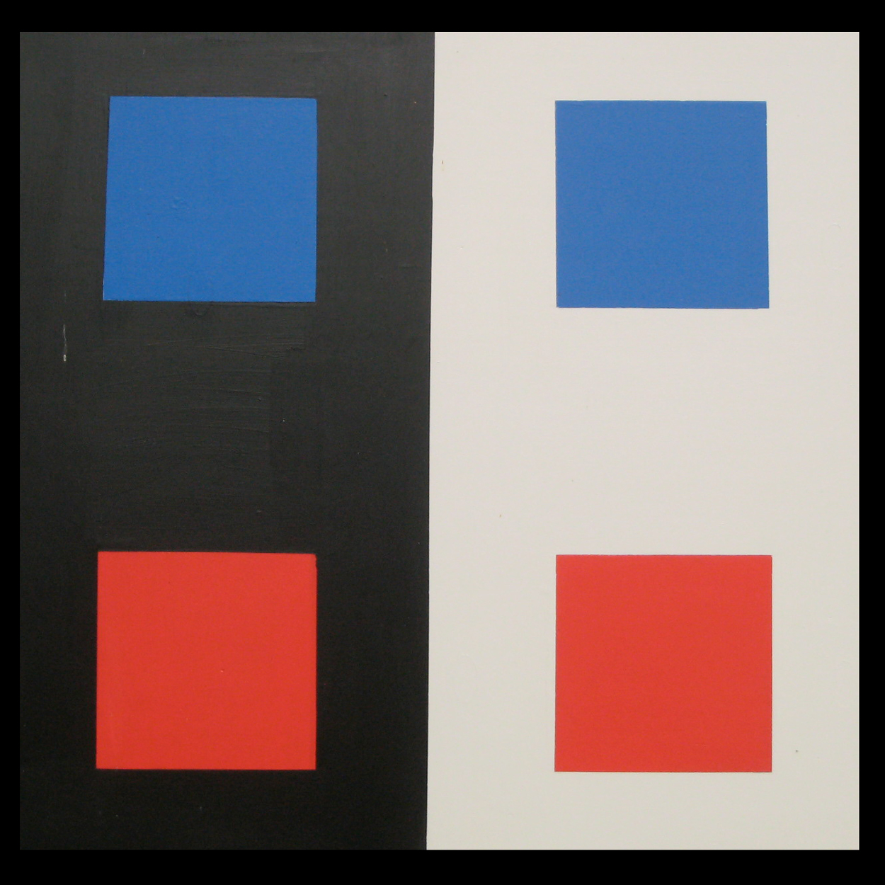
One of the main tools of our brains is to tell the difference – to perceive a contrast, to create binary oppositions out of contingent (analogous) world, to think in them. In such a way, the colors are perceived more intensively when the degree of the difference between them is higher. That happens with white and black and with complementary hues. In the RGB model (see lesson 2), these are yellow with blue, red with cyan and green with magenta.
In a figurative manner of speaking, each color strives to induce its complementary color in its surrounding. That happens at once at several levels of its description.
Each color in the spectrum has its own complementary color. Together, they have the most distinctive effect on the perception. The sight counterbalance any color with its complementary one. When the complementary color is not present in the image for a certain period of time, the brain inserts it into it.
The brain can misinterpret the received data from the sight and compose an image that does not correspond to reality. This sheds light onto the way of how the process of visual perception works. It has a relation to the fact that the sight get weary in course of time with respective colored light.
This condition causes several effects:
A more bright area that is located within darker surroundings appears to be larger and vice versa a darker are located within brighter are appears to be smaller.
If white background is used, everything else seems to be darker due to contrast effect and so actor’s face seems to be less distinctive.
Contrast might have a psychological impact. Low contrast is rather calming, whereas high is rather disturbing.
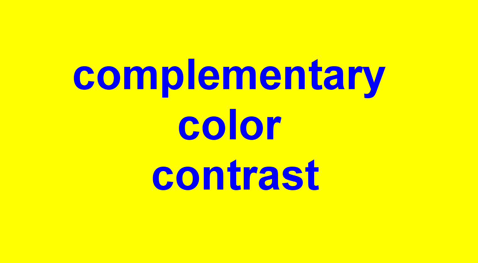
Complementary color contrast
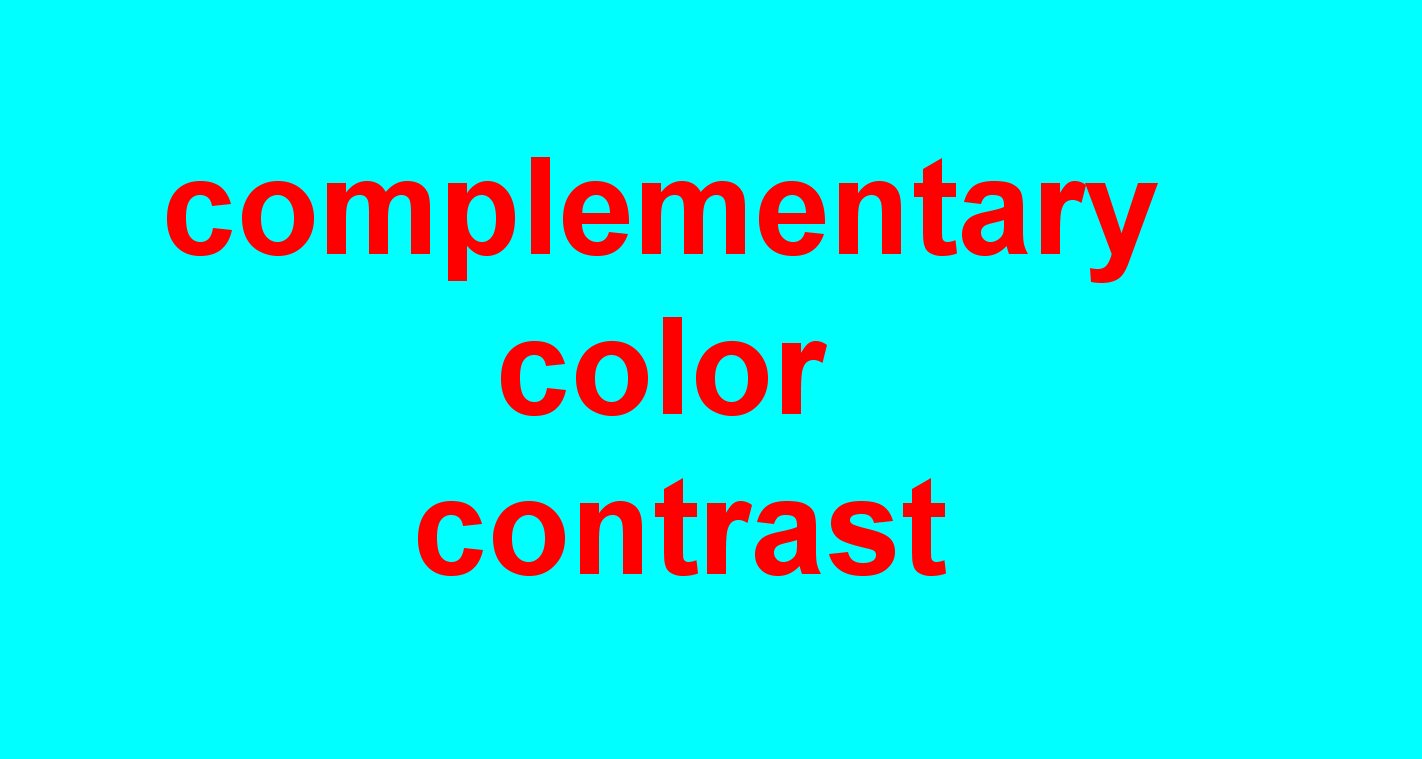
Complementary color contrast
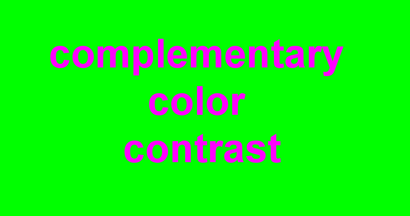
Complementary color contrast
The opposite color in the model that forms white when combined is the complementary color.

Color contrast
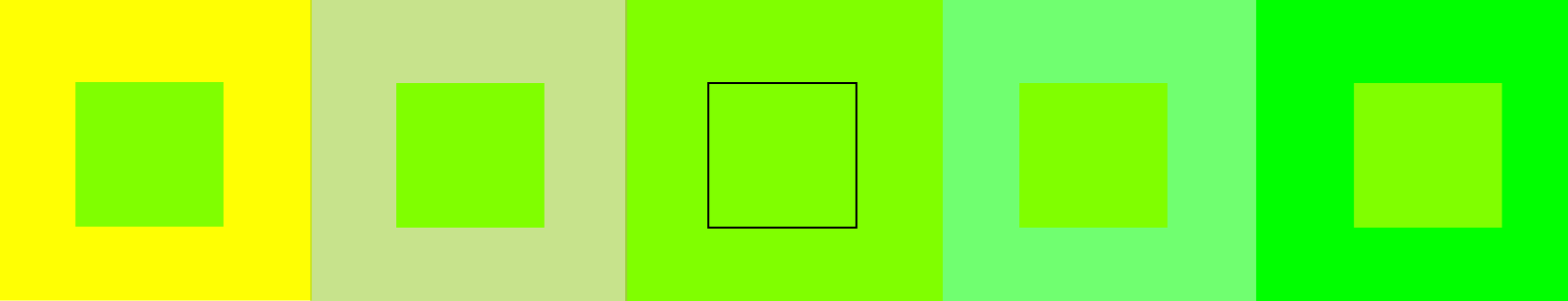
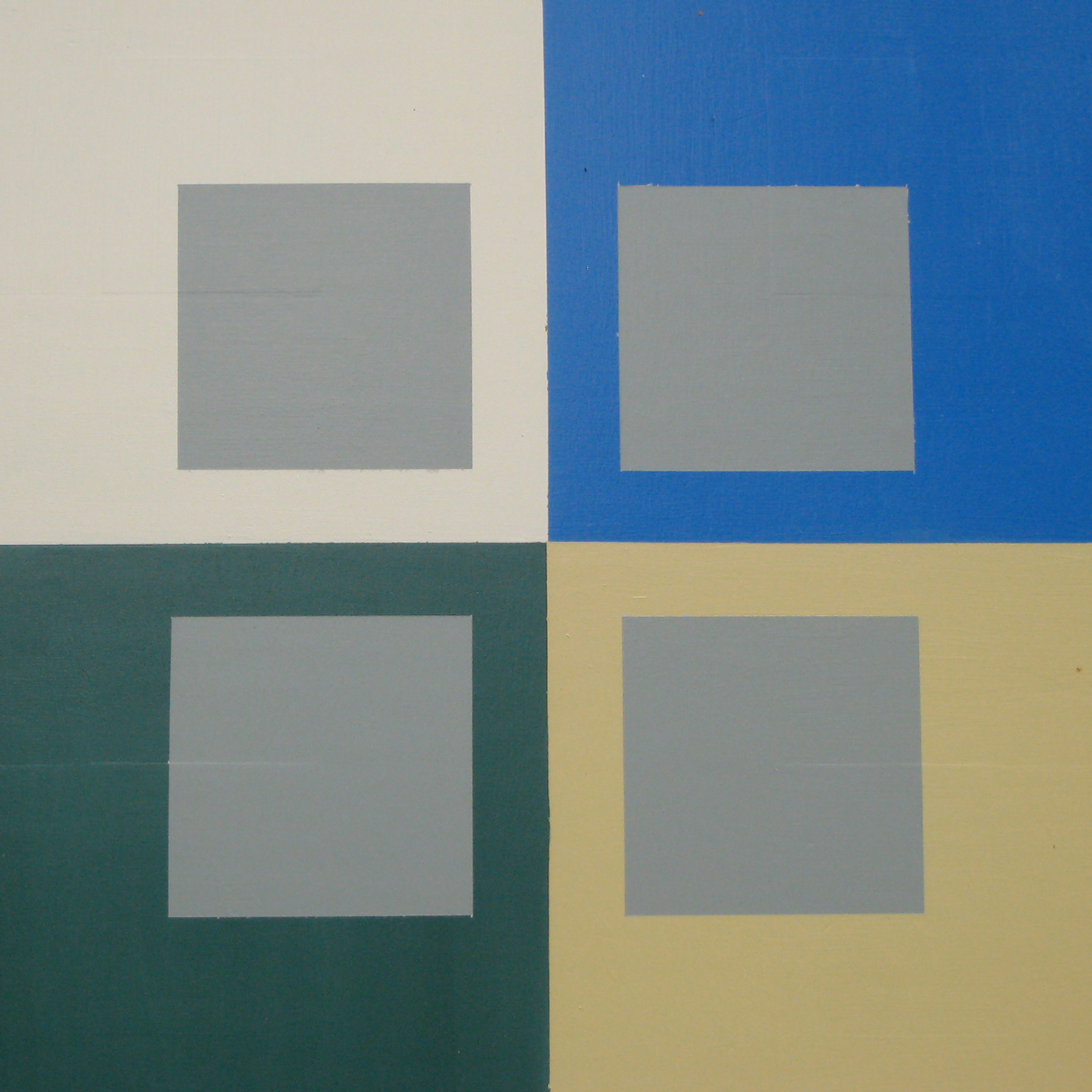
The large squares represent specific points in the color spectrum in the section of wavelengths between yellow and green. The smaller square is of the same hue as the middle large square. Obviously in the middle, it has to be bordered even to be recognizable at all. At brighter and more yellow background, it rather appears to be darker and vice versa, at darker and greener background, it rather appears as brighter. As the cones can distinguish three basic colors that are wavelengths of low, middle and high frequency, it come quite natural that the lesser the distance between the hues at the visible spectrum, the lesser the perceived contrast.
Lightness contrast
Lightness contrast is a difference in brightness. It may be one hue that is saturated more or less with black or white. Bright hues reflect more light than darker hues. This contrast works with the chromatic and achromatic colors as well.
Naturally, white is the brightest color and black the darkest one. So they represent the highest possible contrast, which is the reason, why they are used a lot for visual communication especially in printing. The black is perceived as most dark when used in white surroundings and similarly, white color is brightest in a dark surroundings.
The hues differ with their natural brightness and each of them corresponds to a level of brightness on the scale of black and white. Between the basic chromatic colors, the highest contrast is between yellow and violet. The brightness of green and red is roughly the same.

The middle stripe remains of the same color. However, in the darker surrounding appears to be brighter whereas in the brighter area appears to be darker.
Saturation contrast
The image is a saturation scale of red that is crossed by red of roughly medium saturation. Here, the similar interdependency of a color appearance manifests itself. At the more saturated background, the central strip of medium red rather appears to be more grey that with the less saturated background.

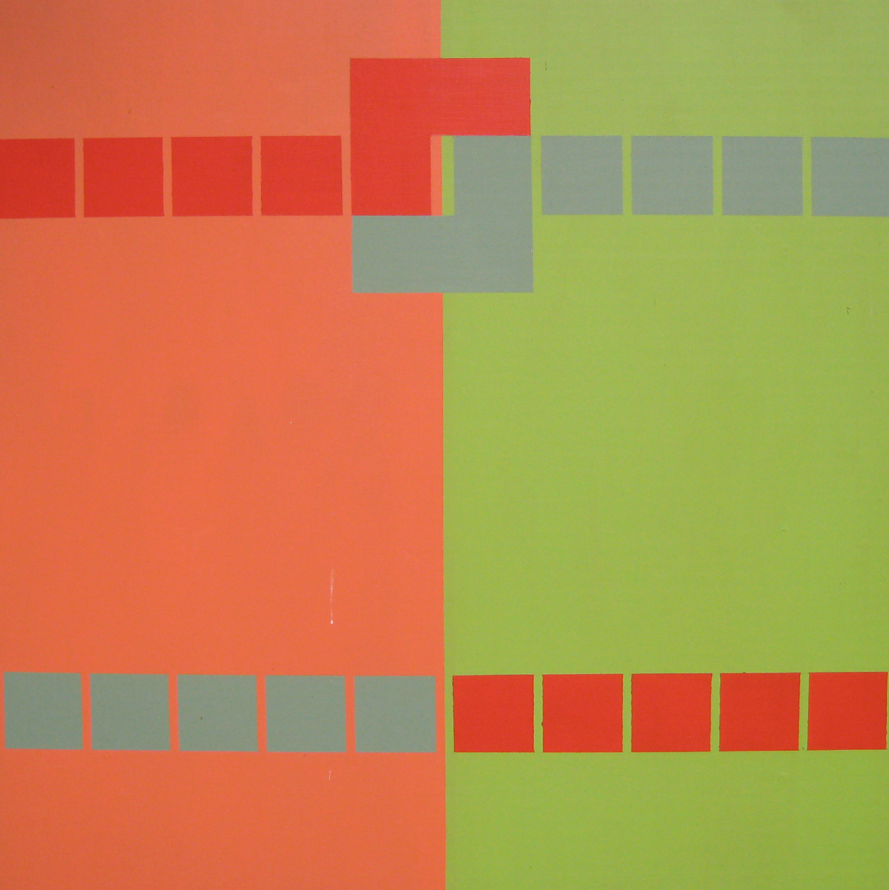
3.3 Warm and cold contrast

Warm colors are red, orange and yellow.

Cold colors are green, blue and violet.
The distinction between warm and cold colors is not based in the nature, but in the culture and perception. It seems that colors can induce feeling of either warmth or cold. Cold colors can calm down, whereas warm can stimulate activity. Such perception is subjective.
Warm colors are red, orange and yellow. So the warm colors are rather to be perceived with attributes as activity, joyfulness, excitement.
Cold colors are green, blue and violet. Cold colors are perceived with such attributes as passivity, sadness, peace.
Colors can also have a spatial effect for perception: Warm colors seem to advance, whereas cold colors recede in the space.
Individual perception of warmth or coldness is influenced by the intensity of light. During a bright day, colors appear to be warmer than in the darker areas.
Comedy would prefer warm and bright colors, whereas tragedy would incline to cold and dark ones.

All the letters are the same, but the their color induces various visual perception of their position.
cold colors recede
cold colors recede
Warm colors tend to advance
Warm colors tend to advance
3.4 Successive contrast
Successive contrast refers to the process of adjusting the eye to a situation. If we keep our sight aimed on a given color, the eye adapt itself and intensity of color seems to be gradually reduced. If the sight is shifted after a certain period of time to white surface, a pseudo color would be seen there. If the surface is colored, a mixture of a pseudo color with the real ones occurs. To put simply, the sight perceives the colors even when they are no longer there, there is delay in adapting to a new condition. Successive contrast emerges for instance when sight shifts from a colored area to the white one.
There are several effects:
If you focus your sight into light of a bulb and then subsequently turn away from it, a black spot is seen that is a negative image of what has been seen before: an afterimage emerges, is being altered and disappears.
If a given color is watched, then the intensity of those components, from which it emerged, is reduced. The non applied color would be more intense at the same time. Thus for instance with longer observation of red, some green shades appear. The sight reacts to strong irritation by red with the complementary color, which is green.
Another contrast situation can happen with saturated colors. The sight gets weary when exposed to it for a certain period of time, so its sensitivity is reduced and compensates the disproportion with complementary color. The difference in color rather depends more on brightness than on the shade of color. The same impulses produce the same senses, but different perception.
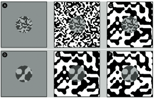
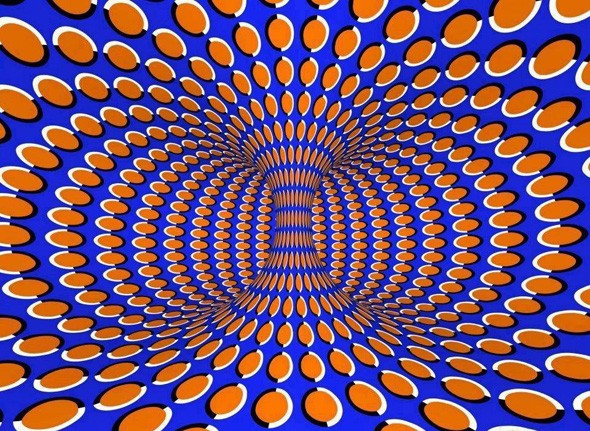
Chromatic adaptation is one aspect of the sight that may fool someone into observing a color-based optical illusion.
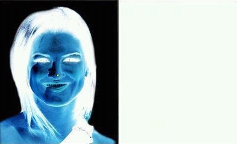
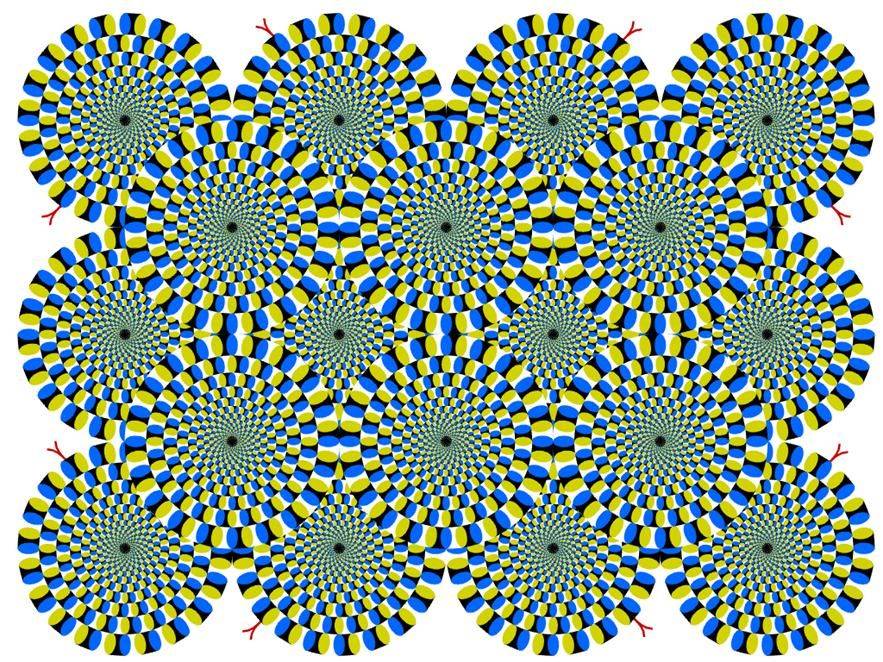
An internet meme, based on the effect of the successive contrast. Staring for half a minute onto the dot on the face and subsequent shift of the sight to the blank section creates an optical illusion.
3.5 Simultaneous contrast
Simultaneous contrast is based on the very same foundations of sight characteristics. Every color creates complementary colors in its surrounding. In this way, the sight tries to compensate the predominance of the given color impulse by creating a complementary one.
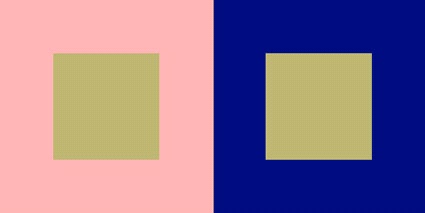
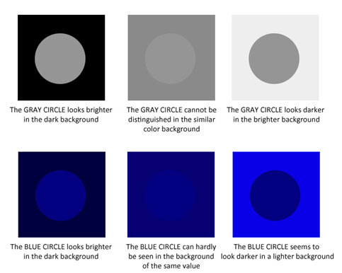
An example of a simultaneous contrast is when a grey square on white surface seems to be darker and vice versa seems to be brighter. Similarly, a grey square on a red background seems to be colored with a complementary color and thus to be tinged a bit with green.

After a certain period of time.

Chromatic induction. Grey square within purple attains a yellow tinge, within yellow square attains a complementary purple tinge. The same works with complementary red and green and complementary blue and orange.

Simultaneous contrast

When a color is surrounded with a darker color, it will appear lighter in comparision with being surrounded by a brighter color.
The perception of a color is influenced by the surrounding hue as it shifts the color towards its complementary hue.

If a colors is surrounded with a less saturated color, it would appear more saturated and vice versa.
Effects
A more saturated color should be used in a smaller area than the colors with lower level of saturation.
As the sight is most sensitive to white, yellow and green, when used on large surface, there might occur a possibility of sight fatigue that impedes the concentration.
Even shadows can be composed of a mixture of colors. As a base, all shadows contain blue, a local color in darker tone and a complementary color.
Other illusions:
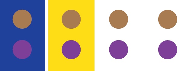
The color of surrounding ambient affects the perception of colors. All foreground circles are of the same color, which is perceived differently in relation to the background color.
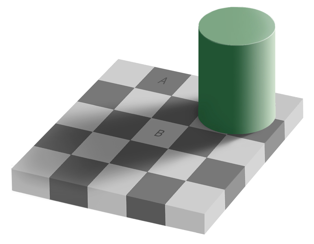
Checker shadow illusion. Areas of the image A and B are of the same color.
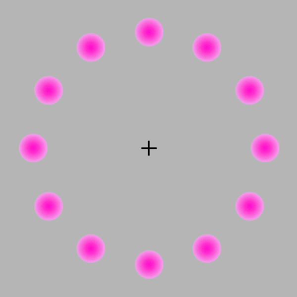
Lilac chaser visual illusion.
When one stares at the cross for about 20 seconds , one sees three different things:
- A gap running around the circle of lilac discs;
- A green disc running around the circle of lilac discs in place of the gap;
- The green disc running around on the grey background, with the lilac discs having disappeared in sequence.


4. Cultural perception of colors
How do we see and perceive colors?
Relativity in perception of colors
color (perceived)
Aspect of visual perception by which an observer may distinguish differences between two fields of view of the same size, shape and structure, such as may be caused by differences in the spectral composition of the radiation concerned in the observation. (CIE 45-25-130.1)
Animals can play games and can also see colors, which might be beneficial for them in itself in many instances. In comparison with humans, the vast majority of them is dichromatic, which means that their sight is based on recognition of two colors. Among other, coloration as a strategy of survival in a given environment, a camouflage in other words, or as rather a mating strategy (peacock) is one of many examples of how important the colors are in nature. Colors might be an indicator of health as well and thus serve as a factor at the mating market. Pale color of skin might indicate some health issues. Some colors of dress increase or reduce the perceived sex appeal.
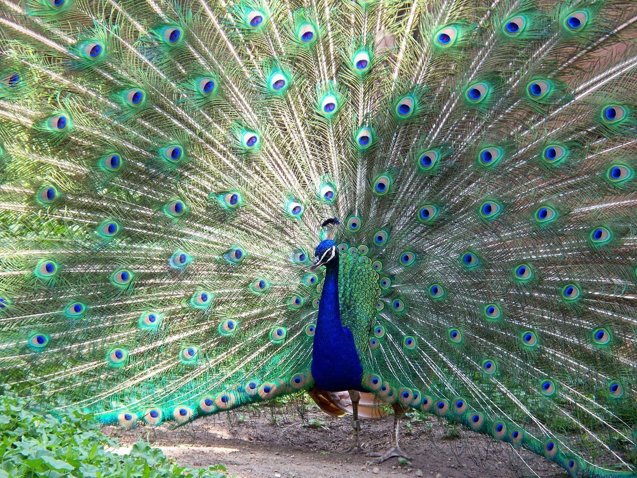
Colors as a part of mating strategy. A peacock in Milwaukee County Zoo.
We may fairly presume that there are differences in perception between individuals on the physical basis of their bodies, there is confirmed difference in cultural recognition of what is to be distinguished as a separate color. Some cultures omit recognition of some colors. Well known is the case of Eskimos who have many more names for various shades of white than any other ethnic group. Of course, their living environment is formed of an area that is covered with snow for the larger part of the year. On the other hand, some dialects in central Africa don’t distinguish blue and red. Only a fraction of colors that can be perceived is named as well.
As much as general conditions concern, the human sight is sensitive at most to the wavelength of about 550 – 555 nm, which corresponds to the yellow – green color. For that reason, people tend to distinguish rather a larger range of shade in this specific range than in other sections of the visible spectrum. But the main factor of perception lies in the fact that it is relational. Human mind always sees a whole. As the colors are an inner phenomenon, although based on qualities in things, there has to be admitted that not only people doesn’t see the same colors, but that their perception varies in the course of time as well, that is determined by previous experiences as well.
The colors or light might acquire cultural meaning that is, they may become a symbol. That is a named phenomenon that represents a complex of thoughts and attitudes of a man towards something in his world. The symbols live longer than those who use them and are largely determined by the culture.
Before the age of technology, not that many shades of colors were available to man. Among the first pieces of art, there was stained glass in many churches that was one of the tools to induce the feeling of the divine presence at the place. To get colorful clothes was actually quite an expensive thing at that time. Before the industrial revolution, when clothes flooded markets, the fabrication itself was rather expensive. Not the say, coloring of them. And similarly as in the present days, the visible thing, about which is clear that it is expensive at the first sight, becomes a display of the status: even with no previous experience, the one who meets a rich man has no complication in realizing that this one stands at the higher level of the rank in the society. In the present day, suits and cars might serve this purpose. In the ancient Rome, the Toga, a white dress, forbidden to women, serves a similar purpose. In the sixteenth century Bohemia, the relative richness of the peasant and townsmen class permitted them to start displaying the relative wealth not only with their immovable possession, but with clothes as well. And in the criterions of the age, the colorfulness o the clothes was the key feature of displaying the wealth.
In the middle ages, the nobility carried clothes of various colors, lower estates were to carry only gray and brown, however, with the social ascent of bourgeoisie, some of them were able to express the pretention for their high social status with their clothes, which was vehemently opposed by nobility. Many of the bans on wearing of such clothes have been preserved in the archives up to the present days. These laws against luxury contain a lot of information about perception of colors and light by the society of that time. Red color was reserved to prostitutes and executioners, yellow to heretics and forgers, green to musicians, jesters and fools. White and black were reserved for excluded people, poor, disabled and committed to God. The Reformation was fighting against worldly pleasures and so the colors were suppressed here as well. The puritans were perceived as persons, who were dressed in black and white, the scarcity of colors quite corresponded with their political and theological stance of many issues: the sober clothing was their trademark.
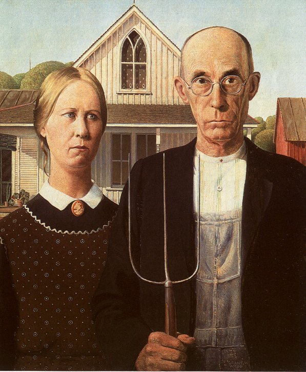
The world without colors is something, toward which Protestants refusing wordly pleasures inclined. American Gothic by Grant Wood.
The sight receives the stimuli from the outside world and transforms them into impulses for the brain. There, an image is composed not only of that what was detected in signals, but of what is expected to be seen as well. Therefore previous experience and culture are an underlying factor of seeing. Colors can be perceived and distinguished also due to the cultural heritage. To some considerable extent, the perception of colors is determined by culture. While we have little understanding for religious sensitivity of Middle Ages, some basic core metaphors, through which we understand the world around us, are dated back to this period.
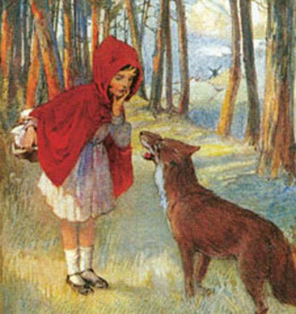
Colors appeal to the unconscious part of human psyche and forms a part of non-verbal communication. As one channel of communication, it might transmit a signal of social validity as for instance red cloth is attributed to sexual predatory as much as women concerns – strong red lipstick, skirt etc. (Little Red Riding Hood who is about to be hunted by a wolf as the fairy tale states.) For that, even little children are capable of understanding and can employ the symbolism of colors.
The colors are partially a social construct and therefore they can be manipulated and use to transfer a meaningful message to a spectator. That is naturally a point of interest to a lighting designer who can take these meanings into account while creating the visual atmosphere. The colors might or might not be read as a sign, it largely depends on the context and actually on the success of the communication process. To have semiosis happened, several factors are in play. Communication of the meaning might be a failure – the message hasn’t been understood. Let us take an example. For instance, the banks always wanted to give an impression of reliability so the people would store their wealth there. Ultimately, one of the strategies of how to avoid panic and bank runs consist in the appearance of a building, they have a seat in. A bank of the 19th century style would look massive and colorless to provide the wanted impact of respectability. On the other hand, amusement and celebration as not so serious parts of human activity are connected to its expression by colorfulness: at one side by a clown who attracts attention already by his costume of many colors to fireworks that are meant to provide impression that would induce amazement.
The preference of colors is in dependence of current trends in vogue and is related to social status: one possible explanations connects the diverse facts that in feudal society, pale skin was evaluated in the upper strata to be more trendy than dark skin, because usually people of lower social class worked under the sun and so a pale skin was a sign of wealth as neat hands. Nowadays, with the majority of workforce spending the time inside, the trend has been reversed, and dark skin is rather a possible sign of wealth as it might indicate luxurious vacations by sea. In Asia, the trend seems to be inverse. Shades of color of the skin are thus part of cultural universe, when understood, it becomes a cultural sign.
Colors have their place in society. Among other functions, the colors are connected to embellishment of human body in many cultures. Make up industry provides an astonishing number of products for women for their needs. Given the importance of sexual relationship in human life, is it a wonder? Interior designers or advertising agencies rely and speculate of the impact of various colors to influence or manipulate with mood and perception of the targeted population.
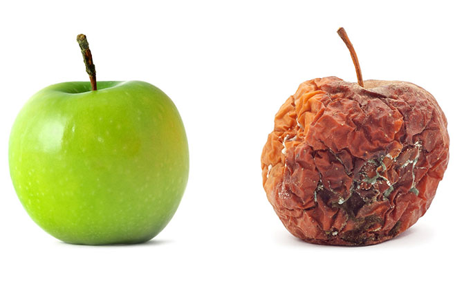
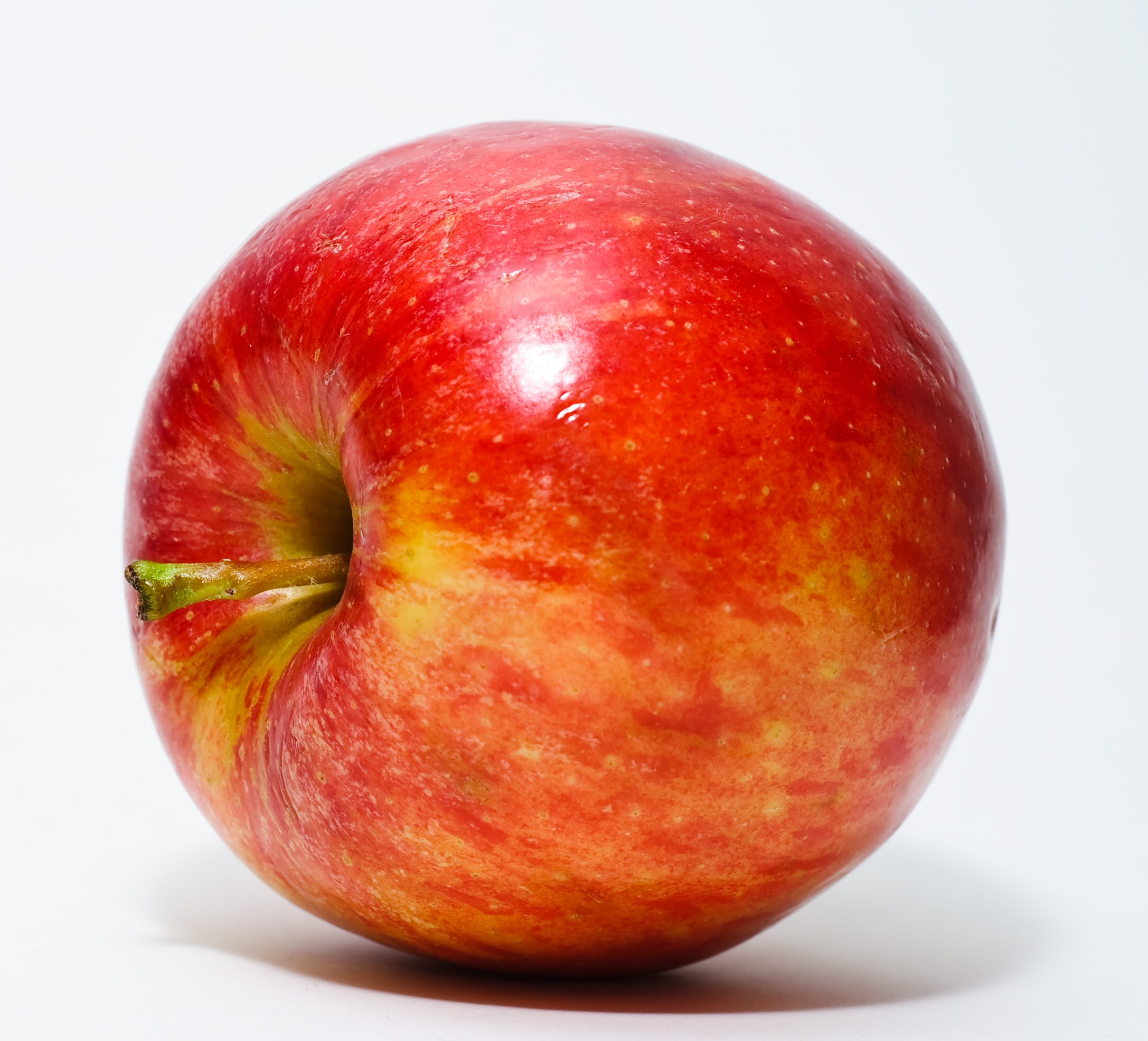
Green and rotten apple. Color cleary indicates the state.
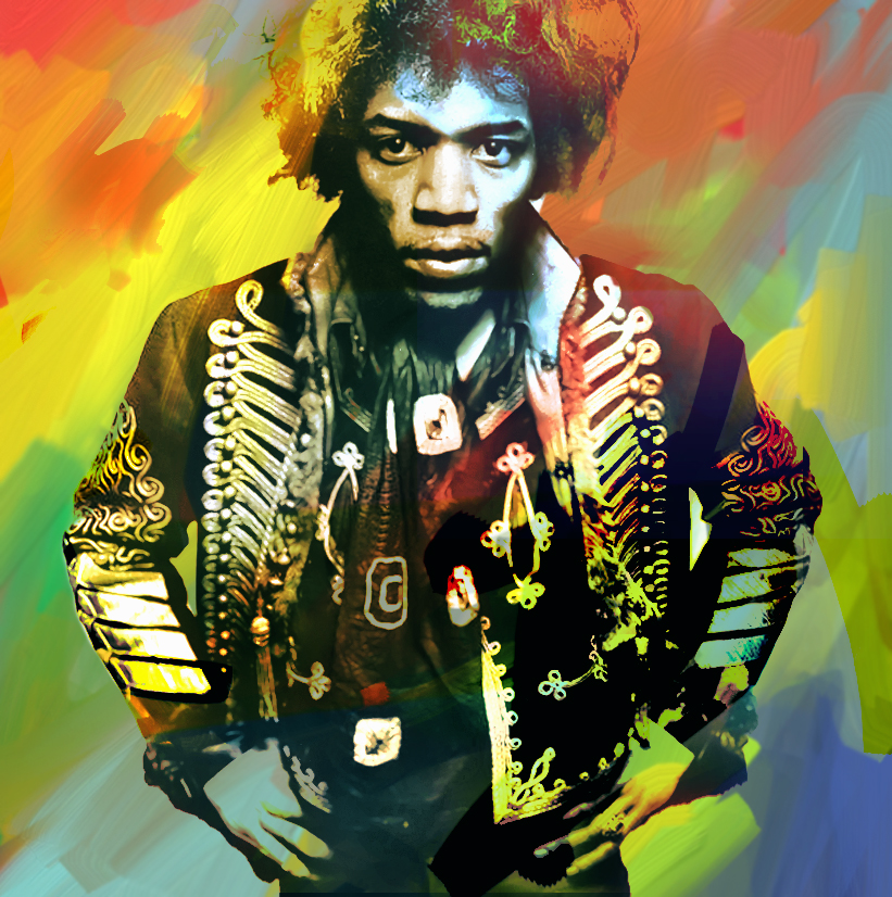
The world of hippies is full of colors. Voodoo Child – Jimi Hendrix.

Death is not likely to be depicted in colors.

A clown is not likely to be dressed in a gray outfit. Source: http://pixgood.com/happy-clown-faces-makeup.html
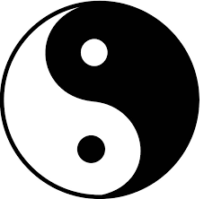
Jing and jang: a philosophical methaphor based on the light and its absence as two sides of reality.

Perception of colors often has a moral meaning as white is attributed to good and wisdom, whereas red to devil and dark in general to be a symbol for bad. It is done in a similar way as beauty is atributted to goodness and ugliness to evil. Source: http://nathanfriedlander01.blogspot.cz/2011/12/devil-wallpapers.html

An example of the usage of colors for communication.
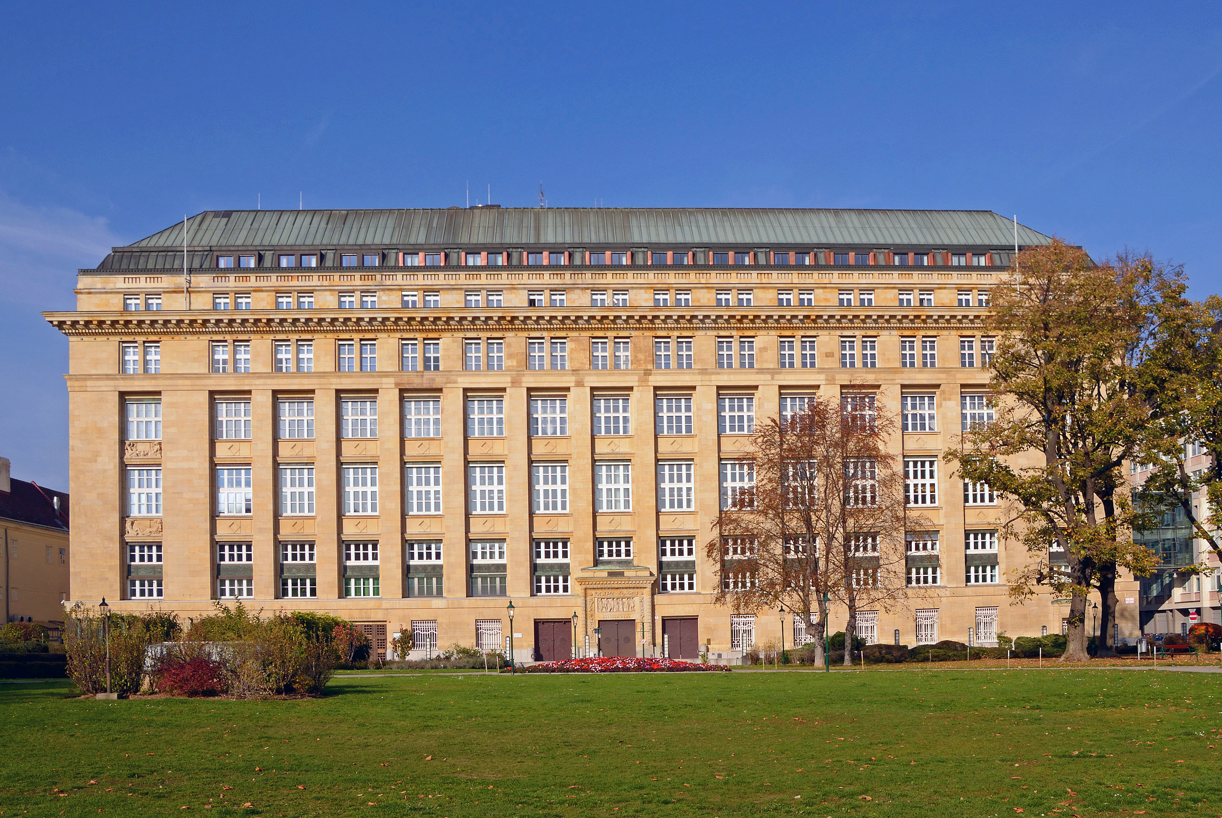
Austrian National Bank, not a place were a abundance of colors is to be expected. Photo by Heinz Winterleitner, source https://www.flickr.com/photos/heinzlw/10638093816/
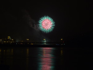
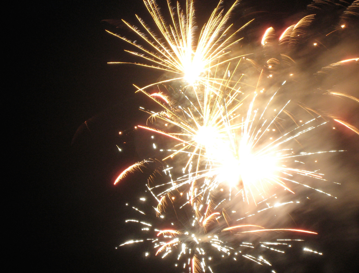
Important events are celebrated by fireworks.

A judge: scarcity of colors is a cultural sign implifiying that this is a serious issue.
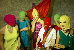
Pussy Riot: a rebellion against the regime would be rather colorfull.
5. Color symbolism
Colors also have an aesthetic and emotional impact.
Color symbolism in art and anthropology refers to the use of colors as symbols in various cultures. There is great diversity in the use of colors and their associations between cultures and even within the same culture in different periods of time.
The symbolism of colors is culturally determined and operates rather on an unconscious level and is actual only when semiosis occurs. The perception varies not only from one man to another, but develops in the course of time as well. Some meanings are rooted in nature and some in culture.
Given the impact of colors on viewers’ emotion, marketing strategies work with colors as one of their tools.
Such symbolism of colors is culturally determined as one can encounter different symbolic content in different cultures as for instance in China where for instance white stands rather for sadness in contrast with black in Europe, and red as the color of life. This perception varies not only in space but in time as well. However, many symbolic expressions are understandable for others and thus form a pattern.
The reactions to color differ not only among cultures, but among individuals. Therefore one cannot rely safely on the semiosis to happen as it is a matter of many variables, of which cultural background plays one of the key roles. There were many scientific surveys conducted that confirmed prevalent association of certain colors with their respective symbolical content within the public at some cases. According to Lüscher and other authors, the colors have a universal psychological impact. But do they? Many authors dared to enter the mysticism of colors that quite resemble astrology, of which testifies many available web pages. Given its nature, it is rather advisable not to rush with judgment.
Colors are a communication medium (a sign) with often settled connotations. It means that when used appropriately, it buttress the flow of communication and so the probability of understanding is enhanced. If not, they hinder the way for the desired message.


Distribution of colors in this chart quite follows their cultural perception in public.

A flag with colors of rainbow became a symbol for the gay community.
Again, the choice of colors in this chart is not likely to be arbitrary.
Also, religious pictures sometimes tend to link beauty with high colorfulness – a rather simple image of expected heaven.
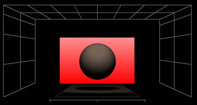
5.1 Red
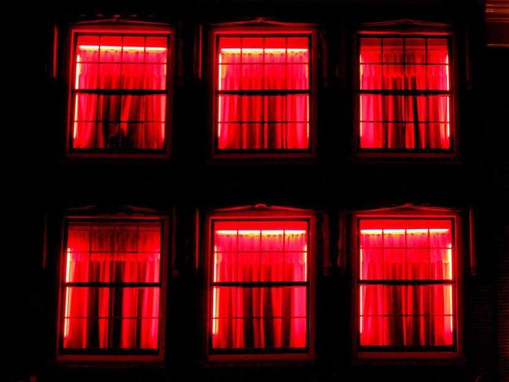
In nature, red is connected to blood, fire and is the color of the rising sun. It’s a warm color that optically protrudes in front of neutral and cold colors. Warm character of red could be intensified in red orange and fiery red. Red makes objects narrower in the space and seems to bring them nearer. When the sight is exposed to it for a longer period of time, it gets weary and is irritated. Red makes blood circulate faster.
Connotations of red express it as the color of energy, aggressiveness, determination, creation, excitement, stimulation, activity, dynamic, vitality. It is optimistic, cause joyful feelings, works against depression, sadness, pessimism. Red in a figurative meaning is imbedded with terms as redneck, red-hot, red-handed, paint the town red, seeing red in English.
Red is associated with dynamic and strong emotions, mainly with aggression (connected to “red face” when blood stream accelerate its circulation on the basis of expecting a physical conflict), furthermore with anger, danger, evil.
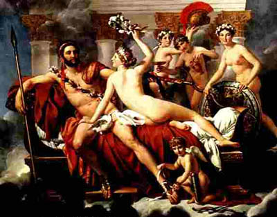
Mars Being Disarmed by Venus by Jacques-Louis David.
Understandably, when there is fight with deadly consequences between rivals, red blood pours from wounds and figuratively, red became connected to warfare. The Greek god of war Mars was associated with red planet Mars. In a symbolic relation with Mars, it is connected to burning world of wars, devil and demons, revolutions (caps of Jacobins, communists).
 Red is an expression of love and emotions, passion, mating.
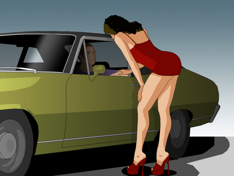
A woman, dressed in red might be considered by some to be in a seductive mood. Similarly flamenco as dance with passion is connected to red dress as a cultural sign. Usage of red color is not arbitrary in this case, but it is from the biological predisposition to perceive red as sexual signal. Red butt by some female monkeys signalizes readiness for mating, a mating season. Red was the apple that was handed over to Adam by Eve, a forbidden fruit. That is where the original innocence was lost. On one hand, red heart represents a symbol of romantic love, being expressed furthermore by red roses. On the other hand, red is connected to sex, especially a sign of a “red district” is universally understood not only all around the present day world, but for instance in the Ancient Greece as well.
Red is associated with movement, excitement, pride, anger, immorality, threat.Red is connected to agressive political stance on the left – progressive, enlightment side. Pure red was sometimes considered as a spiritualized love, so the Virgin Mary.
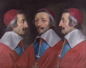
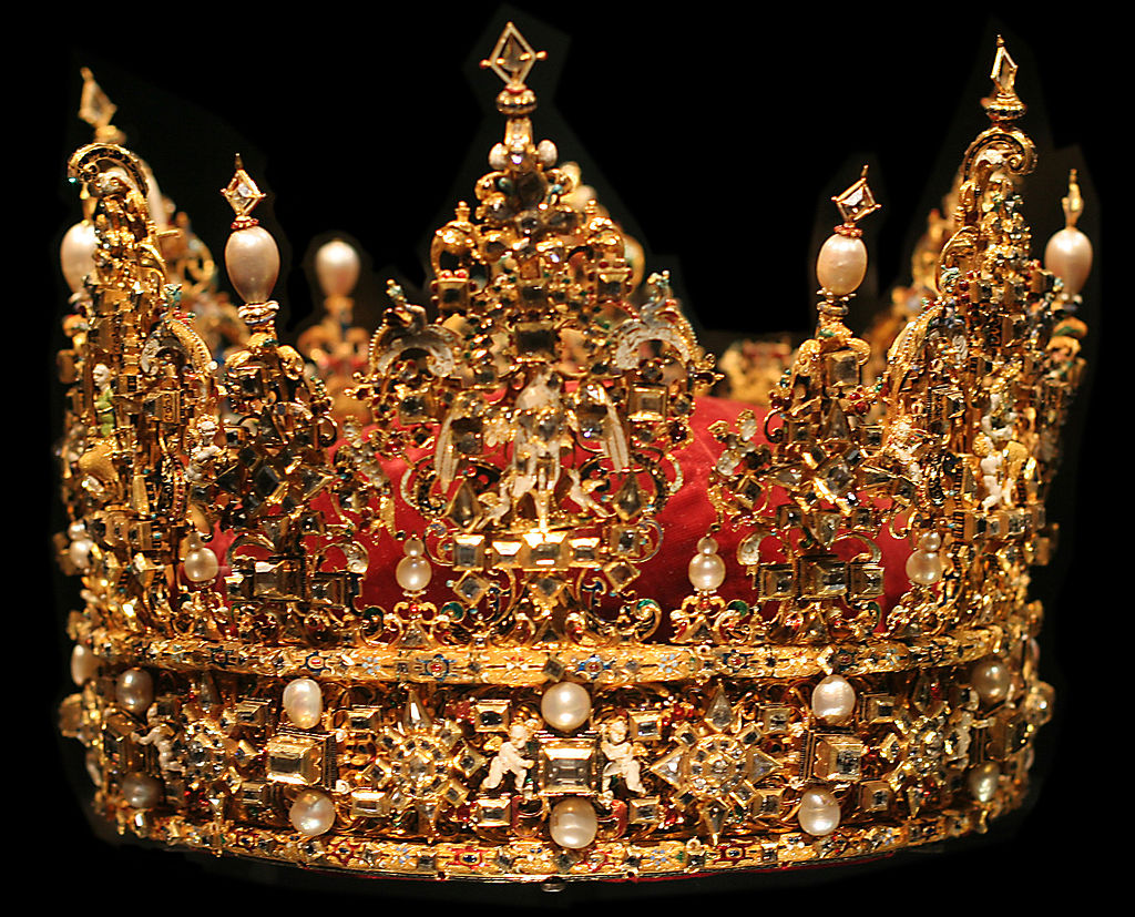
Red color is sometimes connected to grandeur as was used by prelates, academics, or kings.

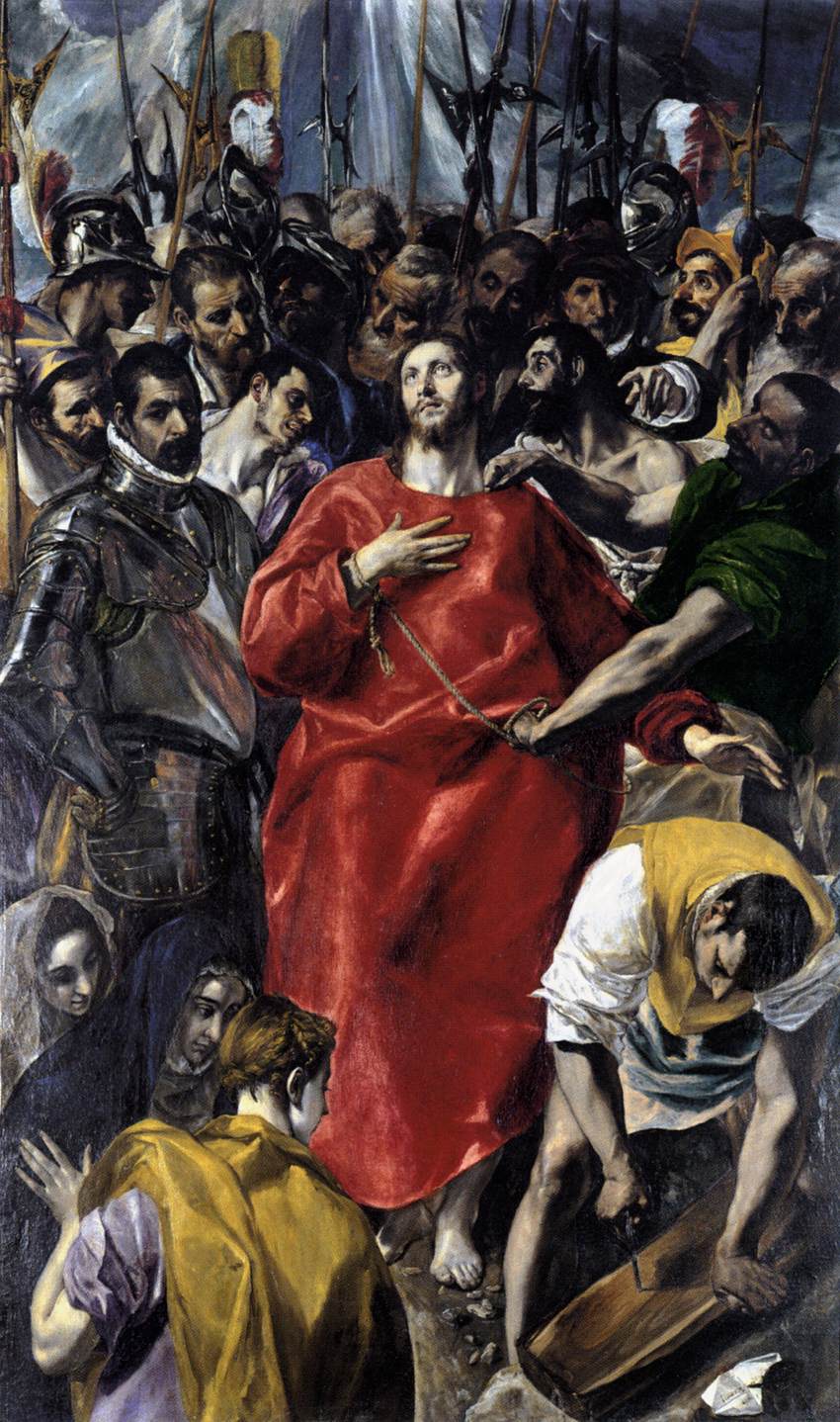
Jesus Christ is often depicted in a red robe that stands as a symbol of his suffering. The Disrobing of Christ by El Greco.
Executioners: representation in modern culture in a Czech musical.
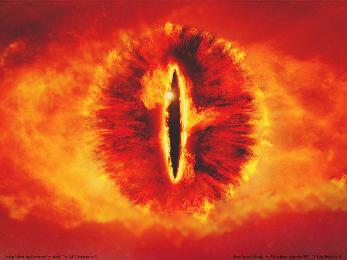
Sauron


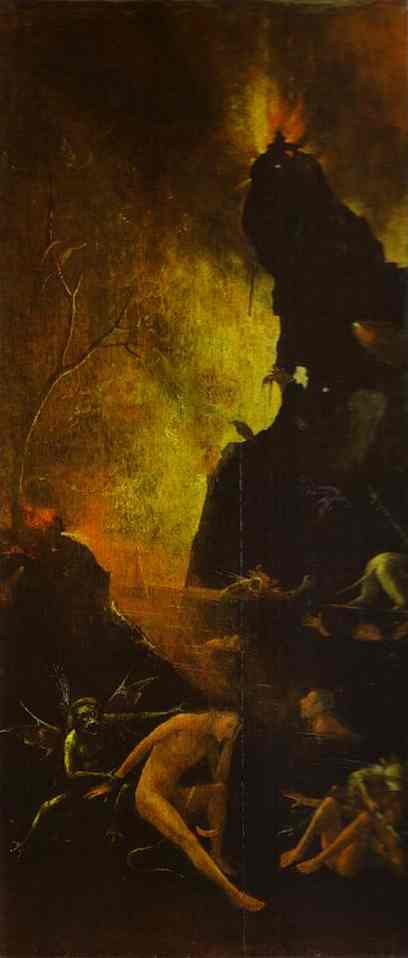
Red orange color is dominant at the Hell by Hieronymus Bosh.
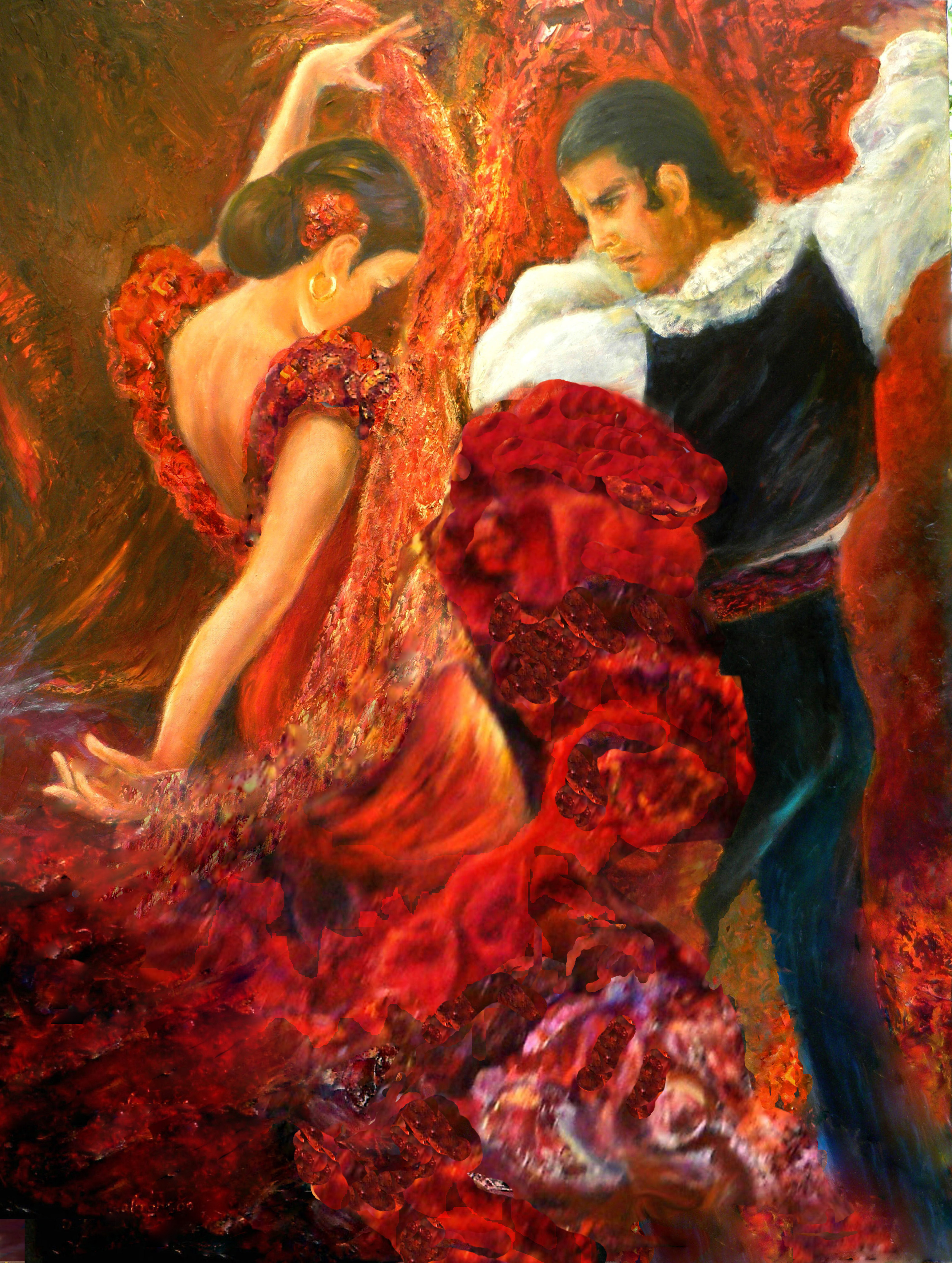
Flamenco as a symbol for passion is highlighted with red to endorse the impact.
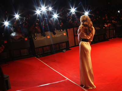
Red carpet is reserved for celebrities.
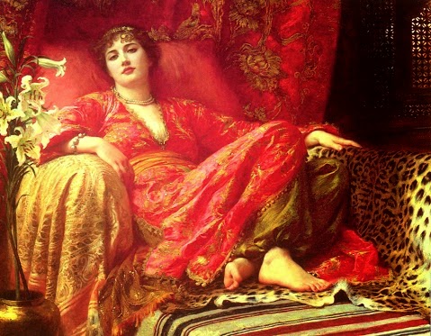
Leila, 1892 by Frank Bernard Dicksee.
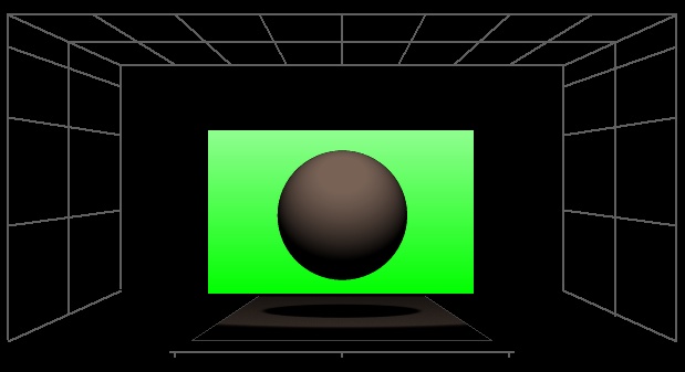
5.2 Green
 Green stands as a symbol of nature as it is a prevalent color in biosphere, in forests and meadows. Green supposedly have a calming effect, restful, soothing, cheerful.
Green is connected with jealousy, illness, good luck, balance, certainness, a symbol of fertility. Green reflect the process of gaining knowledge, comforting, associating home, hope, a symbol of life, aliens and some fairy tales creatures.
Green represents good luck, health. English employs some figurative images with green as for instance green thumb, green with envy, greenhorn, “You are green”, “green behind the ears”, “green around the gills”.
The prevalent liturgical colors are white, green, red. violet, rose and black. In the rituals of the modern Roman rite, green is worn for the Seasons of the Year and on ferial days, and therefore is a color of the everyday, one that celebrates God’s presence in the world even in the humdrum, banal days not earmarked for particular celebration.
In: BROWN, Simon, Sarah STREET a Liz I. WATKINS. Color and the moving image: history, theory, aesthetics, archive. New York: Routledge, 2013, xi, 252 p., 32 plates. p. 158. ISBN 02-031-1812-X. Available from: http://amzn.com/0415892643
Green politics / party – green is considered a natural symbol for a political ideology that put stress on connection to nature and envinronment.
Green man = vir viridis was a middle age symbol.

In the modern culture, aliens are very likely to be green.
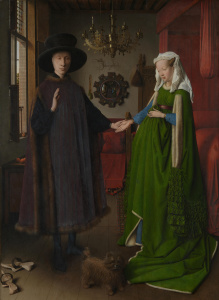
Green as a symbol of commencing love. White part of the dress as a symbol of chastity. The Arnolfini Portrait by Jan van Eyck.


Culturally determined and widely understood symbol.

Green represents connection to nature.
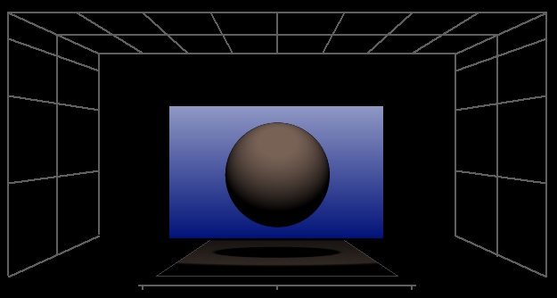
5.3 Blue
Blue is a cold color, receding in context of other colors. Except for sky and water, which however captures a large portion of attention, it is only rarely present in the nature. It has rather a calming effect on the spectator.
Blue is associated with tranquility, coolness, calmness, intelligence, sadness, peace, understanding, attention, relaxation, regeneration, vulnerability, unification, safety, solidarity, identification, harmony.
In figurative manner, it convey characteristics as peaceful, passive, secure, and orderly. In English, there are some phrases blue moon, blue Monday, blue blood, the blues, and blue ribbon, blue collars.
Blue is an expression for distance, which might be connected to sea and sky as distant, unreachable locations. Blue might represent unconsciousness because of connection to a color of the sea that is connected to the image of unconsciousness. Figuratively, it is a color of soul.
Aristocracy is blue-blooded in all European languages. Blue often serves as a symbol for right wing parties. Blue is commonly used in the Western hemisphere to symbolise boys.
A color of Virgin Mary, the inner side of the coat of Virgin Mary, or of Venus as was attributed by Ancient Greek or Romans.

Blue ocean with its dept has been a symbol of unconsciousness.


Red or blue pillow? Blue offers order, red stands for danger.
Being conservative too much.

Sky was always considerably closer to deity than earth.

a 1929 poster attacking the Labour Party. The colors are not arbitrary as blue stood for right and red for left wing politics.

Virgin Mary is likely to be depicted in blue.
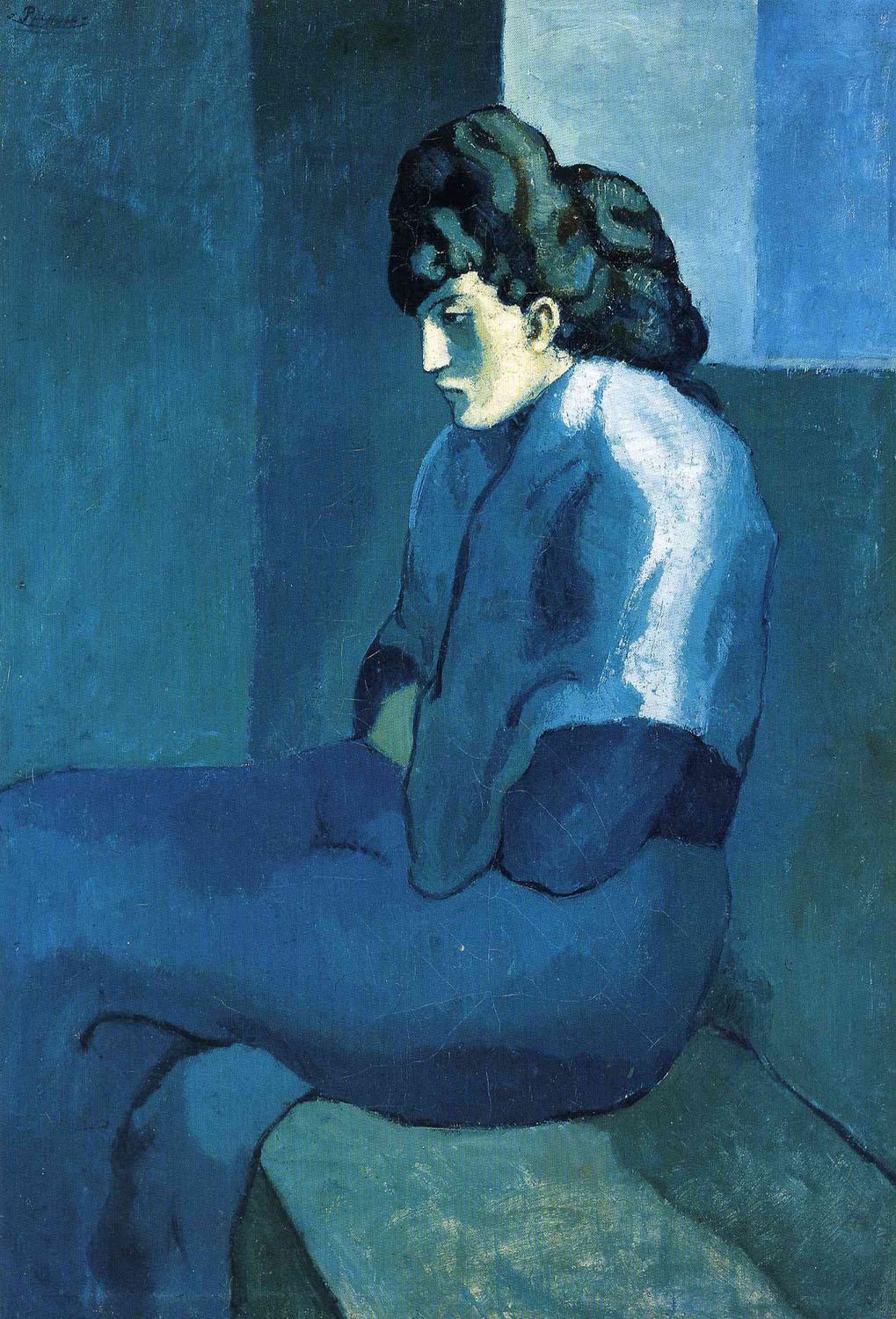
Melancholy woman by Pablo Picasso.
5.4 Yellow
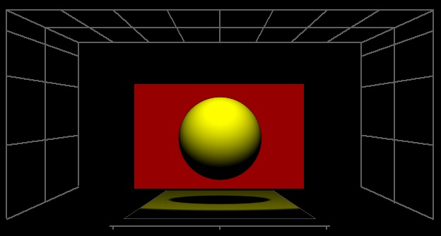
Yellow is the most luminous of all the colors of the spectrum, so it attractsthe largest portion of attention and it overrides other colors in the visual field. So it is the first color, one realizes and thus is used for caution signs. It is very bright, radiant, expansive, cheery and warm impact and leaves a restless, vivid impact on the spectator. In nature, yellow is associated with the sun, bees, spring.
Yellow is associated with hope, color of pride. Other associations contain characteristics as dynamic, bright, free, excitement, envy, treason, deceit, sickness. For many people, yellow represents communication, intuition, freedom, superficiality, joy, relaxation, anxiety, partnership, knowledge, fear, egoism, caution.
Color of shame in the middle ages. In conection with association with Judas, it became a color for Jews. Originally, Judas was vested into yellow at the last supper by Leonardo as well. Well known is labeling of Jews in holocaust by yellow ““Star of David”.
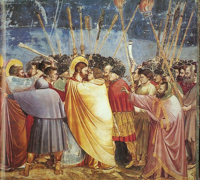
Kiss of Judas by Giotto. Judas is vested in yellow.

Gold, apart of the sun, is a physical base of symbolic meanings.
Gold is understandably the symbol of wealth and prosperity on one hand, but on the other the color of hostility, and betrayal. Yellow gold represents transcendence in Christian religion.

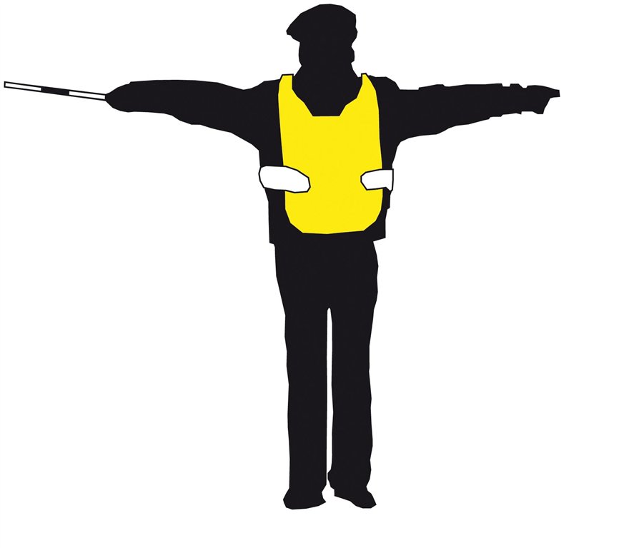
Yellow is widely understood as a sign for an imminent danger.
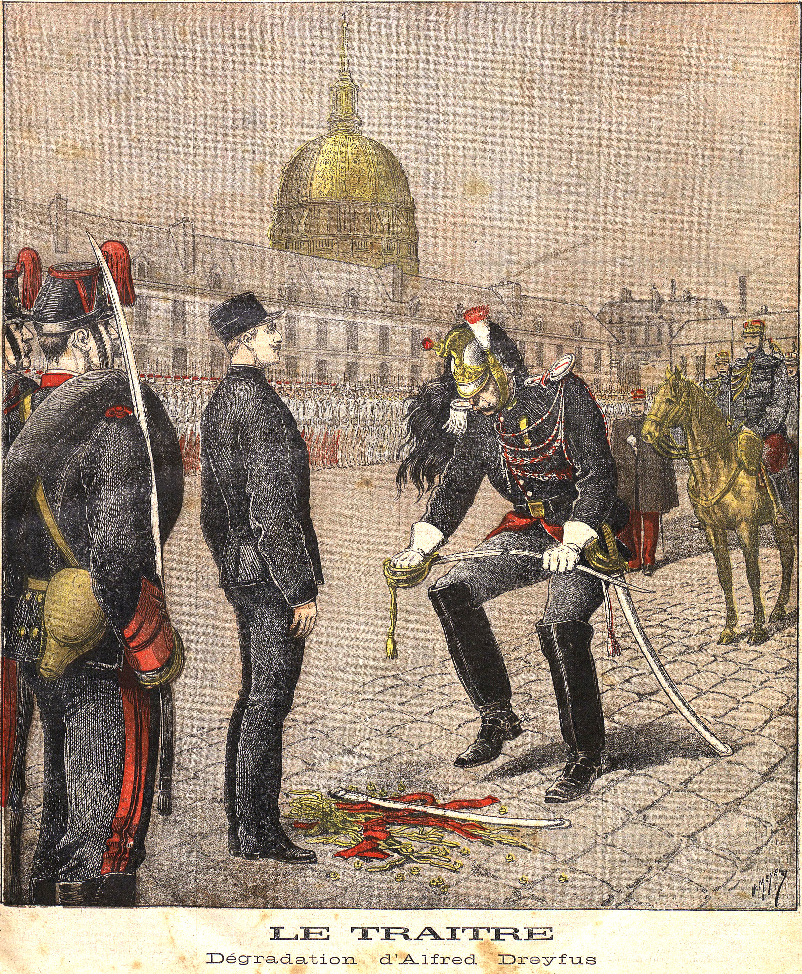
The depiction of degradation of Alfred Dreyfus is accentuated with yellow that convey the meaning of treason as a cultural sign.

Gold and other decor creates a yellowish impact in many churches. It leaves an opulent and mighty impact on the churchgoers.


Yellow as a label for the object of irrational hate.
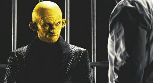
Sin City. Directors: Quentin Tarantino, Robert Rodriguez, Frank Miller.
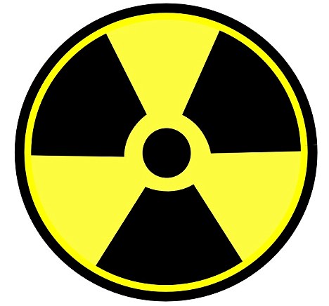
Yellow and black as a sing for imminent danger.
5.5 Purple
Purple can leave a majestic, ceremonical impact and it was often associated with royalty and wealth, wisdom and spirituality. Purple is connected to martyrdom, sometimes death, restlessness, worry, melancholy.
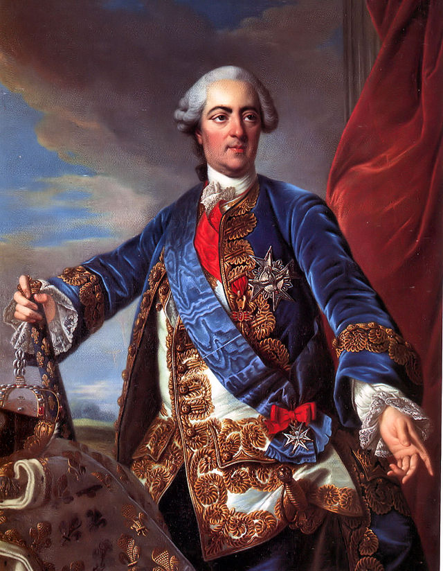
Luis XV., the king of France by Louis-Michel van Loo.
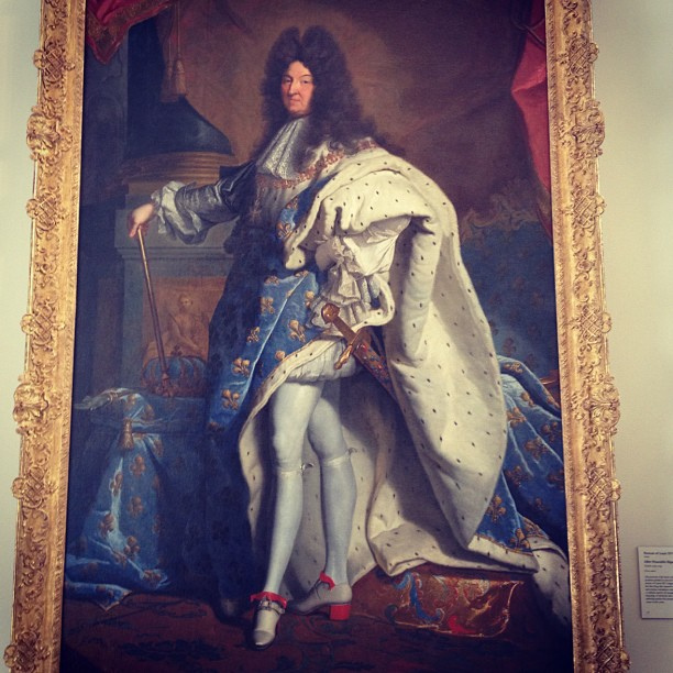
Luis XIV., the king of France.
5.6 Violet
Violet is the transition between red and blue and so symbolic associations of both colors have been projected to it and so it has been bestowed with dramatic character and secret. It might express mixed feelings and split character. Violet is considered to be the most magical color and as an opposite to yellow and is ususally associated with grandeur, mysticism, imagination, individuality, luxury, piety, cruelty, eccentricity, insanity.
In the Catholic Church, violet is worn by bishops and archbishops and is the liturgical color of Advent and Lent.
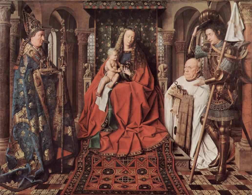
Bishop purple: Madonna and Child with Canon Joris van der Paele by Jan van Eyck, 1436.
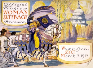
Violet represented the Women’s Suffrage movement.
5.7 Brown
Brown is the typical color of autumn and soil, it is the color of wood and so it is often the color of furniture. Generally, it induces a calm, warm impact, leaving the perception of security, comfort and confidence.
Brown is connected today to wealth and fitness as sun tanning indicates a lot of time having been spent under the sun.
Brown is ususally associated with security, order, tradition, ground, a sense of strength and reliability.

Unlike the numerous notions of the older literature, where pale skin is being reffered as an importatnt feature of woman’s attractivity, the present day criterions of beauty prefer bronze skin. Even so that fitness centers offer it as a product.
Brown symbolized Nazism in Nazi Germany. Some Nazi troops (eg. SA) had brown uniforms.
Brown has been a popular color for military uniforms since the late 18th century, largely because of its wide availability and low visibility, offering higher chance of blending with envinronment,


a Franciscan Monk by Peter Paul Rubens

A poster of Triumph of the Will by Leni Riefenstah, 1934.
5.8 Orange
Orange has a bright, warm impact and associates optimism, friendly, joyfull.
It is associated with the changing seasons, joy, entertainment, friendship, energy, vitality, dynamics, creativity, splendor, caprice, orange can represent change and movement in general.
Orange stands for the warmth of the home and it is the color for wedding in Japan.


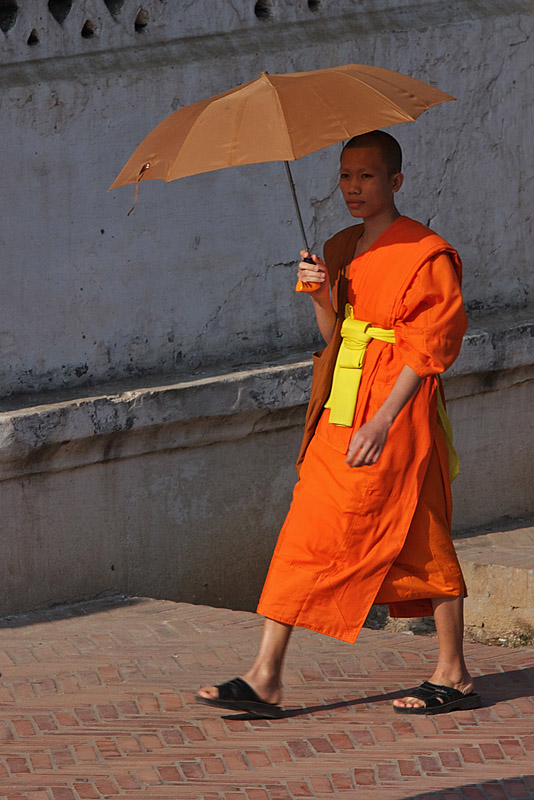
5.9 Pink
The pink color as a mixture of red and white has a soft, fine impact. The pink color is a symbol of girls, femininity, tenderness and associated with love and romance. And with kitsch and immaturity.


Barbie with a cuddly world of unicorns and emotion.
5.10 White

A replica of Kate Middleton’s wedding dress.
White is the light of full spectrum and so it has light, soft impact.
White is the color most associated with cleanliness and sterility as any dirt is immediatelly visible. Associated with sterility of a hospital.
White is a symbol of Christ, peace.
White represent s harmony, represents virtues, joy, innocence, birth. It is associated with purity or innocence, wisdom – enlightment, cold, bland.
White has connotation with good / dove of peace, wedding dress.
It is associated with concepts of innocence, virtue, fidelity, verity, perfection, order, simplicity, fragility, lightness, brightness, order. Further with coldness, uncertainty, infinity.
It was the color of monarchism after the French Revolution and of the White Russians who fought the Bolsheviks during the Russian Civil War.

White dove as a cultural sign for peace.

Dialectic of enlightment. Though in many cases doctor’s white might be functional, showing if there is dirt on the clothes, mainly it is a cultural sign of authority. Dr. House as a maverick so special is excluded from the rule.


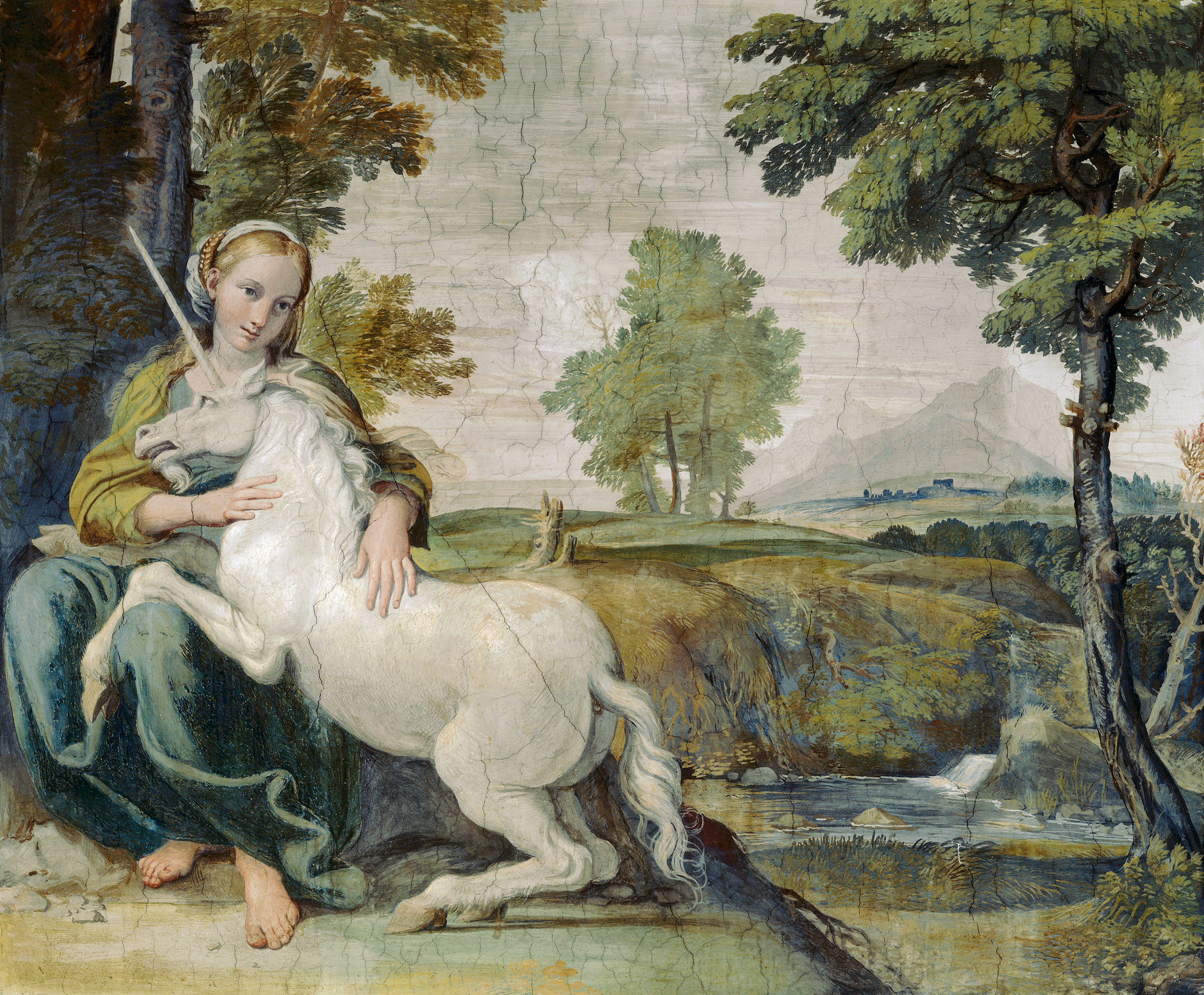

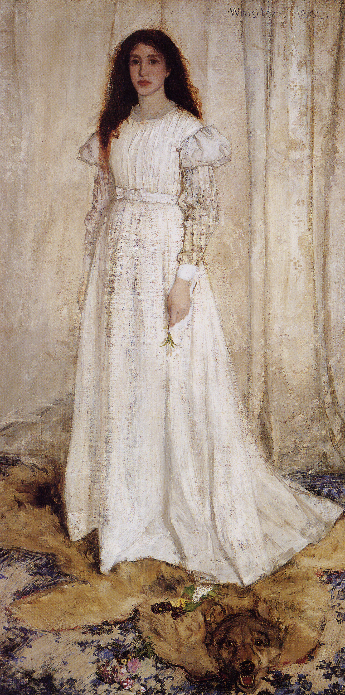


White flag serves as a sign for surrender

Wedding dress of Sissi (film Sissi, directed by Ernst Marischka)
5.11 Grey
Grey is a mixture of black and white
Grey neutral, sometimes depressive with association of dust and dirt. Grey is a symbol for discretion, neutrality, disinterest and is associated with poverty.
Secrets (Éminence grise).
It is associated with concepts of mediocrity, equilibrium, reliability, humbleness, stillness, pasivity, vagueness,
Human hair grow gray in old age, so the gray color can be interpreted as a symbol of the age or maturity. It is connected to reason and thinking on one side and on the other, it has a common association with conformity, boredom and indecision, solitude and emptiness.
In the Christian religion, grey is the color of ashes, and so a biblical symbol of mourning and repentance, described as sackcloth and ashes.

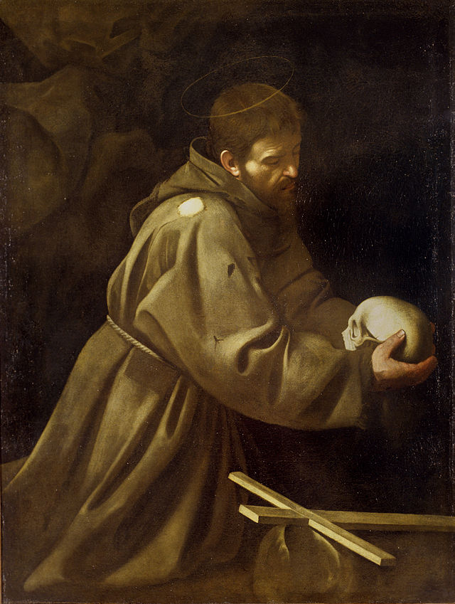


5.12 Black
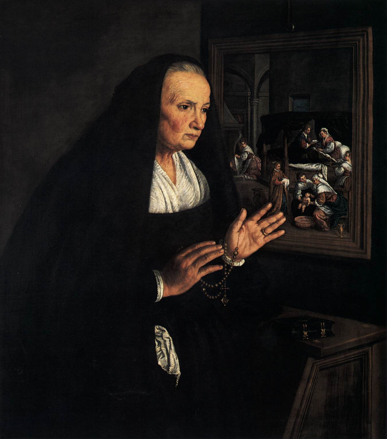
A widow by Leandro Bassano
Black is darkness and so absence of light and it forms the contrast to white and brightness. It has hard, tough, heavy impact.
It stands symbol for death and emptyness, as sort of methaphysical evil. Black also represent subconsciousness.
A symbol of ignorance, backwardness. Dark Ages was a label, which was coined by Renaissance scholars for the previous era of decline in comparison with the glory the Roman Empire. Similarly, the mainstream of Czech revival movement mythology conceived the period after the battle of the White Montain (1621) as the Dark Age.
As an embodyment of evil a literary character Dark Lord appears in Harry Potter, Star Wars, The Lord of the Rings,
Black is the color of those who refuse their destiny.
It has accociation with concepts: unhappiness, respect, authority, noblesse, seriousness, formalness, elegance, power, dominance and agresivity, resistance, fear, loneliness, emptiness, regret, protest, negation.
A symbol of menace – a fact based on lowered visibility during night.
Mourning – in many cultures, the black clothes indicate a status of being a widow.
Special is the combination of black with red, which is associated among other with vampires, satanist.
Black as a methaphore in the everyday usage: blackmail, blacklist, black market, Black Friday, black comedy, black humour, black widow, black magic.

Black color is connected to Anarchism.
Black color used often by anarchists on flags and dress, it should symbolize the never-ending struggle against authority as opposed to white. Black is sometimes regarded as the color of Fascism.


When glossy, black leaves an elegant and monumnetal impact.
A scene from the Pink Floyd’s The Wall.

Dark father.
The Vampire Diaries, a phenomenon of the modern culture


6. Color schemes
This system uses RYB color model.
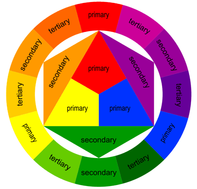
Color harmonies or color schemes is a theoretical framework, decribing the choice of colors to achieve an aesthetic effect. It is based on chromatic colors that is any color, in which one a particular wavelength or hue predominates. In contrast, achromatic colors are white, black, neutral shades of grey.
When achromatic color is mixed with achromatic one, it intensifies the intensity of chromatic shades.
Harmony is based on the prevalence of a given shade of color and on relations between the two mixed colors.
Attributes of individual colors are conceived in relation to another colors, i.e. in contrast.
- Simultaneous contrast emerges in the eye of a spectator, when colors are not complementary, possibly in brightness, saturation,
- Saturation of colors plays a large role in a successive contrast – if a saturated color is observed for a larger period of time, in the view after the end of seeing the color, its negative image is seen – the opposite of perceived
- The middle grey has an activation effect towards its adjacent colors. Neutral colors have the capability of to merge a bit into a complementary color to the one, with which it is complemented. If grey is next to orange, it has a colder effect than when it would be next to blue
- The surface area ratio of colors influence the efficiency of a contrast

Primary colors in the model are different than in the RGB or CMY model.

Secondary colors of the scheme: green, orange and purple.
6.1 Monochromatic
The monochromatic or monotone color scheme uses variations of brightness and saturation and shades of a single color, such as red dark red, and pink. It is clean, elegant, balanced, but of course it offers little contrast.
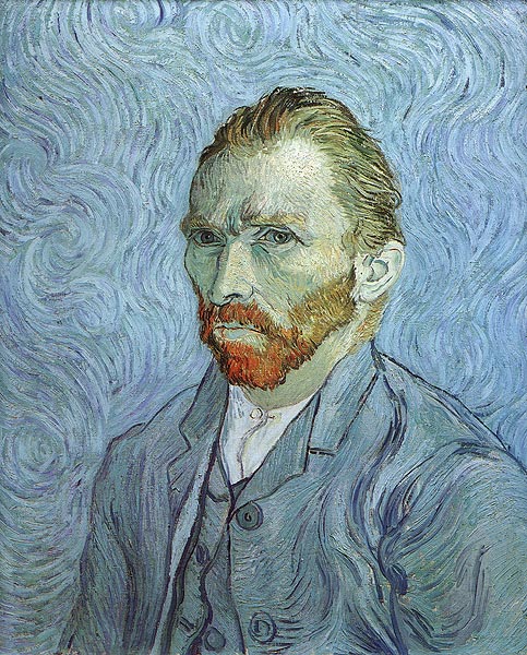
Vincent Willem van Gogh: a self portrait: prevalence of monochromatic scheme in blue, supplemented with complementary red.

6.2.Complementary
Color harmony is at best achieved with mixture of complementary colors. Complementary colors are pairs of colors which, when combined, cancel each other out. This means that when combined, they produce black, or if colored light (rather than pigment) is used, they produce white.
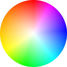 Complementary color Scheme is composed of a main color and the color that is opposite to it at the color wheel. Such a combination attracts maximal contrast and attention.
Complementary pairs are red–green, blue–orange, and yellow–violet. Or in other words , those color that are directly across from each other on the color wheel:
The complementary color scheme uses colors that are opposite each omen such as blue and orange. Contrasts cool against warm colors,
In theory, complementary colors form white light, if they are combined in a additive manner on a neutral surface.
Complementary of any primary color is the secondary color formed by mixing the two remaining primaries.
Complementary colors, when used next to each other, reinforce each other; each makes the other appear to be more vibrant.
The complementary of any primary color is the secondary color formed by mixing the two remaining primaries.
Subtractive mixing of colors is when a single light source shines through differently-colored filters. As the filters alows only a part of the wavelenght to penetrate, with several filters absorbing unwanted color up to the final one.
(example: Orange and Blue)
Red and green
Ratio of colors in complementary harmony.

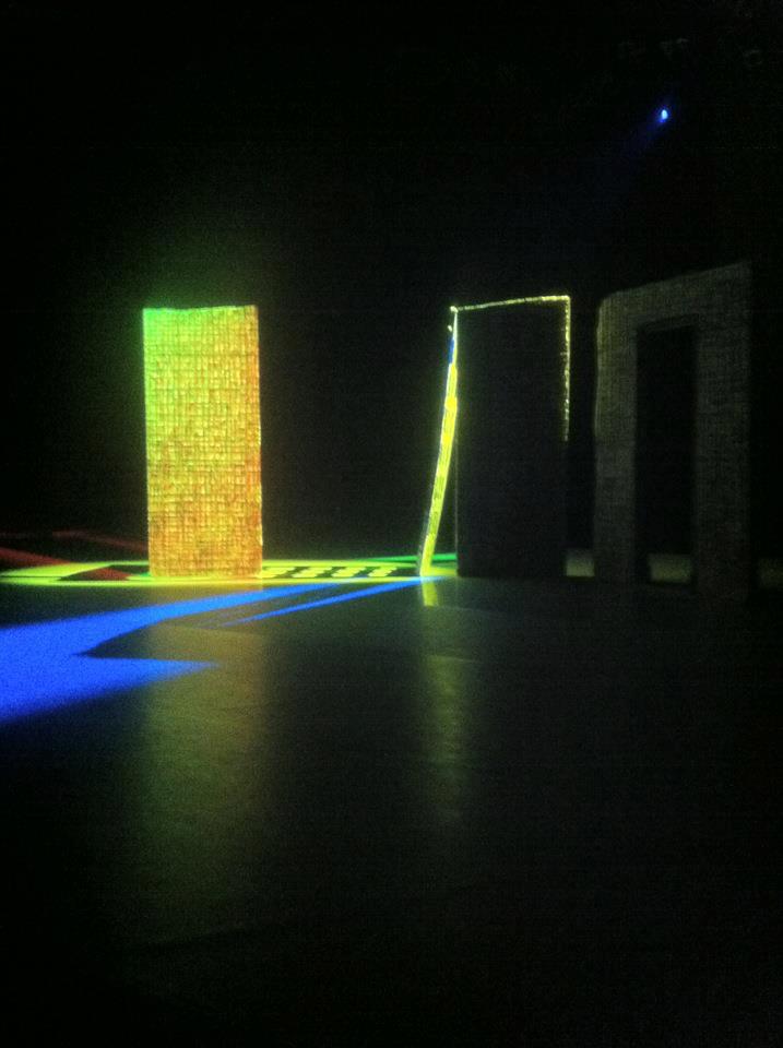
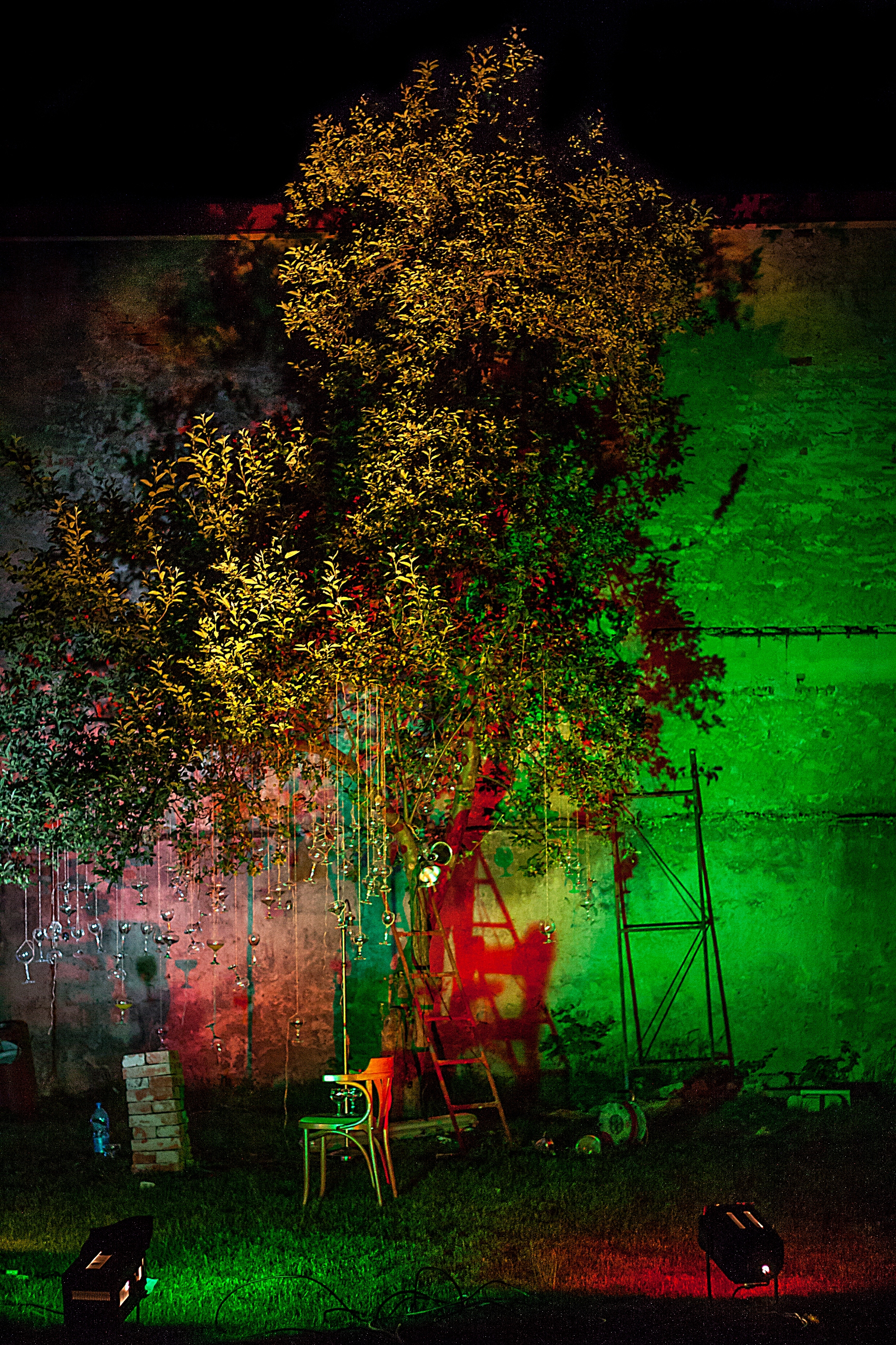
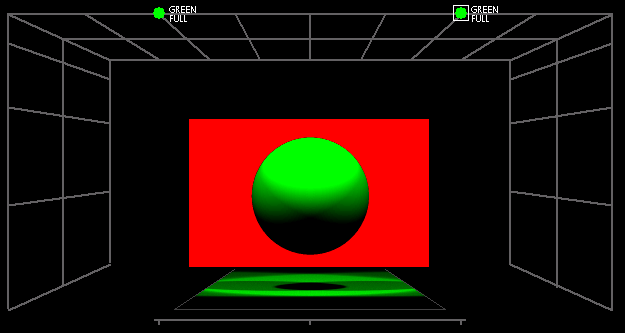
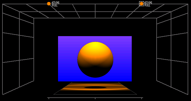
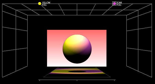


6.3 Analogous
Scheme of adjacent color shades is composed of color that are located next to each other on the color wheel. This type of harmony appears in the nature as well.
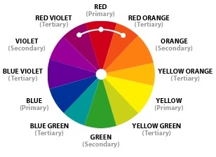
Analogous Color Scheme

Snake Charmer by Henri Rousseau: yellow, yellow-green, green, and blue-green as prevalent colors in the painting.
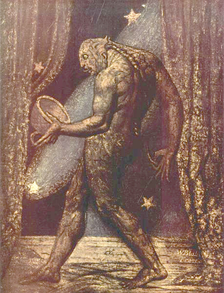
William Blake The Ghost of a Flea


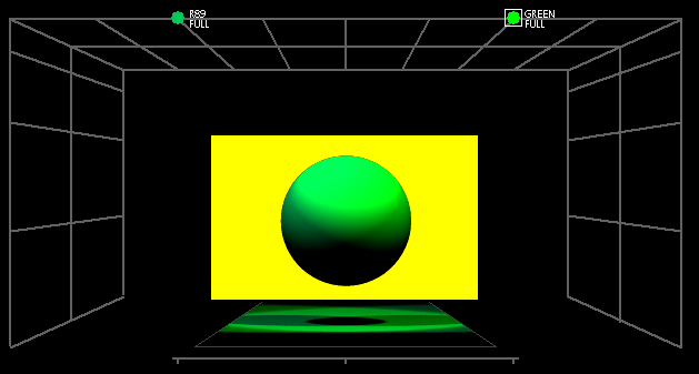
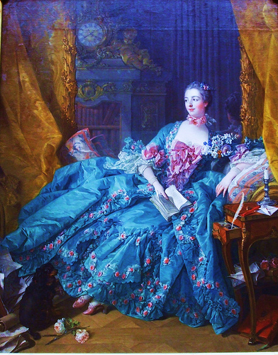
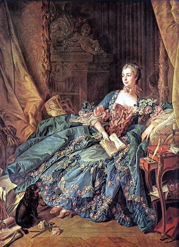
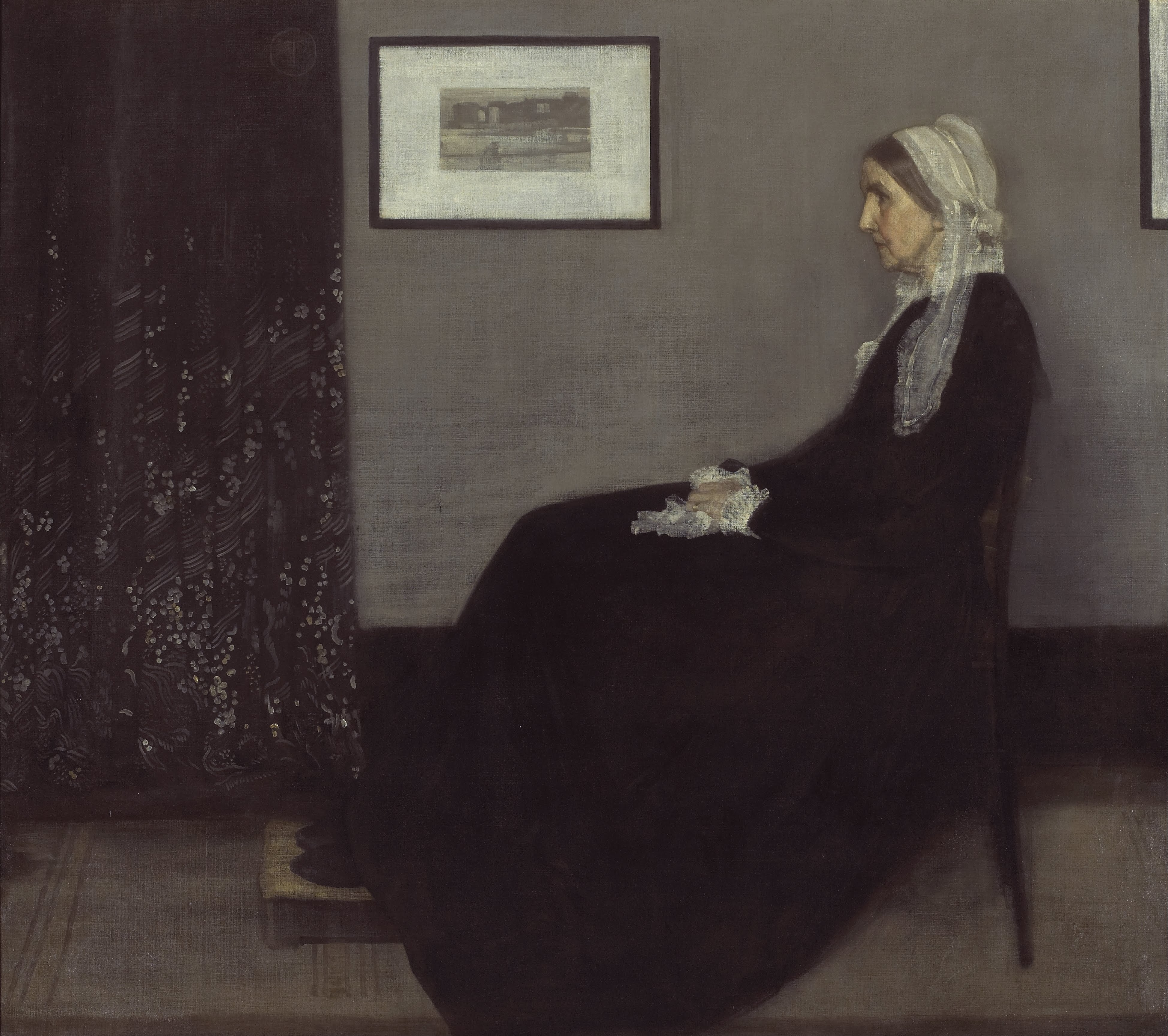
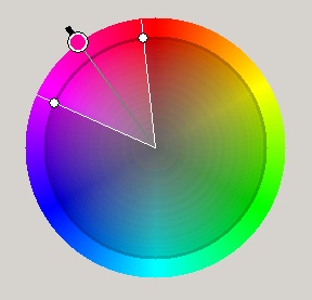
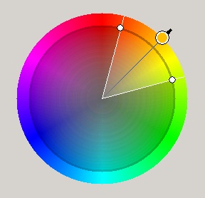
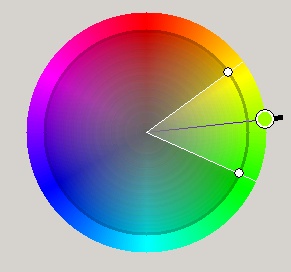
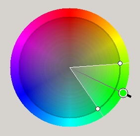
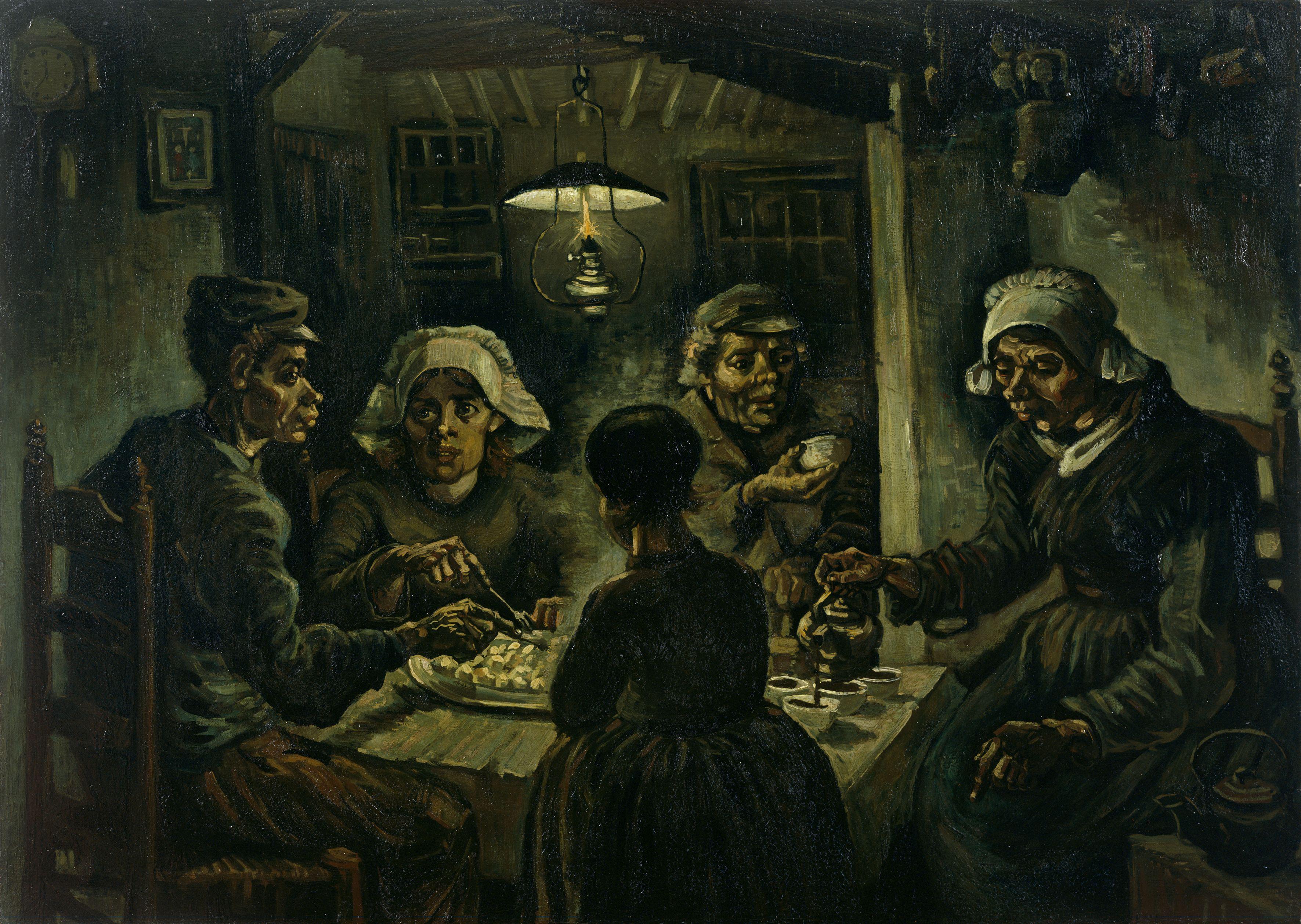

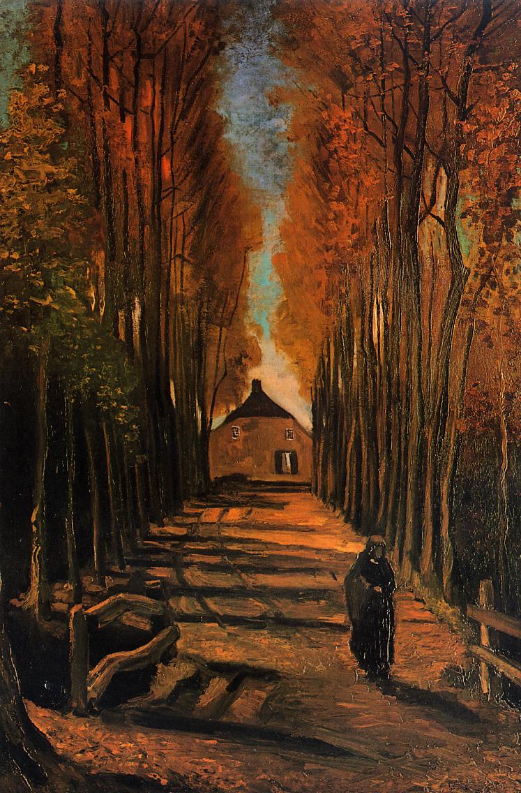
6.4 Triadic Color
Triad harmony – Colors that are located in thirds of the color circle compose triple triad of colors. These colors are located in the vertexes of isosceles triangle in the color circle.
Such a combination has an active and lively effect.
The triadic color scheme uses three colors that are equally spaced around the wheel, such as red. blue, and yellow.
(example: Yellow-Green. Red-Orange and Blue-Violet)
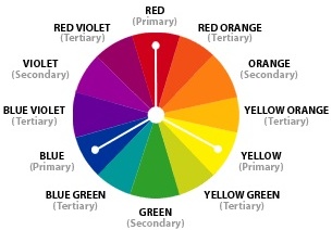
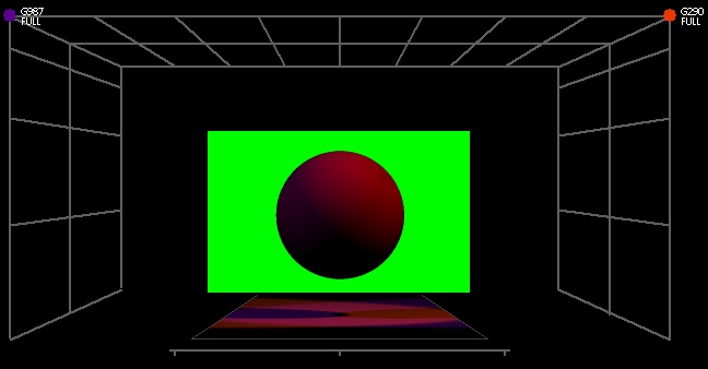
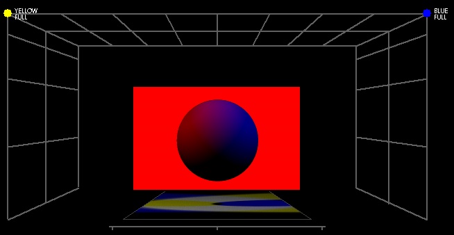
6.5 Split-Complementary
The split-complementary color scheme is a variation of the complementary color scheme. In addition to the base color, it uses the two colors adjacent to its complement.

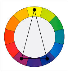
Split complementary
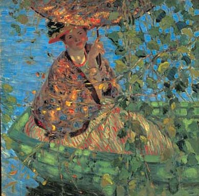
Through the Vines by Frederick Carl Frieseke.
6.6 Tetradic Color

Tetradic Color Scheme uses two pairs of complementary colors that are balances between each other.
The rectangle or tetradic color scheme uses four colors arranged into two complementary pairs.
(example: Orange, Red, Blue and Green)
Double complementary blue/orange – violet/ yellow green.
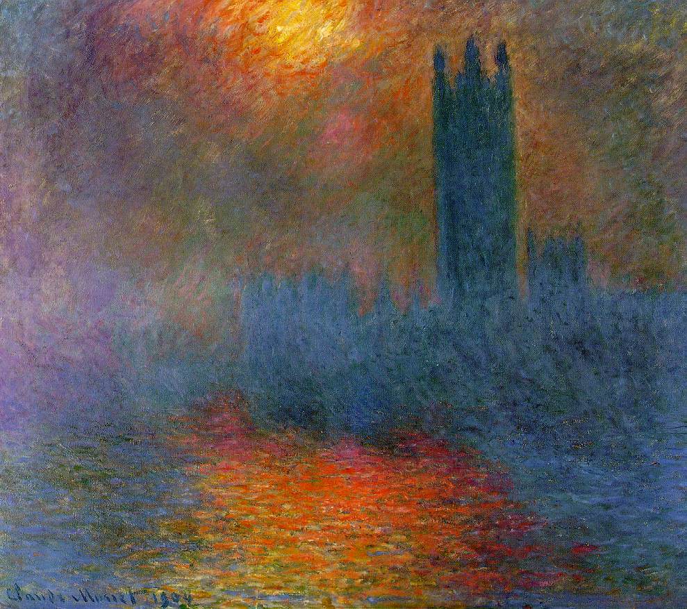
Sun Breaking Through Fog by Claude Monet
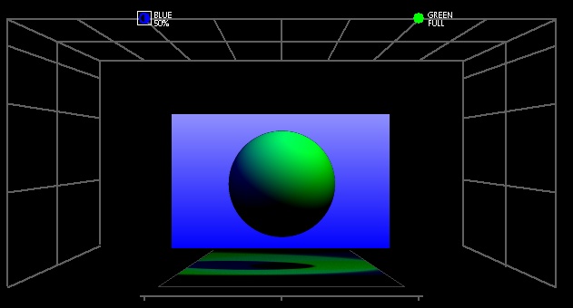
Tetradic harmony

Tetradic harmony
6.7 Square harmony
The square color scheme is similar to the rectangle, but with all four colors spaced evenly around the color circle.
(example: Yellow, Red-Orange, Violet and Blue-Green)
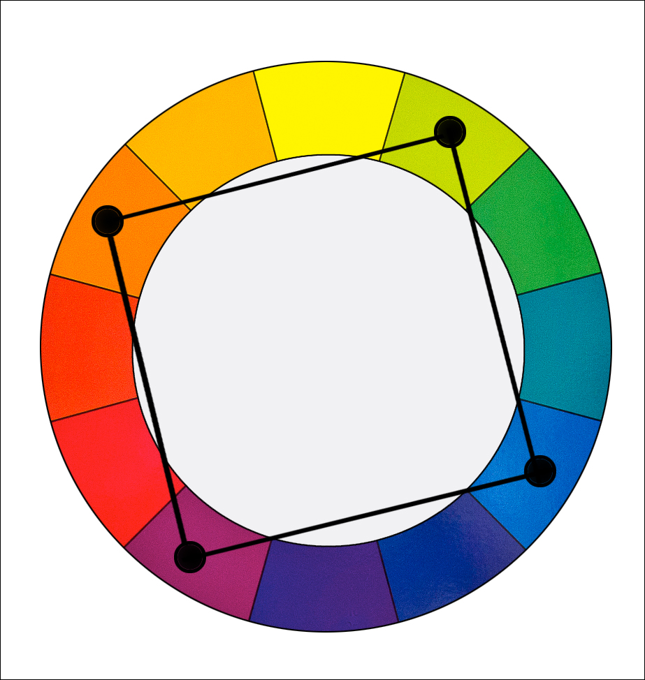
7. Conclusions
In the complicated universe of human society, light and colors play their respective parts. They mainly remain hidden from the attention, being more a component of the structure that determines the everyday life than something specific, to which the attention is paid in that span of awareness dealing with matter of common importance.
The color of uniforms in battle is nowadays rather functional: the soldier is not to be an easy target for the enemy: grey, brown colors are employed. When conditions change so does the clothing as seen in the case of a Finnish machine gun crew during the Winter War.
This functional aspect of colors might or might not be the source of cultural meaning of colors and light. Visual literacy is a sort of developed sensitivity to interpretation of visual images. As an analogy, the reader who has read many books and thought them through, is very likely to be endowed by improved reading skills. He can read better, faster, more deeply than anyone who has done none of this. Something of a similar sort happens with images as well. Though not indispensable, some knowledge of relations that connect various phenomena could be beneficial. Visual literacy is thus higher awareness of something that might have passed unnoticed otherwise.
Light and colors are a mean of expression for a lighting designer. These two natural phenomena are often humanized – they serve as a sign in communication that constantly occurs in the surrounding world. Colors hardly posses such mystic characteristic that would be connected unequivocally with features, or human qualities, but now and then a semiosis occurs and the color acquires a meaning behind its physical nature. Design and color of clothes may serve a function within society as a representation of the wearer’s rank in the pyramid of social stratification.
Prisoners in uniform from the 1920 film From Now On.

A suit: a uniform for those who want to display at least some degree of wealth.

A Finnish machine gun crew during the Winter War. The uniforms are adjusted to the envinronment.
Depiction of a battle: uniforms are functionally designed to correspond to the battle envinronment.
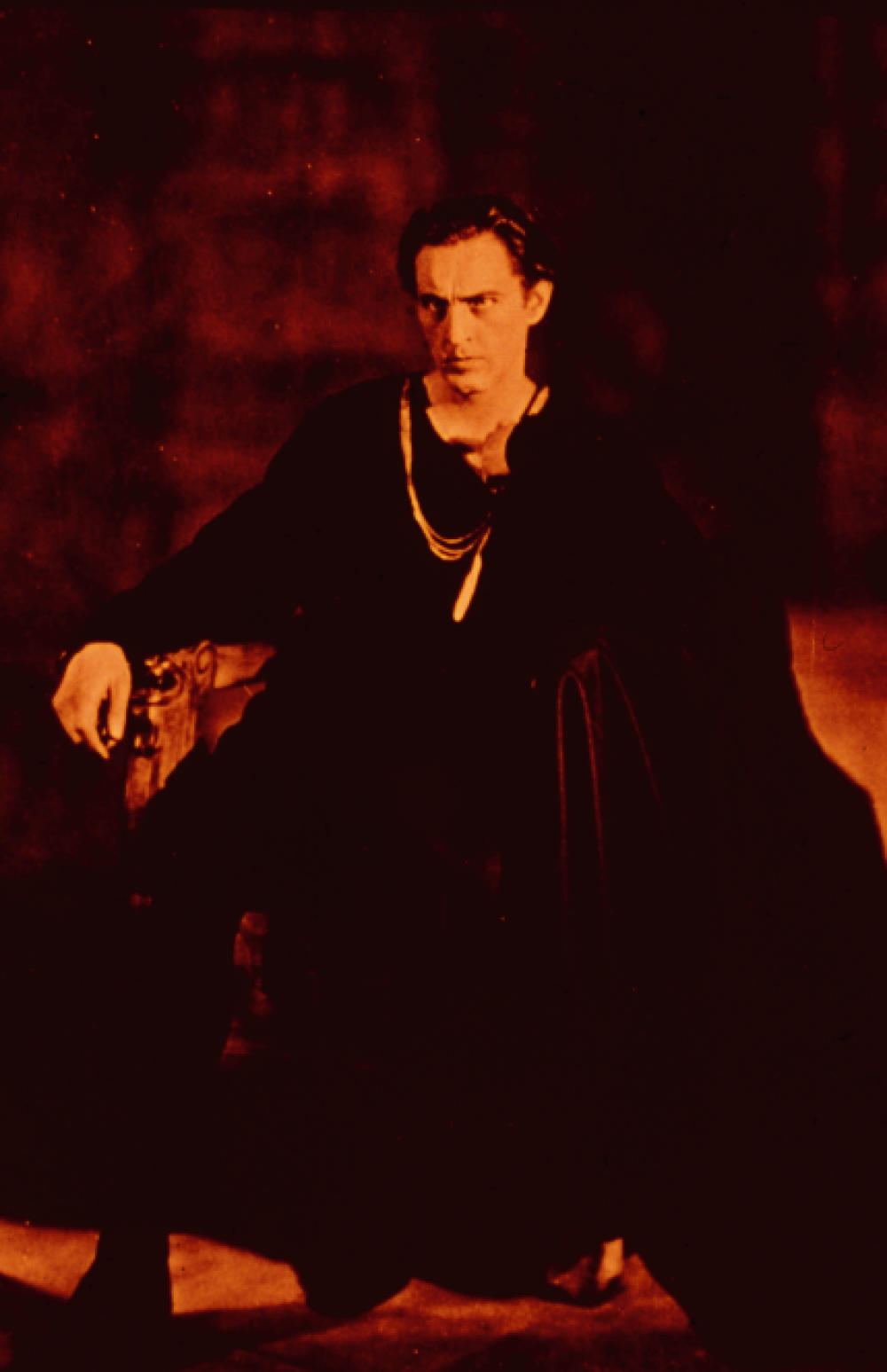
If Hamlet was to say: ” I only crave for love”, would you believe him? John Barrymore as Hamlet
Tasks
How to train visual literacy?
1.
Google pictures of several abstract words that come to your mind to see, whether there are any prevailing colors connected to their representation: we may expect that love would be in reddisch, luck in green, wealth in yellow or greenish, but it is so? Do little research: are there colours that would prevail by some words? Can you list items that carry clearly such a connotation, which is not listed at this page an send it to the tutor?
– Friendship would be represented with holding hands, honesty with raised hand: these are cultural sign, relatively easily undestandable for any member of western culture. Do colours in similar cases work in a similar way? That is something to be considered.
2.
Observe usage of colours in commercials: is there any detectable pattern? Do colours transmitt any kind of a message in this case? Does the choice of colours support the general messange?
3.
Have you ever noticed that Asians actually do not have a yellow skin? It seems to be a cultural naming: because we name it in such a way, we see it as such as well. Consider the possible equivalent example of Eskymos, which discern and therefore have many names for shades of snow. Bur is it really similar, or there is a difference? Is the difference that naming the color of the skin is quite an arbitrary act, whereas discerning many shades of white in a ambiance that is prevalently white and thus improves survival chance? Can you form your own theory?
4.
Read a political commentary and extract several abstract terms. Try to assign a color to each of them and reason on what basis you did that.
5.
Visit the closest gallery: notice how the artist modulate their message and in which context. How they succeded in conveying a message to you?
6.
Focus your sight into a lamp with a respect to your health, then turn away and notice the afterimage disappearing.
7.
Stare for half a minute into a colored area and then shift your sight to white surface. Can you determine what you have seen? Does your perception matches the predicted complementary color?
Case studies
1. Interview: Vincent Longuemare
We live in the European culture that was influenced by Christianity for centuries. Our work is often unconsciously influenced by the environment in which we live. Do you think that it would be hard for a European lighting designer to work, for example, in Asia?
When I worked in Japan, for instance, I had to learn the symbolism of colors, which is completely different from ours. For example, the color that symbolizes the spring in Japan is the color of cherry blossoms. This pink may seem dim to us, because the color of spring is bright yellow, green or orange for us. But I think that anyone can adapt to these cultural specifics. Rather, it can be hard to get used to the different organization of work. Almost all cultures of the world are available to us for several generations, although in superficial honeycomb of images and words: if you want to do your job well, you have to have an open mind, go to the streets and watch and watch until your eyes will cry with fatigue.
Do you use some kind of symbolism, characters in your work, or do you work instinctively?
It’s a big fight between intuition and knowledge. Once you begin to think that you know something, you can be a goner in the next moment. At the same time, it is the reason why people want to work with you. They believe that you are good and you know all the solutions. If you start thinking about yourself that you have the knowledge and solutions, you start to repeat yourself. Some of my colleagues do the same design already for twenty five years. This may be convenient to some directors and productions, because they know what they can expect. However, I believe that each performance is a new experience and therefore we should look for new ways and opportunities. In this conflict, I choose intuition, groping in the dark and discovering the light is much more fun. I don’t mean that in the morning I go to the theater and say to myself, “so how we do it tonight?” For me, groping in the dark means a research and study of new possibilities, preparation. Then I come to the theater with a clear vision and definition of what I want to do.
Could you list in five words, what is the essence of lighting design for you?
Darkness / Black
active eye
perception of space and body
contrast
technical knowledge
And if you should explain it more?
Whenever I start to teach a group of students, I use the same words to express the essence of lighting design: we are not able to see the light as such. We see it through the objects it affects. As it moves through the space, it enters into contact with objects and bodies. One of the best ways how to be able to perceive light is to realize its contrast with the darkness. That is the most basic contrast. There is nothing and suddenly everything comes to life, because I see it standing out from the darkness. The sight captures and interprets light stimuli to us. We cannot think about light, if we do not think about darkness as well.
The way we see and perceive is the next step. A better ability of observation and perception is required from a lighting designer. A lighting designer must be able to transfer the shape, structure and the presence on the stage into the general visual scheme through the light. Space, props, costumes, body, but also the direction of looks of the eyes or the color of the skin – everything that happens on stage, must be seen and discovered.
The best way to achieve this is to create a contrast on the stage, which allows the spectator’s eye to perceive what is happening. From the smallest detail to the dramaturgical structure of the performance. It’s like creating a variety of visual perception and differentiation: to organize the visual field into a general structure and within that, to organize (to the viewer) the movement of the eyes.
Technical knowledge is, of course, indispensable, it allows you to work faster and more accurately. However, I believe that it is necessary that technical knowledge would be in the service of poetics and creation, not vice versa.
Are the lighting design in architecture and lighting design in theater the same professions? Do they have something in common?
They can be created by the same person, but it isn’t the same profession. Dance and theater serves to a world that is ephemeral, intangible and illusive. To a world that is built again and again, represented to the spectators and then disappears. Only some pictures will remain in the mind.
Architectural lighting is challenging due to the actual volume of material, of building, of something that is permanent. It has to be said here that a capable designer can be naturally able to achieve excellent results even in the architectural lighting. In the architectural lighting, one must take into account various constraints (rules, safety), durability of the material and the like. Architects, designers, engineers and firemen hold together and sometimes you have to respect the rules according to which the functionality has the priority over the “beautiful”.
How do you explain the fact that in recent years, there appears to be a growing interest in lighting and lighting design, not only in the theater world, but also in architecture and other arts?
It seems that we find ourselves once again in an age, which is ruled by visual communication: Our fascination with images (in a broad sense of the word) is like a mother’s breast from which we greedily suck the milk of information. In the society, there is a distinctive need for veiling the world with images, to understand and explain the world with images rather than words. Some people seek the truth of history or politics through the images. Most of them creates images in order to hide what is not to be seen. Images that emerge from any kind of power to create a nice two-dimensional world. I assume that interest in the visual creation, by which we can control the world, means that we need technologies to build a vision of the world. Fortunately, I still believe that theater is a place for creation of images. It’s one of the few places where people meet in direct contact, face to face, where you can search for the truth of moments, the truth of humanity. It may be that not that much money flows through the theater world as in other fields of human activity and that protects it against industrial production of images, which has always only one goal: to make money and lie to people in order to maintain power.
The general interest in architectural and public lighting follows from industrial innovation and creation of new markets. There is always someone who wants a new toy or desire to be modern. I believe that we live in difficult times, and the light is associated with life, birth and faith, with the expectation of a new day, but also with the end. Maybe we seek hope through the light: will there appear better days in better light?
Can you describe a typical content of a day of a lighting designer?
When I was young, I was able to spend twenty four hours a day in the theater until I found the right way, there was no daily program, there were only questions, the stage in front of you and possible solutions. Currently, my program is divided into two main parts: the time I spend creating and inventing a lighting design at home in the studio, and the time I spend preparing and installing the lights before the performance. During the first phase, I go to the rehearsals, I discuss with set designers, costume designers and directors. I’m trying to get as much information as possible. I study the scenes or get inspiration from my life and the events around me. During the second phase of preparations, I usually spend twelve hours a day in the theater. I come at eight o’clock in the morning and leave around ten or eleven at night. During the technical preparations, I give a lot of time to building light changes. I try to make the lighting seem natural and live. I like a lighting design, which blends with the performance and helps to complete the story and the time is a single tool for creation of a light dramaturgy.
I mostly come to the theater as the first one- I enjoy the moment when I enter the empty, silent theater, night slowly sails away, technicians begin to come and smell with the first morning coffee – and I am the last to leave. I promised myself that I will be a sound engineer in my next life – the last one who comes and first one who goes.
Your main fields are a theater lighting and set design. When you create a scene, do you imagine it already lighted, or do you invite colleagues to help you to create the light design?
I have started dedicating myself to the set design about ten years ago. I was partly inspired by those morning moments when you enter the empty silent theater. The space in front of you it is not yet burdened by any human activity, and you can fully perceive it. I was also dissatisfied with the approach to the production of scenography. It was annoyed by a general practice of artists who ignore the individuality of space and just builds and builds, inundate the space with walls, structures, props. I have always had a feeling that uniqueness of the space has to be respected when creating performances. Makers of stage sets should be focusing on looking for ways how to work with it instead of overfilling the area. I believe that in every performance there are direct relationships between bodies, voices, eyes and space as such. This mutual interaction between individual elements should be searched for and consolidated during the creation of each performance. Light can also be the structural element for building “architecture” of space. When creating a stage set, I closely work with the director, I use all the actions and movements, which are contained in the performance. I start with lighting, then I define the spatial layout and the invisible lines in which the voltage flows, I assemble all elements of the performance so they correspond in best way with the already created lighting.
So far, I haven’t had the opportunity to see my stage set be lighted by someone else. I think they invite me to do the set design and lighting design also for the reason that to the production would save money!
The remaining part of the interview is available here.
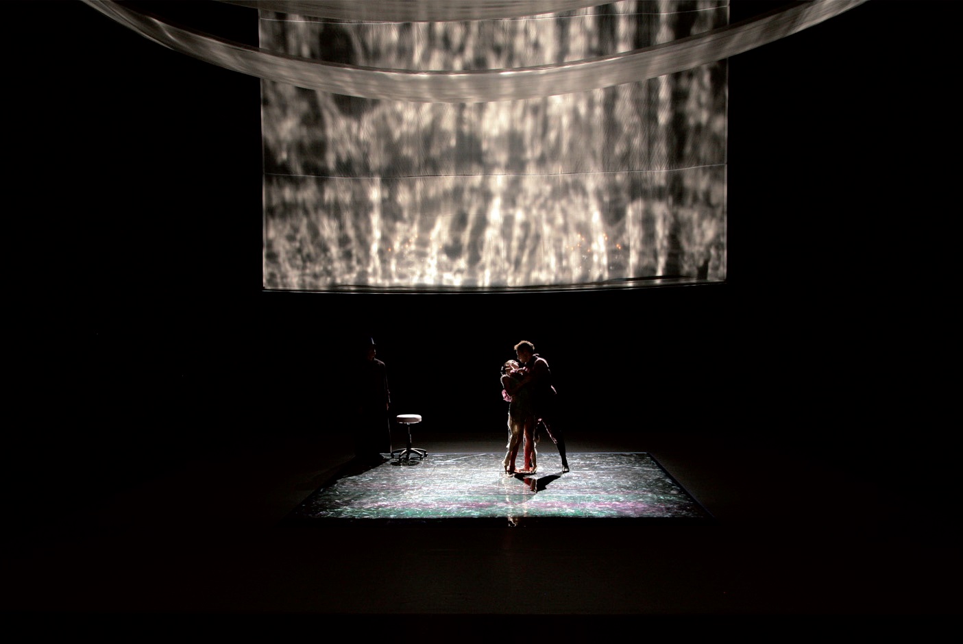
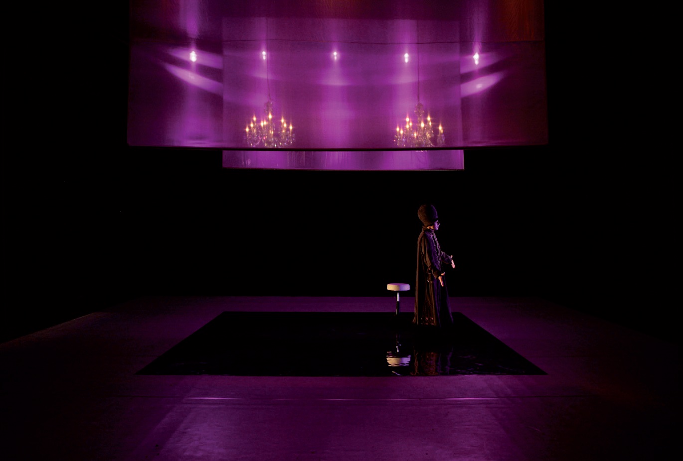
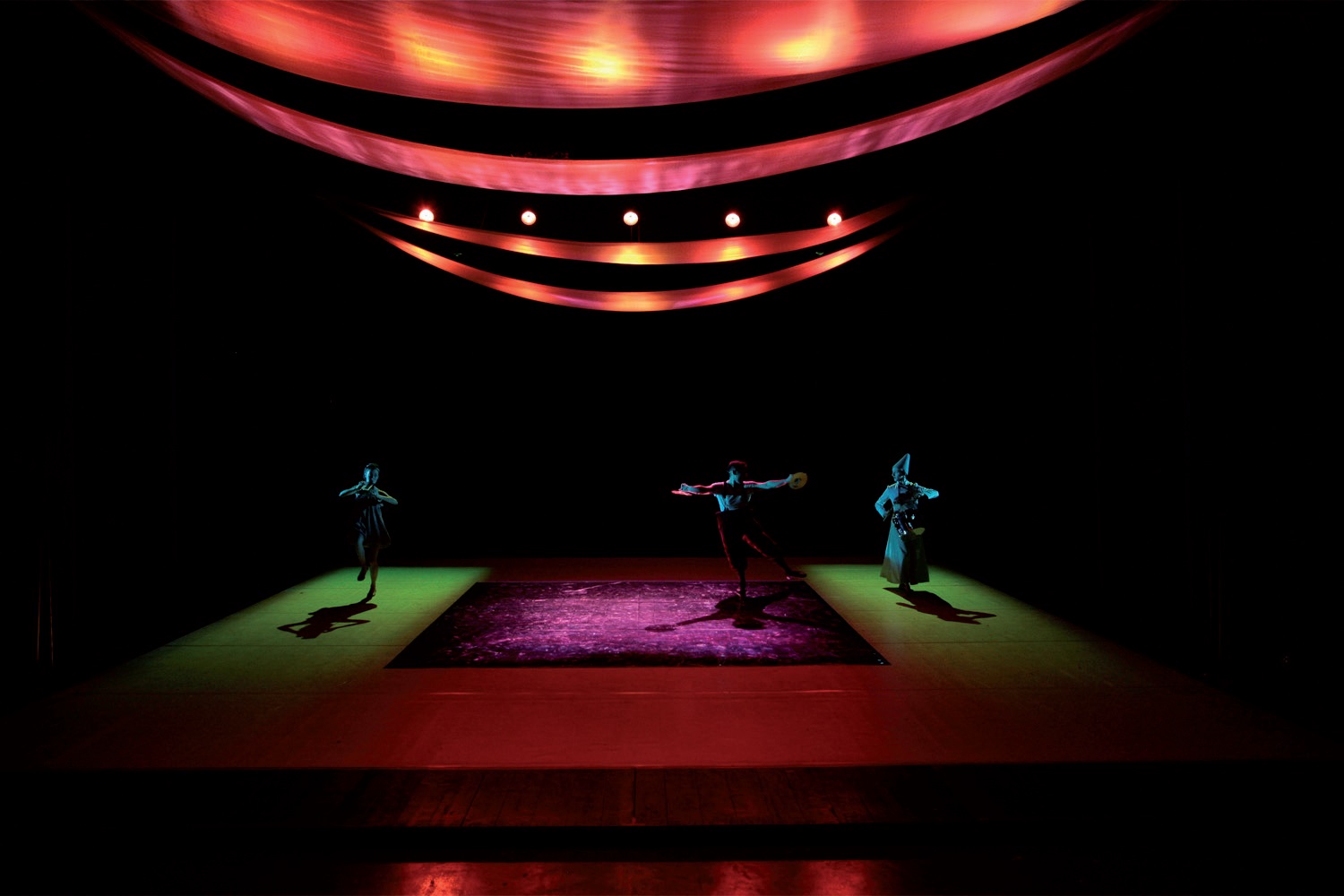
Sources and literature
Perception
BACH, Michael. Optical Illusions & Visual Phenomena [online]. [cit. 2015-06-01]. Available from: http://www.michaelbach.de/ot/index.html
BRADLEY, Steven. How To Use Color To Enhance Your Designs. In: Vanseo Design [online]. [Accessed 2015-05-01]. Available from: http://www.vanseodesign.com/web-design/color-meaning/
WILD, Larry. A Brief Outline of the History of Stage Lighting. In: Northern State University [online]. [Accessed 2015-05-01]. Available from: http://www3.northern.edu/wild/LiteDes/ldhist.htm
Optical illusions. In: Wikipedia: the free encyclopedia [online]. San Francisco (CA): Wikimedia Foundation, 2001- [Accessed 2015-05-01]. Available from: http://en.wikipedia.org/wiki/Category:Optical_illusions
Lüscher color test. In: Wikipedia: the free encyclopedia [online]. San Francisco (CA): Wikimedia Foundation, 2001- [Accessed 2015-05-01]. Available from: http://en.wikipedia.org/wiki/L%C3%BCscher_color_test
Psychology of Color. In: 16 Lessons in Color Theory [online]. [Accessed 2015-05-01]. Available from: http://www.wetcanvas.com/ArtSchool/Color/ColorTheory/Lesson8/index.html
Simultaneous Contrast. In: Color, Vision and Art [online]. [Accessed 2015-05-01]. Available from: http://www.webexhibits.org/colorart/contrast.html
Simultaneous Contrast. In: John Paul Caponigro [online]. [Accessed 2015-05-01]. Available from: http://www.johnpaulcaponigro.com/blog/5810/simultaneous-contrast/
Culture
SMITH, Kate. Color: Meaning, Symbolism, and Psychology. In: [online]. 2014 [Accessed 2015-05-01]. Available from: http://sensationalcolor.hubpages.com/hub/colorexpert-2
Color Meaning. In: Color Wheel Pro: See Color Theory in Action [online]. [Accessed 2015-05-01]. Available from: http://www.color-wheel-pro.com/color-meaning.html
DOTY, Sheri. Color Relationships: Part 4. In: Art Instruction Blog [online]. [Accessed 2015-05-01]. Available from: http://www.artinstructionblog.com/color-studies-part-4-color-relationships
Color Symbolism: Symbolism and emotions. In: MORTON, J.L. Color matters [online]. [ Accessed 2015-05-01]. Available from: http://www.colormatters.com/color-symbolism
Color Symbolism and Color Meaning in The Bible. Riding the Beast [online]. [Accessed 2015-05-01]. Available from: http://www.ridingthebeast.com/articles/colors/
The Meaning of Colors. In: ChangingMinds.org [online]. [Accessed 2015-05-01]. Available from: http://changingminds.org/disciplines/communication/color_effect.htm
The Meanings of Color: Lesson #7. In: 16 Lessons in Color Theory [online]. [Accessed 2015-05-01]. Available from: http://www.wetcanvas.com/ArtSchool/Color/ColorTheory/Lesson7/index.html
CORTES, Maria Claudia. Color in motion. In: [online]. [cit. 2015-05-17]. Available from: http://www.mariaclaudiacortes.com/
Further study
Political colour. In: Wikipedia: the free encyclopedia [online]. San Francisco (CA): Wikimedia Foundation, 2001- [Accessed 2015-05-01]. Available from: http://en.wikipedia.org/wiki/Political_colour
Political uniform. In: Wikipedia: the free encyclopedia [online]. San Francisco (CA): Wikimedia Foundation, 2001- [Accessed 2015-05-01]. Available from: http://en.wikipedia.org/wiki/Political_uniform
Wikiart: Visual Art Encyklopedia [online]. [Accessed 2015-05-01]. Available from: http://www.wikiart.org/
Learn Stage Lighting [online]. [Accessed 2015-05-01]. Available from: http://www.learnstagelighting.com/
The Centre for Vision Research [online]. York University [Accessed 2015-05-01]. Available from: http://cvr.yorku.ca/
SALZBERG, Jeffrey E. a Judy KUPFERMAN. Stage Lighting for Students [online]. [Accessed 2015-05-01]. Available from: http://www.stagelightingprimer.com/
Psychophysics of Vision. Webvision: The Organization of the Retina and Visual System [online]. [Accessed 2015-05-04]. Available from: http://webvision.med.utah.edu/book/part-viii-gabac-receptors/
Symbolism Wiki: Colors. In: [online]. [cit. 2015-05-17]. Available from: http://symbolism.wikia.com/wiki/Category:Colors
BERGER, John. Ways of Seeing: Episode 1. In: [online]. [cit. 2015-05-17]. Available from: http://www.youtube.com/watch?v=0pDE4VX_9Kk
Linguistic relativity and the color naming debate. In: Wikipedia: the free encyclopedia [online]. San Francisco (CA): Wikimedia Foundation, 2001- [cit. 2015-05-17]. Available from: http://en.wikipedia.org/wiki/Linguistic_relativity_and_the_color_naming_debate
ARTS AND THEATRE INSTITUTE, Prague. European Theatre Architecture [online]. [cit. 2015-06-02]. Available from: http://www.theatre-architecture.eu/
Video sources:
KELLEHER, Colm. What is color?. [online]. [cit. 2015-06-03]. Available from: https://www.youtube.com/watch?v=UZ5UGnU7oOI&feature=youtu.be
Out of the Dark: The history of illumination [online]. Dir. John Durst. Prod. Frank A. Hoare. Encyclopaedia Britannica Films, 1954 [cit. 2015-06-08]. Available from: https://youtu.be/QqDU3_o4YMs
LOTTO, Beau. Optical illusions show how we see. In: TED: Ideas worth spreading [online]. [cit. 2015-06-03]. http://www.ted.com/. Available from: https://www.youtube.com/watch?v=mf5otGNbkuc&feature=youtu.be
Optical Illusions:
Fraser spiral illusion, Zöllner illusion, Ebbinghaus illusion,
Café wall illusion is a geometrical-optical illusion in which the parallel straight dividing lines between staggered rows with alternating black and white “bricks” appear to be sloped.
Chubb illusion is an optical illusion or error in visual perception in which the apparent contrast of an object varies substantially to most viewers depending on its relative contrast to the field on which it is displayed.
The Motion aftereffect (MAE) is a visual illusion experienced after viewing a moving visual stimulus for a time (tens of milliseconds to minutes) with stationary eyes, and then fixating a stationary stimulus.
Fata Morgana is an unusual and complex form of superior mirage that is seen in a narrow band right above the horizon.
Mach bands is an optical illusion. It exaggerates the contrast between edges of the slightly differing shades of gray, as soon as they contact one another, by triggering edge-detection in the human visual system.
Literature
Perception
ALBERS, Josef. Interaction of Color. New Haven: Yale University Press, 2006, xi, 145 s. ISBN 978-0-300-11595-6. Available from: http://amzn.com/0300115954
BIRREN, Faber. Color perception in art. West Chester, Pa.: Schiffer Pub., c1986, 63 p., 12 leaves of plates. ISBN 08-874-0064-7. Available from: http://amzn.com/0887400647
BIRREN, Edited and with a foreword and evaluation by Faber a Translated by Ernst Van HAGEN. ITTEN: the elements of color. New York: John Wiley, 1970. ISBN 978-047-1289-296. Available from: http://amzn.com/0471289299
DAVIDOFF, Jules B. Cognition through color. Cambridge, Mass.: MIT Press, c1991, xiv, 217 p., [1] p. of plates. ISBN 02-620-4115-4. Available from: http://amzn.com/0262041154
EVANS, Ralph M. The perception of color. New York: Wiley, [1974], xii, 248 p. ISBN 04-712-4785-5. Available from: http://amzn.com/0471247855
FINEMAN, Mark B. The nature of visual illusion. Mineola, N.Y.: Dover Publications, 1996, 171 p. ISBN 04-862-9105-7. Available from: http://amzn.com/0486291057
GERSTNER, Karl. The forms of color: the interaction of visual elements. Cambridge, Mass.: MIT Press, c1986, 179 p. ISBN 02-620-7100-2. Available from: http://amzn.com/0262071002
GREGORY, R. Eye and brain: the psychology of seeing. 4th ed. Oxford: Oxford University Press, c1990, 256 s. ISBN 0-19-852340-8. Available from: http://amzn.com/0198523408
HARDIN, C a Luisa MAFFI. Color categories in thought and language. New York: Cambridge University Press, 1997, x, 404 p. ISBN 05-214-9800-7. Available from: http://amzn.com/0521498007
LIVINGSTONE, Margaret. Vision and art: the biology of seeing. New York, N.Y.: Harry N. Abrams, c2002, 208 p. ISBN 08-109-0406-3. Available from: http://amzn.com/0810904063
ROSSOTTI, Hazel. Colour. Princeton, N.J.: Princeton University Press, 1984, c1983., 239 p. ISBN 06-910-2386-7. Available from: http://amzn.com/0521499631
THEROUX, Alexander. The primary colors: three essays. London: Picador, 1995. ISBN 978-033-0343-985. Available from: http://amzn.com/033034398X
WATZLAWICK, Paul. How real is real?: Confusion, disinformation, communication. New York: Vintage Books, 1977, c1976., xiv, 266 p. ISBN 03-947-2256-6. Available from: http://amzn.com/0394722566
Psychophysics of Vision. Webvision: The Organization of the Retina and Visual System [online]. [Accessed 2015-05-04]. Available from:http://webvision.med.utah.edu/book/part-viii-gabac-receptors/
PALMER, Stephen E. Vision science: photons to phenomenology. Cambridge, Mass.: MIT Press, c1999, xxii, 810 p. ISBN 02-621-6183-4. Available from: http://amzn.com/0262161834
History
BROCKETT, Oscar G, Margaret MITCHELL a Linda HARDBERGER. Making the scene: a history of stage design and technology in Europe and the United States. San Antonio, Tex.: Tobin Theatre Arts Fund, 2010, xi, 365 p. ISBN 978-029-2722-736. Available from: http://amzn.com/0292722737
BRUSATIN, Manlio. A history of colors. 1st ed. New York: Distributed in the U.S. by Random House, 1991, vii, 172 p. ISBN 08-777-3524-7. Available from: http://amzn.com/0877735247
BALL, Philip. Bright earth: art and the invention of color. Chicago: University of Chicago Press, 2003, ix, 382 p. ISBN 02-260-3628-6. Available from: http://amzn.com/0226036286
GARNETT, Oliver. Colour, a social history. London: National Trust, 2000, 48 p. ISBN 07-078-0316-0. Available from: http://amzn.com/0707803160
BOSTON EDISON COMPANY. The history of stage and theatre lighting. Nabu Press, 2011. ISBN 978-1178531770. Available from: http://amzn.com/1178531775
Art
ACTON, Mary. Learning to look at paintings. 2nd ed. New York: Routledge, 2009. xxxvi, 267 p., [30] p. of plates. ISBN 04-154-3518-8. Available also from: http://amzn.com/0415435188
ALISON, Edited and introduced by Jane, Essay by Nuit BANAI a Introductory artist texts by Jane Alison… [et]. AL]. Colour after Klein: re-thinking colour in modern and contemporary art : [exhibition, Barbican art gallery, London, 26 May-11 September 2005]. London: Black dog publ, 2005. ISBN 978-190-4772-255. Available also from: http://amzn.com/1904772250
BERGER, John. 1972. Ways of seeing: based on the BBC television series with John Berger. London: British Broadcasting Corp. ISBN 01-401-3515-4. Available also from: http://amzn.com/0140135154
HALL, Marcia B. Color and meaning: practice and theory in Renaissance painting. New York, N.Y: Cambridge University Press, 1994. ISBN 978-052-1457-330. Available also from: http://amzn.com/0521457335
HARDIN, C. L. Color for philosophers: unweaving the rainbow. Indianapolis: Hackett Pub. Co., c1988, xxii, 243 p., [8] p. of plates. ISBN 08-722-0040-X. Available also from: http://amzn.com/0872200396
KEMP, Martin. Science of art: optical themes in western art from Brunelleschi to Seurat. New Haven: Yale University Press, c1990, viii, 375 s. ISBN 03-000-5241-3. Available also from: http://amzn.com/0300052413
LAMB, Trevor a Janine BOURRIAU. Colour: art. New York: Cambridge University Press, 1995, 237 p. ISBN 05-214-9963-1. Available also from: http://amzn.com/0521499631
POL, Edited by Vincent Laganier. Light and emotions: exploring lighting cultures ; conversations with lighting designers. Basel: Birkhauser, 2011. ISBN 978-303-4606-905. Available also from: http://amzn.com/3034606907
REID, Francis. Designing for the theatre. London: Black, 1989. ISBN 07-136-3136-8. Available from: http://amzn.com/0713631368
RILEY, By Charles A. Color codes: modern theories of color in philosophy, painting and architecture, literature, music and psychology. 2. print. Hanover: University Pr.of New England, 1996. ISBN 978-087-4517-422. Available also from: http://amzn.com/0874517427
SCHAMA, Simon. Rembrandt’s eyes. 1st ed. New York: Alfred A. Knopf, 1999, xi, 750 p. ISBN 06-794-0256-X. Available from: http://amzn.com/067940256X
WESTPHAL, Jonathan. Colour: a philosophical introduction. 2nd ed. Cambridge, Mass., USA: B. Blackwell, 1991, 166 p. ISBN 06-311-7934-8. Available also from:: http://amzn.com/0631179348
Culture
DEDRICK, Don. Naming the rainbow: colour language, colour science, and culture. Boston: Kluwer, c1998, x, 215 p. ISBN 07-923-5239-4. Available also from:http://amzn.com/0792352394
GAGE, John. Color and meaning: art, science, and symbolism. Berkeley: University of California Press, 1999. ISBN 978-052-0226-111. Available also from:http://amzn.com/0520226119
GAGE, John. Color and culture: practice and meaning from antiquity to abstraction. First paperback printing 1999. Berkeley: University of California Press, 1993. ISBN 978-052-0222-250. Available also from: http://amzn.com/0520222253
LOCHER, By Hans a Michael Latcham TRANSLATION. Piet Mondrian: colour, structure and symbolism : an essay. Bern: Gachnang, 1994. ISBN 978-390-6127-446. Available also from: http://amzn.com/3906127443
MORTON, Jill. A guide to color symbolism. Honolulu: Colorcom, 1997. ISBN 978-096-7908-007. Available also from: http://amzn.com/0967908051
PORTMANN, Adolf. Color symbolism: six excerpts from the Eranos yearbook, 1972. Dallas, Tex.: Spring Publications, c1977, 202 p. ISBN 08-821-4400-6. Available also from: http://amzn.com/0882144006
SAINT-MARTIN, Fernande. Semiotics of visual language. Bloomington: Indiana University Press, c1990, xiv, 255 p. ISBN 02-533-5057-3. Available also from:http://amzn.com/0253350573
SUN, Howard a Dorothy SUN. Color your life: how to use the right colors to achieve balance, health, and happiness. ix, 227 pages. ISBN 978-039-9165-009. Available also from: http://amzn.com/0399165002
WATZLAWICK, Paul, Janet Beavin BAVELAS a Don D JACKSON. Pragmatics of human communication: a study of interactional patterns, pathologies, and paradoxes. First published as a Norton paperback 2011, reissued 2014. xiii, 284 pages. ISBN 978-039-3710-595. Available also from: http://amzn.com/0393710599
WOLSCHAK, Dorothea. Colour Symbolism in Fairy Tale Film Adaptations. GRIN Verlag GmbH, 2014. ISBN 978-3656689645. Available from: http://amzn.com/3656689644
CHANDLER, Daniel. Semiotics for Beginners. 1994. Available from: http://visual-memory.co.uk/daniel/Documents/S4B/semiotic.html
Test