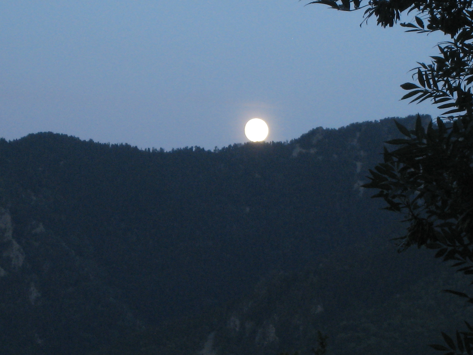
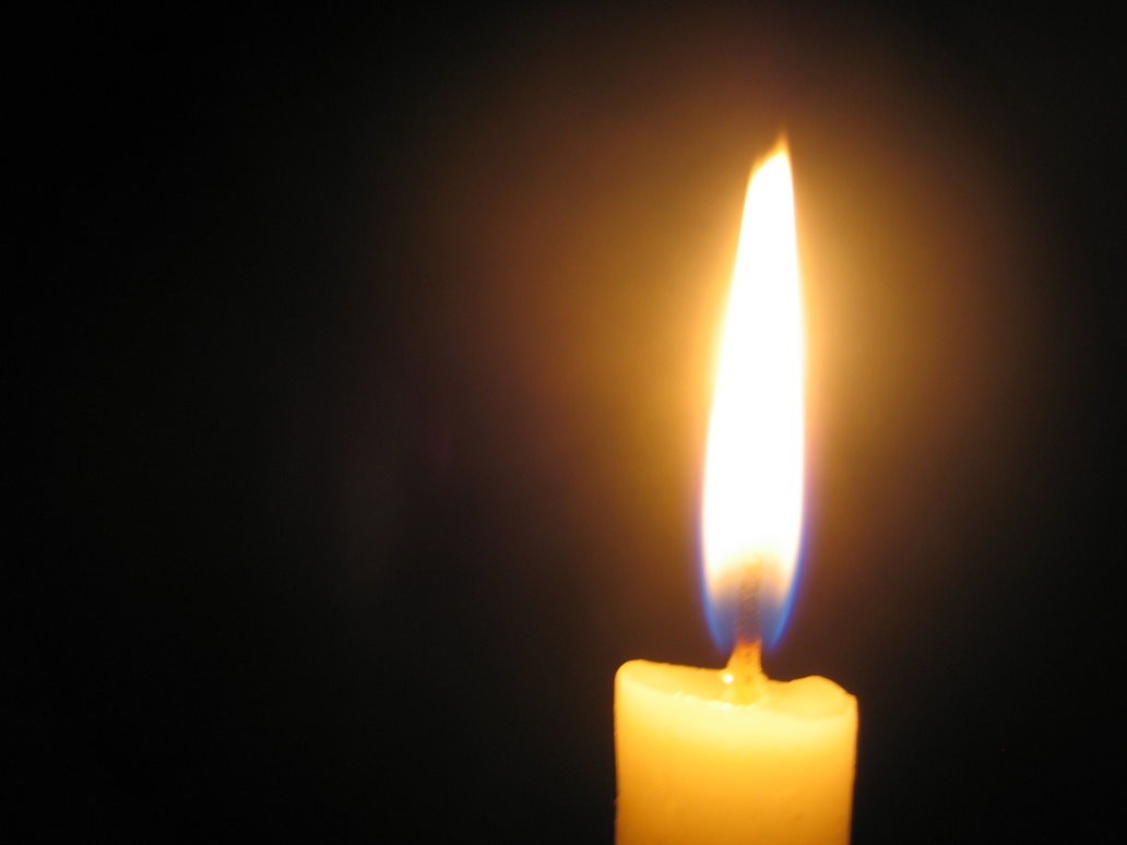
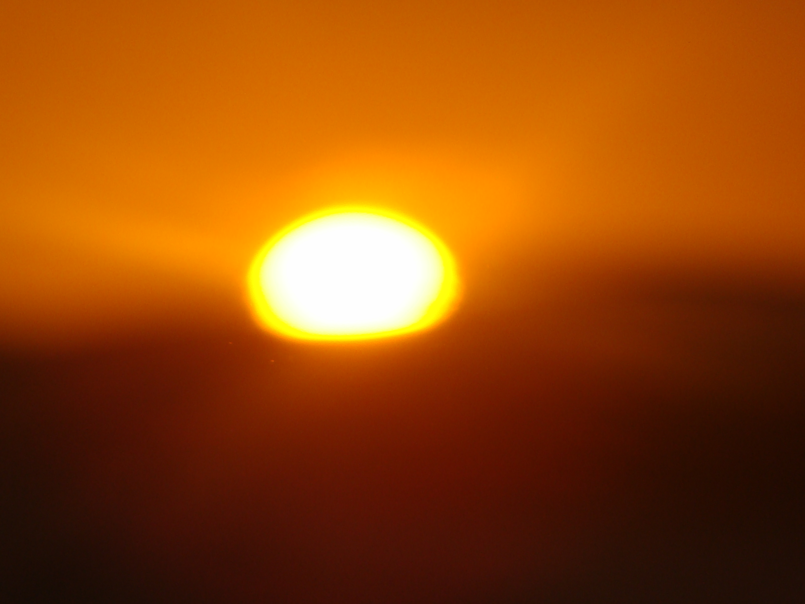
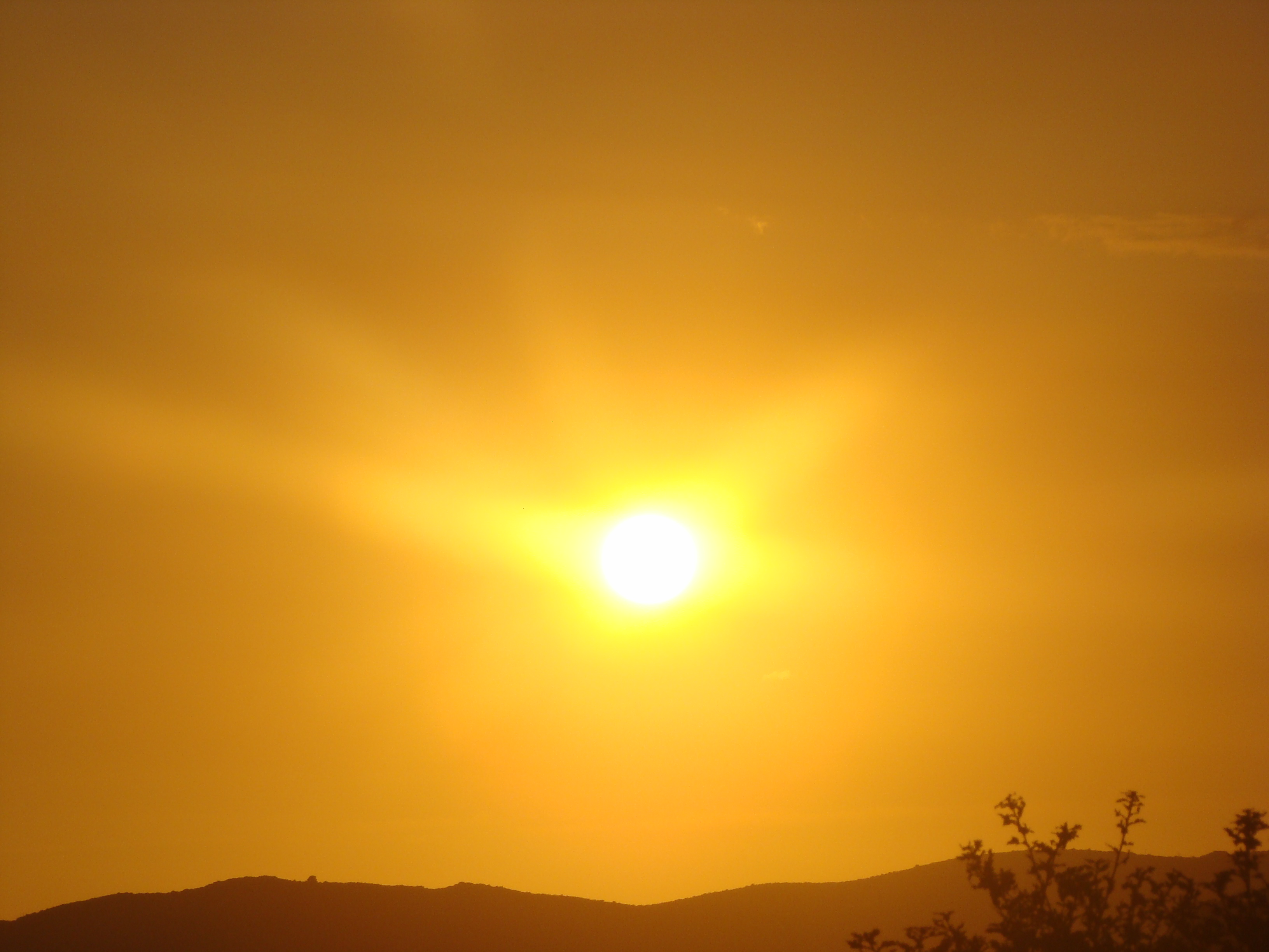
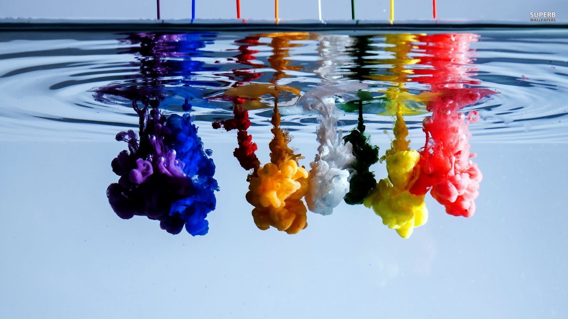
LIGHT IS INVISIBLE, WHAT WE SEE IS REFLECTION FROM AN OBSTACLE
Color is the place where our brain and the universe meet.
Paul Klee
Light does not make compromises, it is only governed by the physical laws
Introduction
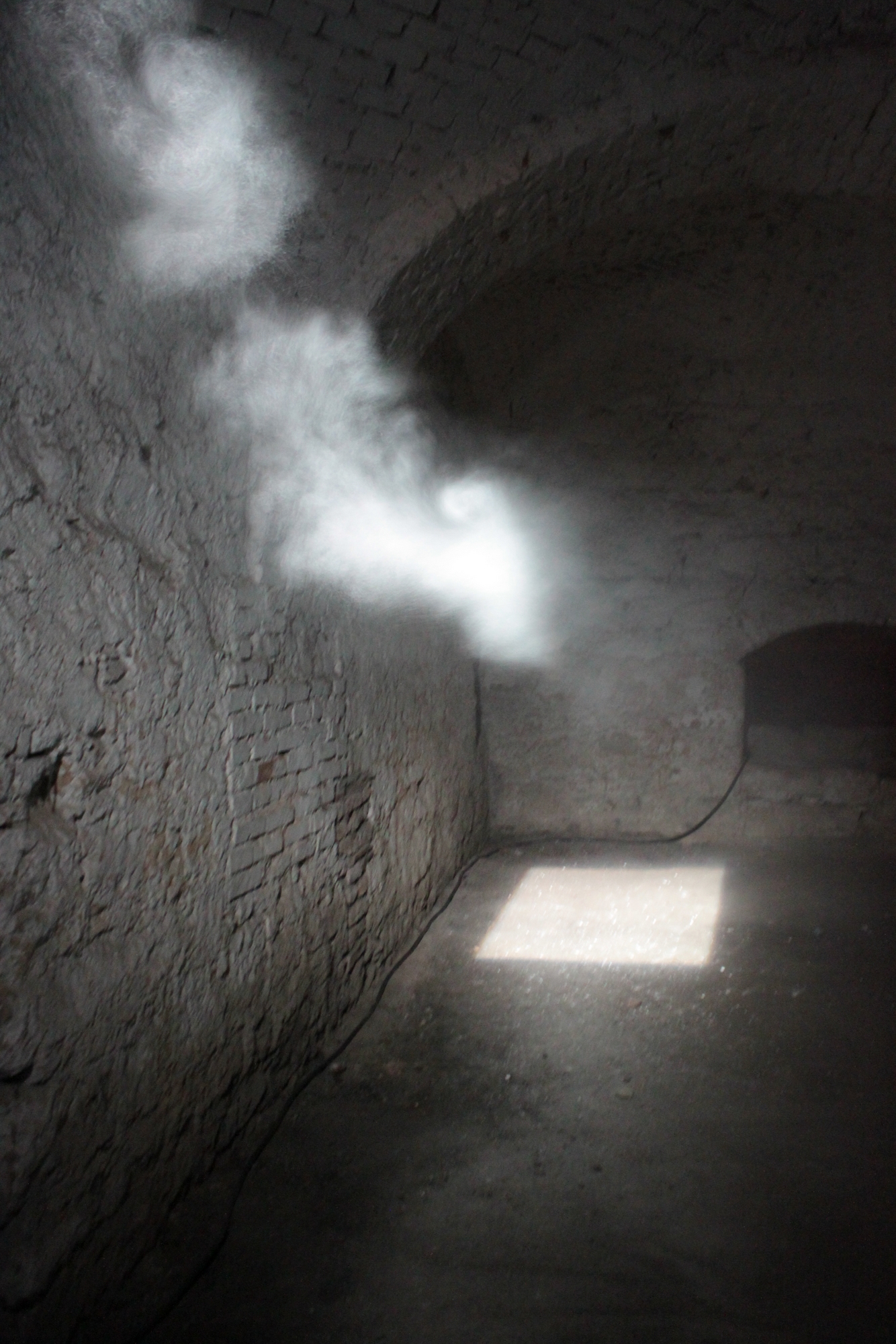
We do not see light as such. We cannot observe light as it travels from the source to the illuminated object, or from illuminated object to the eye.
Light only allows us to see the surrounding area. The eye is able to perceive not only sources of light, but reflections of the light from objects. Everything what is within the range of our sight either emits the light or reflects it.
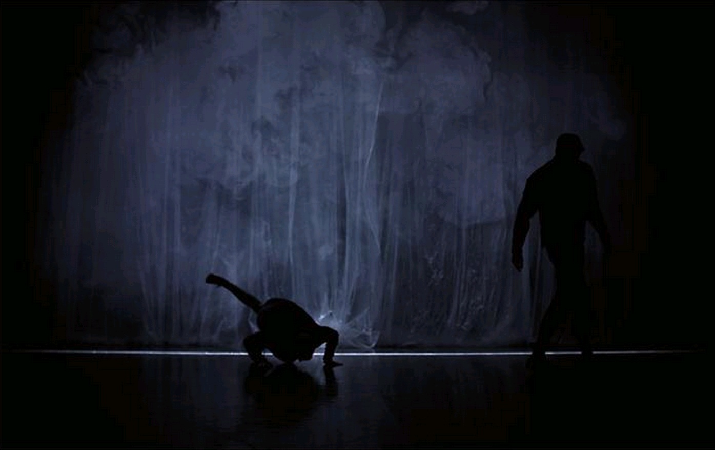
Whenever we are able to detect the rays of light, it is when they are refracted from an object, even drops of rain as in rainbow or from pieces of dust. We can purposefully use haze if such an effect is desired.
The second lesson of the European Lighting School Knowledge Center deals with the nature of light and its influence on the lighting design in theater. The goal is to apprehend the basic qualities of light and what kind of influence they have onto the objects, areas in theater, further to consider the result of falling light in the real ambiance of various qualities, to learn how to think over and intentionally work with reflection, refraction, color and color contrast and contrast between cold and warm.
Topics:
Physical qualities of light (reflection, refraction, scattering). The problem of “white”. Color temperature. Color Rendering Index. Theory of colors, characteristics of a color. RGB and CMY color mixing. Reproduction of colors, effects on the stage. Some basic ways of measuring light.
Time requirement for this lesson:
6 – 8 hours
Author and tutor for the lesson:
The lesson was prepared by Ondřej Růžička with cooperation of František Fabián and Jan Purkert.
Photos courtesy of Institute of Lighting Design and Jan Purkert. Other sources are quoted separately as appropriate. Some pictures were created with the help of programs Color Wheel Pro and Virtual Light Lab 2010.
In the Key terms section, the definitions were mainly retrieved from Wikipedia. Some definitions are retrieved from International Lighting Vocabulary (International Commission on Illumination 1970) and are marked by their code CIE with a reference number in the vocabulary.
Tutor for the lesson is Ondřej Růžička who is available for answering questions in the period 12.7 – 25.7 of 2015. You can contact him via the contact form at the end of the lesson. Reply is not guaranteed, unless submitted within the given period of time.
Introduction Test
Key terms
Theory
Light is electromagnetic radiation within a certain portion of the electromagnetic spectrum.
Snell’s law is a formula used to describe the relationship between the angles of incidence and refraction, when referring to light or other waves passing through a boundary between two different isotropic media, such as water, glass, or air.
Wavelength of a sinusoidal wave is the spatial period of the wave—the distance over which the wave’s shape repeats, and the inverse of the spatial frequency.
Refraction is the change in direction of propagation of a wave due to a change in its transmission medium.
Reflection is the change in direction of a wavefront at an interface between two different media so that the wavefront returns into the medium from which it originated.
Color is the visual perceptual property corresponding in humans to the categories called red, blue,yellow, and others.
Color model is an abstract mathematical model describing the way colors can be represented as tuples of numbers, typically as three or four values or color components.
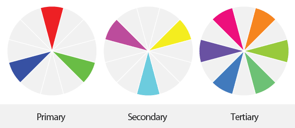
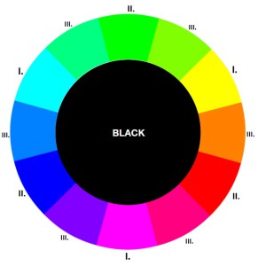
Color wheel is an abstract illustrative organization of color hues around a circle that shows relationships between primary colors, secondary colors, tertiary colors etc.
RGB color model is an additive color model in which red, green, and blue light are added together in various ways to reproduce a broad array of colors.
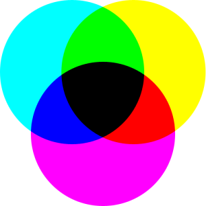
CMY color model (process color, four color) is a subtractive color model,in which cyan, magenta yellow pigments are subtracted from each other in various ways to reproduce broad arrays of other colors.
Primary colors are sets of colors that can be combined to make a useful range of colors.
Secondary color is a color made by mixing two or more primary colors in a given color space.
Tertiary color is a color made by mixing either one primary color with one secondary color, or two secondary colors, in a given color space such as RGB and CMYK or RYB.
Monochromatic colors are all the colors (tints, tones, and shades) of a single hue.
Complementary colors are pairs of colors which, when combined, cancel each other out.
Chromatic color (psychophysical) – Psychophysical color of greater than zero purity and hence possessing a dominant or complementary wavelength. (CIE 45-25-140)
Additive color is color created by mixing a number of different light colors, with Red, green, and blue being the primary colors normally used in additive color system.
Subtractive color model explains the mixing of a limited set of dyes, inks, paint pigments or natural colorants to create a wider range of colors, each the result of partially or completely subtracting (that is, absorbing) some wavelengths of light and not others.
Colors essentials
Tints and shades a tint is the mixture of a color with white, which increases lightness, and a shade is the mixture of a color with black, which reduces lightness.
Brightness is an attribute of visual perception in which a source appears to be radiating or reflecting light.
Hue is one of the main properties of a color, defined technically (in the CIECAM02 model), as “the degree to which a stimulus can be described as similar to or different from stimuli that are described as red, green, blue, and yellow,”
Lightness is a representation of variation in the perception of a color or color space‘s brightness.
Color temperature of a light source is the temperature of an ideal black-body radiator that radiates light of comparable hue to that of the light source.
Color rendering index (CRI) is a quantitative measure of the ability of a light source to reveal the colors of various objects faithfully in comparison with an ideal or natural light source.
Illuminance is the total luminous flux incident on a surface, per unit area.
Luminance is a photometric measure of the luminous intensity per unit area of light travelling in a given direction.
Chromaticity is an objective specification of the quality of a color regardless of its luminance.
Colorfulness is the degree of difference between a color and gray.
Chromatic aberration is a type of distortion in which there is a failure of a lens to focus all colors to the same convergence point.
Saturation is the colorfulness of a color relative to its own brightness.
Light scattering is a form of scattering in which light is the form of propagating energy which is scattered.
Lesson 2
1. Nature of light
For long time, people were trying to describe the light – it was thought to be small particles traveling from light sources to eyes. Other theories came into existence, saying that it has the nature of a wave in environment. At the beginning of the 20th century, physicists discovered that it could be described either as a wave or as a particle. This can be very confusing, but don’t worry, for description of our common visual experience, we will treat it only as a wave here.
Light is electromagnetic radiation, like x-rays or radio waves are, within a certain portion of the electromagnetic spectrum. We speak of visible light when it is visible to the human eye and is processed by the sight.
We can characterize light by its wavelength – simply how long is a single wave or more academically, the distance between the same phase of two near-by waves. Or we can characterize it by its frequency, which is simply the speed of wave motion – an amount of waves per second (in hertz).
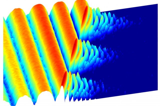
Light is a part of the electromagnetic spectrum. Light moves in wavefronts.
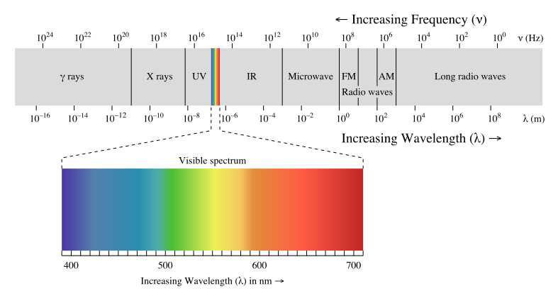
Visible light is usually defined as having wavelengths in the range between 380 and 740 nanometers (nm) – between the infrared (with longer wavelengths) and the ultraviolet (with shorter wavelengths). Often, infrared and ultraviolet are also called light, although they are not detectable with the human sight.
The speed of light is constant in vacuum according to the Einstein’s theory, but the speed differs in relation of the nature of environment. Not only light as such, but some of its wavelengths are slower than others. Violet and blue light is slower than orange and red.
Things that emit light are called sources of light. A source of light transforms various sources of energy (electricity, chemical, nuclear) into light.


2. Light propagation
As said in the quote above, we can’t see the light itself, but its reflection from the obstacles. The light is being reflected differently from different obstacles – this constitutes the appearances of our material world. So how does the light behave in different conditions of our material world? It moves in direct lines unless the environment changes, what happens next depends on nature of the environment. It can pass through, it can be reflected or it can be absorbed.
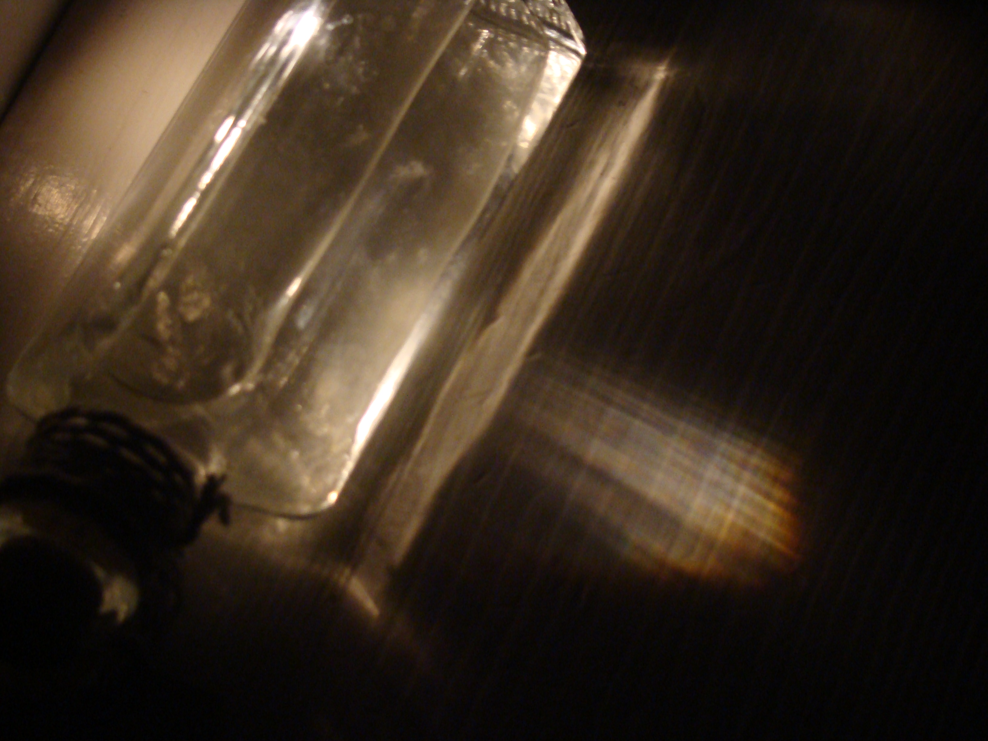
If the light penetrates through such an object (or environment) without being dispersed to several directions, we call that object transparent – like air, clean water, window or gel. Altering of direction of the light when passing from one environment to another is called refraction and is scientifically described by Snell’s law.
In general, we can say:
– the refracted beam remains in the plane.
– the angle of refraction depends on the angle of incidence, nature of the materials and on the wavelength of light.
If the light penetrates through an object, but it is dispersed in several directions, we call that object translucent. For example a matt surface window or air full of haze.
Non-transparent or opaque materials don’t allow light to pass through – the light is either absorbed or reflected.
Transparent ambiance
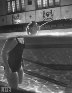
Refraction. Photo by George Silk for Life magazine.
2.1 Reflection
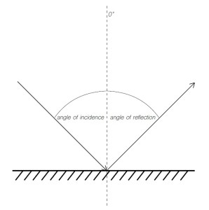
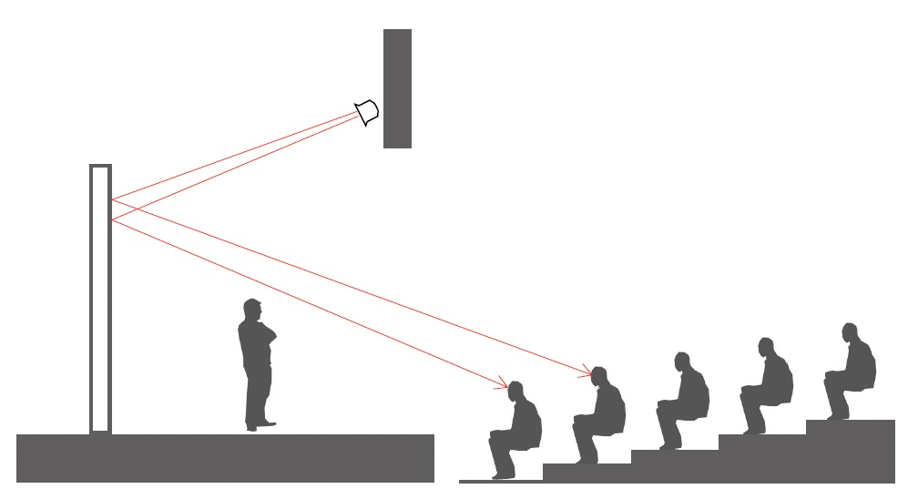
Generally, if the light is reflected, the reflected beam remains in the plane and the angle of incidence equals the angle of reflection, measured from the axis perpendicular to the surface.
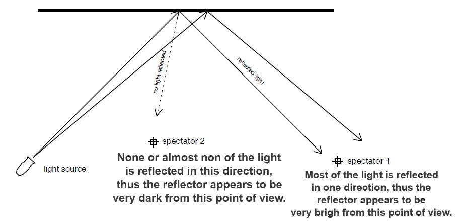
Now, it depends much on the features of the surface, how the reflected light would look like: if the surface is flat and bright (at the micro level – don’t forget that waves of light are pretty small), the majority or all the rays are reflected in the same direction and thus the original images can keep its shape. It is called specular reflection, a mirror being typical example of it. This kind of a surface will look very bright, but only if viewing from a specific angle and probably only on a particular place. From other sides, it may look dark.
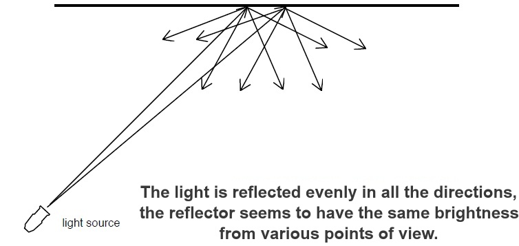
A rough surface with high unevenness (again at the microscopic level) causes the light to be reflected in many directions as the light is reflected in the same angle. When the beam of light is dispersed, it is called diffuse reflection. The light bounces off the reflector (typically felt) in all directions. This kind of surface looks similarly if viewed from different angles.
Most of the surfaces we usually meet reflect more light in the angle equal to the angle of reflection, but they also reflect light to other directions. You have probably observed this while looking onstage – backlight seems to be more visible on the floor then light coming from the front, although they have the same intensity. It is because a larger part of the backlight reflected from the floor goes directly towards your eyes.
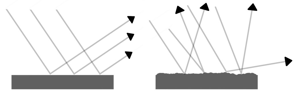
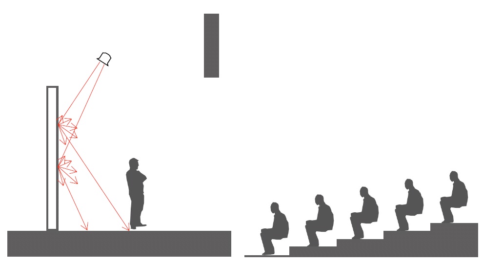
Specular and difuse reflection.
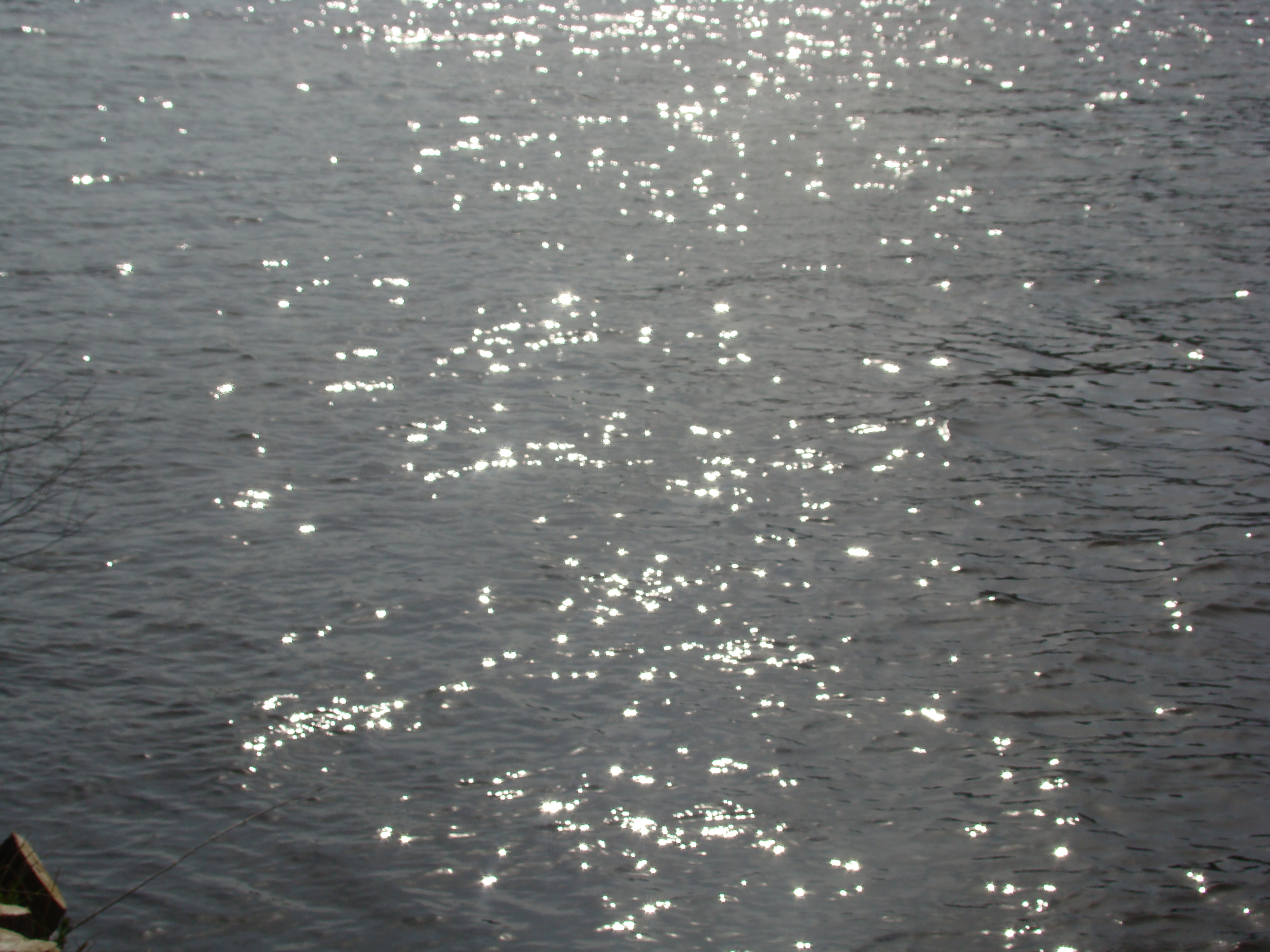
At an uneven surface, light is dispersed in various directions. We see the reflection of the sun at the areas, at which the angle of incidence directs the rays to our eyes.
All this sounds logical and there is nothing surprising in it. Does it have any use for the stage lighting design? Let’s put the following example to the test.
Let us imagine a quite simple set: on the stage, there is a round table with a glass table top and two chromed chairs, a silver bowl on the table. The rear section is composed of a wall from white PVC with a glossy surface finish.
Because all the mentioned set elements reflect the light mostly in one direction, because they are lustrous, you will have to meticulously locate and focus all fixtures so the reflection from any lustrous surface (and there are many) wouldn’t shine to where it shouldn’t – into the spectator’s eyes, onto the wall of the auditorium, onto other part of scenery etc. This itself is a lot of work, but the simple law of reflection is sufficient. The entire stage will have to be meticulously masked so the technical background can’t be seen, to where probably the light would fall.
If you have the intention to directly illuminate the walls (for instance in various colors), the angle of incidence has to be carefully chosen (and so the position of the instrument) – for example, if it is to be illuminated from the front, the spectators will be probably dazzled – they won’t see the walls, but shining lenses of the fixtures. But if you select a more steep angle, dazzling will be avoided, but the major part of light will be reflected from the floor uselessly.
This theoretical knowledge is thus beneficial in the way that a lighting designer should be able to foresee what kind of a material would look like under the light of various fixtures, to react adequately or even to influence which material would be used in the preparation phase.
Reflection blinds audience.
A major part of light gets away.
3. Light and color
3.1 White light
As common sense suggests, white light is the light of no significant color. While we usually don’t see light, we tend to say that what we try to call white light is light that has no color.
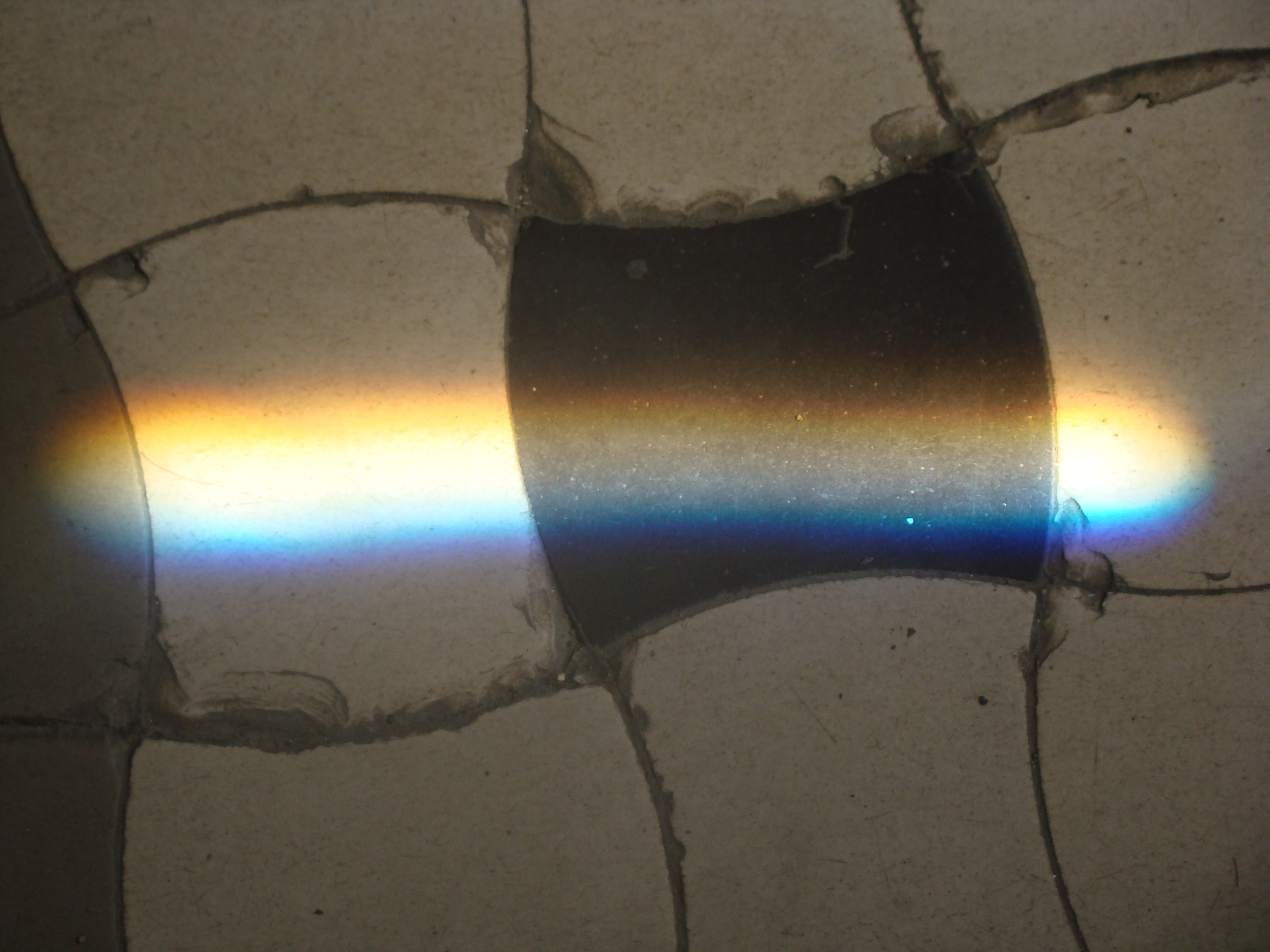
But you might have maybe heard about Isaac Newton’s prism experiment, when he demonstrated that what is perceived as white (or colorless) light can be dispersed to light of different colors and then (with another prism) composed back to white. Thus white light contains a mixture of all kinds of colored light. Different wavelengths in the spectrum are perceived as representing different hues with the range from purple-blue (the shortest wavelengths) to red (longer wavelengths).
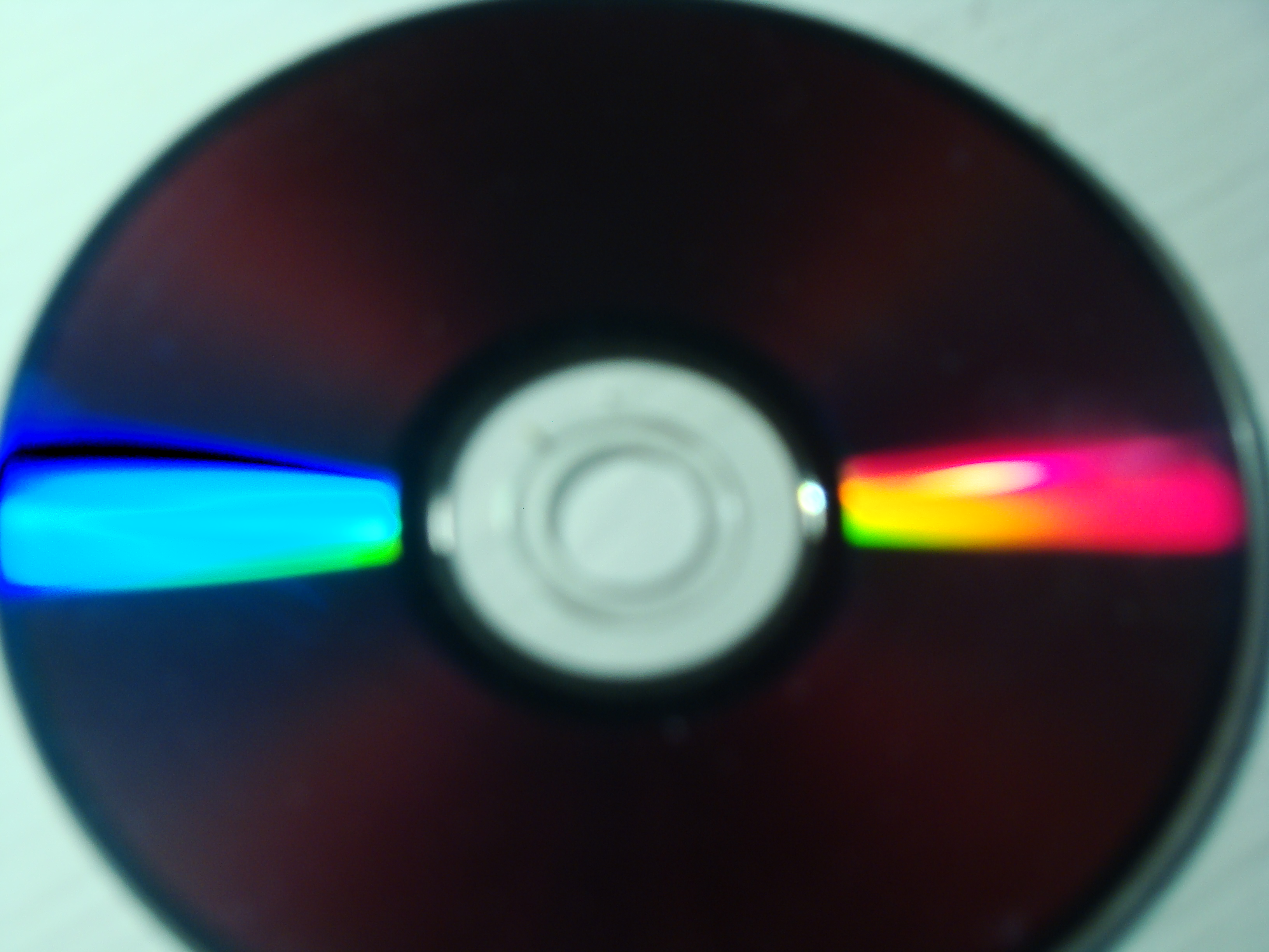
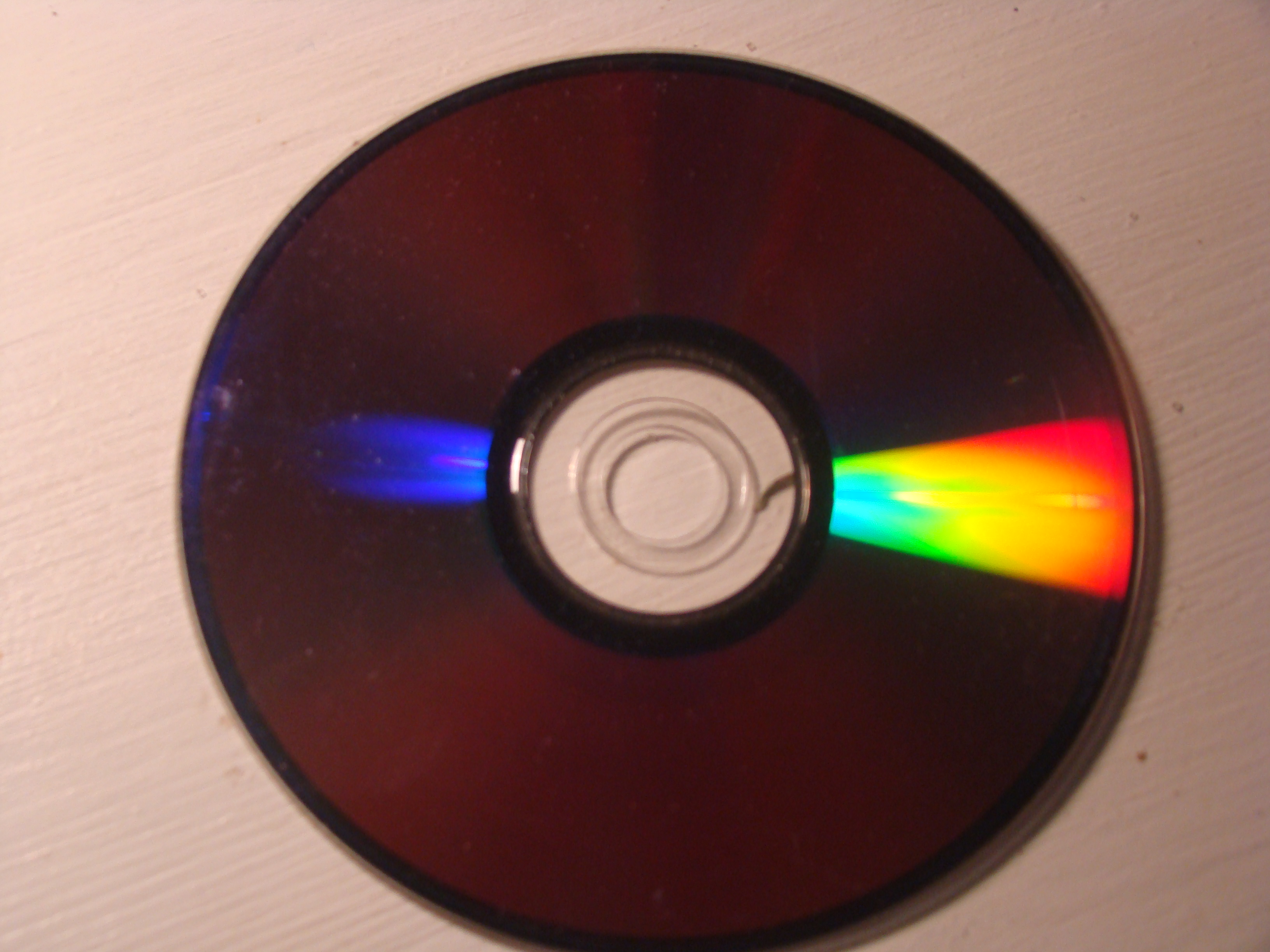
Most of you have seen this dispersion – a rainbow is a familiar example of decomposing white light to colored light. You can also observe it for example while playing with a CD – you can see all the colors of the spectrum reflected by its data side.
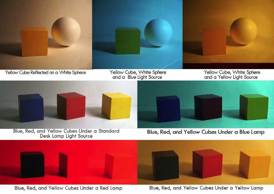
Also you have most likely noticed, that what we call white light has many different appearances. Light of a sunny day is not the same as light of a cloudy one, white light of your table lamp looks very different from the one from fluorescent tubes in your kitchen.
The output of a luminaire with no filter attached is usually called white (or open white) but tungsten lamp sources do not produce the same light as those with HMI discharge lamp.
Avoiding its distribution, all these lights differ in something we tend to call color: light of HMI lamps is more bluish than that of incandescent light sources, which seems to be more yellowish. Generally, they are all white but we are able to perceive differences – some are colder (bluish) and some warmer (red-yellowish).
Because we already know that white light is composed of light of different colors, it is pretty obvious that blue wavelengths of spectrum prevail in cold light while the yellow and red ones in warm.

Visible spectrum with its respective wavelenghts.
Light consists of packets of energy – quanta – these combining the characteristics of corpuscles and waves. Light of short wavelength has more waves in each bundle than light of longer wavelength. … When light is bent by a prism, each frequency is deviated through a slightly different angle, so that the emergent beam comes out of the prism as a fan of light, giving all the spectral colours. Newton discovered that white light is a compound of all the spectral colours, by splitting a beam of sunlight into a spectrum in this way and then finding that he could re-combine the colours back into white light by passing the spectrum through a second similar prism, held the other way up.
GREGORY, R. Eye and brain: the psychology of seeing. 4th ed. Oxford: Oxford University Press, c1990, 256 s. ISBN 0-19-852340-8. p. 18
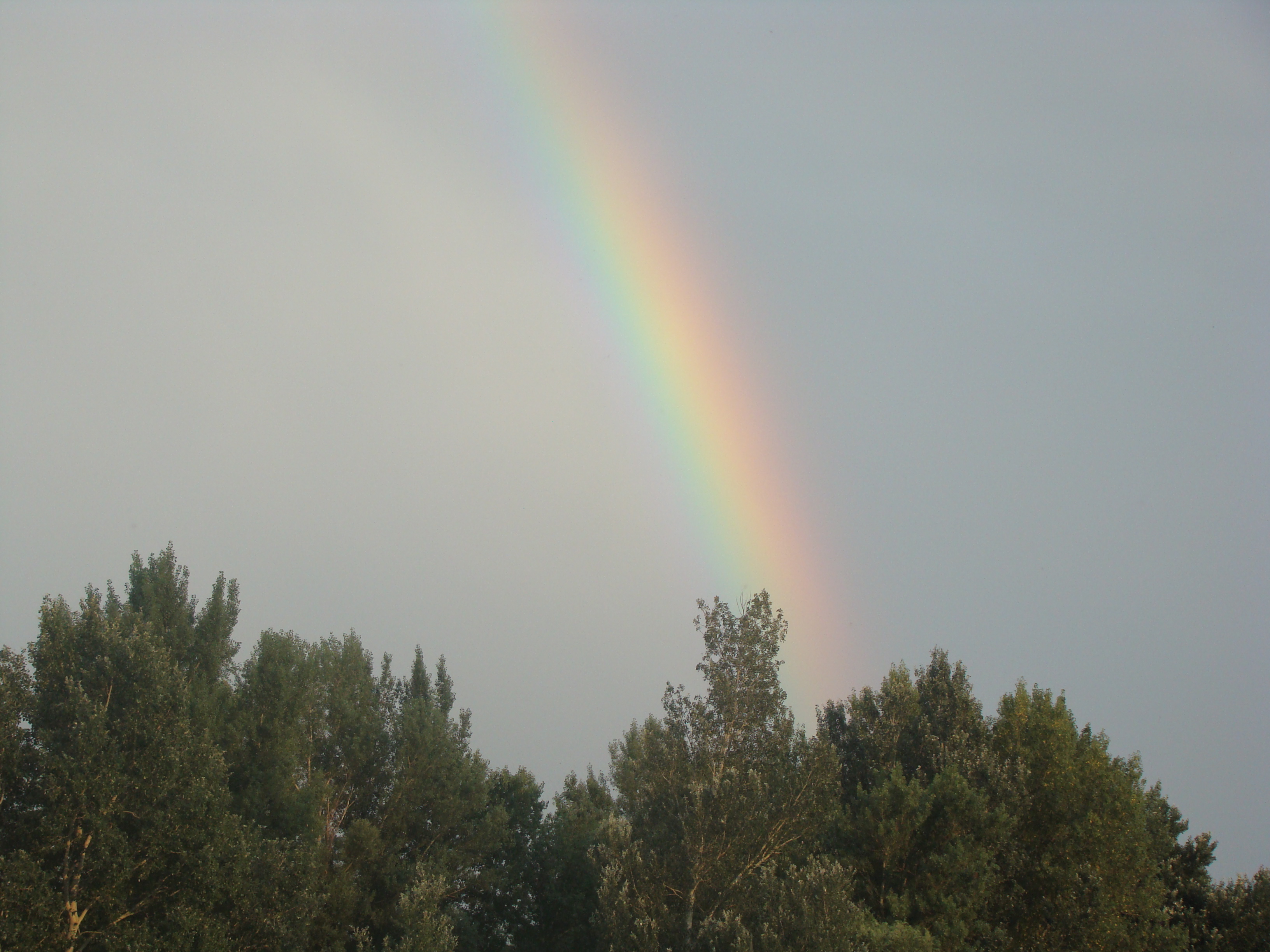
As the white light is composed of a range of color with different wavelength, when it hits the edge of glass or drop of rain, light decomposes as each wavelength has different angle of refraction. Natural sunlight is so decomposed into its spectrum.


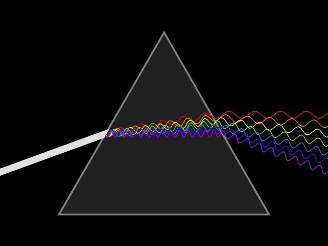
Light dispersion: representation of the nature of the Newton’s experiment.
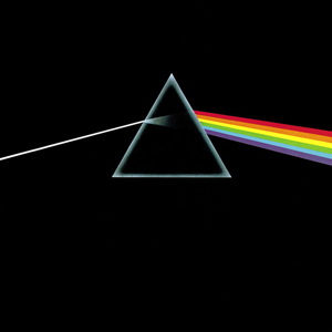
Newton’s Prism Experiment as a pop-culture icon at the cover of The Dark Side of the Moon by Pink Floyd.

Colors of the spectrum at a CD.
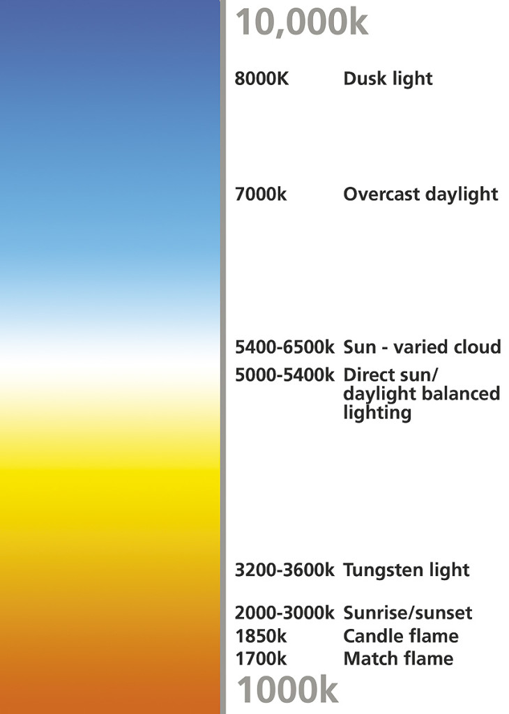
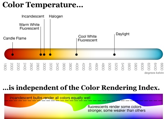
3.2 Color temperature
To describe this “color” of white light, there is a helpful thing called color temperature. This gives us a standard by which light sources can be compared.
The color temperature of a light source is the temperature of an ideal black-body radiator that radiates light of a comparable hue to that of the light source. In practice, color temperature is only meaningful for light sources that do in fact correspond somewhat closely to the radiation of a black body, i.e., those on a line from reddish/orange via yellow and more or less white to bluish white; it does not make sense to speak of the color temperature of, e.g., a green or a purple light. Color temperature is conventionally stated in the unit of absolute temperature, the Kelvin, (unit symbol K).
It might be confusing that the higher temperature, the cooler the light appears, but you may imagine the “black body radiator” (which may seem to be a very mysterious object) as a piece of metal. When you heat it, it goes from red hot to white hot and it can be even blue at the highest temperatures. You have probably observed that when using an incandescent source of light (i.e. source that emits light when heated – it is called thermal radiation) like a classic filament bulb. As the temperature of the filament (which is a piece of metal) increases, the filaments is brighter, but it also performs a significant color change from orange to white (and vice versa – lesser temperature, thus lesser intensity and also warmer appearance of the light). This is called a red shift.
Color temperature is important when you want to match different types of light sources: since fixtures using discharge type lamps or fluorescent ones produce a light of considerably higher color temperature than tungsten lamps, using the two in conjunction could potentially produce a stark contrast. To avoid this, color correction filters are used. When fitted in a fixture, they change color temperature (by blocking unwanted wavelengths) of that source to another one. There are filters to match a tungsten based lamp with daylight or fluorescents and vice versa. Almost every lamp you can buy is labeled with its color temperature, which makes matching via color corrections very simple.
Common color correction filters
Color temperature blue (CTB) converts tungsten light sources to various daylight temperatures. Most common are: full CTB filter that converts tungsten of 3200 to 5700K (or 5500K, it depends on manufacturer), half CTB – which converts tungsten to 4300K (4100K) or quarter CTB (tungsten to 3600). To achieve more accuracy (often necessary when lighting for the camera), there are also available 1/8, 1/3, ¾, double etc. CTB filters.
Color temperature orange (CTO) converts daylight sources (or HMI of high color temperature) to more orange light of tungsten lamps. When used with tungsten, they produce warmer color than just open white. There is also a whole range of them available, like full, half, quarter etc.
There is a lot more of color correction filters used to balance light sources of different temperatures, like HMI, CID, GSI or fluorescents. Although used more in camera lighting, for theatrical lighting designers, they offer (aside of the correction abilities) wide possibilities of toning white output of tungsten sources.
It’s worth mentioning that there are also neutral density filters (sometimes called grey filters). These filters do only one thing – they reduce the overall light output, without any affecting the color of the light. They are also available in variety of “strengths”. They can be put on windows if you need to lower the intensity of daylight coming from outdoors or used to put tungsten lamps down and avoid red shift. In theatre they are useful to balance the intensity of sources which can’t be dimmed, like fluorescent tubes etc.
So if you have fluorescent tubes of 4300 K (usually called neutral white) you should put half CTB gel (L202) or maybe L242 (Lee fluorescent) in your tungsten lamp fixtures to reach the same color perception. L242 is greener, if it will work depends on the performance of the fluorescent tube, but I would foretell that L202 does it better. On the other hand, you can wrap the fluorescent tubes with half or quarter CTO and balance it with the tungsten open white. But it sounds bit strange as people usually put fluorescents on the stage because they like their cooler light.


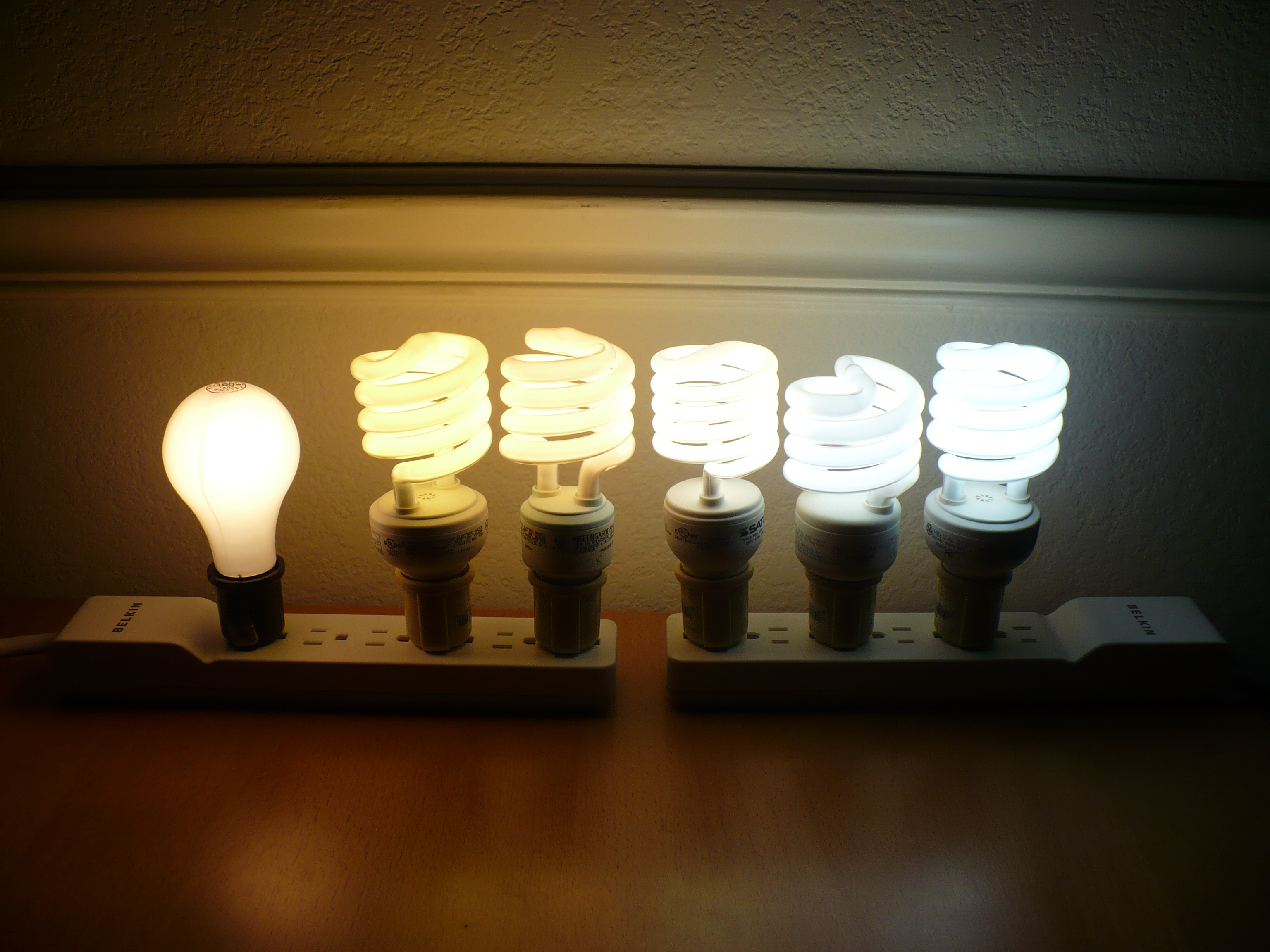
Color temperature comparison.

Warm, cold and their contrast is a mighty tool in the hands of a lighting designer, but mind this: 1) They are relative denotations. It depends on the possibility of comparison – warm downstage wash can only mean that it is warmer than very cool wash upstage, although we would not call it warm itself. Or if you execute a color change from orange to open white, you can say that the light became cool. But if you do a transition from light blue to open white, the light will become warm, although still having the same color temperature as in the previous example. A sophisticated use of this contrast is described in the case study to this lesson. 2) Communication with non-lighting people. Warm and cold very often denotes feelings and emotional associations rather than colors of light. When a director calls for cold lighting, you’ll probably do a good job with L201 or say L200 but maybe he or she wants only some uncomfortable feel on stage, which can be achieved by different means than just adjusting every fixture to 6000K.

Sources of light with different color temperature
When sun goes down and everything is colored in red, the shadows can be seen as rather blue.
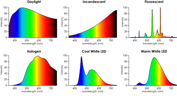
3.3 Color Rendering Index
You may object that although some sources have the same color temperature, they still don’t produce the same white. If you compare light from a classic tungsten bulb and a fluorescent bulb of color temperature 2700K, they will presumably not look the same.
Consider that light sources such as fluorescent bulbs (or even LEDs) produce light primarily by other processes than thermal radiation. That means that the emitted light spectrum does not follow the form of a black-body (that means our heated piece of metal) spectrum, thus they can’t be assigned with color temperature. They are instead labeled with correlated color temperature, which is the temperature of a black-body radiator which most closely matches the light from the lamp. But it doesn’t say how close, thus the appearance might be different.
Another information describing performance of white or white-closed light, which you may also find on lamp packing, is a color rendering index (CRI). It is a measure of the ability of a source of light to reveal the colors of various objects faithfully in comparison with an ideal or natural light source (usually the sun).
It is defined by the International Commission on Illumination (CIE) as follows:
Color rendering: Effect of an illuminant on the color appearance of objects by conscious or subconscious comparison with their color appearance under a reference illuminant
The value often quoted as ‘CRI’ on commercially available lighting products is properly called the CIE Ra, value ‘CRI’ being a general term and CIE Ra being the international standard color rendering index. Numerically, the highest possible CIE Ra value is 100 and would only be given to a source identical to standardized daylight or a Black body (incandescent lamps are effectively blackbodies). Since other lamp types emit light by different processes, their spectrum have different structures. The incandescent lamp has a continuous spectrum, whereas the fluorescent lamp has separate lines in the spectrum due to emission of photons of discrete wavelengths by mercury. Because it doesn’t contain every part of visible spectrum, some pigments may appear differently than under daylight or appear as not having color at all.
For example, high pressure sodium discharge lamps that are often in street lights, with their distinctive orange light, have CRI about 25, which means that they reproduce colors very poorly. Common fluorescents and LEDs has CRI about 80, the better ones even over 90.
The spectrum of different lamp types has different structures:
3.4 Colored light
In general, colored light is light of specific wavelengths. Some transparent objects allow some wavelengths of the light to penetrate, while absorbing the other – color filters work this way. A red filter blocks all the wavelengths of different colors from the light and releases only the wavelength that is perceived as red. The filters thus decrease the intensity of light as a part of light is absorbed by the filter. Colored light is therefore deprived of some of the wavelengths of the white light. Therefore colored light is white light without some wavelengths.
monochromatic radiation
Radiation characterized by a single frequency. By extension, radiation of a very small range of frequencies or wavelengths, which can be described by stating a single frequency or wavelength. (CIE 45-05-010)
When thinking of nontransparent objects, it works in quite the same manner, with the difference that the wavelengths which are not absorbed, do not pass through but are reflected. White objects reflect all wavelengths of the light, while black ones don’t reflect any, or at least so little that we can’t distinguish any color. A colored object, say red, absorb most of the wavelengths that are blue, green, yellow etc. and reflects the red part of the spectrum. It usually doesn’t absorb all the non-red wavelengths, but the reflection of red is dominant. The relation of which colors are absorbed and which reflected at which intensity is the basis of perceiving a color.
Color is by definition (CIE 45-25-130.2)
Characteristic of a visible radiation by which an observer may distinguish differences between two fields of view of the same size, shape and structure, such as may be caused by differences in the spectral composition of the radiation concerned in the observation.
Color is the attribute of visual perception consisting of any combination of chromatic and achromatic components. This attribute can be described with the help of names of chromatic colors, such as yellow, orange, brown, pink, green, blue, purple etc., or with the help of names of achromatic colors like white, gray, black etc., and can be specified further with attributes as dark, light, bright, dark or with a combination of these names. All the things are actually black and white and the color of things is a result of reflection of light in combination with the composition of the surface. Therefore the thing can have different color when being illuminated by a specific type of light.
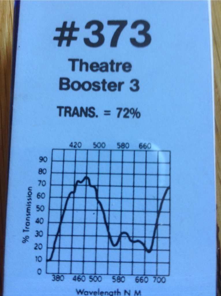
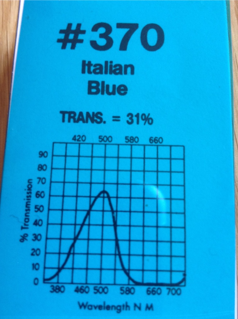
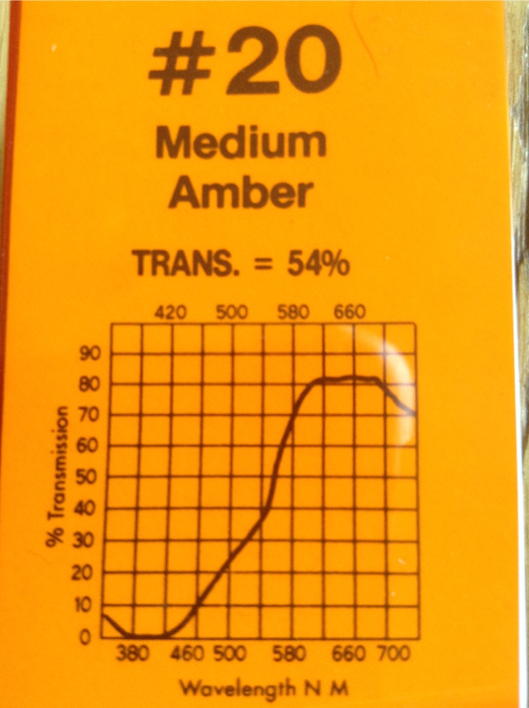
Here you can see a transmission diagram of different color gels. The curve shows how much of every wavelength is transmitted through the filter. Percentage above the diagram is the transmission value – how much of light passes through in general. Note that by using filter you always weaken the light output of the fixture.
A filter allows only a part of the light to pass through: cyan light in this case.
White light is partially absorbed at red surface and partially reflected. In a simplified representation, all the wavelenghs except for red were absorbed.
Filtering of light.
4. Attributes of colors
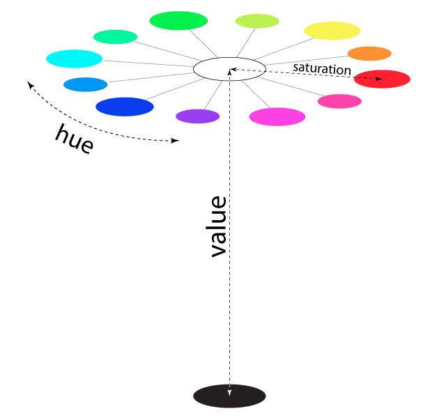
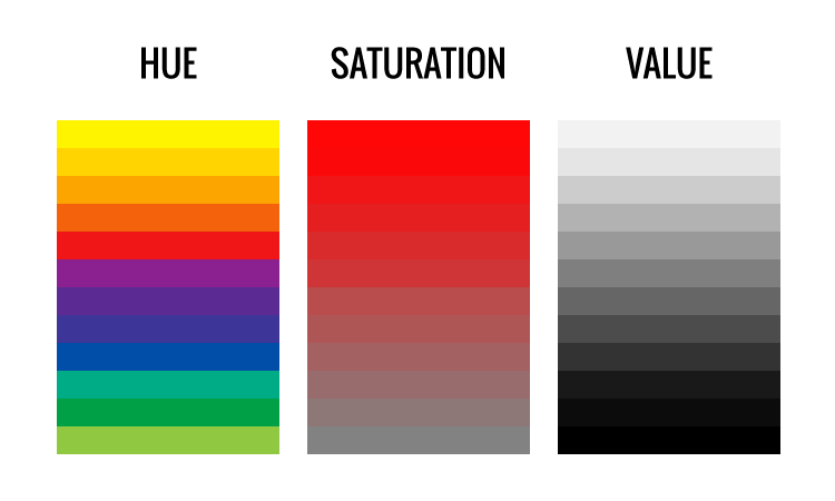
4.1 Hue, saturation, brightness
The colors can be described by three qualities that correspond to three different physical properties of light: hue, saturation, brightness (or hue, chroma, value)
Hue is a designation for basic colors of spectrum, like blue or green, it corresponds to the wavelength of incidence. Hue is a specific wavelength that belong to any color. Thus theoretically number of hues is infinite, as the spectrum is continuous, although in practice we use only general denotations like blue or red. To more precisely distinguish between different hues, people have developed such names like scarlet, chartreuse or cobalt blue.
Hue
Attribute of visual sensation which has given rise to color names, such as: blue, green, yellow, red, purple, etc. Note: This attribute is the psychosensorial correlate, or nearly so, of the colorimetric quantity dominant wavelength. (CIE 45-25-215)
Colors as white, gray or black, which possess no dominant hue are called achromatic. The hues in that colors are more or less in equal distribution. Colors, which possess a dominant hue like blue or green, are called chromatic. Therefore we can say that there are more colors than hues.
Saturation or chroma is the purity of a color. High saturation colors look rich and full. Low saturation colors look dull and grayish. We can imagine it as that less saturated chromatic colors are more or less mixed with some achromatic color.
Saturation
Attribute of a visual sensation which permits a judgment to be made of the proportion of pure chromatic color in the total sensation. Note: This attribute is the psychosensorial correlate, or nearly so, of the colorimetric quantity purity. (CIE 45-25-225)
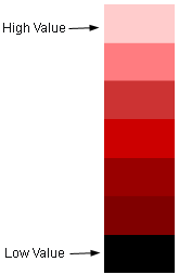
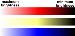
Brightness, also called value or lightness or intensity, is the attribute of visual sensation, according to which surface emits more or less light. Brightness is related to intensity. The more the light is intensive, the more the color is bright.
brightness (British: luminosity)
Attribute of visual sensation according to which an area appears to emit more or less light. Note: This attribute is the psychosensorial correlate, or nearly so, of the photometric quantity luminance. (CIE 45-25-210)
Note well that chroma/saturation and value/brightness are related but distinct concepts, each has its specific purpose (and specific notion) in different technical applications. Properly defining this three attributes is necessary to precise rendering of colors, but is far beyond needs of this lesson.
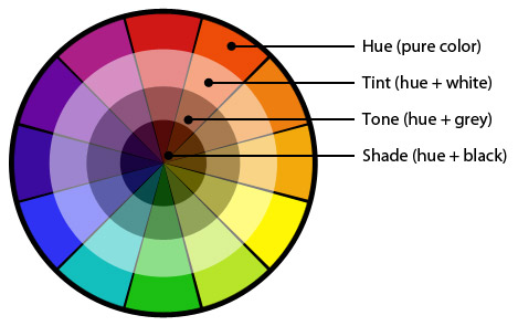
Tint, shade and tone is a way to describe colors, based on hue, saturation and brightness.
A tint is the mixture of a color with white, which increases lightness, and a shade is the mixture of a color with black, which reduces lightness, while hue remains the same. A tone is a mixture of color and grey, which reduces saturation, while lightness and hue remains the same.
5. Color models
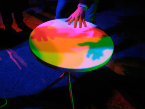
Color mixing is generally a way of how to create a broad range of colors, using a limited color palette. Knowledge of how colors mix (especially the colors of light) is naturally a crucial for lighting designers. Partly to foresee how differently colored lights will blend on the stage, partly because many of the automated fixtures we use to illuminate the stage – like LED PARs or moving heads – are equipped with some kind of a color mixing engine. It is vital to know how to use them to reach the desired color. Most of this equipment would not respond to something like: I need that passionate pinky-red I have seen yesterday. (although the days when it will work so are not that far away). They still largely need more specified commands, like blue@30, red@100, white@50.
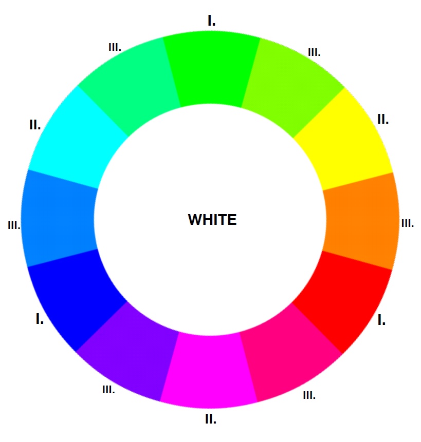
The systems of colors models are based on mixing of colors from the basic hues. From them, other colors are derived according to a specific principle. In that order one proceeds from primary (the basic ones) to secondary (mixture of basic ones) and tertiary colors (mixture of a primary one with a secondary one).
The problematic of color models and numerical representation of color is much more sophisticated than we need, we will undergo basics of only two color models, which have the largest impact on stage lighting. It is additive and subtractive color mixing models.
Additive color mixing

Substractive color mixing.
5.1 Additive
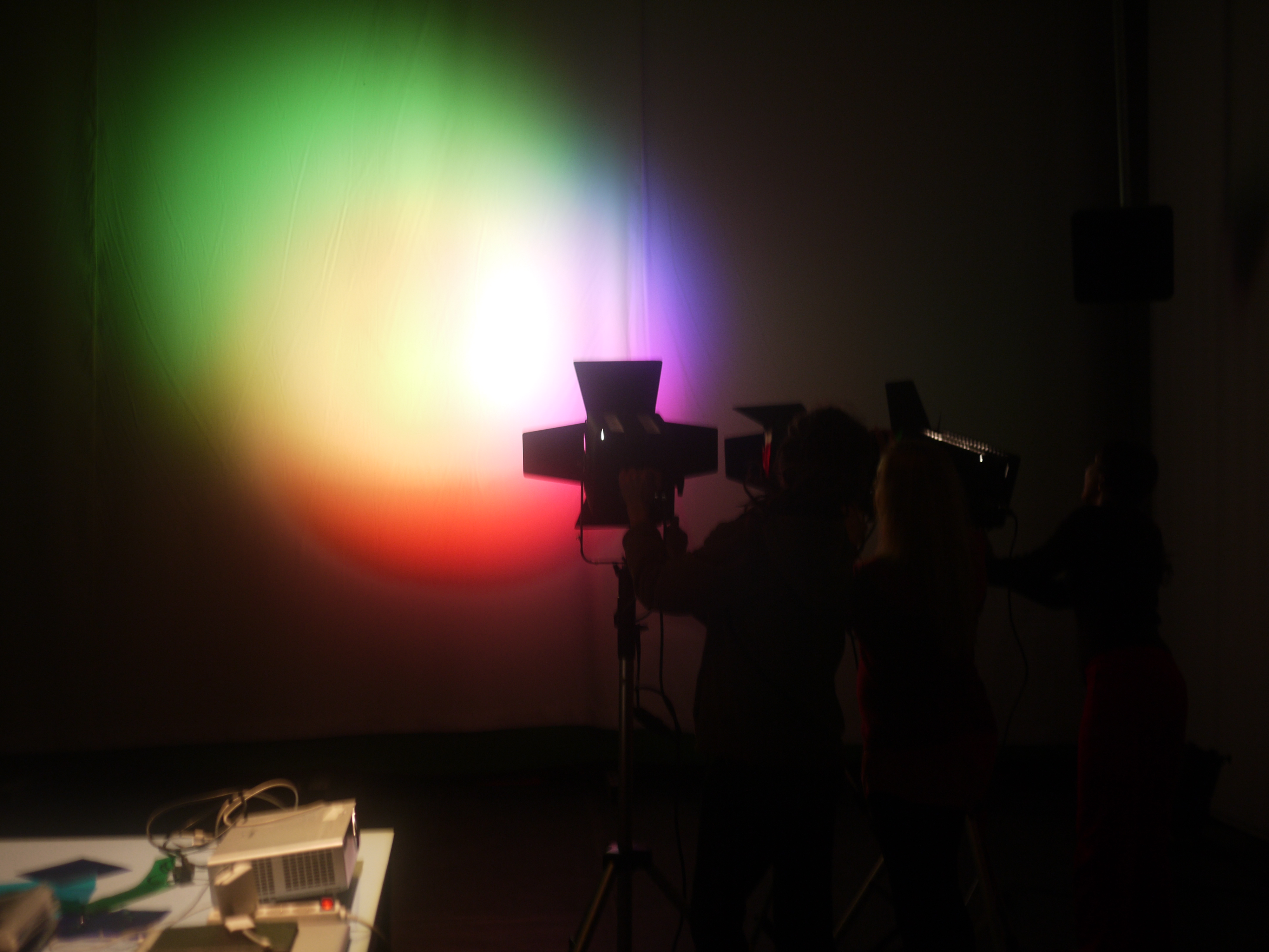
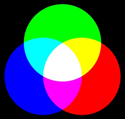
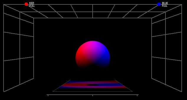
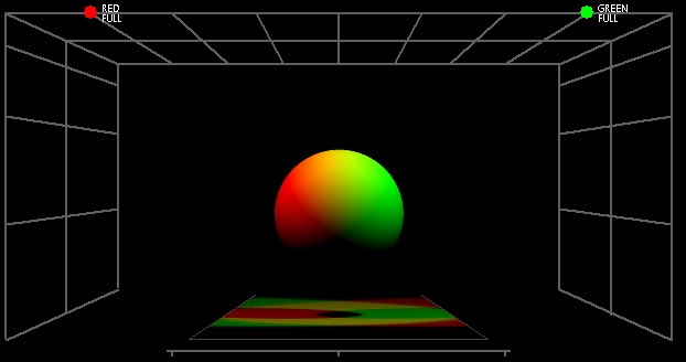
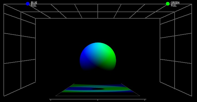
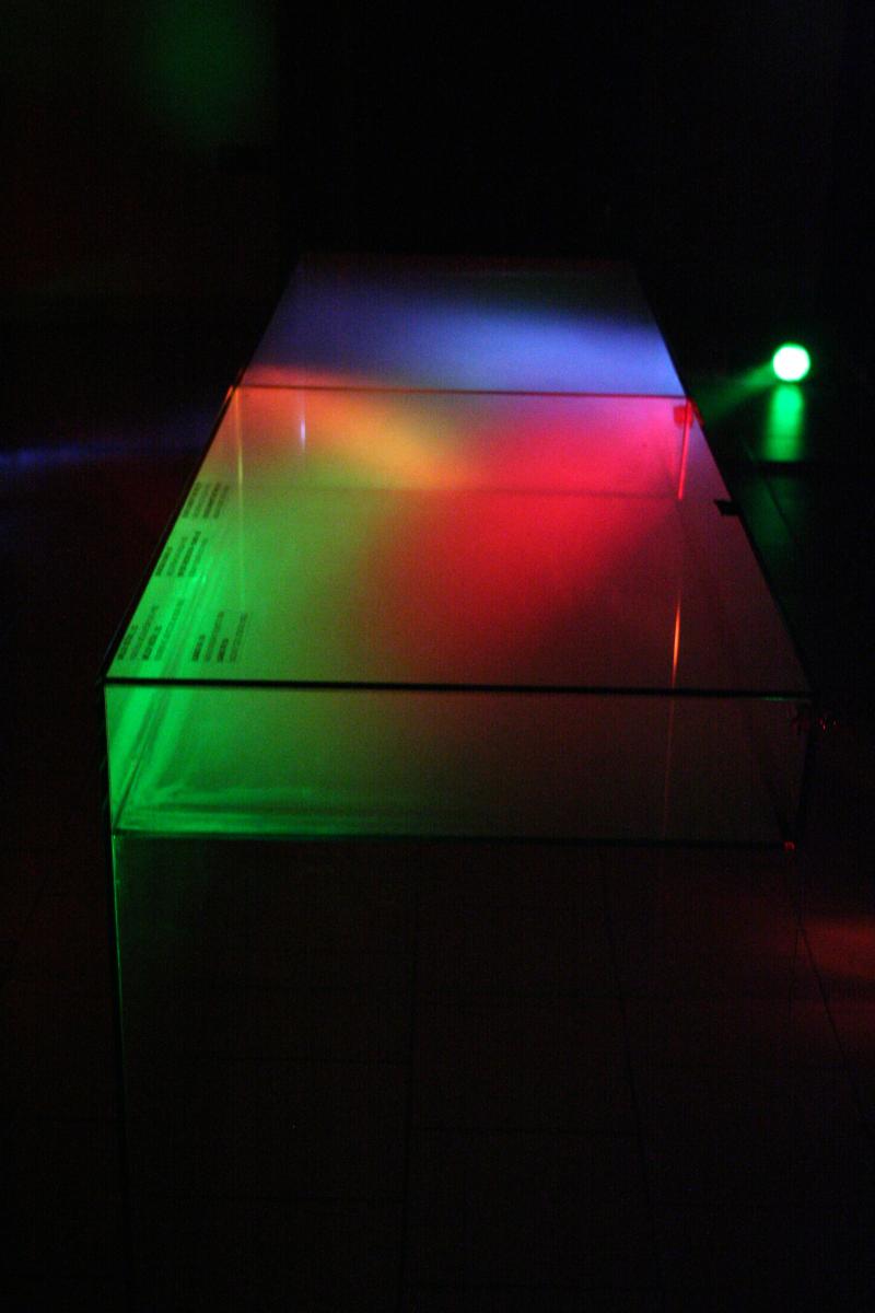
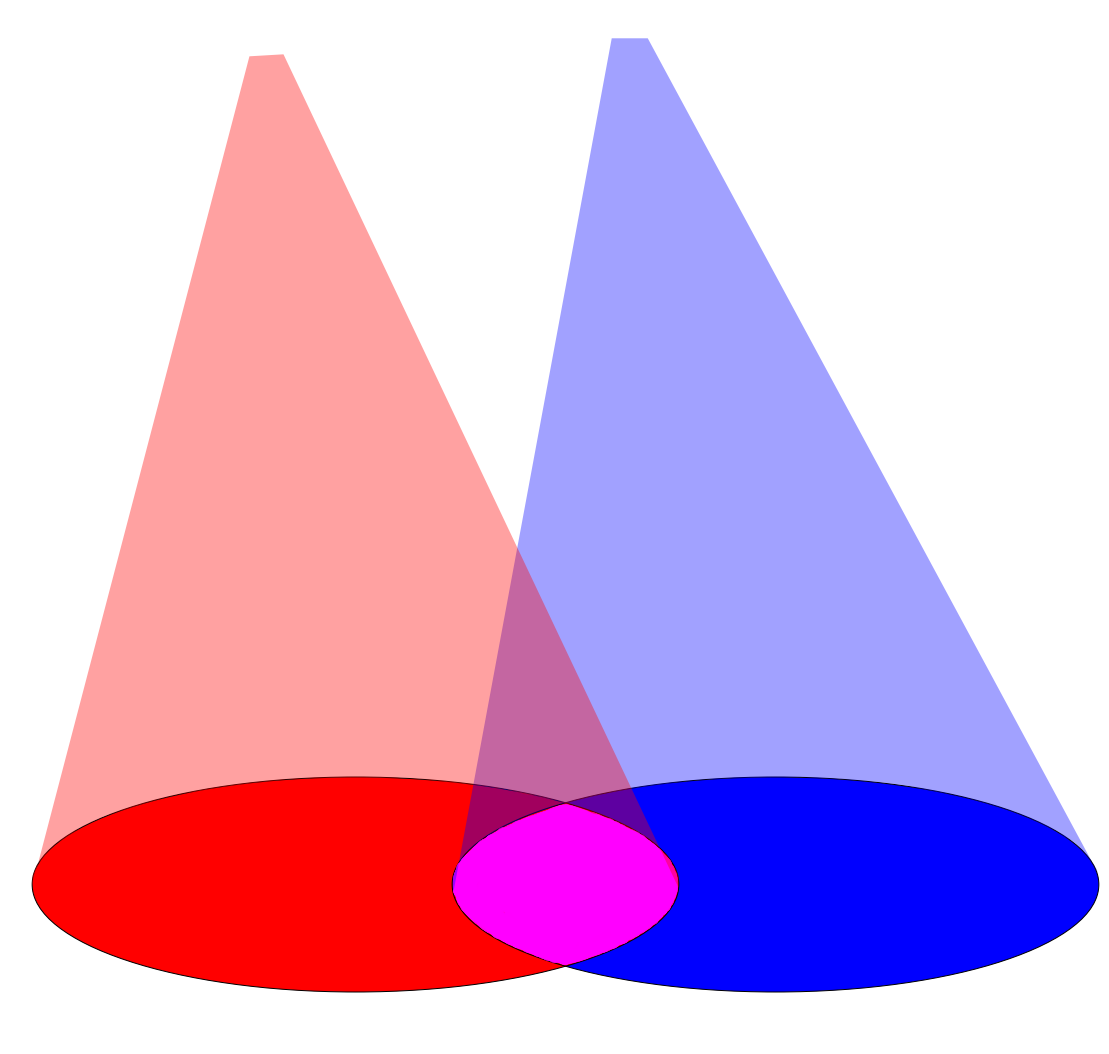
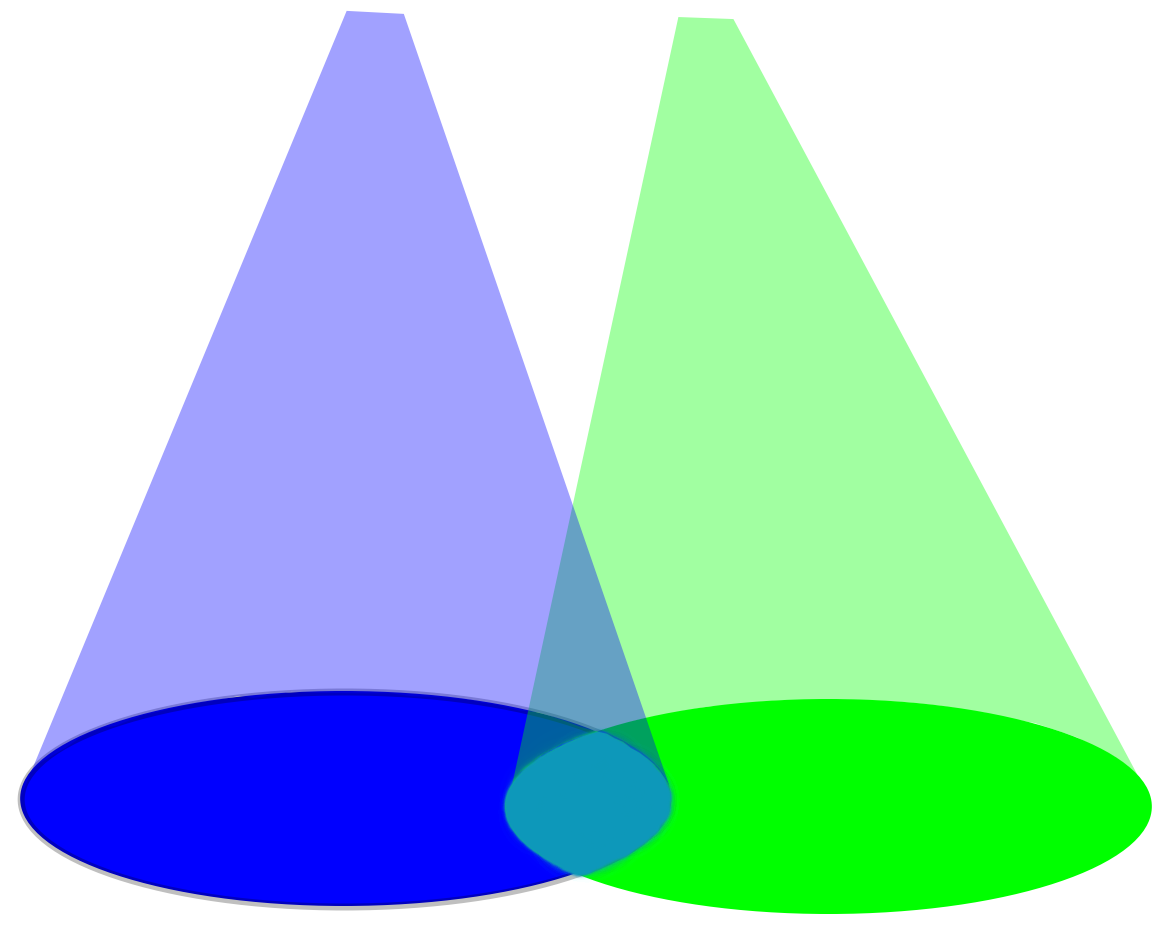
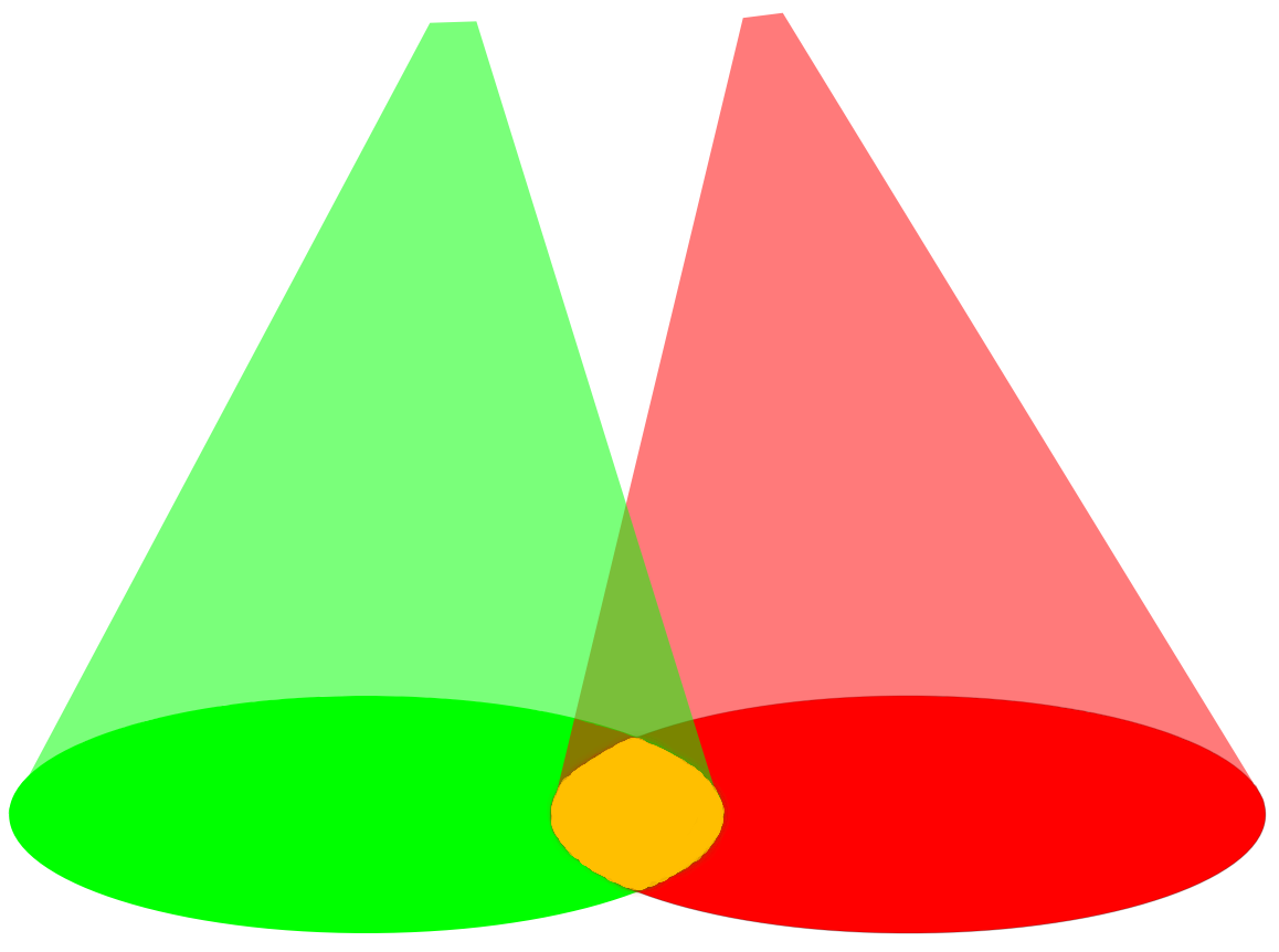
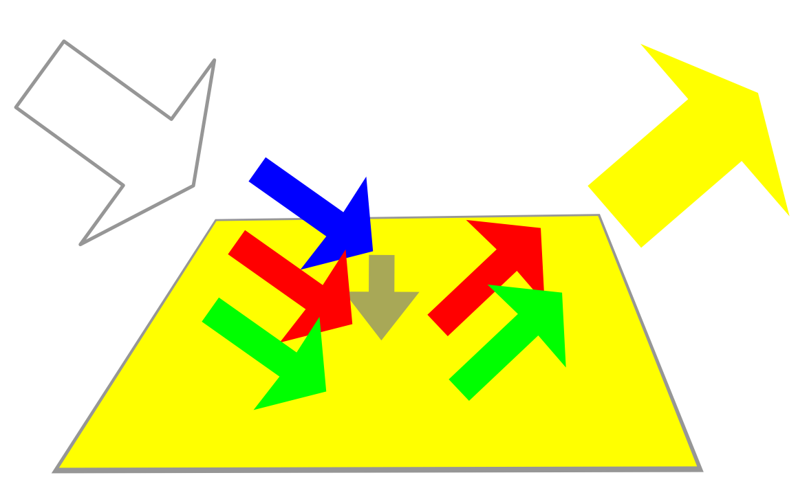
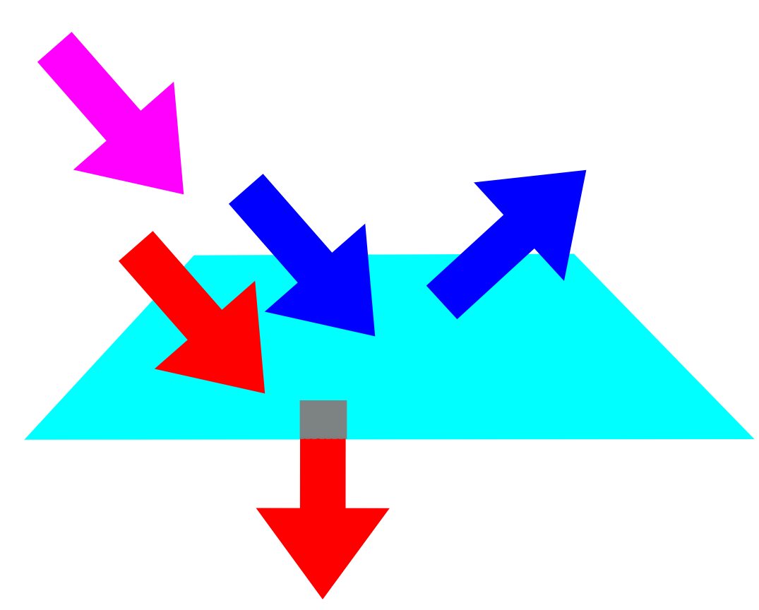
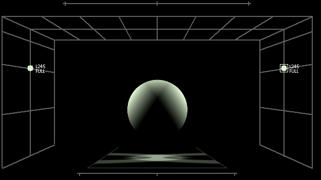
An example of additive color mixing. The picture itself is an explanation of the additive model of color mixing. First there is dark. Then there are three sources of light, each one fixed with its respective red, green, blue colors filters. In the middle, where all three beams cross each other, a white area emerges, in which the wavelenghts of all three sources are roughly under even distribution. With decresing ratio of hues from the center towards edges, white is being changed into another color as one of the concentrated beams does not reach it to the point on the outside edges, where is seen only the beam of one source. Either red, green or blue.
– RGB (Red Green Blue)
Idealized representation of additive mixing.
This system is based on emitting light and is thus of great importance in lighting. The primaries are red, green and blue, therefore it is often called RGB mixing. Red, green and blue light is added together in various ways to reproduce other colors in the spectrum.
To form a color with RGB, three light beams (one red, one green, and one blue) have to be superimposed (for example by emission from a three color LED). Each of the three beams is called a component of that color, and each of them can have an arbitrary intensity, from fully off to fully on, in the mixture. The RGB mixing is additive in the sense that the light beams are added together, and their light spectra add, wavelength for wavelength, to make the final color’s spectrum.
A / Primary colors
Primary colors are red, green and blue. They together compose white color when mixed under even distribution. Because we already know that white light is a mixture of colored light, this is probably not a big surprise. We also know (from the CRI chapter) that it isn’t necessary to fill evenly all the visible spectrum to reach the perception of white.
B / Secondary colors
Secondary colors in additive mixing are those which can be created by evenly mixing two primaries. We get cyan by mixing blue and green and magenta by mixing blue and red – which is quite intuitive. Less obvious is that we create yellow by mixing red and green.
C/ Terciary colors
Tertiary colors are those which are created by mixing secondary and primary colors. Yellow and red produce orange, magenta and blue purple etc. Have a look on the color wheel to further examine it.
Tertiary colors
Note that by mixing colors which are opposed to each other you create white. For example, mixing red and cyan produces some kind of white. That makes a perfect sense – for cyan is a mixture of blue and green, mixing with red is then mixing red with green and blue. Colors opposed to each other in the color wheel and which can compose together white color perception are called complimentary.
In stage lighting, you are going to meet additive mixing very often. Lots of LED based fixtures are equipped by RGB LEDs, which allow us to create a variety of colors by a single fixture. It saves time and offers more flexibility to the lighting designer, but remember that there are also some odds in using RGB fixtures. Some colors just can’t be created or don’t look good – like some pastel tints or nice white. The dimming curve of the LED is not fluent, mainly at lower intensities. And the overall light output is often weaker than of conventional fixtures. On the other hand, there are also high quality LED fixtures which do not suffer any of these flaws. Many modern LED systems use four or five color diodes to add better mixing ability (usually it is RGBW – W for white diode, or RGBA – A for amber). Dimming curves are very smooth so the transitions between colors are really seamless and with further development of high power LED modules, intensity doesn’t seem to be that issue.
additive mixing: blue and red give magenta
additive mixing: green and red give yellow
additive mixing: green and blue give cyan
Red, green, blue.
Magenta (blue and red) under even distribution.
Cyan (blue and green)
Amber (red and green)
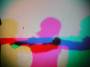
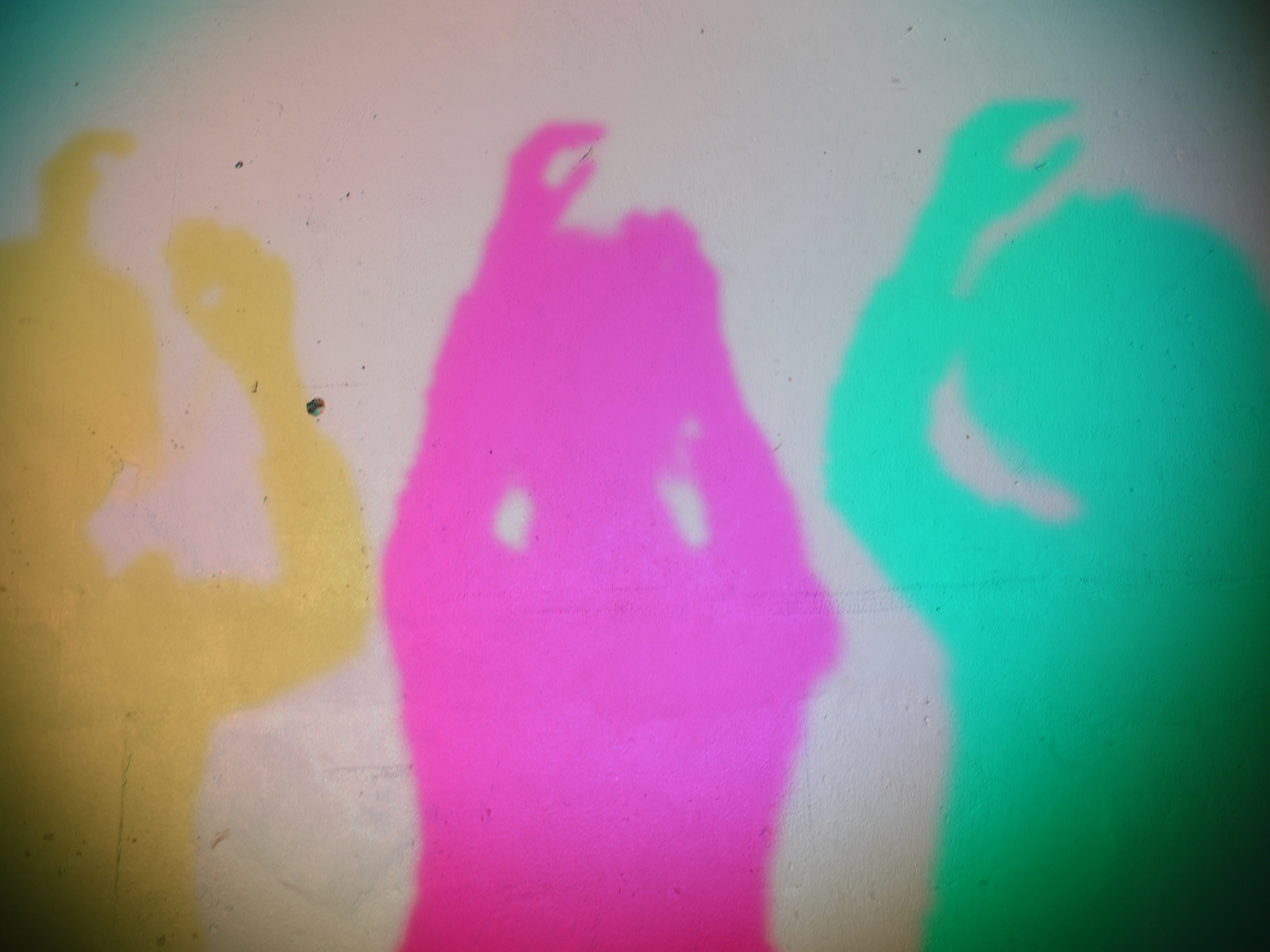
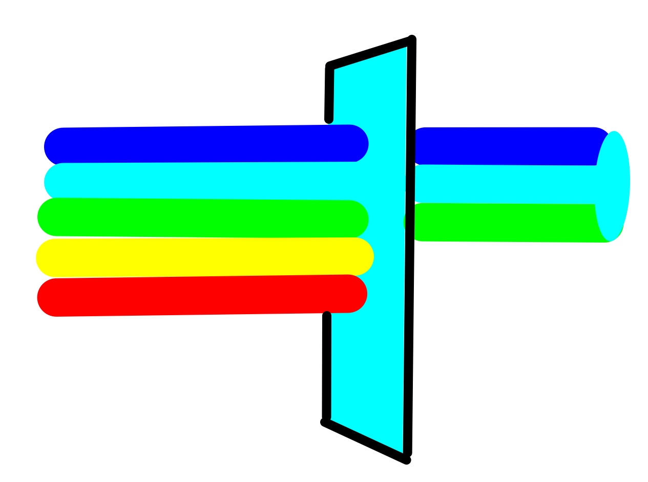
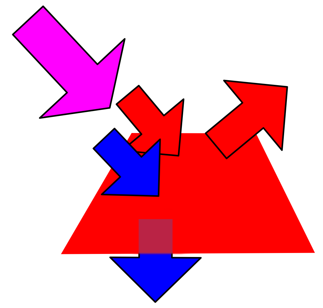
As there are basic three sources of light, each of one basic color (red, green, and blue), emitted onto the figure from different angles, they compose white light. When one source is screened by the figure the color changes as it is deprived of one its component. Yellow lacks blue, cyan lacks red, magenta lacks green
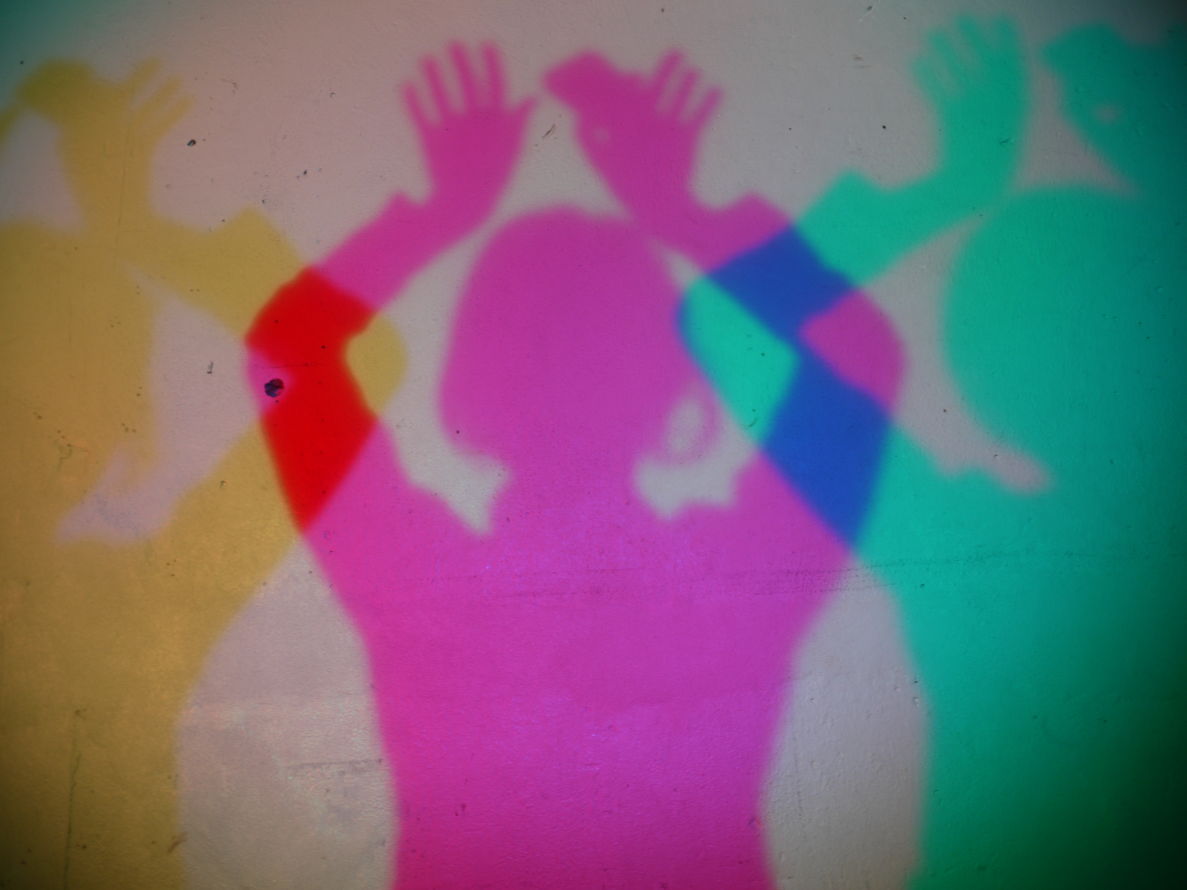
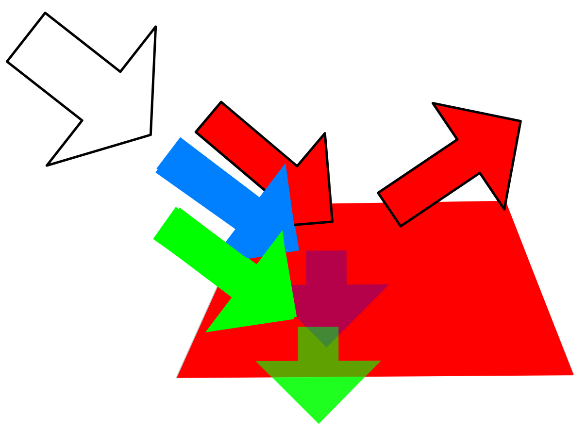
When light sources were moved to a different angle, now there are locations around elbows where two sources are blocked at once. Blue and green blocked on the left leaving only red; red and green blocked on the right leaving only blue.
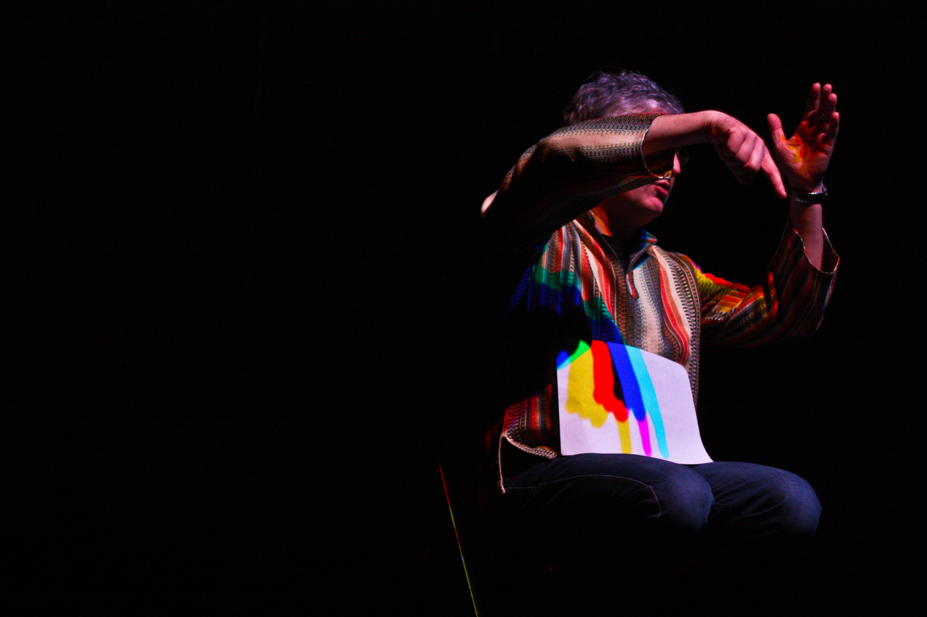
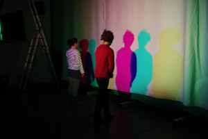
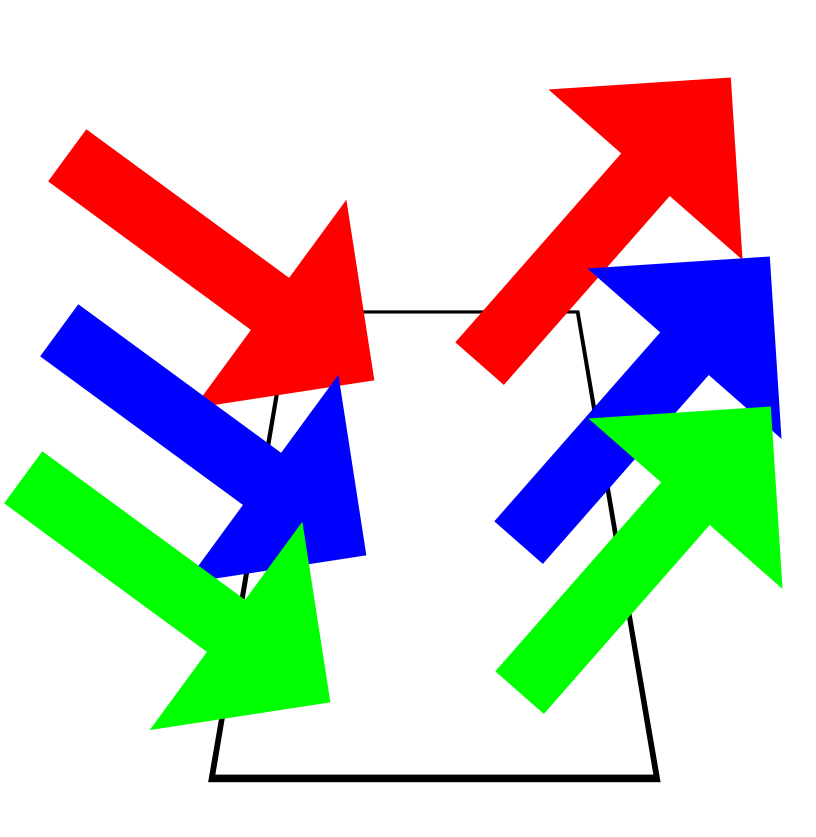
As there are basic three sources of light, each of one basic color (red, green, and blue), they compose white light. When one source is screened by the lecturer’s hand, the light in the screened section is deprived of one of its component, hence changes its color: cyan, when red is blocked and only green and blue are available, blue when red and green are blocked, i.e. only blue is available, magenta when green is blocked and only blue and red are available, red when green and blue are blocked i.e. red is available, yellow when blue is blocked and only green and red is available.
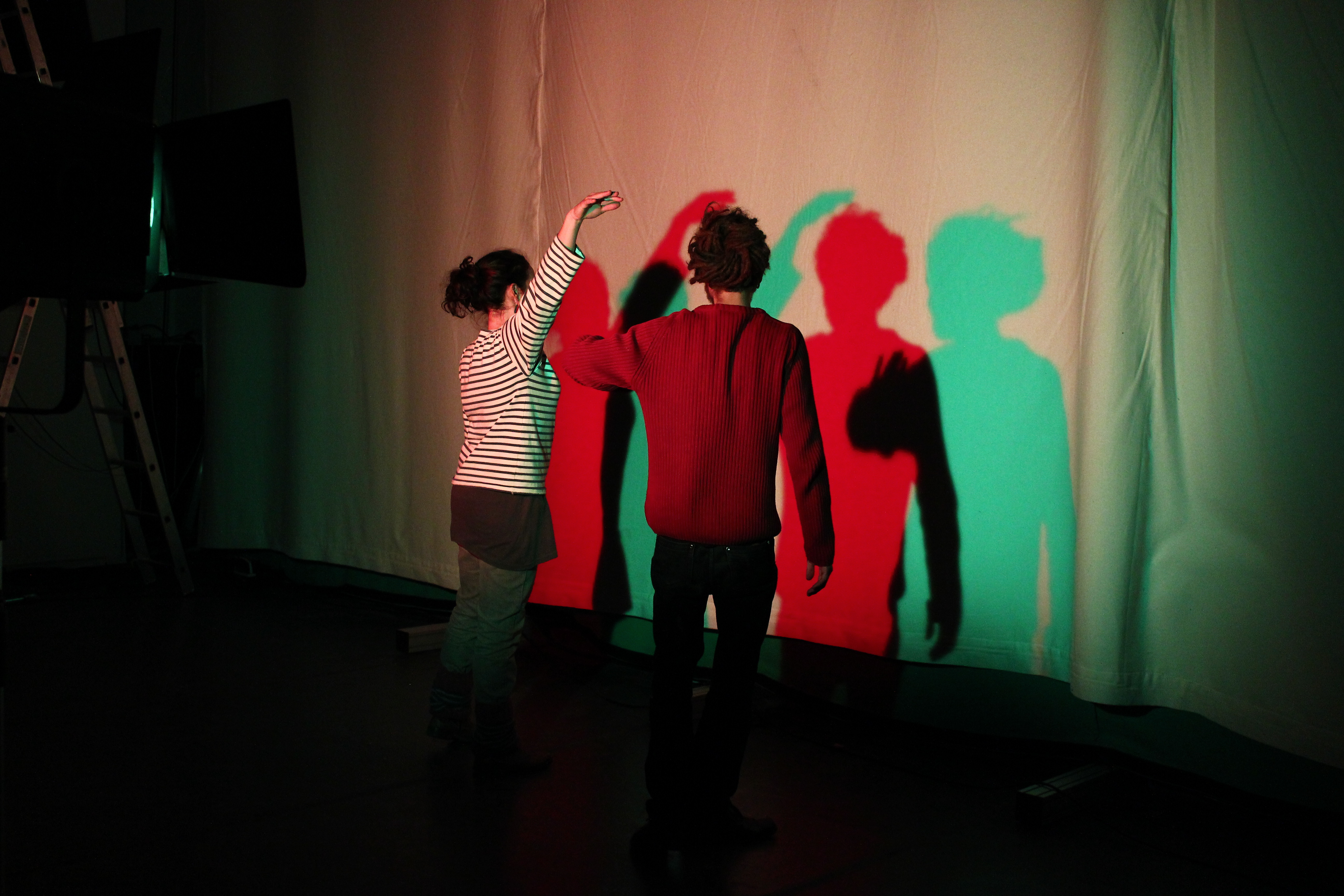
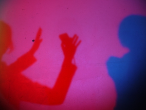
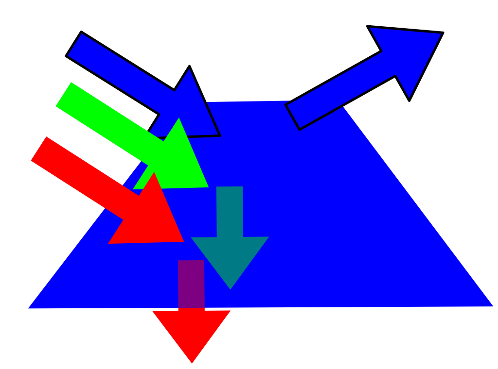
Here, this is an example of additive mixing, there are two sources of light – red light on the left, cyan (green and blue) on the right. Together, these three components compose white light, but as the red is blocked by bodies the shadow on the right is ciant, the right hand of the right figure is black as not lit and left shadow of the right figure is red as it is lit only by red light as the source of green and blue is blocked.
5.2 Substractive
A subtractive color model explains the mixing of a limited set of dyes, inks, paint pigments or natural colorants to create a wider range of colors, each being the result of partial or complete absorption of some wavelengths of light. Painting pigments absorb a part of light and only a fraction is reflected – that part of the spectrum that we perceive as the color. The more pigments are mixed the more light is absorbed – in the end, the black color is perceived.
The subtractive color system is somehow opposed to the additive one. While additive mixing starts with no light or darkness to which we add colors, subtractive model starts with light (presumably white) from which we subtract colors. The subtractive color mixing uses secondary colors of additive model as the primary ones, from which further colors are made.
A / Primary colors
Primary colors are cyan, magenta and yellow, therefore the model is often called CMY. Every primary color absorbs a certain wavelengths of light, so the white light is somehow reduced. By mixing them all we reach the point when there is none – black appears.
This works fine while using color filters (although there is probably no good reason to put all that filters to a single fixture), but when working with pigments, mixing all the primaries usually end up in some dark grey-brown. That is why for example printing engines use CMYK color system (K for black) – to reach true black. (Actually it is analogous as using RGBW LEDs to reach better white).
B/ Secondary colors
Secondary colors of the subtractive model are the primary ones in the additive model – red, green and blue. They are composed as the primary colors are subtracted from each other.
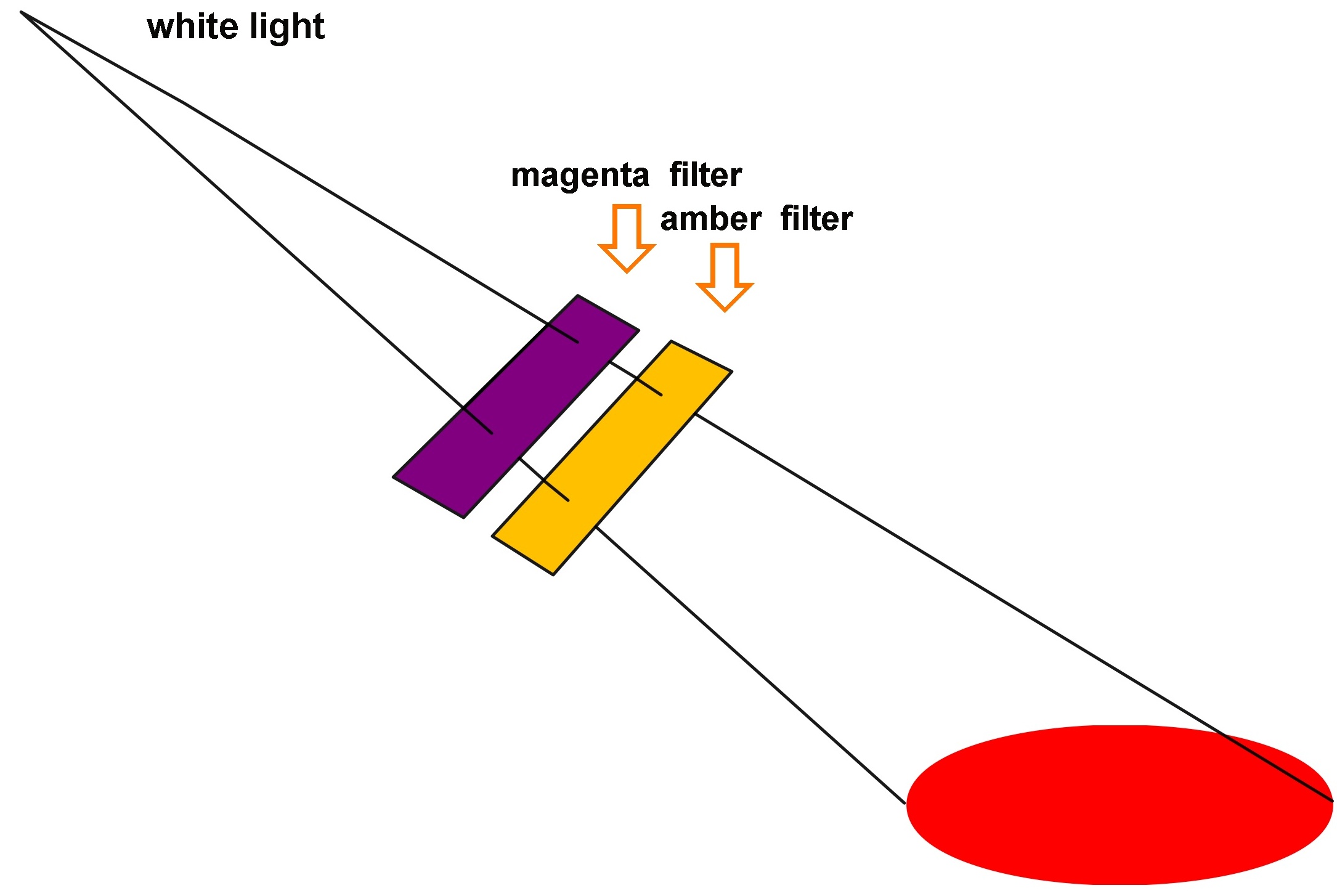
As we already know, color filters are used to subtract wavelengths of light. A magenta filter absorbs all non-magenta wavelengths, that means only red and blue parts of the spectrum are allowed to pass through (for magenta light is composed of blue and red light). By adding a yellow filter furthermore to this setting, in fact from the red and blue light, the blue part is absorbed (as yellow filters allow only red and green part of the light to penetrate) and the only color that remains is red. Vice versa, such an intuitive thing as putting together red and blue filters to make purple wouldn’t probably work as you expected. Because blue and red light usually don’t have much wavelengths in common, you will end with some kind of very dark red and poor light output.
C/ Tertiary colors
Tertiary colors are those created by mixing primary and secondary ones. There is the color wheel again and as you can see, it looks still the same. The concept of complementary colors works still with the difference that mixing them together will result in black (or no light).
Principles of subtractive mixing are used in lighting practice whenever there are more filters used in conjunction. Sometimes we put two (or more) filters into a single luminaire, usually to reach a deeper color. Moving heads with discharge or halogen lamps are commonly equipped (but not always) with a CMY mixing module. It is a set of cyan, magenta and yellow filters, each with the ability of changing its brightness – from very dark to bright. By combining them, we are able to put a wide range of colors on the stage directly from the lighting board.

6. Intensity
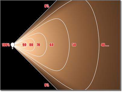
Concerning the qualities of light, there is one of enormous importance for the stage lighting design – the one we usually call intensity – simply: how bright is the light.
Before we undergo a brief review of the means to measure brightness, let us try this easy intellectual experiment: think of a stage with only one present actor, lit by a single 100W tungsten spot bulb hanging from the ceiling just above his head. He is well visible and appears to be brightly lit. Next, imagine that there is a white backdrop somewhere upstage which we illuminate by a batten of 1kW floodlights. Now, he is still somehow visible but we probably would not say that he is brightly lit although the bulb is still on.
With this simple example, we can see that the intensity of light is quite relative – due to the ability of eye to accommodate to different lighting conditions, perceived brightness of an object (or a light source) depends much more on the contrast with overall lighting conditions than on absolute values of the light output of that given source.
We still can measure any of these features and it is necessary to do so when illuminating public environment or artistic pieces as these branches of lighting design are subjects to many rules and regulations, but in stage lighting design, you can probably live without it. Measuring the light is in my opinion mainly useful for comparison of different light sources. Some time ago, everyone was more or less aware of the difference between 1 kilowatt Fresnel and 750 watt ellipsoidal (as much as “brightness” concerns). With modern sources of light like LEDs, things have become more complicated.
How can we measure brightness of a light source? The adjective “bright” can refer to several features: a light source which delivers high luminous flux, or to a light source which concentrates the luminous flux it has into a very narrow beam, or to a light source that causes bright illumination of specific area. Because of the ways in which light propagates through space — spreading out, becoming concentrated, reflecting off shiny or matte surfaces — and because light consists of many different wavelengths, the number of different kinds of light measurement that can be made is large and so are the numbers of quantities and units that represent them. Those that you can usually meet in stage lighting practice are:
Luminous flux:
Luminous flux or luminous power is the measure of the perceived power of light. Luminous flux is often used as an objective measure of the useful light emitted by a light source, and is typically reported on the packaging of light bulbs.
Consumers commonly compare the luminous flux of different light bulbs, since it provides an estimate of the apparent amount of light the bulb will produce. Its unit is lumen.
Luminous intensity
Luminous intensity is a measure of the light power emitted by a light source in a particular direction per unit solid angle. It is measured in candela.
Luminous flux (in lumen ) is a measure of the total amount of light a lamp puts out. This is useful when comparing omnidirectional sources like bulbs. But in stage lighting, we usually deal with directional sources of light – the luminous intensity (in candelas) is more useful, because it tells us how bright is the beam in a particular direction.
If a lamp has a 1 lumen bulb and the optics of the lamp are set up to focus the light evenly into a 1 steradian beam, then the beam would have luminous intensity of 1 candela (in reality, optics are not that efficient – they aren’t able to concentrate all the light output into a given direction). If the optics were changed to concentrate the beam into 1/2 steradian then the source would have a luminous intensity of 2 candela. The resulting beam is narrower and brighter, however, the luminous flux remains the same. So when dealing with directional light sources using luminous intensity, it is necessary to know the angle, which they are supposed to concentrate the light to.
Illuminance
Illuminance is the total luminous flux incident on a surface per unit area. It is a measure of how much the incident light illuminates the surface. Its unit is lux.
We can successfully use all of these units to compare different light sources.
The manufacturers of stage lighting equipment, which are serious about their industry, give some of the photometric values of their products – luminous flux of the lamp, luminous intensity at different angles and even the illuminance on different distances and also diameter of the light spot at this distance.
Lets go through a little practical example: in the theatre, where you are supposed to light a show, you are going to work with ETC Source Four zoom 25-50 and Robert Juliat 613SX 28/54. Both are zoom profiles, they have nearly the same angle range – comparing them is quite easy. You have some experience with Source four and you want to know more about RJ’s profile spot. It is always helpful when you have some experience with one of the compared luminaires. Most of us don’t know how say illuminance of 1115 lux will look like on the stage, but finding that a fixture I use often can do the same, will give me a clear notion.
Following the data sheets, the HPL 750/115 lamp of ETC S4 has luminous flux of 21600 lumens. CP70 lamp which RJ 613SX uses, has 26000 lumens. But as we know, comparing directional sources by lamp lumen output isn’t wise, because it doesn’t say anything of the optical efficacy of the whole luminaire.
Source four zoomed at 25°(tightest) has luminous intensity of 150 745 candela, 613SX zoomed at 28° has intensity 63 000 cd, thus S4 is supposed to be more than twice brighter. That is quite surprising, especially when knowing that RJ is equipped with 1kW lamp while S4 only with 750W lamp.
To verify, lets continue: for this tightest zoom, S4 is supposed to have at 15 ft (cca 4,6m) diameter of 2,2m and illuminance of this field is supposed to be 7 212 lux. 613SX at the very same distance has slightly bigger diameter of 2,3m and illuminance of 3122 lux. Again, S4 seems to be more than twice brighter.
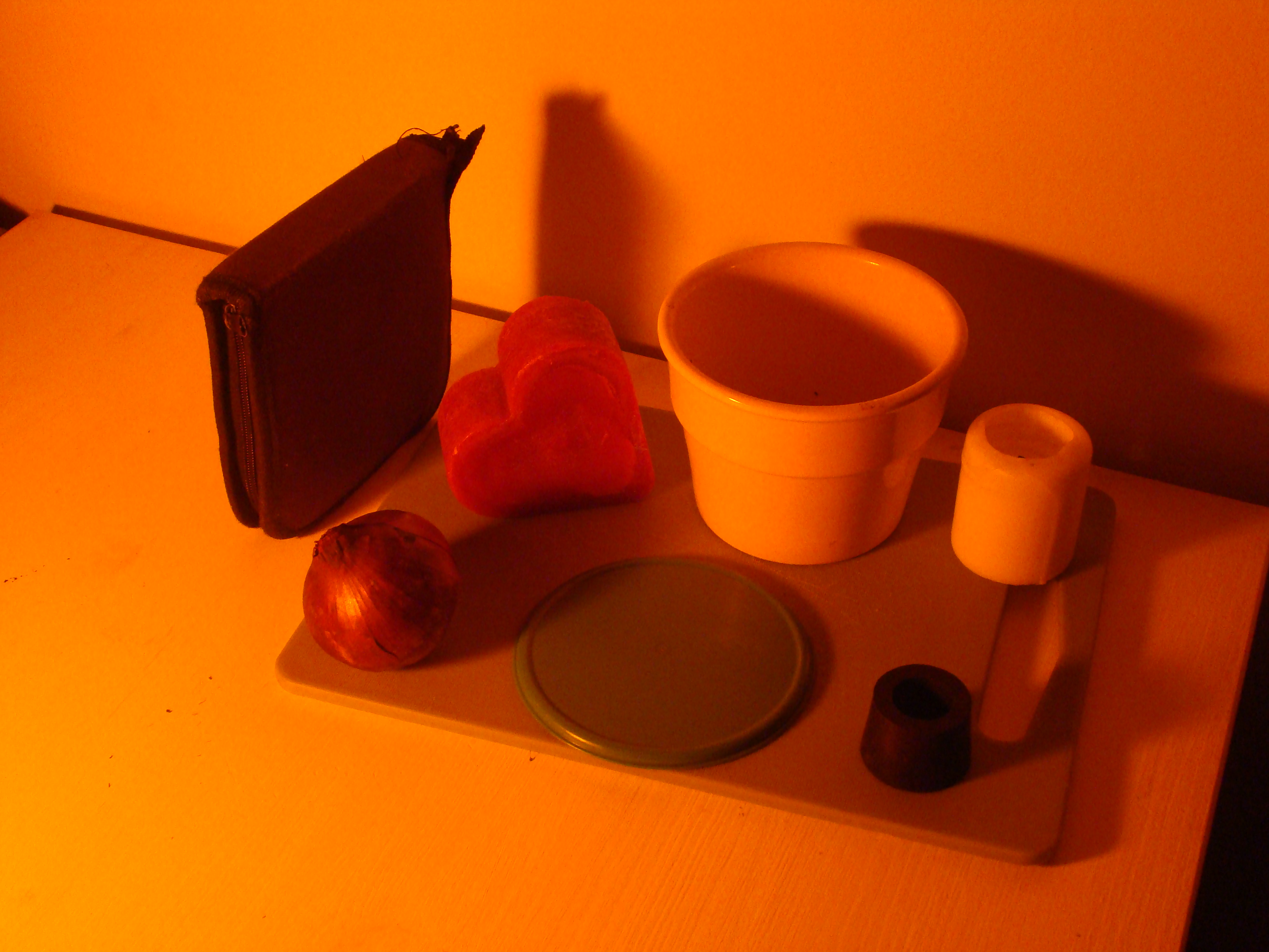
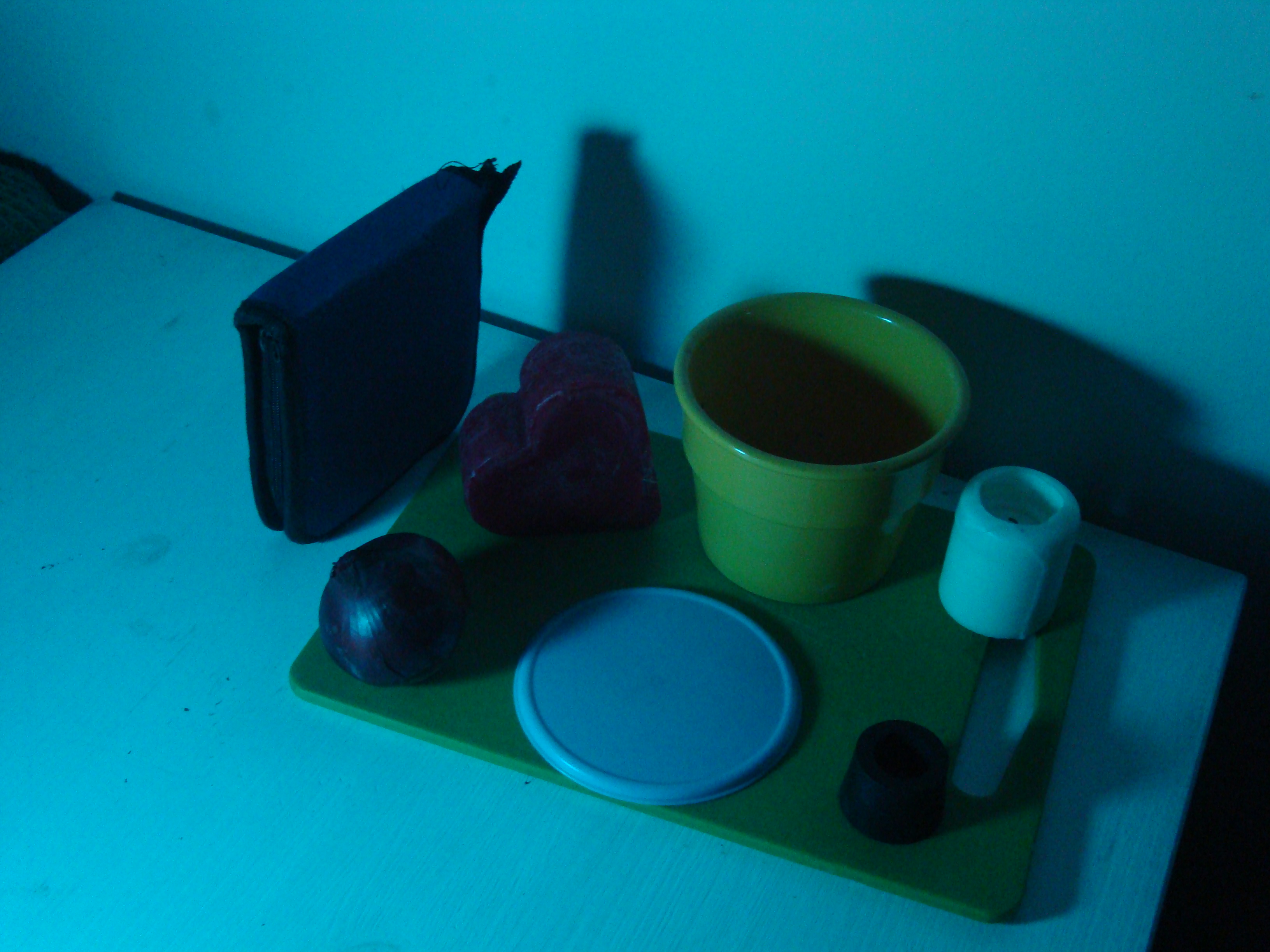
Intensity of illumination affects the perception of a color.
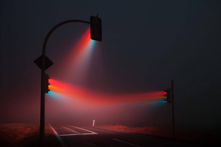
Photo by Lucas Zimmermann
7. Color on the stage
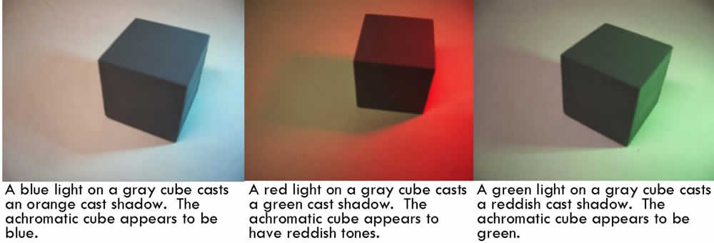
All the things are actually black and white and their color is a result of reflection of light in combination with the composition of the surface. Therefore an object can have a different color when illuminated by a specific type of light.
When a colored object is lit, only a part of light is reflected and the rest of wavelengths is absorbed. The reflected wavelengths are the color we see. Let’s take a red box as an example. The box reflects only red section of the spectrum, while all other colors of the white light are absorbed. If then the very same red box would be lit by light with only a limited range of wavelengths as for instance blue is, because the box reflects only the red part of spectrum and absorbs all the other, it would appear to be black as reflecting no light at all.
Though fairly obvious, it is of great importance for lighting. Presume that we have a set which is dominantly red – using blue lighting will make it look very dark. It is great if intended but if not, some people (especially a set designer) might get very upset.
But as you may realize, it is not entirely true. A red object under blue light may appear black but it may also appear dark red or blue. How does this happen?
It all depends on two factors.
Firstly: nature of the surface (or its pigment). What looks red under white light still can have the ability to reflect blue (or orange) wavelengths of light, although its ability to reflect the red part of the spectrum is much bigger.
Secondly: spectral composition of the light. Light which appears to be blue on white surface might be composed of different wavelengths although the blue prevails.
This seems to be really disappointing as it now seems that there are no rules for reflecting colors. BUT: Have a look on the picture of the visible spectrum with the traditional seven colors assigned (red orange yellow green blue indigo violet) and remember that:

Firstly: it is quite safe to presume that colored light will not affect surfaces of colors, which aren’t directly nearby.
Secondly: the more the color looks to be composed of some others – like bluegren, magenta, pink etc, the differently it will reflect or be reflected.
A simplified model: Magenta light on red surface. What color does a red object assume with a magenta light being cast onto it? Red reflects red and absorbs green and blue. Magenta light is composed of red and blue light. So the red object will reflect the red light and absorb the blue. It will appear red.

Black absorbs almost all the light.
White surface reflects all the light.
Blue surface.
Yellow absorbs blue.
A simplified model: Cyan surface under magenta light. Cyan reflects green and blue and absorbs red. So the object will absorb the red from the magenta and reflect the blue: the object will appear to be blue.
What would happen, when only some parts of light are present, that is, if the light is colored?
-
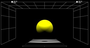
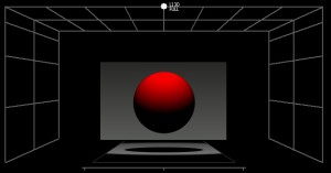
- a yellow sphere under white light
-
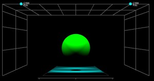
- blue light on yellow surface
-
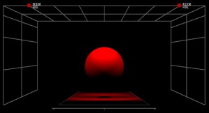
- yellow sphere in red light
-
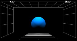
- blue sphere under white light
-
- blue sphere under red light
-
- blue sphere under yellow light
-
- A red object in white light
-
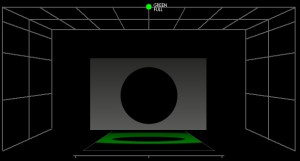
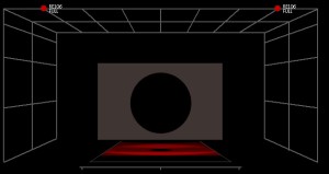
- A red sphere illuminated by a green light seems to be black
-
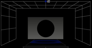
- A red sphere illuminated by a blue light seems to be black.
-
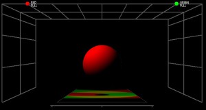
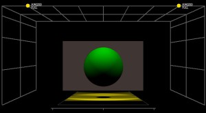
- red and green on red
Perception of color depends not only on the color of the object, but on the color and intensity of the light that is cast onto it.
Tasks
Many phenomena that were decribed here can be seen in the everyday life. Seeing and realizing them with your own eyes is your task.
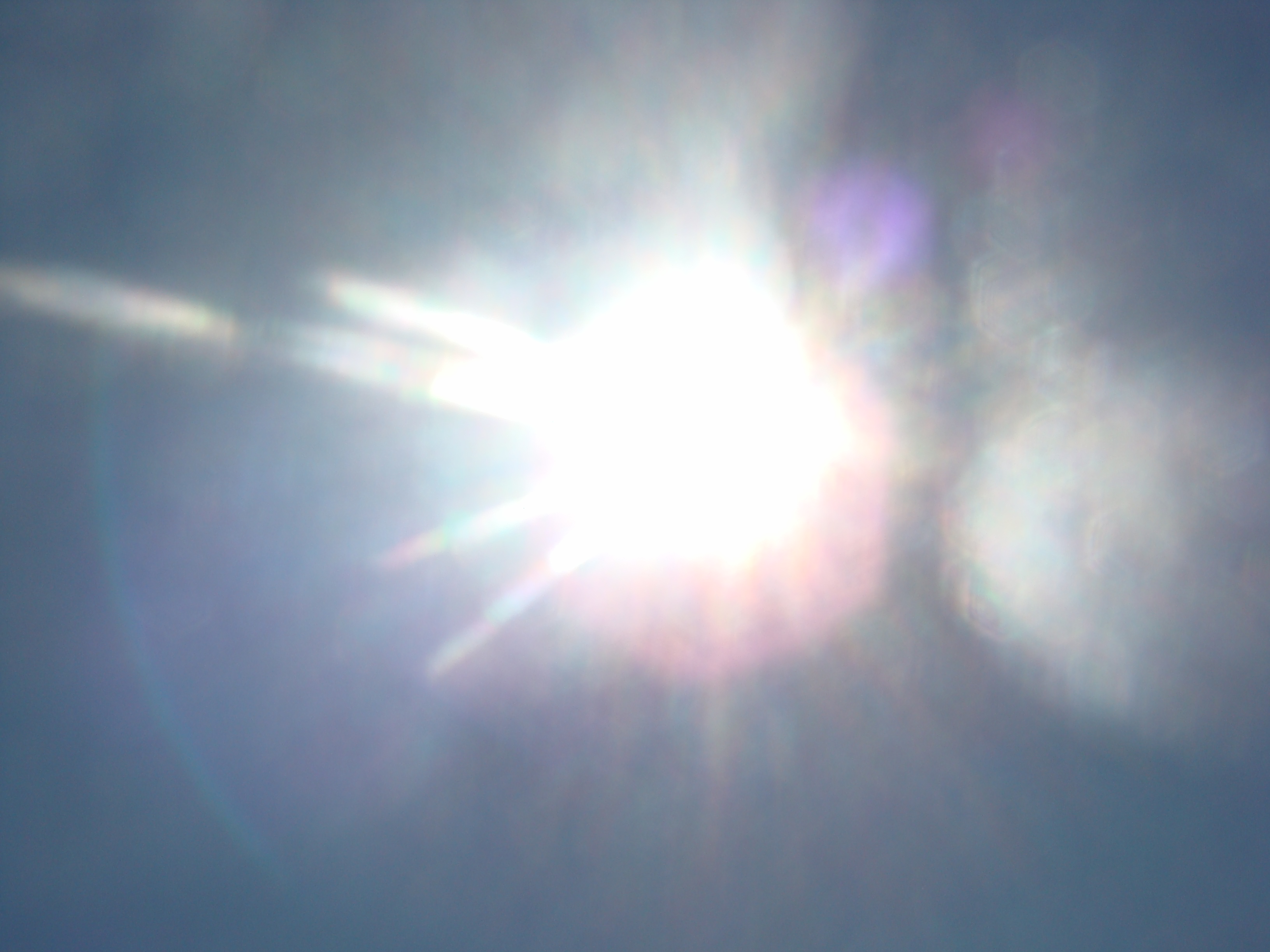
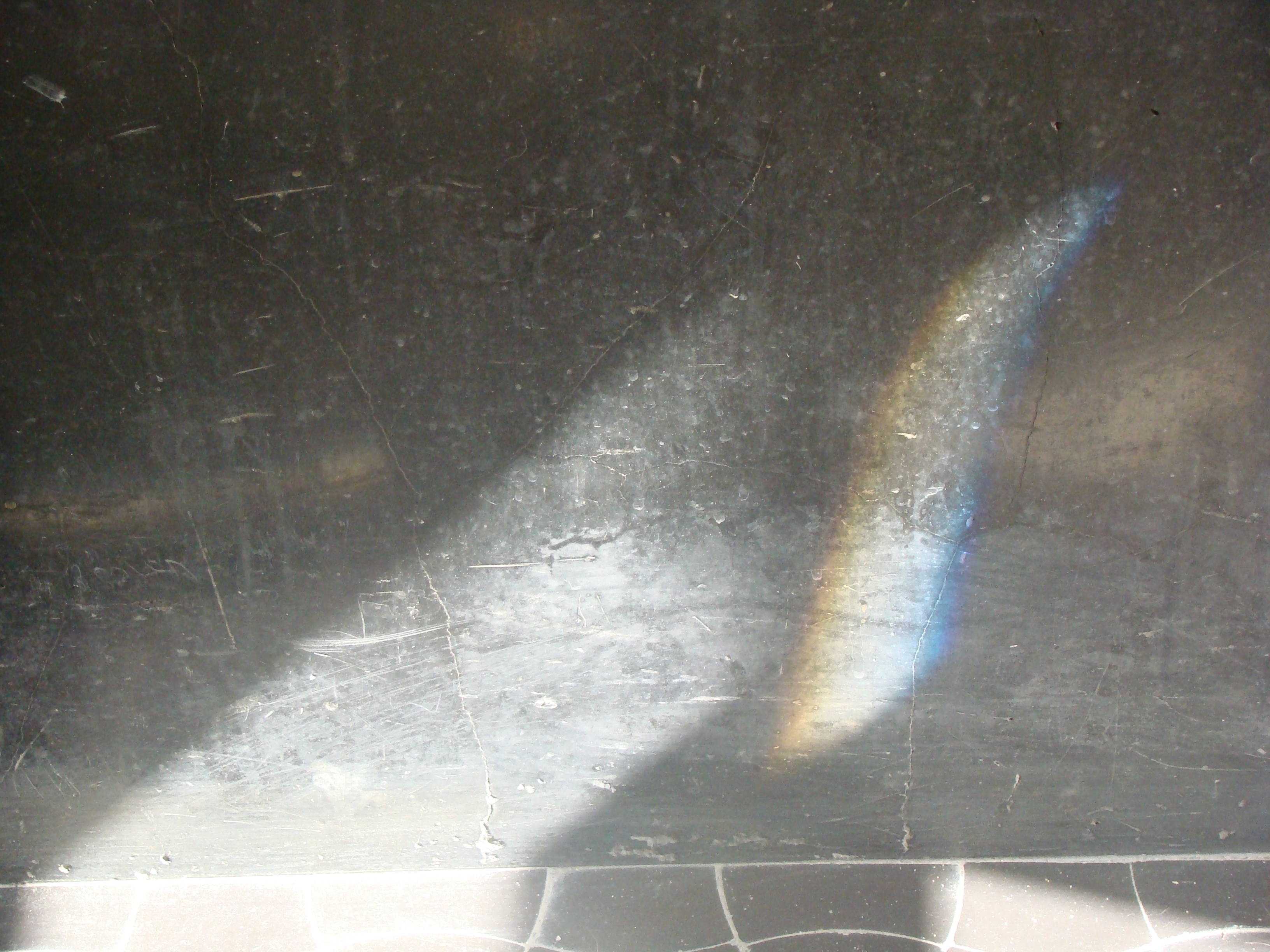
1. Refraction
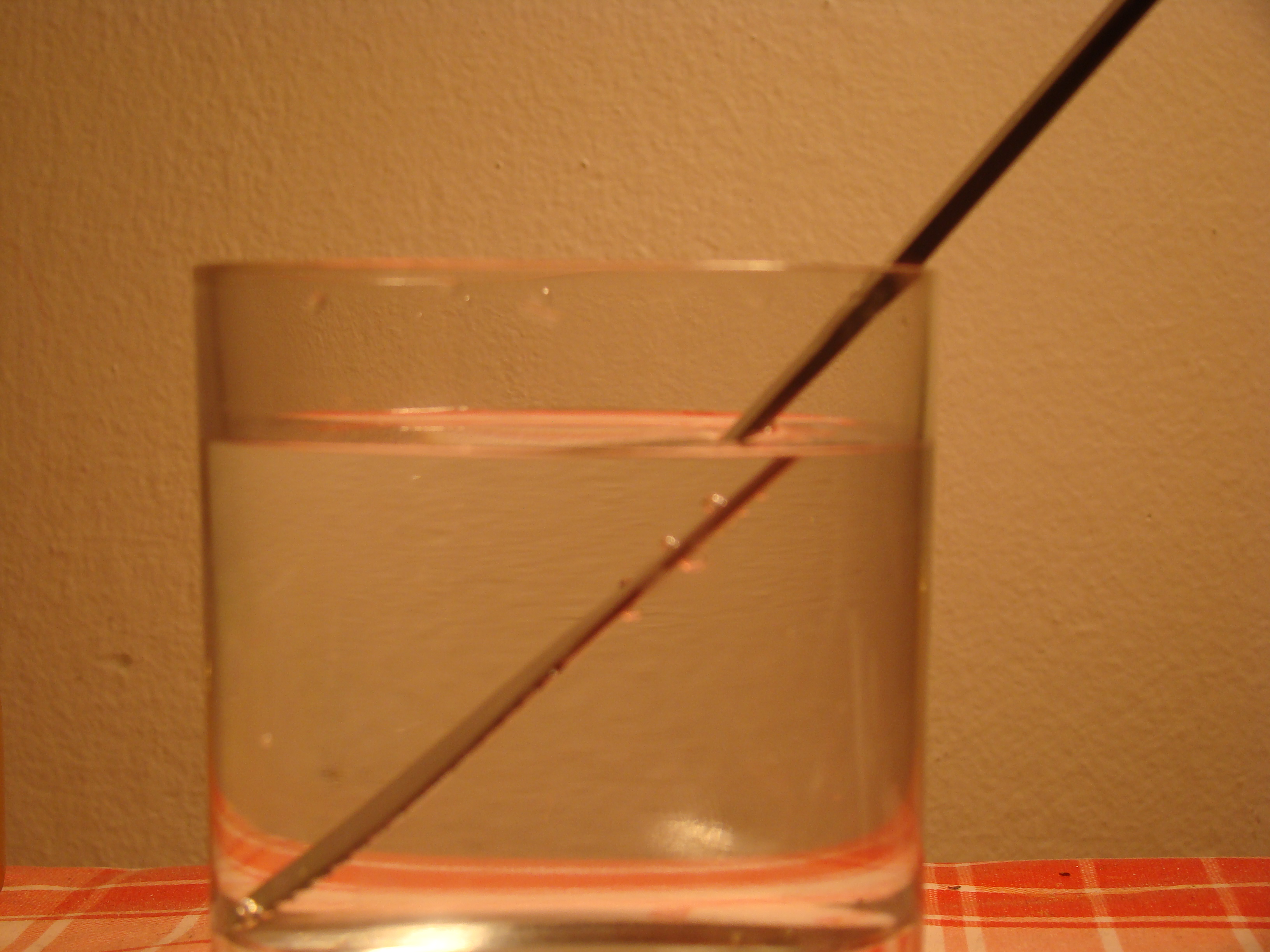
An example of refraction that can be observed on a daily basis.
3. Coloring the light
With a help of plastic bags of different colors and other colored transparent materials that were used for fitering the light, some basics of color mixing can be reproduced in homemade conditions. Try it on your own.


2. Newton’s Prism Experiment
At least to some degree, this experiment can be reproduced in home-made conditions. What is needed is something similar to a prism, a lamp and cardboard, or anything similar that can release just a narrow beam of light. Try it on your own.
A deliberate attempt to reproduce the prims experiment is only partially succesful here.
But the same phenomena can be seen at the coridor of an apartment building in Prague. The shape of glass door filling, which is skewed at the border, is similar to a prism.


Determine which color does the shirt have.
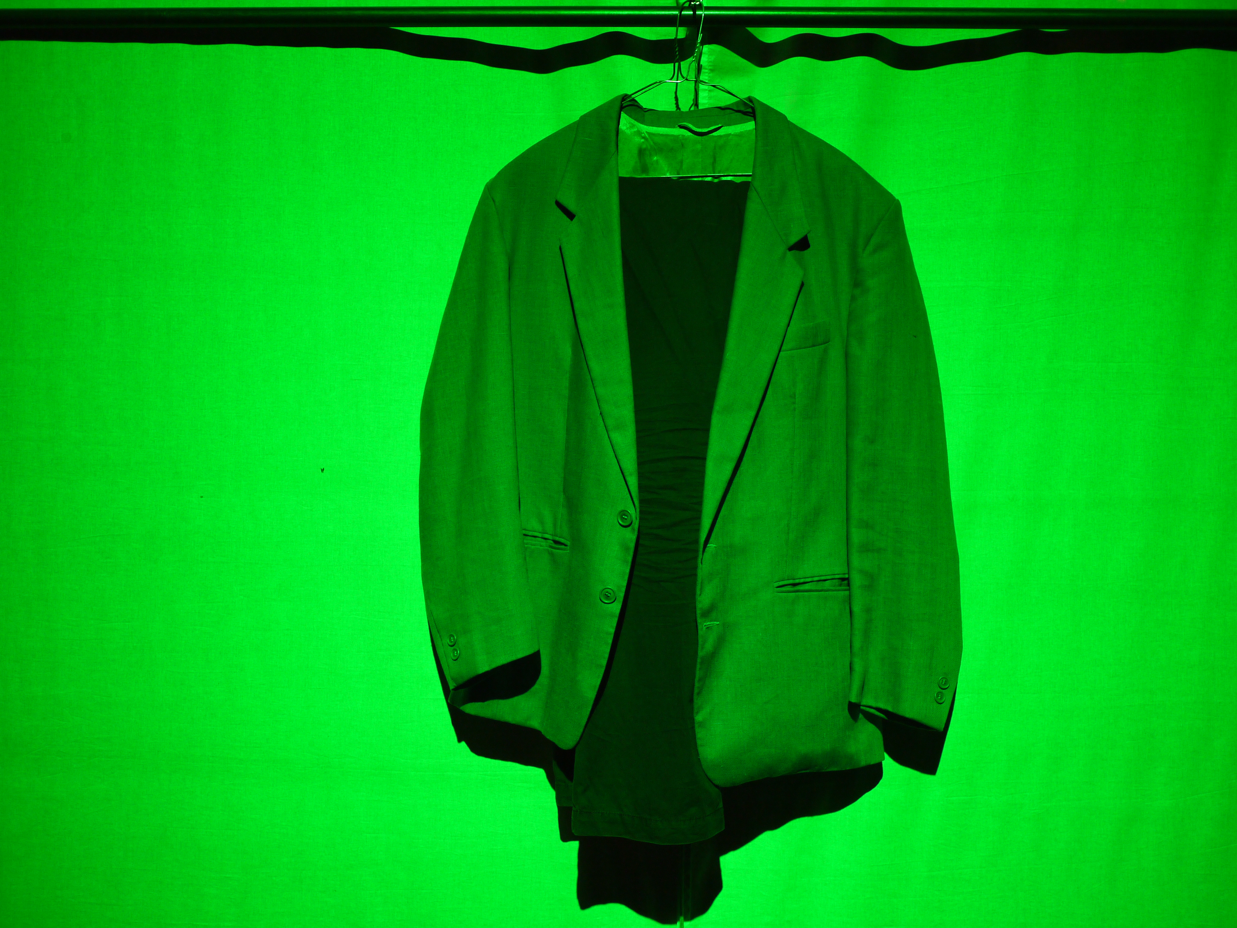
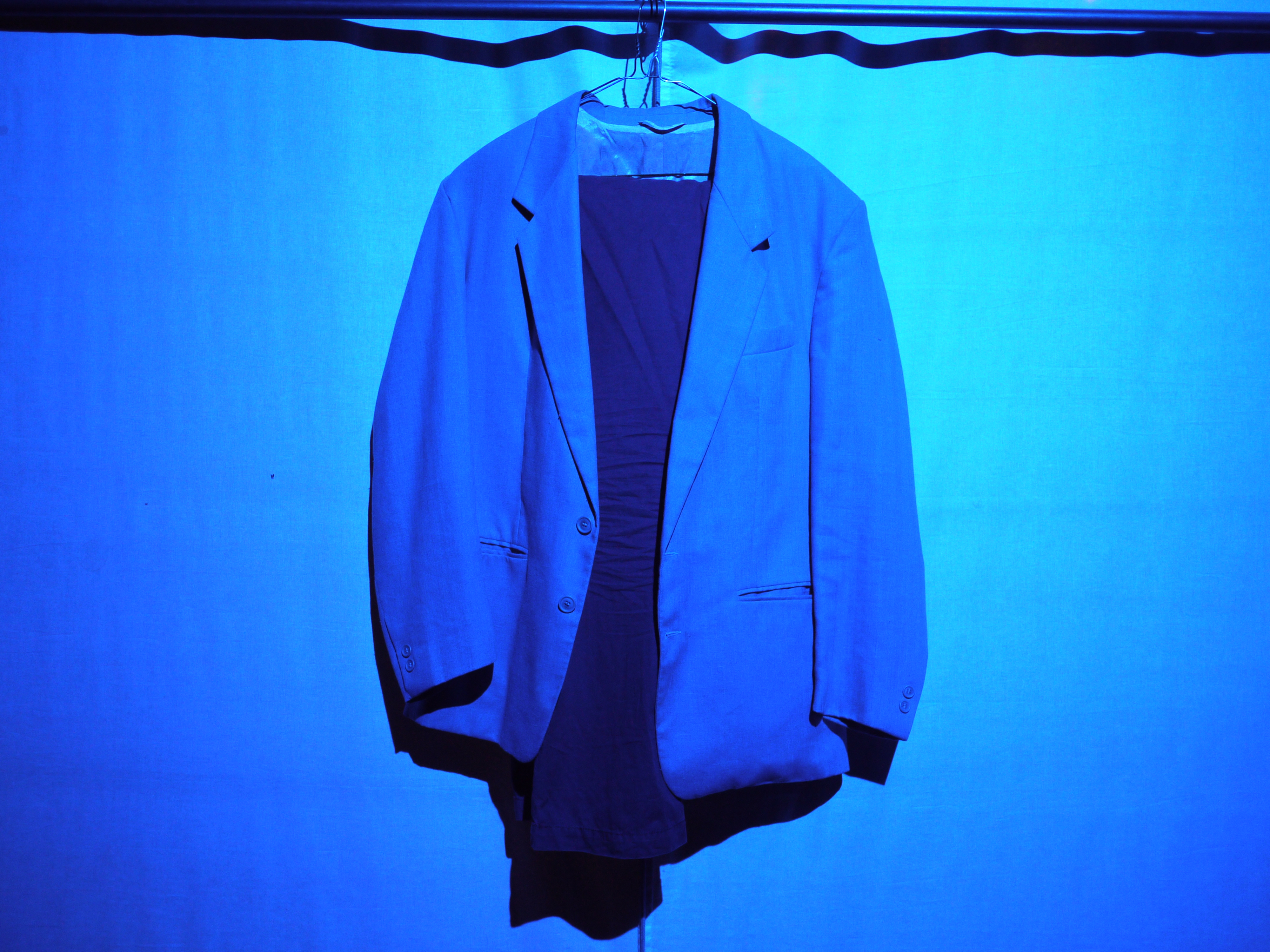

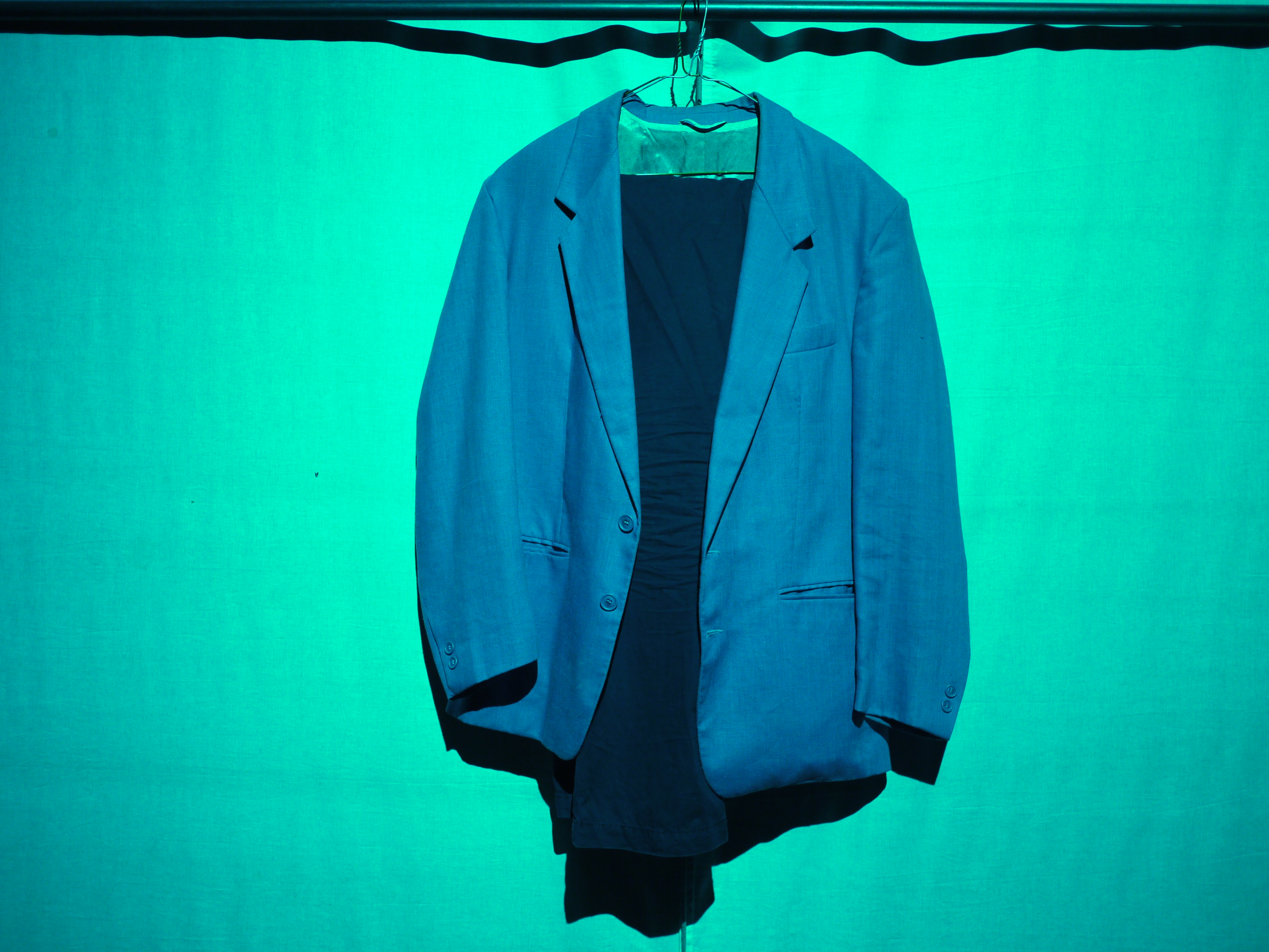
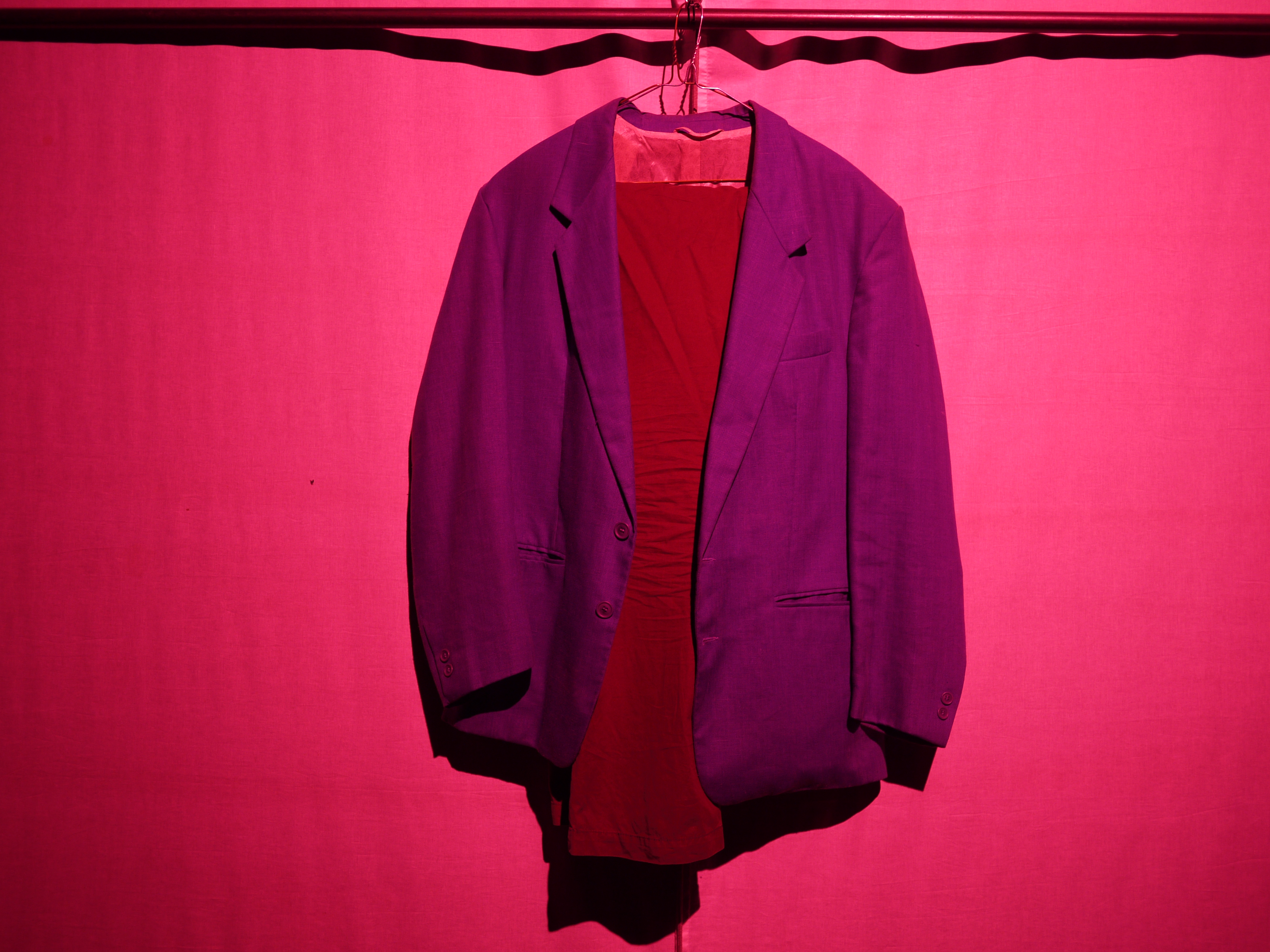

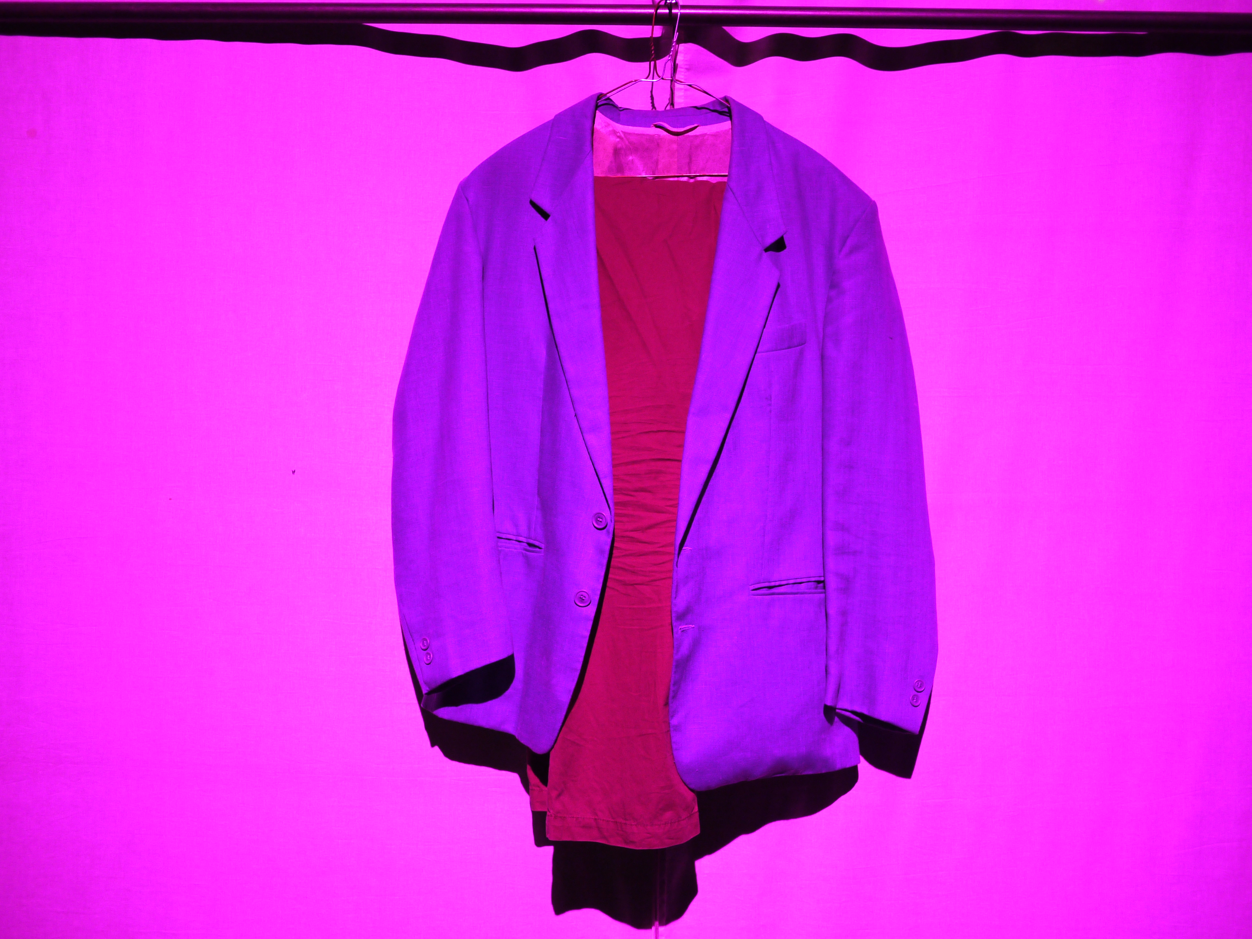
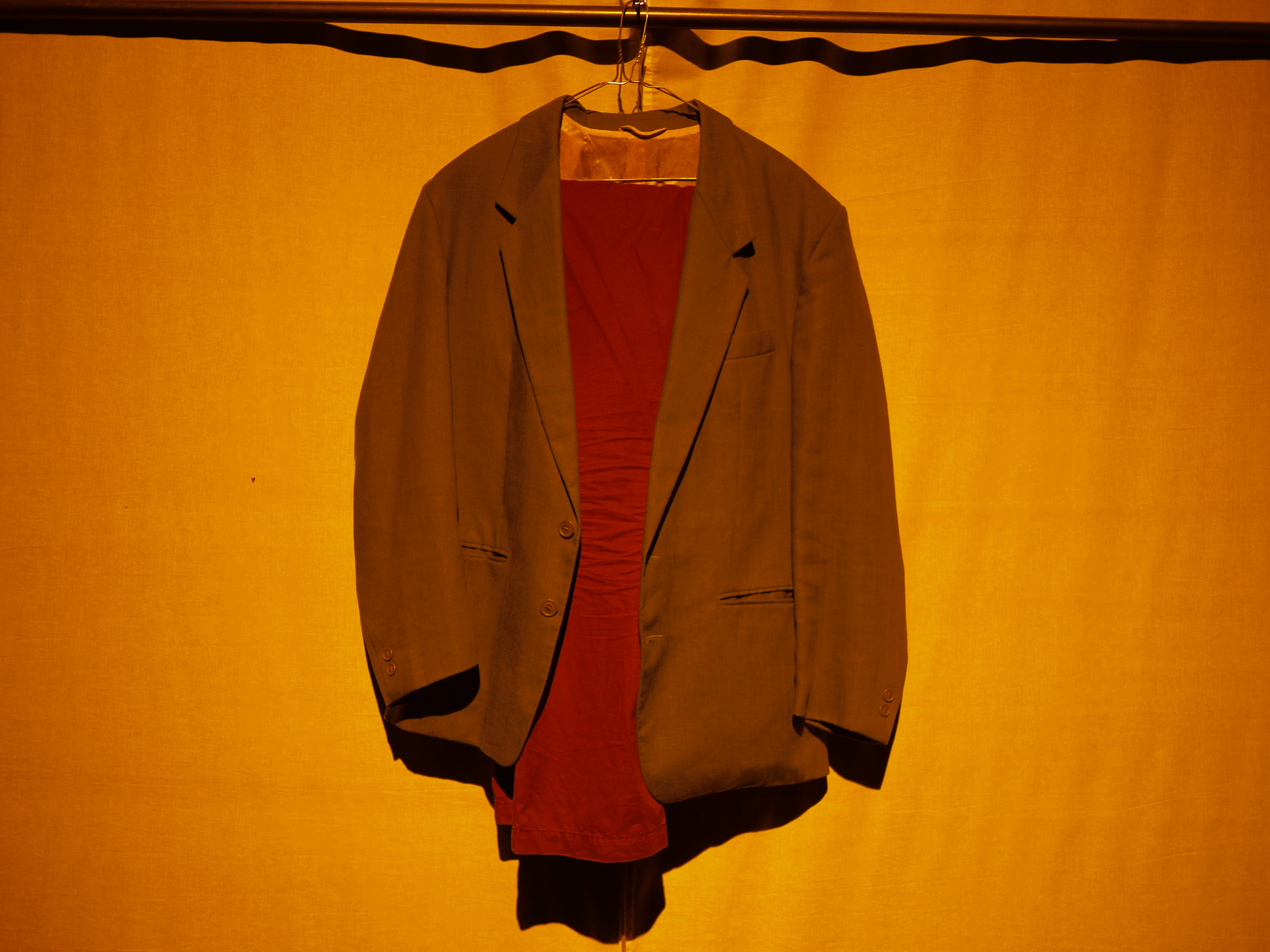
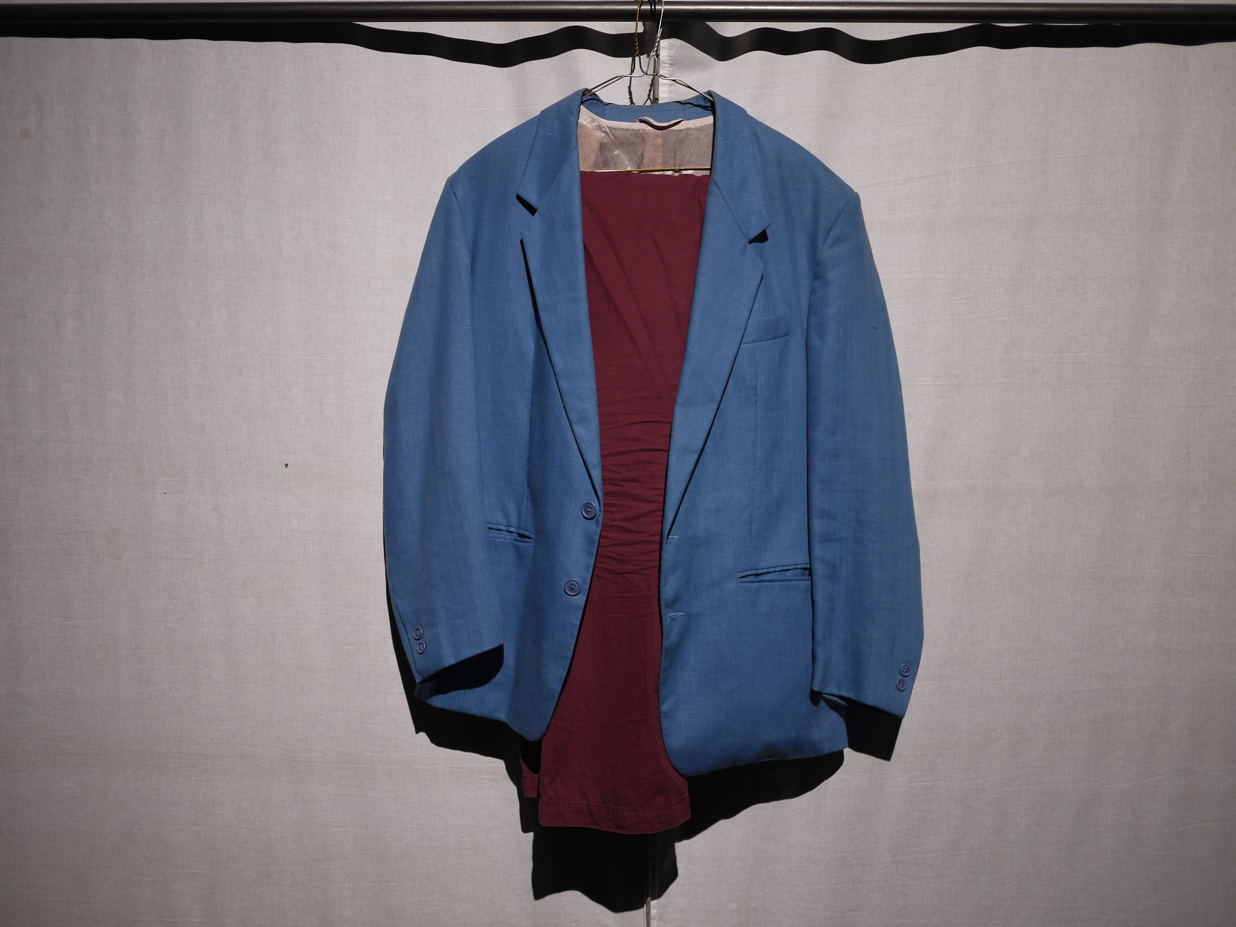
This is how the clothing looks like under white light.
Case studies
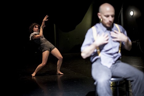
1. Found & Lost
A little bit about the colors: Cold is warm.
Ponec Theater, Prague. 2014
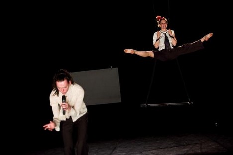
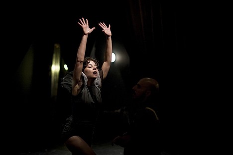
This very sober set design is completed with light that delineates the dimensions of the scene: backlight PAR fixtures from left open the depth of space and also its verticality thanks to a cloud of mist; dancers are also lit from front ground ramps MR16, they don’t cast shadows on the floor or on the backdrop; the angle from the ground position also causes monstrous appearance.
In his work, P. Kotlík often rhythmize and determine the dramaturgical line of the choreography by application of a color scheme. He takes the surface as a base – he covers the theater space in such a way that it would work as a whole. He combines various positions and angles (electric pipes, side towers and ground lights). To cover the entire area, he uses side lights in the level of a figure – side lighting- from both the sides, which models the figures of dancers in a plastic, real, faithful manner. It’s a classic procedure of ballet and dance lighting. The unifying principle of his approach is generally the contrast between “warm” and “cold” areas, but that doesn’t necessarily mean to use warm and cold colors (blue in the base and orange in contrast), but rather a contrast of two shades of color, when one induces a warmer and the second colder impact.
The human eye is an easily deceived organ that is able, first, to adapt to very different lighting conditions (e.g. strong light versus twilight), and secondly to perceive contrast indistinctive at first glance (two shades of the same color).
Therefore P. Kotlík speaks of “zero” (which is a kind of niveau which defines white), the natural color environment to which a person is able to relate the perception of colors and dimensions: the viewer determines the color from the zero, or rather the atmosphere, because he lets himself a priori be carried away by the feeling not the racio during a performance.
If there is such a basis (though it doesn’t have to be shown on stage!) and the eye is given time to adjust, it is possible to create contrasts, even with the cold colors in two different shades, when one automatically produces a warm and the other cold impact. It’s based on a simple principle – similarly as is perceived the contrast between traditional tungsten bulbs and (cold) fluorescent tubes. During the performance Lost and Found, there were used side lights in ballet towers in two levels – at an angle of about 90 ° (body height) and 135 ° (bottom position, at knee level) when the top is warmer shade of color (L245 – Half plus green) and lower lights in the colder shade (L241 – Lee fluorescent 5,700 K).
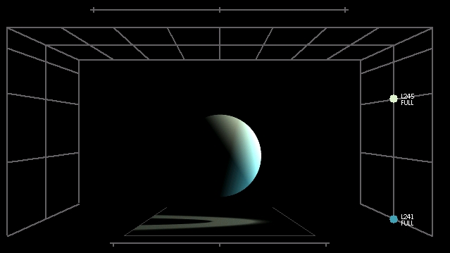

Paradoxically, both are rather cold in the color spectrum, despite that their combination has a contrast impact. It is, however, essential that both colors are placed in the same type of fixture (PC 1 kW). Usage of the same color (L241) in the upper PAR lights (P64 1 kW CP624), however, may work differently, especially with the regard to intensity: PAR doesn’t have even distribution of light across the entire surface of the light beam, and so it is more intense in the middle of the beam than a PC of the same input. If one needs to reach approximately uniform, compact lighting with combination of PC and PAR sources, it is necessary to reduce the intensity of PAR lights, which results in (another specific feature of a PAR) warming of a light beam (visibly lower color temperature). A PAR at lower intensity with a cold color filter emits much warmer color than the PC with the same color.
Thus in the performance Lost and Found, the upper PAR fixtures are used in such a way – they correspond to the PC with L245 at lower intensity (causing warm impact) and are as cold as PC with L241 at higher intensity (but providing stronger light).
For the purpose of the performance (and Kotlík’s concept where warm evokes cheerful and the cold sad atmosphere), cold shades (L241) are used in the scene with a dying mother – backlight PARs cast light at high intensity and lights from ground ramps MR16 as a additional source casting light from the front.
Let’s here briefly mention the fixture MR165 – small halogen sources that are located in the luminaire, placed side by side, provide the effect of multiple sources, so the lit figure or object does not cast a shadow. In the performance Found and Lost, the ramps are placed frontally on the floor (ground position) and replace the direction of the front light almost absolutely. Despite the fact that they are not colored, it is possible to combine them effortlessly into any color atmosphere, because it is not necessary to use high intensity – their role is to provide additional light to essential scenes with the front lights so that the key atmosphere would prevail. It remains to add that the red area can function as a “niveau”. It is possible in the context of the cold colors L241 and L245, which are prevalent in the whole performance and determine its “zero”.
One time lit area in the red color (L182 in the type of source AHR) then contrasts with the cold shade so that the adapted eye perceives it as extremely warm, open color revealing more space – hence the comparison to a niveau. Although eye senses that it is really red, it determines it as the neutral white in the sense of affective perception.
Finally, let’s mention the profiles with Gobos, which leave a “non-white” impact, although not being equipped with any filter. A Gobo pattern, projected onto the surface of a certain color, is in context with it and in relation to the intensity and “colorlessness”, the eye decodes it as a supplement, a detail of the key color of the atmosphere, therefore it moves the temperature of the color closer to the predominant color.
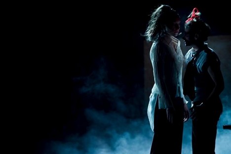


A bunch of cold PAR instruments used for backlighting determines the key coloring of the scene, dancers are lit by additional back light from the front by ground ramps MR16 at low intensity, so they have warmer impact, enhanced by white color of the costume.
PAR instruments used for backlighting with cold light, this time without any additional light; using light from only one side bestows a dramatic effect to the situation and tension, a part of the dancers’ body is in shadow; a cloud of mist highlights the focus of the situation.
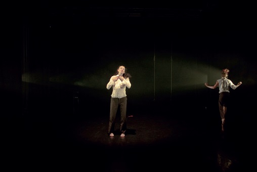
PCs used as side lighting with warmer L245 correspond to white (colorless) spot light from above; use of side lighting changes the dimensions of space, which fades away in the rear, with vanishing vertical dimension; the dancer on the right is lit only from the side, despite of that the figure has vivid impact and is lit well enough.
L245
2. Inteview: Pavel Kotlík
Do you have your own style, your language that you use and repeat? You are very often associated with intense color lighting.
I like very much to use fields and an evenly illuminated whole on the stage. The most distinctively floor, front, back, side. This is a basis for me; I believe that dancers are best seen in the direction of the side lighting from a tripod or towers, usually at the level of the head. Furthermore, the side lighting models bodies well.
The direction and angle of light is just one thing, but the coloring will help to produce more. I am very often too descriptive, which means that I am trying to add a color to the given situation as I perceive it. The key to all this is actually simple: I choose dark colors for a sad atmosphere and happy colors for a cheerful one. One old lighting electrician’s advice is that when a water goblin creeps out, use the green color, when the devil then red. (laughs) It works just in the same way, only I just created my own law. There’s a zero, showing the sort of “a normal situation”. This zero doesn´t need be actually used in the show at all costs. It serves as a sort of a springboard, from which I determine to myself what’s warm and what’s cold. It doesn’t have to be always blue and orange, it may be completely different colors, but they should always stand in contrast.
This means that a spectator can perceive the pinkish white light to be white after an hour presentation… That is something I like.
So what is the “zero”, the center in the case of the Lost and Found show?
243 Lee Fluorescent 3600K from the company LEE filters, that is the zero, which is, however, not actually used there.
So you define the “zero” as a springboard – as the basis from which you seek for another color?
Exactly so, and I proceed further actually quite intuitively. In the case of the Found and Lost, the side lighting is created with PC 1Kw. There is 241 Lee Fluorescent in the lower lights and warm 245 Half Plus Green in the upper ones. There is no 243, even though it was my “zero” at the beginning. In these colors, there is dark green inserted into the PAR‘s. A PAR is stronger as you know in comparison with the PC, which means that the light gives warmer impression. The cold floor is used, for example, in the scene where the mother dies. This scene is so the coldest one, it’s such dying light.
In the case of the Lost and Found, I got a request from choreographer Charlotte Öfverholm for warm and cold colors, so I gave it to her. Only in shades of green. Red function there as “working light” and on the other hand, profiles with gobos provide non-white impression.
Many lighting designers talk about the stage as a canvas, on which they draw their images. Would you agree?
It is a playground where you can play. It is not a canvas, the lights itself don’t exist. You can dance alone, but that’s stupid, you can play the music to yourself and it’s pretty good, but to turn on the lights just for yourself, only few fools as us really do that. I disagree and do not think that theater is like a canvas. It can be a canvas within a story, but it does not work like that as such.
The remaining part of the interview is available here.
3. Last Minutes
The performance Last Minutes was an interesting task (Prague DISK, 2011/2012) where the director wanted to create the so called halo optical phenomenon in a scene, in which there would be an Antarctic research station and snowy garden in front of it (white ballet floor). Using fine steam is simply not possible in theatrical conditions. It was therefore necessary to think about how such a phenomenon would manifest itself in the indoor environment, when it is actually visible only in the sky. Obviously, it will be strange and unnatural light. In this way, the colors were used in such a way for changing the scene in color (cold, yellow and red hues) to the odd reflections from the white surface of the floor, with which strange light should be guaranteed. In one moment, when the halo was noticed by spectators, strong front lights were used that hadn’t been used until that time. In such a manner, the desired effect was simply achieved.
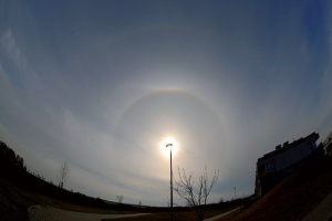
At the photos taken on 22. 2. 2014, more halos can be seen at once: 46° halo and 22° halo, Parry arc, light pillar. It is worth noting the areas of pale light of landscape despite the fact that the contrast of the image was adjusted (photo: Štěpánka Kosová, available at: http://show.astro.cz/upload/20140222StepankaKosova_Komplex2.jpg)
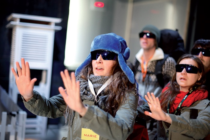
Performance Last Minutes, in which halo phenomena were simulated by stage lighting instruments; reflection of front fixtures on actors’ sunglasses should imitate the light of a hall phenomenon. (Photo: Jan Hromádka)
Sources and literature
Basic color schemes: Introduction to Color Theory. Tiger Color [online]. [Accessed 2015-05-04]. Available from: http://www.tigercolor.com/color-lab/color-theory/color-theory-intro.htm
Color. Stanford Encyclopedia of Philosophy [online]. [Accessed 2015-05-04]. Available from: http://plato.stanford.edu/entries/color/
Color: 2D Elements of Design. UMWDesign [online]. [Accessed 2015-05-04]. Available from: http://umwdesign.wikispaces.com/Color
Color Harmonies: Basic techniques for combining colors. Tiger Color [online]. [Accessed 2015-05-04]. Available from: http://www.tigercolor.com/color-lab/color-theory/color-harmonies.htm
Color Schemes Defined. The Informed Illustrator [online]. [Accessed 2015-05-04]. Available from: http://www.theinformedillustrator.com/2012/10/color-schemes-defined_16.html?m=1
Color Subtraction [online]. [Accessed 2015-05-04]. Available from: http://ux1.eiu.edu/~cfadd/1160/Ch23RR/Sub.html
Color temperature [online]. MACEVOY, Bruce. [Accessed 2015-05-04]. Available from: http://www.handprint.com/HP/WCL/color12.html#top
Color Theory: Overview [online]. [Accessed 2015-05-04]. Available from: http://www.worqx.com/color/
Color theory. 2001-. Wikipedia: the free encyclopedia [online]. San Francisco (CA): Wikimedia Foundation [Accessed 2015-05-04]. Available from: http://en.wikipedia.org/wiki/Color_theory
DOTY, Sheri. Color Theory. Art Instruction Blog [online]. [Accessed 2015-05-01]. Available from: http://www.artinstructionblog.com/category/ab-art-lessons-by-subject/color-theory
Color Theory Basics [online]. [Accessed 2015-05-04]. Available from: http://www.color-wheel-pro.com/color-theory-basics.html
Color Theory in Web Designs [online]. [Accessed 2015-05-04]. Available from: http://www.web-designers-directory.org/articles/color-theory-in-web-designs-9.html
JEWETT, Tom. Color tutorial [online]. [Accessed 2015-05-04]. Available from: http://www.tomjewett.com/colors/index.html
Color vision. 2001-. Wikipedia: the free encyclopedia [online]. San Francisco (CA): Wikimedia Foundation [Accessed 2015-05-04]. Available from: http://en.wikipedia.org/wiki/Color_vision
Color wheel [online]. [Accessed 2015-05-04]. Available from: http://www.geocities.ws/murraysclassroom/ColorWheel/ColorWheel.htm
Color Wheel [online]. [Accessed 2015-05-04]. Available from: http://deeterdude.wikispaces.com/Color%20Wheel
Colors on the Web: A color Resource for Web Designers [online]. [Accessed 2015-05-04]. Available from: http://www.colorsontheweb.com/
Colour lovers [online]. [Accessed 2015-05-04]. Available from: http://www.colourlovers.com/
HSL and HSV. 2001-. Wikipedia: the free encyclopedia [online]. San Francisco (CA): Wikimedia Foundation [Accessed 2015-05-04]. Available from: http://en.wikipedia.org/wiki/HSL_and_HSV
OGDEN, Adam. Lighting Color Theory [online]. [Accessed 2015-05-04]. Available from: http://www.theworshipcommunity.com/lighting-color-theory/
Notes on color mixing [online]. NEWLAND, Andrew. [Accessed 2015-05-04]. Available from: http://www.andrewnewland.com/homepage/teaching/techniques/painting/colourmix/colourmix.html
RICHARDSON, Steve. Technical Theatre Handbook: Color [online]. [Accessed 2015-05-04]. Available from: http://www.gweep.net/~prefect/pubs/iqp/node67.html
DOTY, Sheri. The Influences of the Environment on Color [online]. [Accessed 2015-05-04]. Available from: http://www.artinstructionblog.com/color-studies-part-3-the-influences-of-the-environment-on-color
The Physics and Physiology of Color and Color Vision [online]. [Accessed 2015-05-04]. Available from: http://www.greatreality.com/color/index.htm
Munsell Color System [online]. [Accessed 2015-05-04]. Available from: http://munsell.com/
Color Matters [online]. [Accessed 2015-05-04]. Available from: http://www.colormatters.com/
Color Schemes [online]. [Accessed 2015-05-04]. Available from: http://facweb.cs.depaul.edu/sgrais/ColorSchemes.htm
List of light sources. In: Wikipedia: the free encyclopedia [online]. San Francisco (CA): Wikimedia Foundation, 2001- [cit. 2015-05-09]. Available from: http://en.wikipedia.org/wiki/List_of_light_sources
The dress. In: Wikipedia: the free encyclopedia [online]. San Francisco (CA): Wikimedia Foundation, 2001- [cit. 2015-05-17]. Available from: http://en.wikipedia.org/wiki/The_dress_(viral_phenomenon)
Light and Color. In: [online]. [cit. 2015-05-17]. Available from: http://www.micro.magnet.fsu.edu/primer/lightandcolor/
Programs:
Video source:
NASA SCIENCE. The Electromagnetic Spectrum [online]. The Science Channel [cit. 2015-06-07]. Available from: https://www.youtube.com/watch?v=cfXzwh3KadE&list=WL&index=4
AUDIOPEDIA. Color temperature. Available from: https://www.youtube.com/watch?v=rG039N2SYzs
Literature:
BRIGGS, David et al. The Dimensions of Colour. Available from: http://www.huevaluechroma.com/index.php
LOEB, Arthur L. Color and symmetry. Huntington, N.Y.: R. E. Krieger Pub. Co., ,1971. xiii, 179 p., [8]. ISBN 08-827-5745-8. Available also from: http://amzn.com/0882757458
RAINWATER, Clarence a Herbert S. ZIM. Light and color. New York: Golden Press, 1971. ISBN 978-030-7635-402. Available also from: http://amzn.com/0307635406
PADGHAM, C a John E SAUNDERS. The perception of light and colour. London: Bell, 1975. ix, 192 p. ISBN 07-135-1874-X. Available also from: http://amzn.com/071351874X
MOLLON, J a L SHARPE. Colour vision: physiology and psychophysics. New York: Academic Press, 1983. xxiv, 613 p. ISBN 01-250-4280-9. Available also from: http://amzn.com/0125042809
JOLLANDS, David. Sight, light, and color. New York: Arco Pub, 1984. ISBN 978-066-8061-773. Available also from: http://amzn.com/0668061774
GERSTNER, Karl. The forms of color: the interaction of visual elements. Cambridge, Mass.: MIT Press, 1986. 179 p. ISBN 02-620-7100-2. Available also from: http://amzn.com/0262071002
FISHER, Paul Zelanski and Mary Pat. Colour. 3rd ed. London: Herbert Press, 1999. ISBN 978-071-3650-327. Available also from: http://amzn.com/071365032X
MAUND, Barry. Colours: their nature and representation. Pbk. re-issue, digitally printed version. S.l.: Cambridge Univ Pr., 2009. ISBN 978-052-1110-129. Available also from: http://amzn.com/0521110122
WILCOX, by Michael. The artist’s guide to selecting colors. Perth, Western Australia: School of Colour Pub, 1997. ISBN 978-095-8789-189. Available also from: http://amzn.com/0958789185
GEGENFURTNER, Karl R a L SHARPE. Color vision: from genes to perception. New York: Cambridge University Press, 1999. x, 492 p. ISBN 05-215-9053-1. Available also from: http://amzn.com/0521590531
FEISNER, Edith Anderson. Colour: how to use colour in art and design. 2nd ed. London: Laurence King, 2006. ISBN 978-185-6694-414. Available also from: http://amzn.com/1856694410
FEISNER, Edith Anderson. Color studies. 2nd ed. New York: Fairchild Publications, 2006. ix, 182 p. ISBN 15-636-7394-0. Available also from: http://amzn.com/1563673940
MOLLICA, Patti. Color theory. Irvine, CA: Walter Foster, 2013. ISBN 978-1600583025. Available also from: http://amzn.com/1600583024
WOLF, Thomas H a Ned SEIDLER. The magic of color. New York: Odyssey Press, 1964. 40 p. Available also from: http://amzn.com/B001KRHRWG
CLARENCE H. GRAHAM, Clarence H. ed. Vision and visual perception. New York [u.a.]: Wiley, 1965. ISBN 978-047-1321-705. Available also from: http://amzn.com/0471321702
KLEIN, Bernat. Eye for Colour. London: Collins, 1965. ISBN 978-0686098294. Available also from: http://amzn.com/0686098293
KNIGHT, Julie a A. V. S. REUCK. Colour Vision. Physiology and Experimental Psychology. Boston: Little, Brown & Co., 1965. Available also from: http://amzn.com/B001J1TMF8
BROOKS, Walter. The Art of Color Mixing. New York: Grumbacher, 1966. ISBN 978-9553370518. Available also from: http://amzn.com/9553370519
HELLMAN, Harold. The Art and Science of Color. McGraw-Hill, 1967.ISBN 978-0070280779. Available also from: http://amzn.com/0070280770
BEGBIE, G. Hugh. Seeing and the eye; an introduction to vision. Garden City, New York: Anchor Books, 1973. ISBN 978-038-5054-669. Available also from: http://amzn.com/0385054661
FRASER, Tom. The Complete Guide to Colour: The Ultimate Book for the Colour Conscious. Cambridge: The Ilex Press, 2004. ISBN 978-1904705222. Available also from: http://amzn.com/1904705227
GEDDES-BROWN, Leslie. Color essentials. New York: Ryland, Peters, 2004. p. cm. ISBN 18-417-2687-7. Available also from: http://amzn.com/1841726877
FINLAY, Victoria. Color: a natural history of the palette. Random House Trade Paperback edition. New York: Random, 2002. ISBN 978-081-2971-422. Available also from:: http://amzn.com/0812971426
BRAKEL, Jaap van a Barbara SAUNDERS. Theories, technologies, instrumentalities of color: anthropological and historiographic perspectives. Lanham, MD: University Press of America, 2002. ISBN 978-076-1822-653. Available also from:: http://amzn.com/0761822658
HOPE, Augustine a Margaret WALCH. The color compendium. New York: VanNostrand Reinhold, 1990. ISBN 978-044-2003-784. Available also from: http://amzn.com/0442003781
FALK, David S, Dieter R BRILL a David G STORK. Seeing the light: optics in nature, photography, color, vision, and holography. New York: Harper, 1986. xvii, 446 p., [16] p. of plates. ISBN 00-604-1991-1. Available also from: http://amzn.com/0060419911
ALBERS, Josef. Interaction of Color. Aktualizované a rozšířené vydání. New Haven: Yale University Press, 2006. xi, 145 p. ISBN 978-0-300-11595-6. Available also from: http://amzn.com/0300115954
GERSTNER, Karl. The forms of color: the interaction of visual elements. Cambridge, Mass.: MIT Press, 1986. 179 p. ISBN 02-620-7100-2. Available also from: http://amzn.com/0262071002
FINLAY, Victoria. Color: a natural history of the palette. Random House Trade Paperback edition. New York: Random, 2002. ISBN 978-081-2971-422. Available also from: http://amzn.com/0812971426
ROY, David Bomford and Ashok.. Colour. London: National Gallery, 2001. ISBN 978-030-0079-227. Available also from: http://amzn.com/0300079222
INTERNATIONAL COMMISSION ON ILLUMINATION. Vocabulaire electrotechnique international. Eclairage: Vocabulaire international de l’éclairage = International electrotechnical vocabulary. Chapter 845, Lighting : International lighting vocabulary. [1987 ed.]. Genéve: Bureau Central de la Commission Electrotechnique Internationale, 2011. ISBN 978-390-0734-077. Available from: http://amzn.com/B008SVPK12
Test